


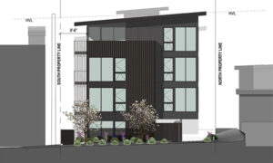
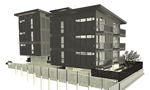
BUILD picks apart a recent project for keys to improve the efficiency of rentable area
Technical
Defining a Construction Budget: The 2024 Cheat Sheet+
BUILD breaks down the construction and project costs for a challenging economy with an update to our Construction Budget...
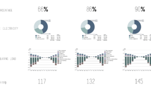
How to Predict the Future with Energy Modeling+
Like many of us in the design and construction industries, we at BUILD have been thinking about how to create...

Design, Context and Delight: Explanations of the Built Environment with Kate Ascher / Part 1+
BUILD interviews Kate Ascher for ARCADE Magazine.

Design Guide for the Home Office+
BUILD covers design ideas for the work-from-home lifestyle
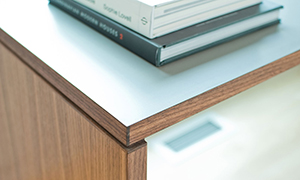
Paring Down to the Essence+
BUILD documents the specifications and finishes for a strikingly minimal residence

Defining a Construction Budget; The 2019 Cheat Sheet+
BUILD breaks down the construction and project costs for an uncertain economy with an update to the Construction Budget...

Curbless Shower Guide+
BUILD shares the next guide in their manual series: the curbless shower detail.
Header Alignment Guide+
BUILD’s guide to achieving alignment at windows, doors, and siding.
Flush Base Guide+
A step by step guide on the design and install of BUILD’s flush base detail

A Decade of the BUILD Blog+
A look back at the past decade of the BUILD Blog, and the toward the future ahead.

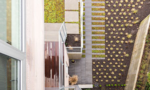
Case Study House 2016 Exterior+
BUILD takes a technical look at the CSH2016 landscape and hardscape plan.
Advanced Rainscreen Envelope Detailing+
BUILD pushes and pulls rainscreen detailing on the Pham Residence.
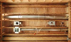
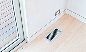
A Residential Guide to Heating Ventilating and Air Conditioning+
BUILD compares the different HVAC systems for residential design.

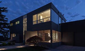
The Logic of Elevation Design+
BUILD reviews the modern envelope strategies of their latest project in Bellevue.

Case Study House 2016 Interiors+
BUILD reviews the interior design and specifications of the CSH2016.

Three Structures, Four Roof Types+
BUILD examines a variety of roof assemblies on the Magnolia House + Guesthouse.

How Much Energy is Saved by Reusing a Foundation?+
BUILD runs the numbers on the energy savings of down-and-dirty sustainability
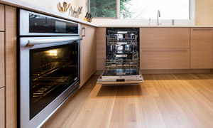
Case Study House 2016 Kitchen Appliance Package+
BUILD kicks the tires on their most current kitchen appliance specification.
Architectural Steel Design+
BUILD outlines their most important design guidelines for architectural steel design.
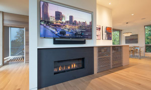
Evolution of the Modern Entertainment Wall+
BUILD strikes design harmony between the flat screen and the firebox.

Strategies for Interior Wood Finishes+
BUILD outlines the design methods for balancing the use of 3 different interior woods.

Timeless Representations + Modern Technology+
BUILD discusses the magic balance between timeless representation methods and modern technologies.

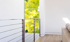
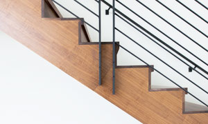
Tricks of the Trade: Architectural Guardrails+
BUILD discusses some aesthetically pleasing strategies for guardrail design
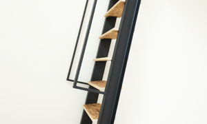
The Art of the Nonconforming Stair+
BUILD explores an important exception in the building code for vertical circulation.
An Architect’s Guide to Photography+
BUILD's photography department reviews the motives, gear, and methods behind the architectural shot.

The Working Model+
BUILD reviews the usefulness of the working model as a communication tool.