
[Image source: Eikongraphia]
Design is inherently about solving problems. It’s highly functional, aesthetically pleasing, and ideally evokes the “how did we ever live without ________?” sentiment. When design doesn’t accomplish that task, and particularly when it creates new ones, outrage ensues. So today’s post is dedicated to those designs that each of us here at BUILD considers to be ones that should never–ever–have seen the light of day.
Duff
Clamshell Packaging designer unknown
![]() Just about anything from Costco is packaged with this amazing
Just about anything from Costco is packaged with this amazing
and unfortunate invention.![]()
[Image source: Wikipedia]
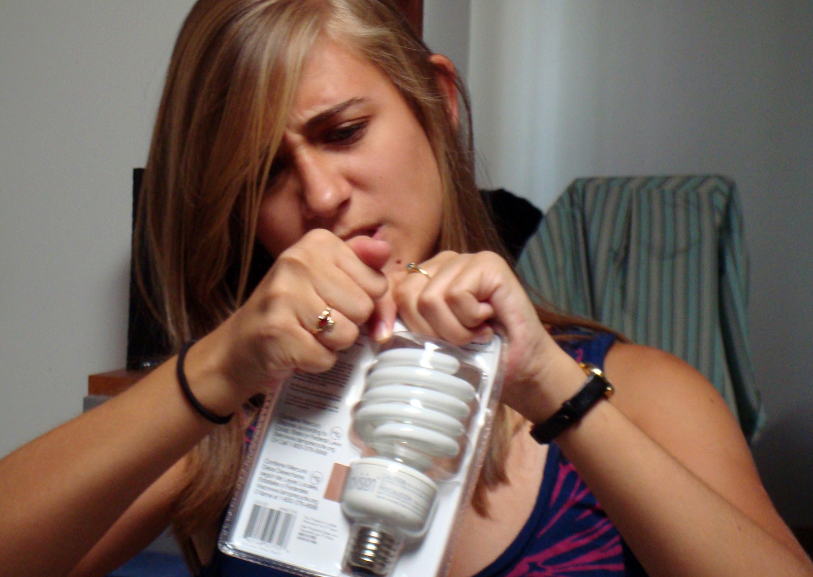
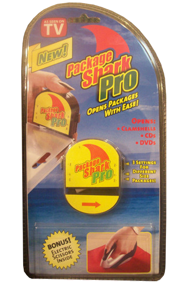
My list of “Designs That Shouldn’t Have Been” is long. But, I’m forgiving. As a matter of fact, I’m sort of glad these design failures are out there—we learn from our mistakes. It’s all part of the exploration and evolution of a design, and in many cases, we realize quickly whether its further development is worth pursuing. However, there is one design that stubbornly sits at the top my list: clamshell packaging. I don’t think I have to go into much more detail. Just about anything from Costco is packaged with this amazing and unfortunate invention that makes it nearly impossible to extract the item from its molded transparent shell. But thankfully there is a solution: The Package Shark Pro! The only problem is that it’s encased in the very clamshell packaging it’s meant to open.
[Image source: eBay]
Andrew
P.T. Cruiser designed by Bryan Nesbitt for GM, 2001
![]() The P.T. Cruiser should never have made it past that phase
The P.T. Cruiser should never have made it past that phase
where a concept car is artistically rendered.![]()
[Image source: dayerses.com]
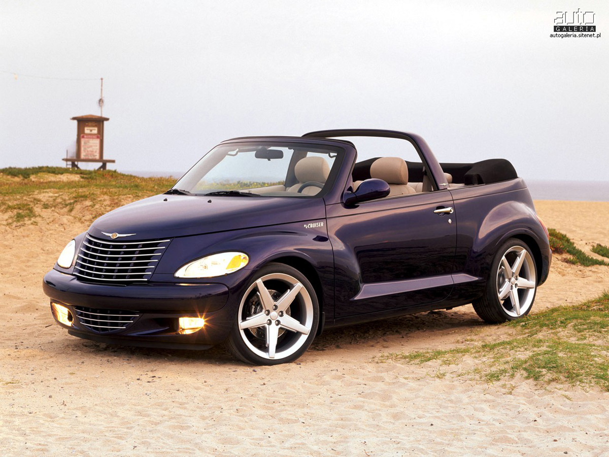
Don’t get me wrong, I like plurality in the world. I like a spectrum of designs from the various time periods designed with diverse philosophies by different authors. But the P.T. Cruiser should never have made it past that phase where a concept car is artistically rendered with zippy felt pens and reflections of a setting sun. How on earth did a room full of car designers and decision makers look at a clay model of the P.T. Cruiser and say “yup,that’s the one. Send it to the production line!” I cringe when stopped in traffic near a P.T. cruiser; its chrome-y retro curves clogging up my peripheral vision. I once had a nightmare that I was in hell and all of the taxis were yellow P.T. Cruisers (oh wait, that was my last trip to Phoenix). Adding insult to injury, Chrysler has released the wood paneled “Woodie Package,” a 2-door sporty convertible model and the “Dream Cruiser 5 Series” which boasts a spoiler. Want options? How about the “Factory Flame Package,” which includes flame decals extending from the front fenders? Rrrrowwww! Barf.

[Image source: innerspaeth.com]
Sandy
Comic Sans designed by Vincent Connare for Micorsoft, 1994
![]() But that was another era. What’s perplexing is why it’s still being used today, outside the occasional ironic rant.
But that was another era. What’s perplexing is why it’s still being used today, outside the occasional ironic rant.![]()
[Image source: Comic Sans Criminal]
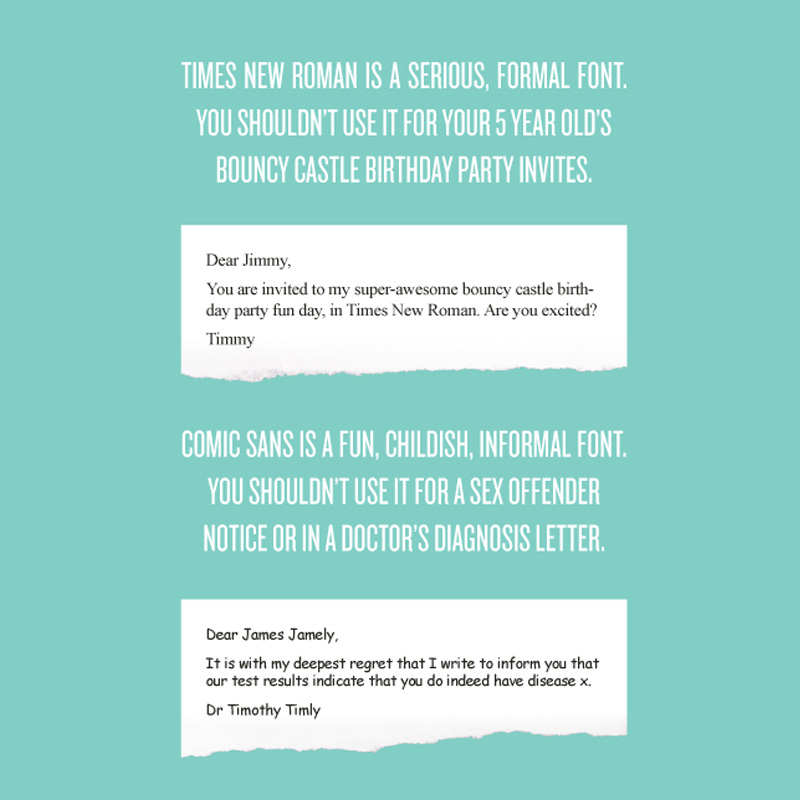
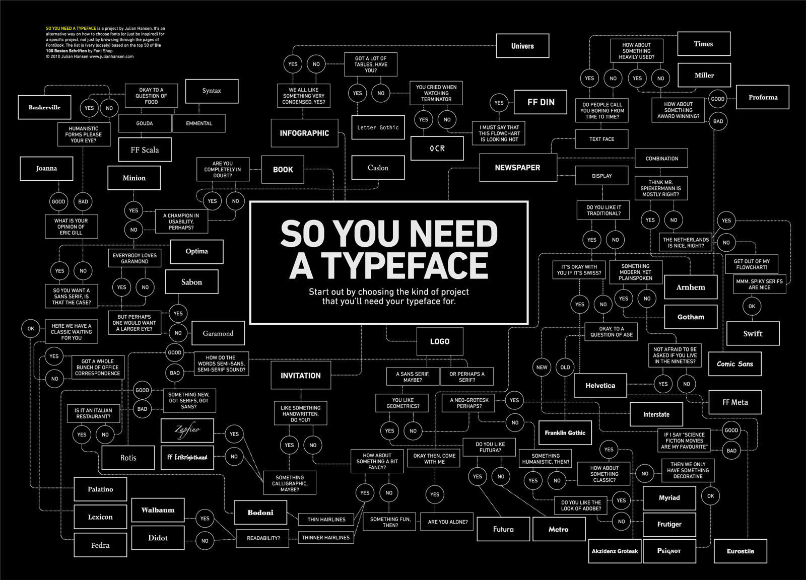
This may be one of the most universally scorned fonts in the history of type. Since its introduction eighteen years ago, Comic Sans has undergone more than its fair share of overuse, inappropriate use—some might say use at all—and inevitable backlash. I can understand why it was initially embraced by the masses: the allure of being able to choose a font coupled with the availability of a “fun” and “friendly” one that doesn’t look like all the others was an irresistible combination. But that was another era. What’s perplexing is why it’s still being used today, outside the occasional ironic rant. And by physicists no less. Clearly, a world without Comic Sans is not in the cards. But if it were to miraculously be banished for good, its scarcity and forbidden nature would cause it to become the most treasured of fonts. And nobody wants that.
[Image source: Julian Hansen]
Charles
Steinberger L-Series Electric Guitar designed by Ned Steinberger 1979
![]() The L-Series fits the bill with its minimalist body and non-existent headstock.
The L-Series fits the bill with its minimalist body and non-existent headstock.
The problem is Steinberger seems to have taken things too far.![]()

[Image source: Musician’s Friend]
I’ll admit, I really struggled with this one. My gut instinct was to stick to a theme and go with something from OMA. But let’s face it, they rock too hard. (Okay, maybe I could have made a case for the Guggenheim Hermitage Museum, what with its economic shortcomings and all.) In a lot of ways, choosing the L-Series probably goes against my modernist training. One of our favorite phrases around the office is “everything it needs to be and nothing more.” In that case, the L-Series fits the bill with its minimalist body and non-existent headstock. The problem is Steinberger seems to have taken things too far. Meanwhile, does my love of Fender Stratocasters and Harmony H-78s belie my architectural aspirations? Would I be more at home designing Art Deco villas and using French curves at the drop of a hat?

[Image source: Flickr]
Kevin
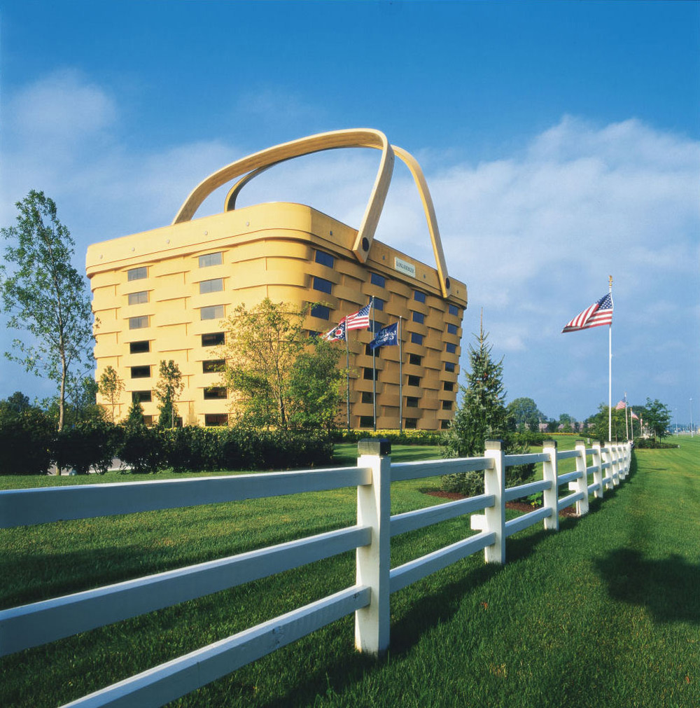
Longaberger Home Office designed by NBBJ, Newark OH, 1997
![]() Nothing says you shouldn’t have quite like two non-functioning gigantic handles that need to be specially heated.
Nothing says you shouldn’t have quite like two non-functioning gigantic handles that need to be specially heated. ![]()
[Image source: idesignarch.com]
This was a tough one. The FA Blog has a fine selection to choose from. But in the end, the winner was clear: The Basket Building. Here’s a direct quote from Longaberger’s website describing one of the building’s special features: “The handles are heated to prevent ice from forming.” Nothing says you shouldn’t have quite like two non-functioning gigantic handles that need to be specially heated.

[Image source: Eikongraphia]
That covers our roundup. If you’ve got examples to add to the mix, let us know in the comments.
Cheers from Team BUILD


