[All photos by BUILD LLC]
BUILD LLC’s most recently completed project is a mid-century modern home in Seattle’s Innis Arden neighborhood. We covered the exterior of the home in a previous post and today we’ll take an in-depth look at the interior architectural package.
Remodeling a home from the 1950’s makes sense for several reasons; the foundation and framing of houses from this era are typically well constructed, the existing framing is usually straight-forward and can be efficiently modified in key areas, and the interior layouts are simple and relatively open. What this means for us architects, is that you can bring a mid-century home up to date cost-effectively. By staying within the existing envelope, construction dollars were focused on a new kitchen, new bathrooms, new cabinets and new surfaces throughout. The construction costs came to $152 per square foot on this project – for a list of everything included in that number, click here.
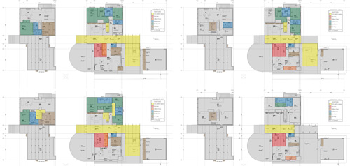
We first looked at a variety of design strategies for the home. The color coded diagram below shows 4 different design concepts for 4 different construction budget levels. This helped the team (owners + BUILD) figure out the critical intersection between construction dollars and scope of work. We think it’s paramount to figure out how much the construction is going to cost before too much time is spent in design.
The home owners were instrumental in the design process on this project. Hunting down fixtures, reviewing appliances and sorting through hundreds of granite samples takes commitment and discipline –a huge thanks from team BUILD goes out to the owners for making fantastic choices throughout. The guidance of a good interior designer is also greatly appreciated and we enjoyed working with Jeri Jacobsen of Jacobsen Studios LLC.
Demolition on a project like this is more like surgery and carefully taking the house apart has its advantages. Thanks to Seattle’s RE-Store, the owners were able to get tax credit for a number of existing items including the sliding glass doors, lights, pocket doors, appliances and some of the plumbing fixtures.
From the get-go, the kitchen was designed as the most important place in the house. It’s where the family spends the majority of their time, and when entertaining, everyone gravitates to the kitchen. In a nutshell, the kitchen is the hub of the house. It was designed with double isles and a twelve foot long island in the center where all of the action happens. The east wall of the kitchen (on the right) is full height to contain the Sub-Zero refrigerator, Dacor Epicure wall ovens and a full height pantry. Bypass walnut sliders above the appliances allow access to additional storage.
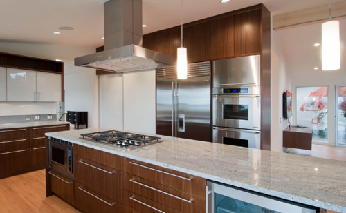
A Dacor 36” cooktop is located at the island and because the hood is one of the main visual points of the room we like to use the Zephyr Roma island hood – it’s sleek, modern and looks great as a centerpiece. Complimenting the hood are the ET2 Rondelle pendant lights which provide good light within an elegant fixture. Inconspicuously tucked below the island are a Dacor Microwave and a GE beverage refrigerator.
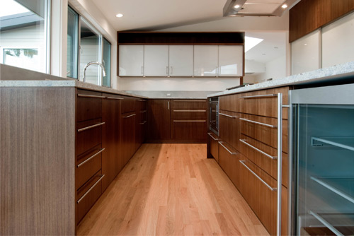
On the west wall a bank of cabinets houses the Miele dishwasher with integral face to match the cabinet package and the pull-out garbage and recycling drawer. The sink is a custom fabricated stainless steel basin by Metal Masters and the faucet is the Kallista One Pull-Down in polished chrome.
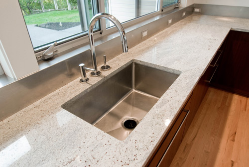
The kitchen cabinets are quarter-sawn, book-matched and sequenced walnut veneer with 1/8” edge-banding and a matte conversion varnish built by our very own Special Projects Division cabinet shop. We like walnut because it has a sophisticated look, a fairly regular grain pattern and is readily available. Props go out to Edensaw here in Seattle for supplying some gorgeous walnut. The cabinet boxes are outfitted with the Blumotion soft-close glide system and the Blum Orga-line interior organizers. The Sugatsune 16 series pulls keep to the modern aesthetic by providing function without getting in the way visually. The dark wood tones of the cabinets are balanced out with the opaque glass of the upper cabinet doors and the Raumplus S720 series clear anodized aluminum sliding doors with polar white glass panels that conceal the pantry. The counter tops at the kitchen are 3cm thick Kashmir White granite slabs with eased edges and they give the kitchen a warm and welcomed texture. Seagull under-mount puck-lights at the cabinet uppers provide a consistent light at the countertop workspace.
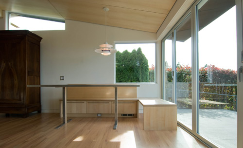
Adjacent to the kitchen is a built-in breakfast nook made from 2 layers of ¾” apple-ply. Against the wall we used cubby drawers for additional storage –on the west side we kept the frame open to integrate with the LaCantina accordion doors which open up to a maximum fifteen foot clear opening. A maple soffit is attached to the ceiling above which defines the breakfast nook, from it hangs the classic Louis Poulsen PH5 pendant light. The stainless steel table was fabricated by BUILD LLC and Metal Masters.
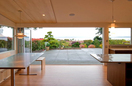
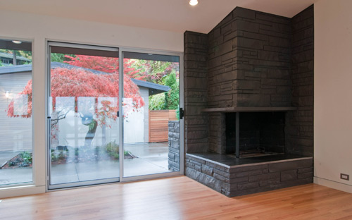
The family room incorporates an existing stone fireplace which brings a much needed texture to the room. We painted the stone after a series of explorations on the fireplace and surrounding stone. The family room looks onto the private courtyard and frames the Japanese maple beyond.
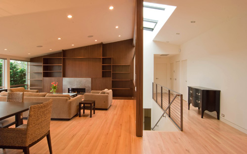
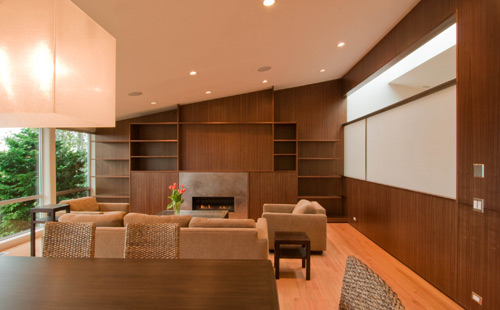
A number of subtle architectural moves occur at the living room. The walnut cabinet package is carried along the north wall and reflected on the east wall wrapping the ridge beam and framing a screen which separates the living room from the stair beyond. The screen is an Oyster Linen texture from Lumicor and it brings a pleasant, light tone to the room. It is ¼” thick and attached with a steel frame.
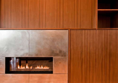
One of the main features of the living room is the Heat-n-Glo Cosmo SLR natural gas fireplace. Its minimal design (note the absence of fake wood logs) offers a clean line of flames to accompany the surrounding modernism. The steel fireplace surround was fabricated by Bart Gibson of BUILD LLC.
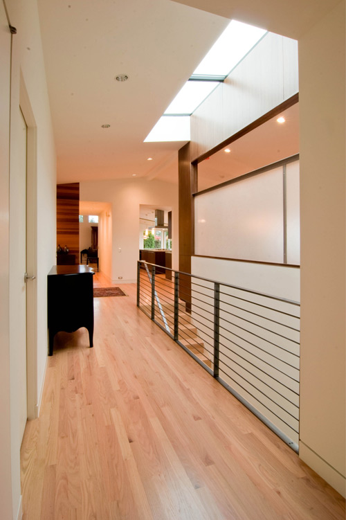
Bart also took on the work of the stair guardrail and handrail which bring an attenuated formality to the hallway. A skylight runs the length of the stairs and includes a remote-controlled operable panel for ventilation. As with most areas of the house, the hallway includes a flush base detail –more about that here. The existing solid oak floors were refinished with 3 coats of Swedish finish and yellow stain by Olde English Hardwoods. A few damaged areas were patched as needed and the floors look brand new.
The entry is one of our favorite parts of the house. We brought the cedar screen in from the exterior entryway and wrapped it around the south wall into the powder room. The cedar provides visual continuity as you enter the home and it warms up the entry experience. The fir entry door is outfitted with the Karcher UER29 71 passage lever and deadbolt.
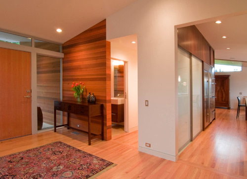
The powder room window uses a jamb-less frame at the cedar wall and the cedar boards have been matched on each side lending to the continuity of the composition. A Lacava Auquagrande vanity sits on an SPD walnut box. The wall-mount Kohler Stillness K-T944 faucet, used in conjunction with a non-directional stainless steel backsplash, makes for nice clean lines at the powder room. The toilet is the Toto Aquia dual tank with soft close seat.

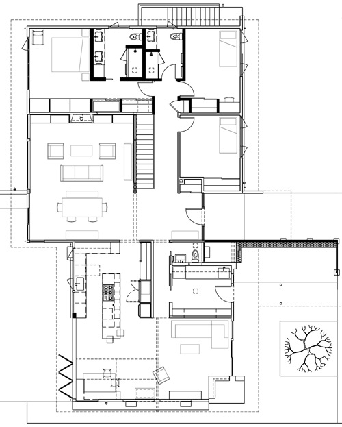
The laundry room/drop sort area is an important part of the house. With two growing boys, it was important to provide space to drop all of the sports equipment and gear before entering the rest of the house. Large cabinet boxes made from apple-ply line the walls of the laundry room and offer plenty of storage cubbies and hooks to drop gear and clean up. An industrial T-106 Iron Rubber floor from Commercial Interiors provides the durability needed in this location. The Hansgrohe Talis prep faucet and Kohler cast iron utility sink are used at this location for their durability.

A simple and cost effective palette of materials is used at the bedrooms. The floor is a tight, low profile carpet from Décor Carpet One over an 8lb cushion. We like roller shades with a stainless steel control chain from Atrium Shade because they’re unencumbered and minimal. Thanks to Excel painting, a Sherwin Williams ProMar 400 interior latex flat white paint continues at the walls and ceilings.
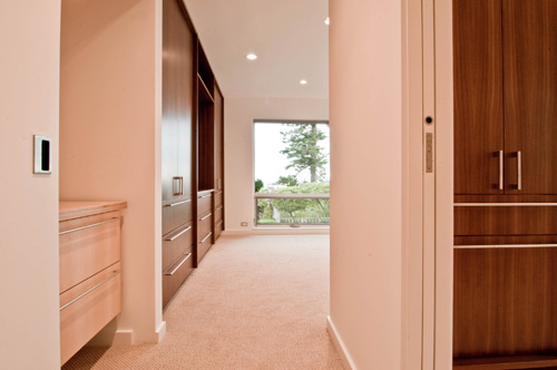
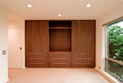
The master suite has a few design features superior to the other bedrooms such as a bank of walnut cabinets as the main feature in the master bedroom. In addition to storage for clothing, the center bank allows for the display of an art piece or sculpture. Apple-ply cabinets are also installed behind the bypass doors.
The bathrooms incorporate walnut wall-hung cabinets and Chroma Cascade White 3cm countertops with an eased edge. Large custom mirrors and frameless shower enclosures with Satin Chrome MT series hardware from Distinctive Glass keep the walls deliberate and tidy. Tile selections from Pental combined with Schluter aluminum edge strips maintain a serious, but warm look in the bathrooms. Panasonic Whisper Quiet ceiling mounted bath fans do their job discretely without creating a visual eyesore. Lights are always a challenge with bathrooms – we like to provide light without the light fixture being the center of attention. Lightolier 5” recessed can lights with Alzak trim provide general lighting while wall mount Luna vanity lights by Tech Lighting provide more direction lighting at the mirrors.
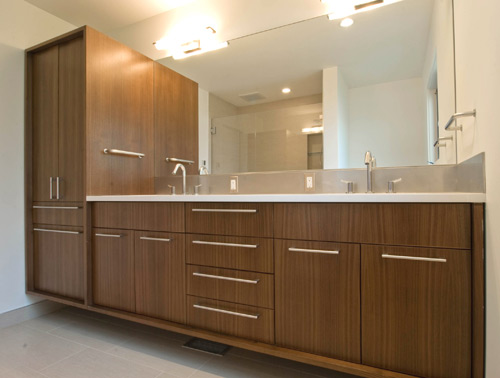
The floor at the master bath is heated with electric heat mats. 12 x 24 “Feel Colonial” wall tiles over greenboard line the shower walls. We used a Hansgrohe Raindance jet hand shower and Unica wall bar at the master. The sinks are the Kohler Verticyl rectangular lavatory with Hansgrohe Talis faucets. The toilet is the Toto Nexus with soft close seat.

The kid’s bathroom uses 12 x 24 “Park Ash Gray Matte” tile and “Glossy Chiaro Glass Darjeling” accent tile at the shower. Plumbing fixtures at the kid’s bath match the master bath.

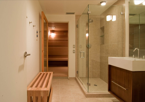
A sauna and guest bath are located in the basement. You can read more about the sauna here. The bathroom includes a Lacava Aquagrande sink with a Kohler Stillness deck-mount faucet. The basement includes a guest room and a large playroom. Quietly working away in the basement utility room is a Rheem 75,000 btu gas furnace.
Overall the interiors achieve that warm Scandinavian modernism that we’re always striving for, at the same time this MCM house has another 50 years of life in it.
okay, we’ve talked enough –your turn, hit that comments button.


