Modernism isn’t so much a style as it is a way of thinking -a philosophy if you will. The modern mindset guides nearly everything about how a home is designed and constructed, even down to the base trim details. As with modern design in general, modern base details are intentional and functional –they are everything they need to be and nothing more. Today’s post covers three of BUILD LLC’s favorite modern base details, complete with construction details. The good news is that many of the examples are hot off the press and just completed on a recent project, the bad news is that there’s a bit of dust to put up with -please pardon the mess.
For comparison purposes, here is a standard applied base detail (below), typically a 3-1/2” profile applied on top of the drywall. In more traditional applications there’s even a small piece of quarter round in the corner of the base trim and the floor – a base for the base.

Flush Base: the 3-1/2” or 5-1/2” tall base trim is recessed so that it’s flush with the wall. While it takes a bit more work and care to install, the look is clean and unencumbered. It’s a museum quality finish that can be achieved cost-effectively.

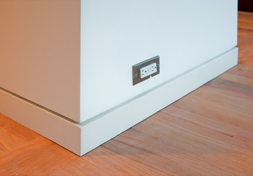
We’re big fans of how the horizontal reveal at the flush base meets the vertical reveals at doors and other breaks.

At the condition below the flush base profile actually turns and becomes a vertical bumper for a set of interior sliding doors.

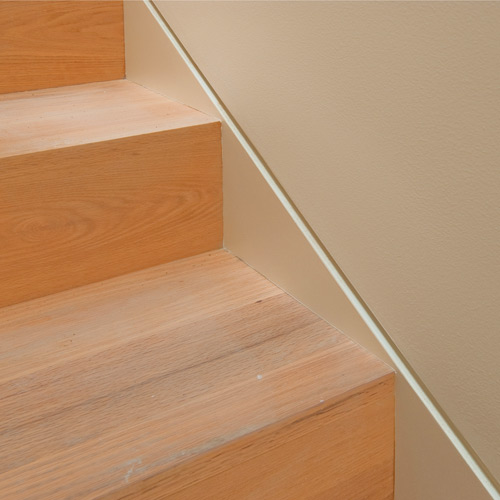
The flush base makes for a clean transition at areas like stairways (often a tricky situation for base trim).
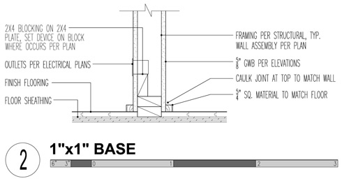
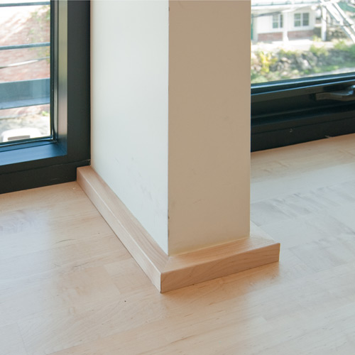
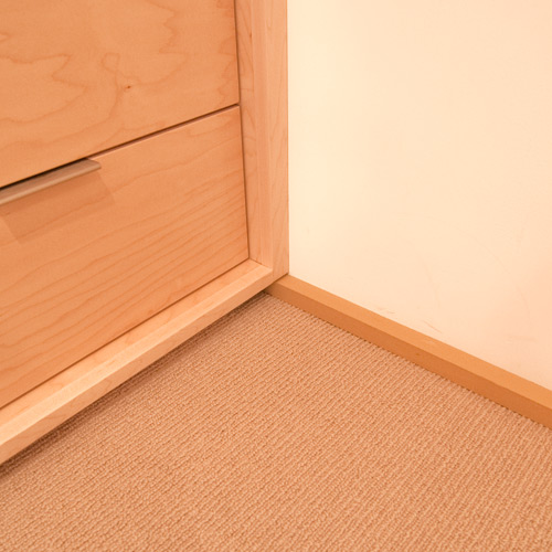
1×1 Base: the low profile section covers the gap between the drywall and the floor and also provides a bumper for shoes, vacuum cleaners, etc. At hardwood applications we tend to match the base with the hardwood (in this case maple), at carpet applications we’ll paint the base trim something close to the carpet. The end goal is to achieve a subtle profile that doesn’t draw your attention to the base.

The low profile of the 1×1 base often works much better with window systems – a taller base trim would seem less deliberate and clunky compared to the sleek, minimal window frames.
We’ll often bring the toe-kick of cabinetry down to the level of the 1×1 base trim, the trim aligns with and disappears into the shadow line of the cabinets (you also get a few extra inches of storage out of the cabinets).
Similarly with sills, the level of the window sill is brought down a few inches to align with the base trim. It’s a clean modern look and maximizes the amount of daylight.

Baseless: The most minimal of the bunch is actually a baseless condition where a piece of Z-metal separates the drywall from the floor leaving a ¾” reveal –or shadow line as we like to call it. The application is only used in certain situations, typically industrial or commercial applications where there isn’t a lot of foot traffic. Used correctly, it can give that sparse Chelsea gallery look that puts focus on the things and people in the room rather than the room itself.


For us, modernism is all about losing the fussiness of design and allowing for more flexibility, durability and quality of life in and around architecture. Stay tuned for more modern design and technical details from BUILD LLC.
Get more of our research and development by following us on Twitter.


