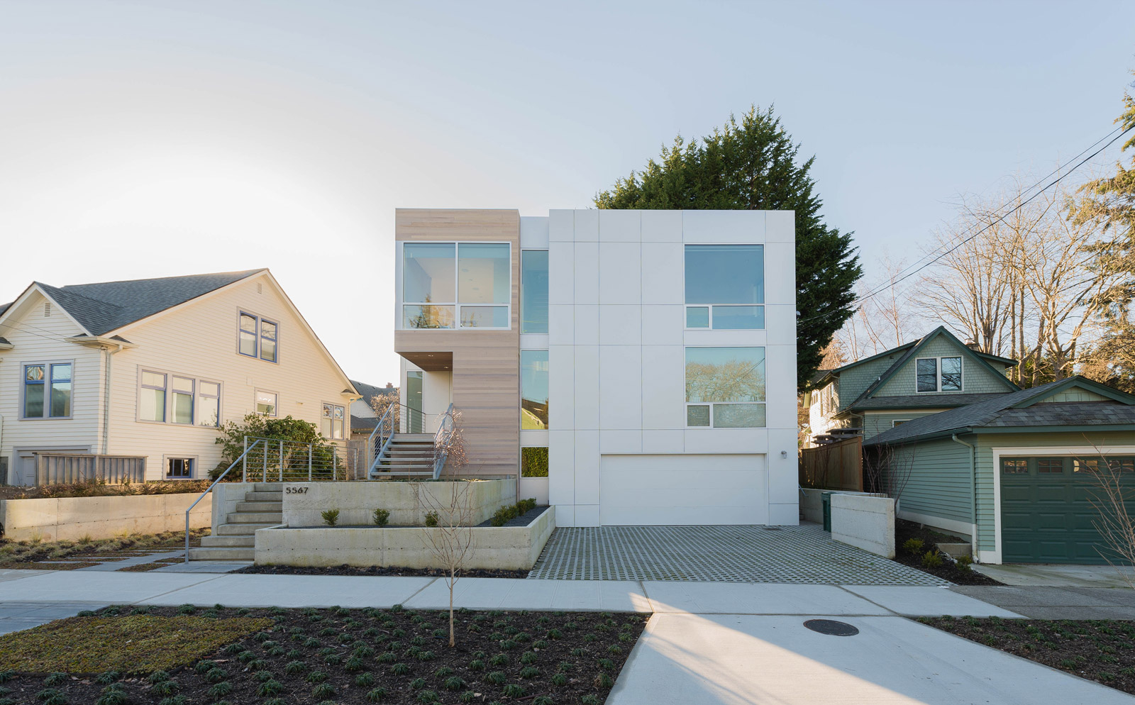
[All images by BUILD LLC]
BUILD completed the Case Study House 2016 in Seattle last fall and we’ve had several months now to settle in and kick the tires on the third dwelling of our CSH series. With each Case Study House we continue fine-tuning the design and honing the construction process, creating an effective learning curve for the series, and better informing our client-based projects in the office. Today’s post reviews the inner workings of the project while calling out the materials and specifications of the interiors package.
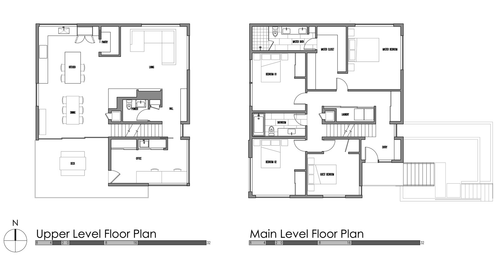
One of the primary ordering mechanisms of the CSH2016 is the inverted floor plan, which we continue to develop in our projects. This places the common areas (living, dining, kitchen) on the top floor where they can best take advantage of natural light and territorial views. Special attention to the structural framing of the roof allows these spaces to open to one another, creating a spacious, light-filled upper floor.
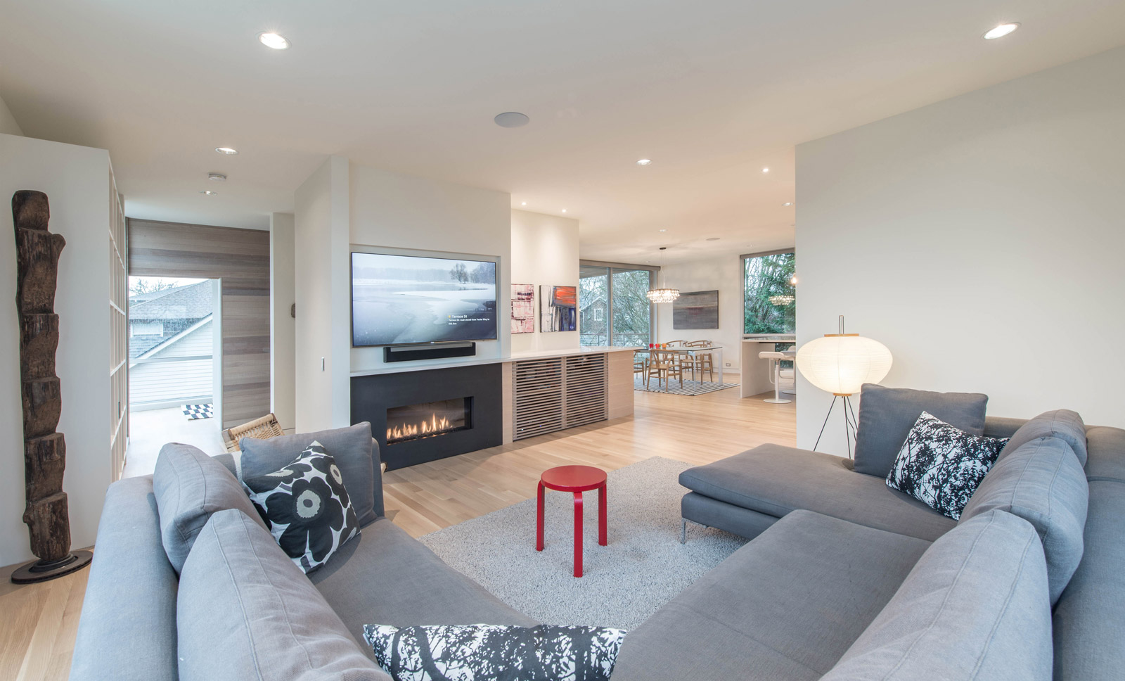
At the center of the common area is an entertainment block which wraps the stair and conceals a small powder room around the side. You can read all about the details of the A/V wall design in a previous post. Several large columns are discretely tucked into the framing of this massing, allowing for longer spans and fewer walls at the upper floor. The ceiling height at the upper floor is 9’-0”, which we have found to be the sweet spot to keep things open but cozy. Floors are kept light and bright with gray-stained, rift sawn and quarter sawn solid oak by Olde English Hardwoods. A wood totem by artist Jerry Wennstrom and paper lamp by Isamu Noguchi bring texture and visual warmth to the room.
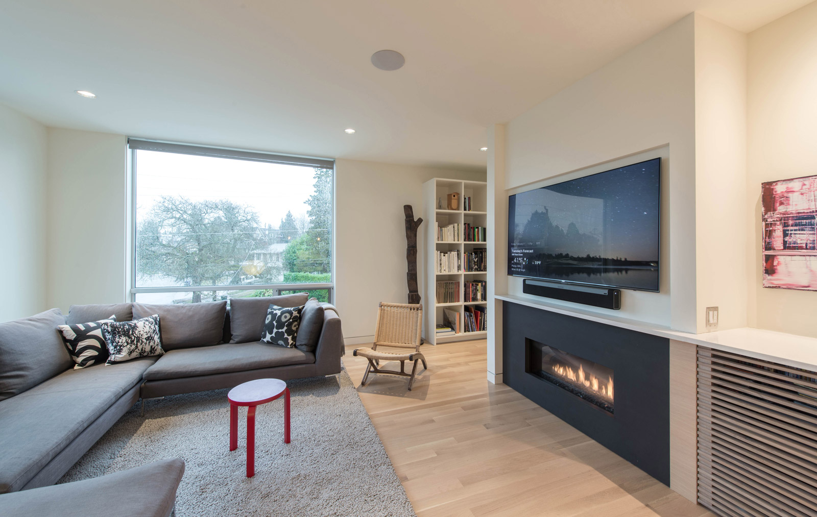
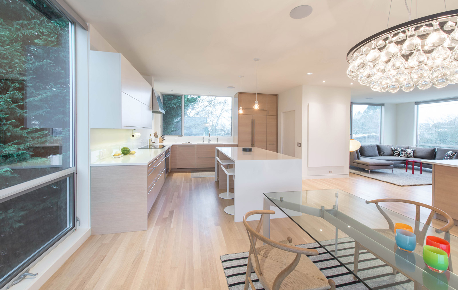
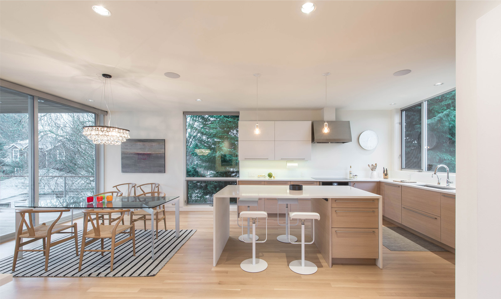
Where natural light and big windows aren’t quite as important, the kitchen and it’s 36” tall countertops are positioned at the northwest corner of the upper floor. A pantry provides a subtle division between the living area and the kitchen, while offering discrete storage for ingredients and countertop appliances. Light-gray stained, horizontal grain oak veneer cabinets by Griffin Cabinets wrap the kitchen and are topped with 3cm thick Cascade White Pentalquartz countertops from Pental Surfaces. This highly durable countertop material looks light and bright, while containing just enough speckle so that you don’t have to keep it spotless. Aside from the Jenn-Air built-in refrigerator, all materials in the common areas are white above countertop level, including the bi-fold door upper cabinets at the kitchen. This Blum cabinet hardware gets the doors out of the way while dishes are put away or the tables is set. The glass backsplashes, from Herzog Glass, are back-painted white to match the aesthetic. The cabinet package is outfitted with Dekkor 1800 series wide pedestal D bar handles.
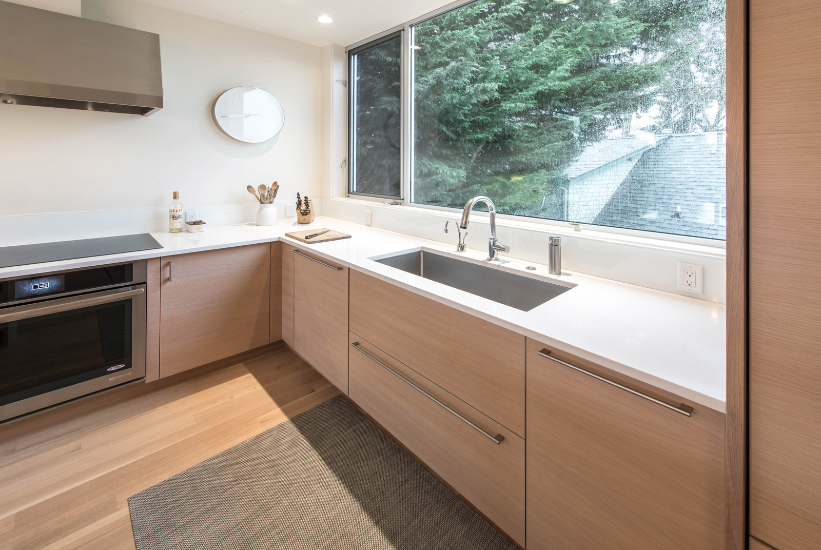
At the kitchen sink, we used a deep stainless steel basin custom fabricated by Metal Masters Northwest. We like the extra deep sink as it hides all the dishes out of eyesight after a dinner party. The sink is complemented with the Brizo Solna faucet and an instahot water filter by Insinkerator. The specifics of the Jenn-Air appliance package from Metropolitan Appliance can be found here.
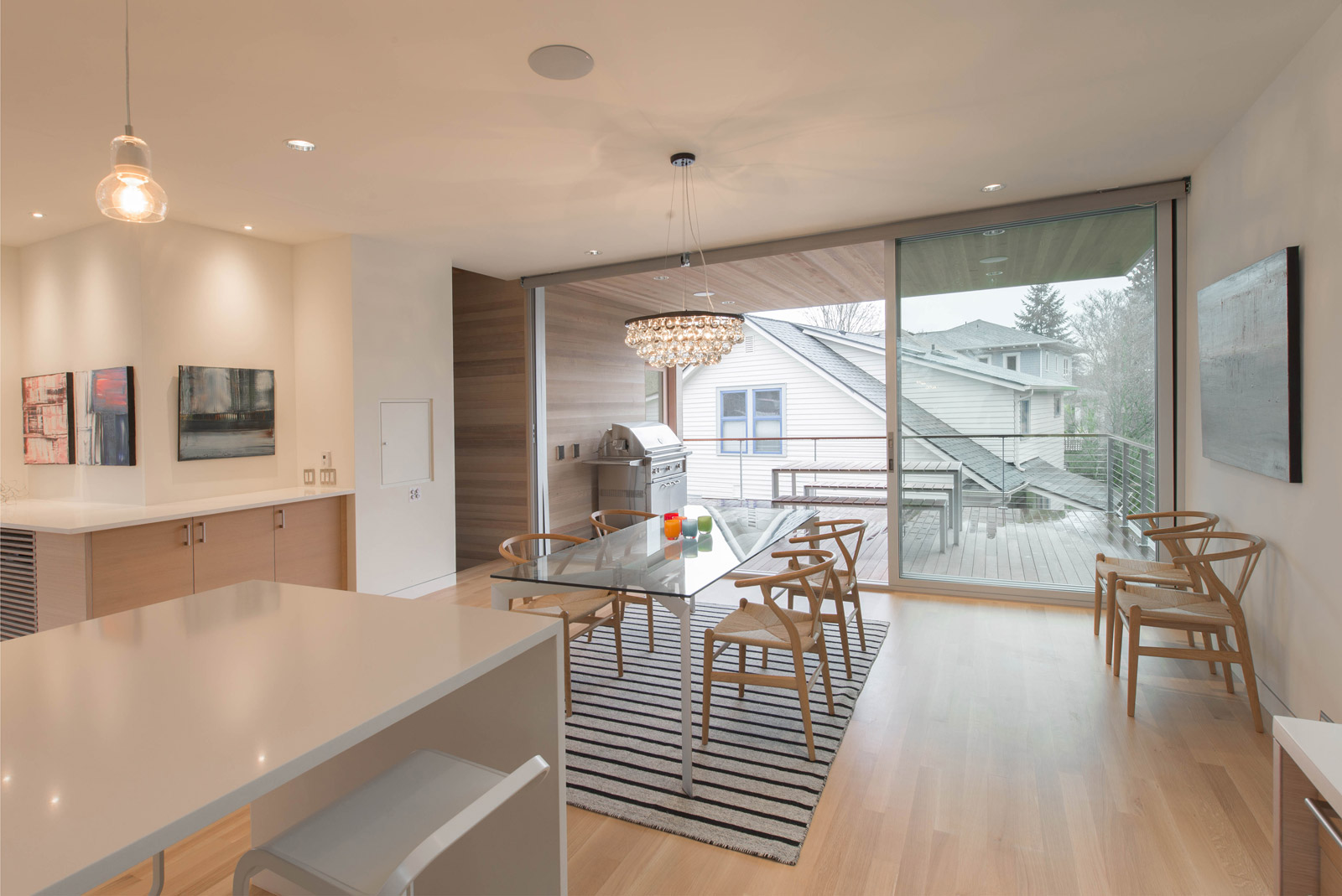
At the dining area, three 5’-6” wide by 9’-0” tall La Cantina sliding door panels allow the space to open to the covered deck beyond. The dining area is celebrated with a 60cm Artic Pear Chandelier by Ochre, Wishbone Chairs from Design Within Reach at the dining table, and wall hangings by Gary Anderson and Erik Niemann.
Opposite the living area, a bookshelf lined hallway leads to the powder room, the roof deck stair, and a home office. Stained, horizontal cedar siding by Rivera 26 Remodeling wraps the southeast corner of the residence and extends inside becoming a feature of the interior. A wall hanging by artist Gabe Newton mimics the cedar and points visitors to the powder room.
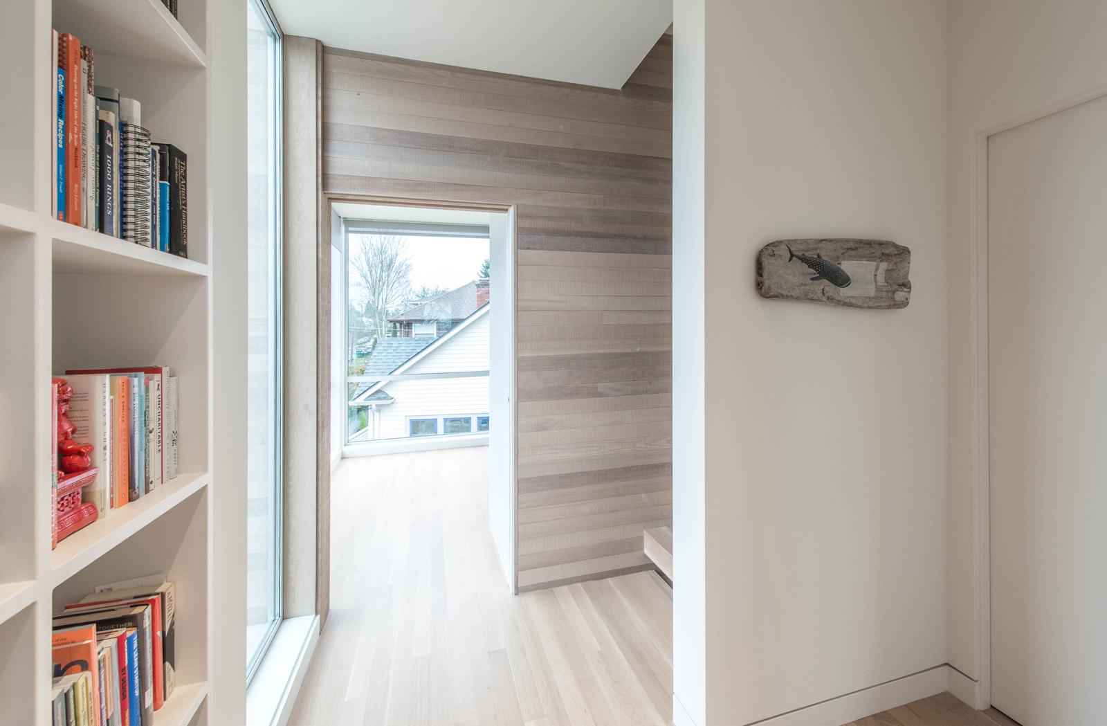
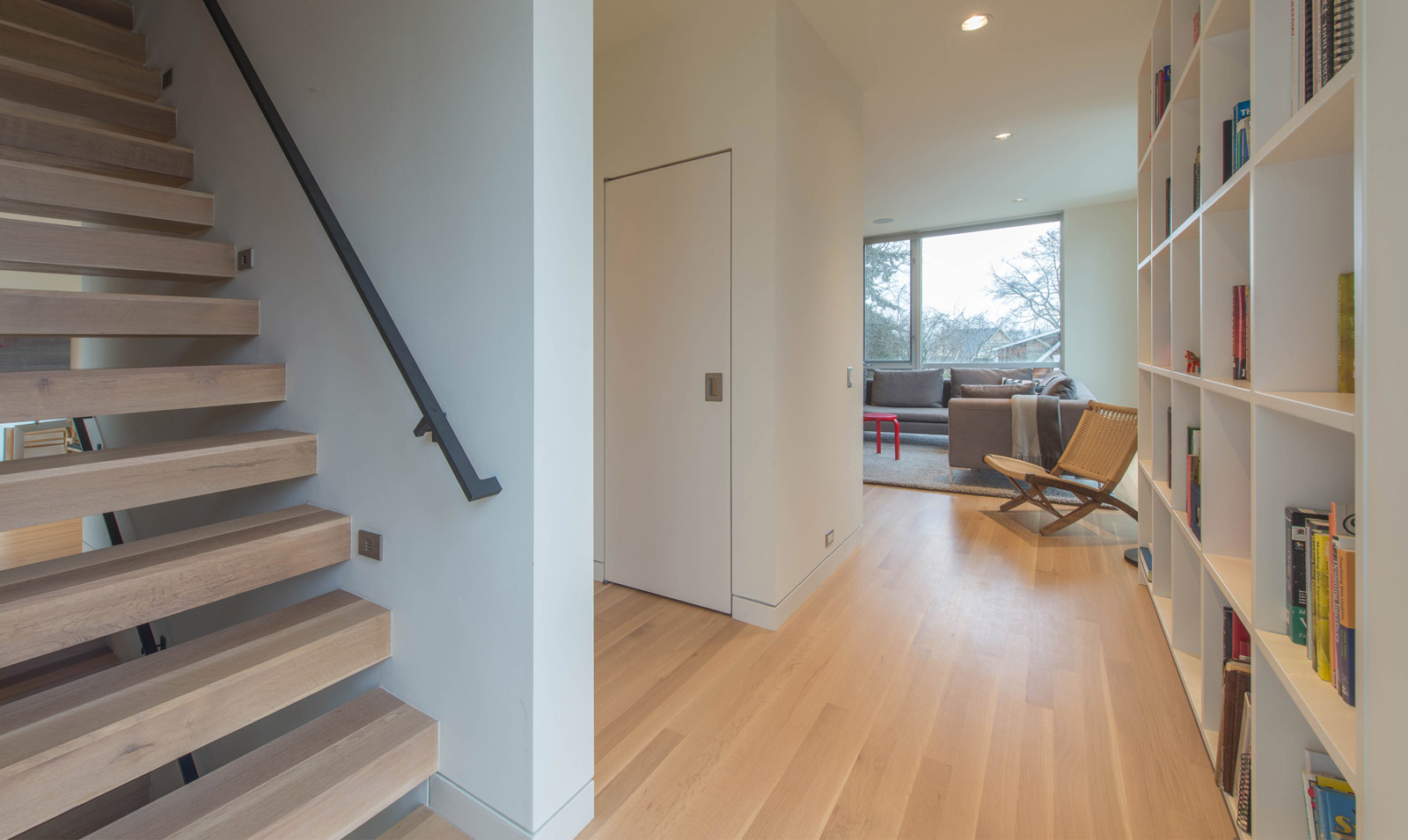
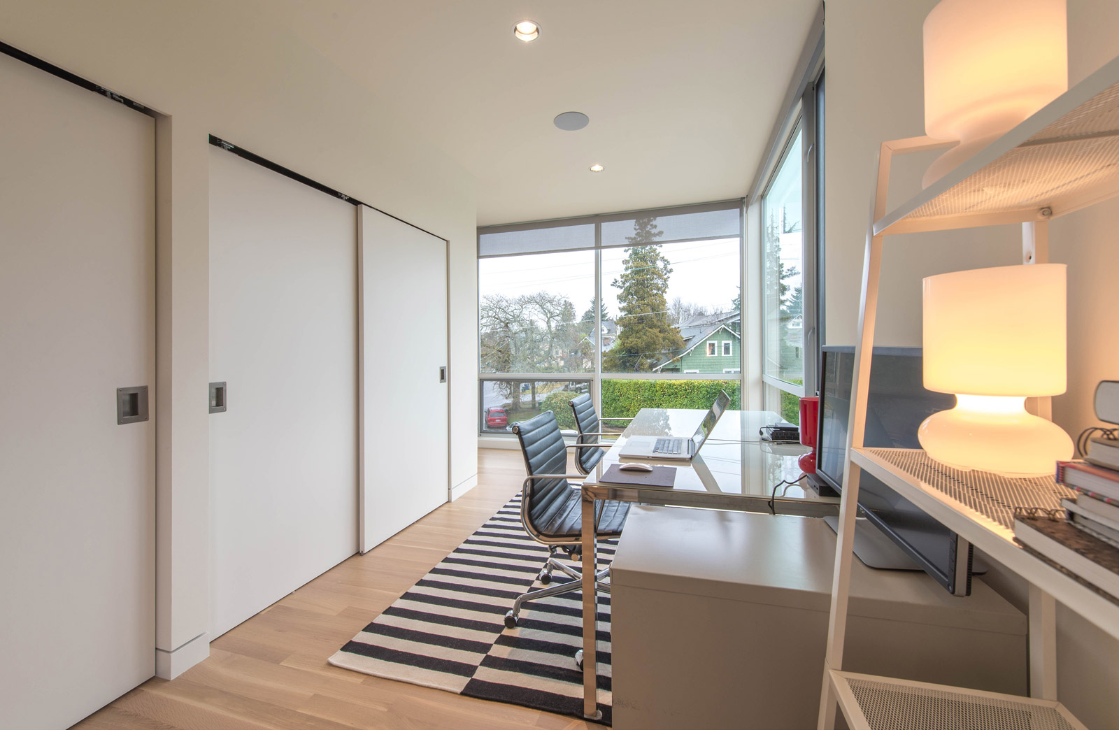
Contained by the cedar envelope, the home office is perched over the entry and provides an excellent vantage point to the surrounding neighborhood. Large bypass doors conceal storage shelves and a utility sink beyond.
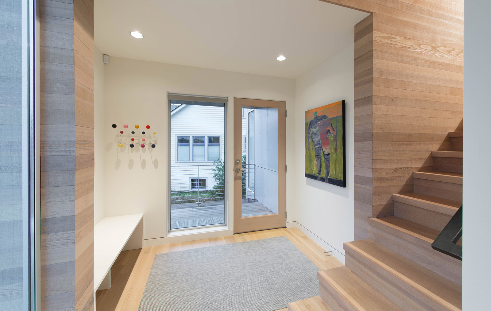
Downstairs, a light filled entry greets visitors as segments of the exterior cedar wall extend inside and continue up the oak stairway. The painting by Gary Anderson and Eames Coat Rack provide a pop of color. The blackened steel handrails were fabricated by Modern Metal Works.
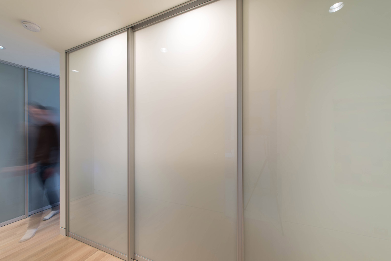
A coat closet and laundry area are concealed at the main level behind Raumplus etch-matte doors which give off a warm glow when back-lit. Because the hallway is a high traffic area, an oak hardwood floor is incorporated to match the stair and upper level floors.
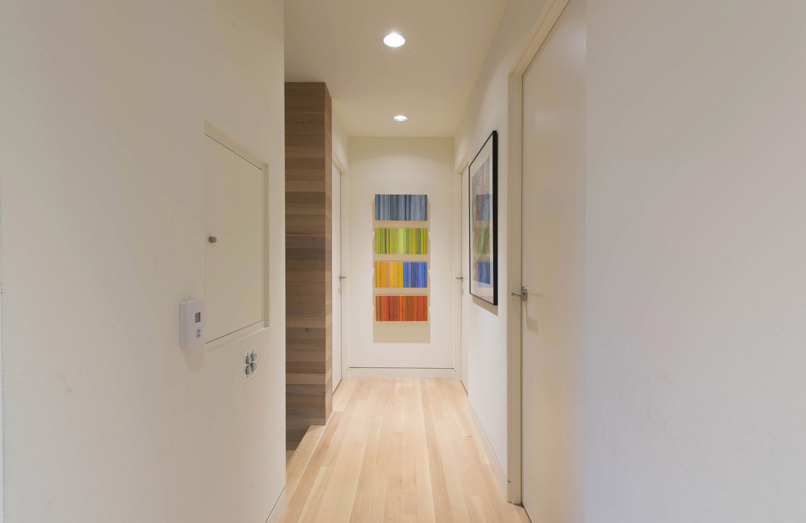
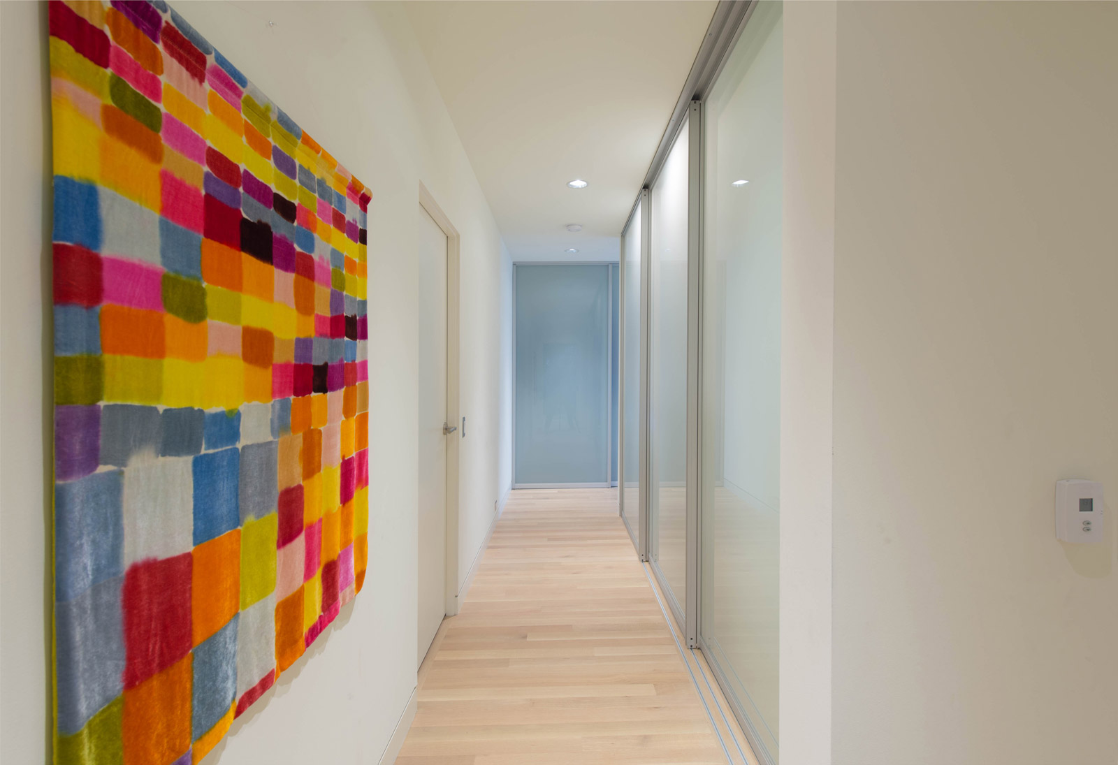
Circulating around the core of the house, the hallway leads to both kids’ bedrooms, a guest room and the master suite. Each hall axis ends with art as a focal point. The wall hangings above are by Angela Nelson and below by Erika Eckert.
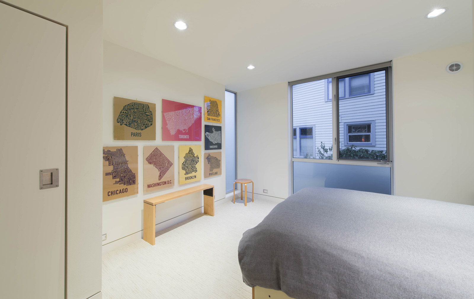
The bedrooms are 8’-6” tall, a bit lower than the common areas upstairs, and share a common material palette. Walls and ceilings stay with a consistent SW 6385 Dover White and the soft carpets are Soujourn Cape Town from Décor Carpet One. Built-in millwork at the closets is outfitted with tab pulls and bypass doors.
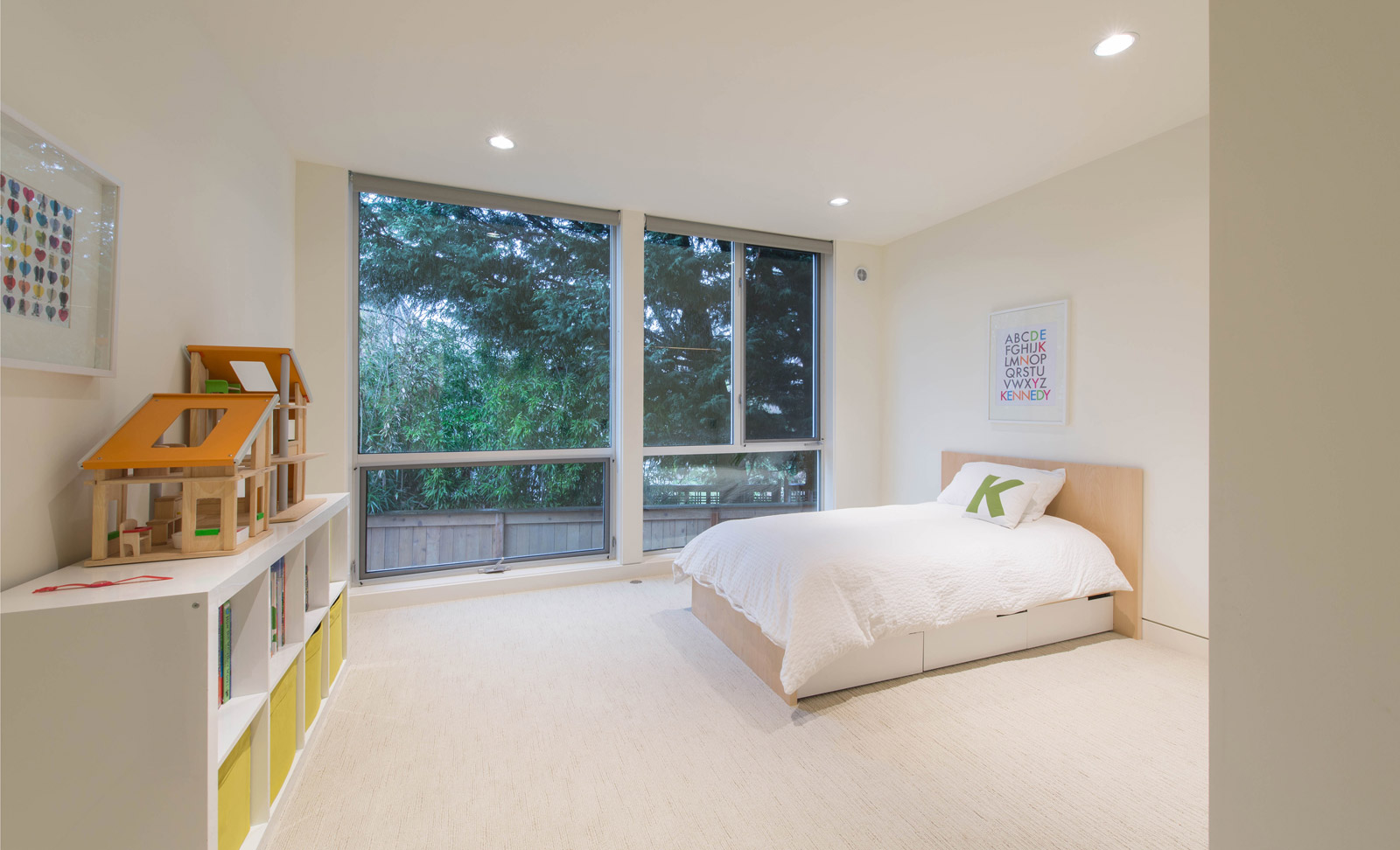
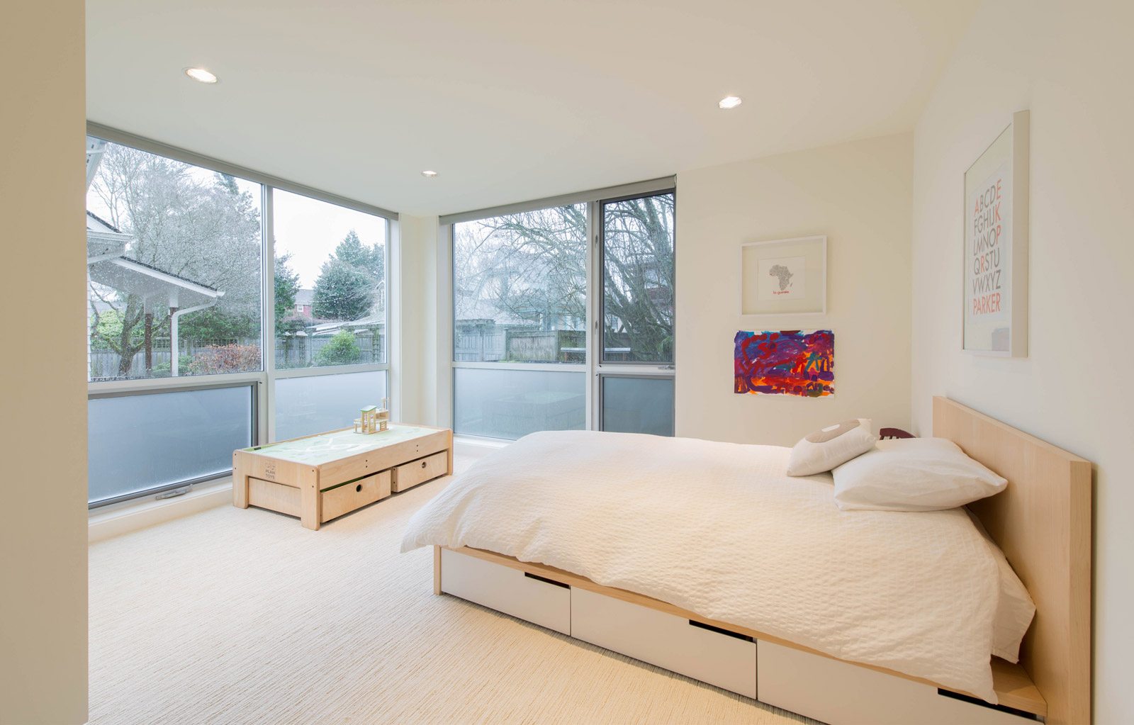
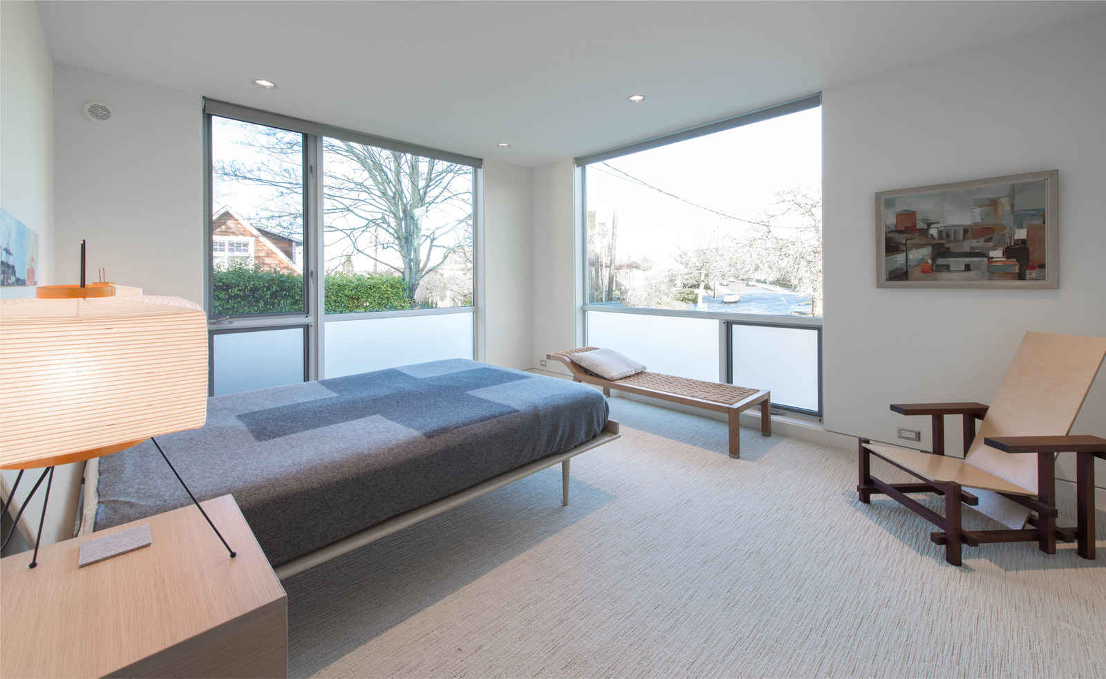
Whereas the kids bedrooms are located on the west side of the house to keep the spaces darker (and prevent the little ones from early wakings), the master suite faces east and is light-filled in the mornings. The master bedrooms is furnished with Noguchi lamps, a maple and purple-heart Rietveld Chair custom built by Aaron Nelson and a wall hanging by Phyllis Hansen.
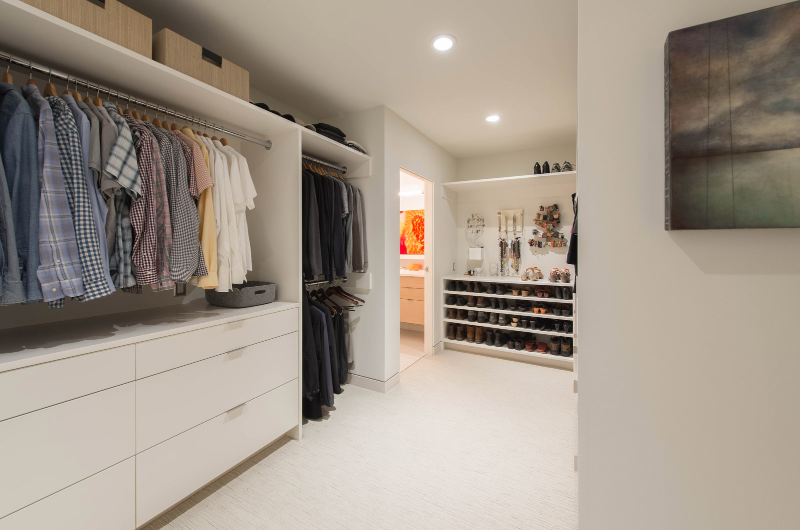
The master closet is built out with millwork by JW Woodworks and painted white to match the walls. Shoe racks and overhead bins provide ample, well-lit storage. Art is incorporated into the space with an encaustic by David Price.
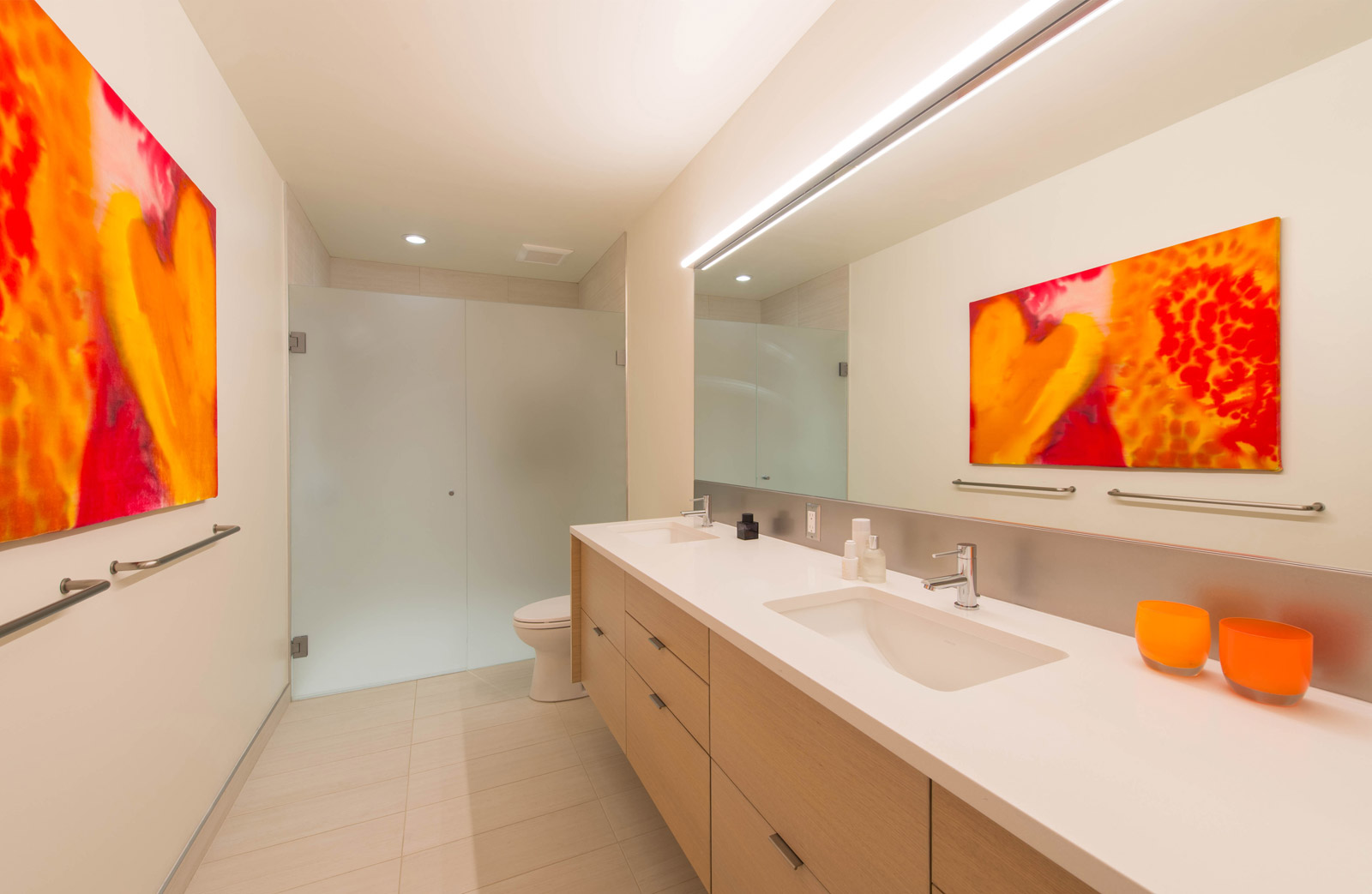
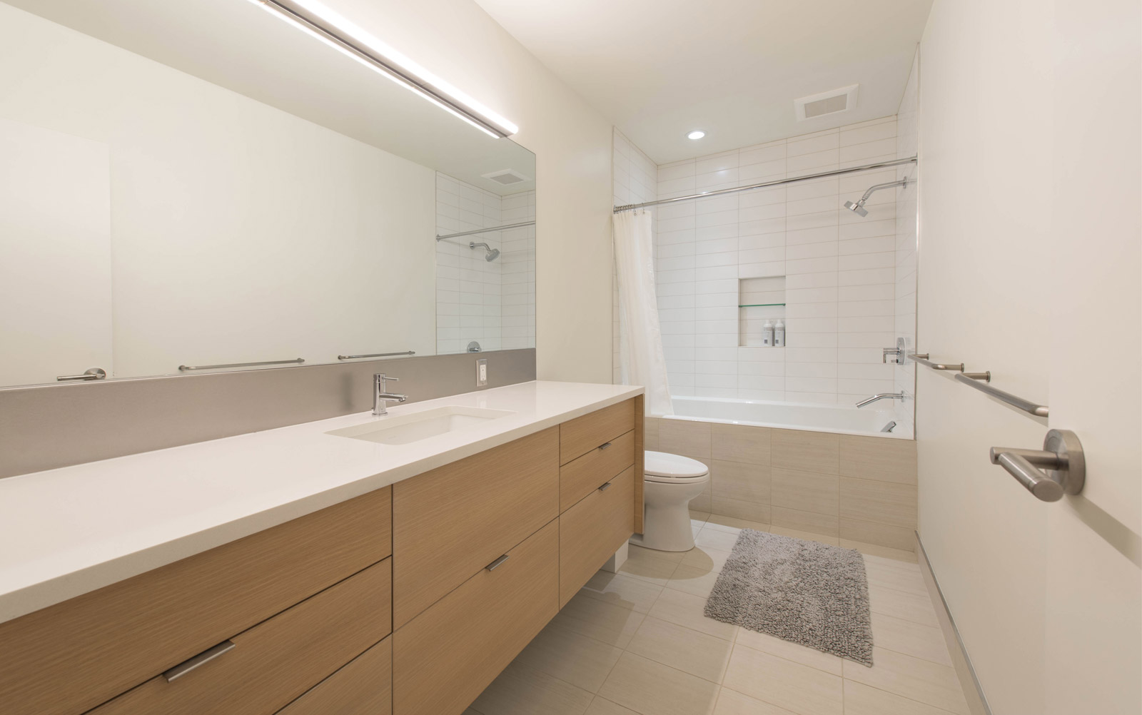
The master bathroom is accessed from the walk-in closet and includes Lineare Bianco Field tile from Ann Sacks, horizontal oak veneer cabinets, Cascade White Pentalquartz countertops and etch-matte glass from Herzog Glass. For sink bowls we like the Kohler Ladena undermount paired with Graff ME.25 faucets. At bathrooms we prefer a stainless steel backsplash with a non-directional finish under a full-length mirror and a velvet wall hanging by Erika Eckert. The kids’ bath shares a similar specification package only the wall tile is swapped out for the more utilitarian 4×12 white matte subway tile by Pental Surfaces.
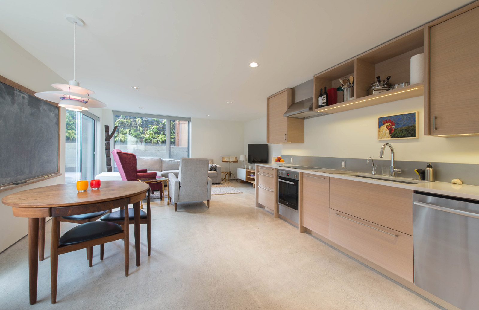
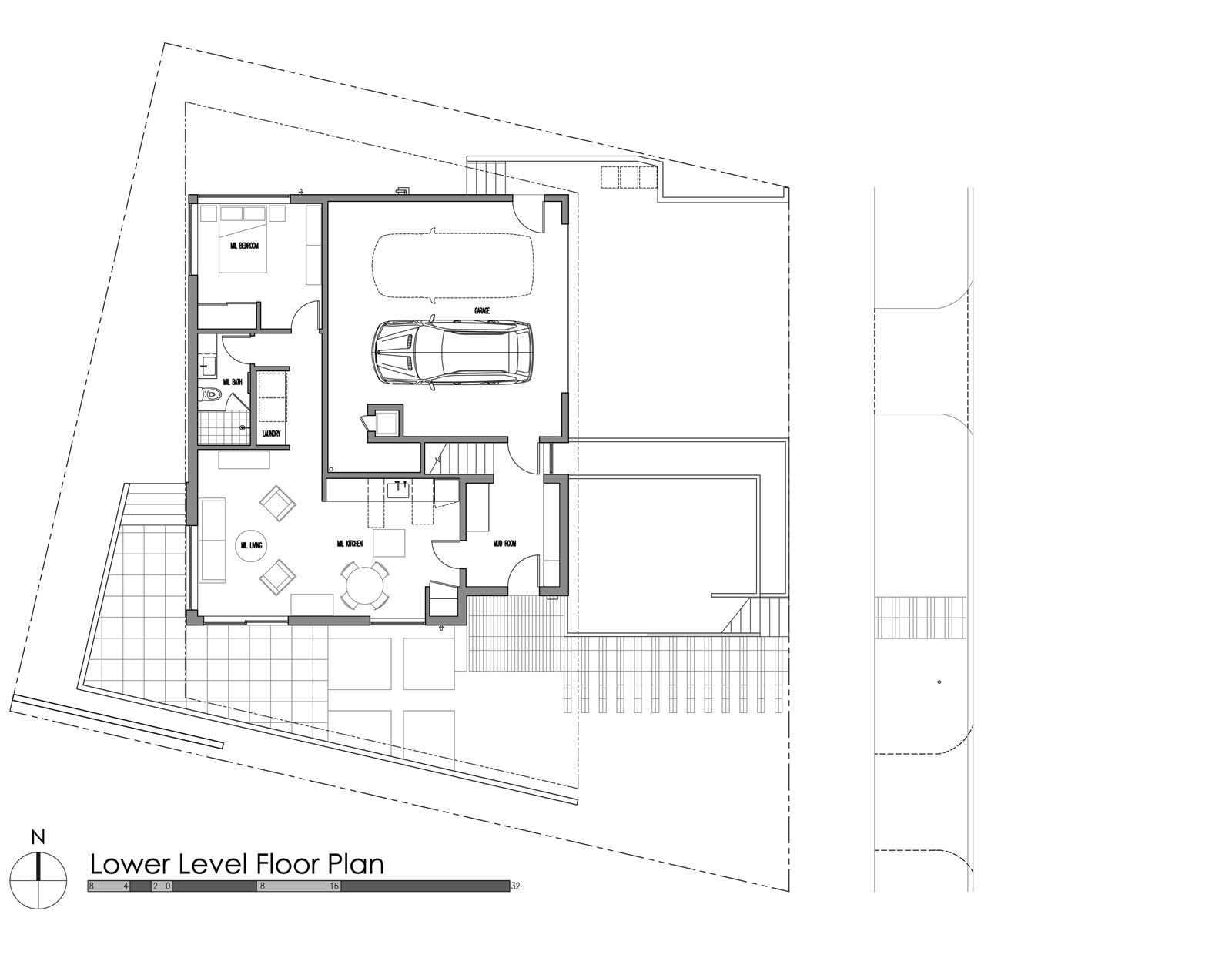
The lower level footprint includes a two-car garage and a fully independent Accessory Dwelling Unit (ADU). For construction efficiency, the ADU benefits from a similar specification package as the main house, which also makes for a pleasant living space adjacent to the outdoor terrace. The slab on grade radiant heat floors keep the temperature comfortable and are polished with a clear finish. The Danish Modern table is outfitted with the Louis Poulsen PH5 Pendant Lamp and the wall hanging is a mosaic by Joseph Kaftan.
We’ll have further coverage on the Case Study House 2016 pertaining to the exterior envelope and some of the additional design details. Stay tuned.
Cheers from Team BUILD


