[All images by BUILD LLC]
Certain visuals come to mind when you think of the design of a “startup” company. For us it’s usually the sight of a foosball table in the lobby or a gathering area full of mismatched, albeit expensive, lounge chairs. No doubt, there are some exceptional examples of projects in this arena of design, but more often than not, startup interiors lean toward what we refer to as “college-dorm-room-posh.”
We’ve recently taken on a couple of T.I.s (Tenant Improvements) for tech-based startup companies and we’re finding that these project types offer design opportunities that we love wrapping our heads around. Because recruitment is such an important component in the competitive world of startups, the aesthetic of the space needs to be an enrolling extension of the startup’s character. Without being too literal, the experience of the design needs to display what the startup does best.
We’ve done quite a bit of homework on startup design now, and we’re noticing that, when it comes to recruitment, the majority of startups focus squarely on post-college twenty-somethings. This relationship has led to some influential ideas in the design world: walls of chopped firewood, meeting pods, shared bikes parked around the office, or immense walls full of sticky notes. All good stuff and all ideas that have influenced our own thinking here at BUILD. But what we’re finding is that there is a new generation of startups emerging, and it’s not just for the kiddos anymore; in fact, it’s quite serious.
BUILD’s creativeLIVE San Francisco project has been challenging the conventional design aesthetic of startup architecture. This sophisticated and savvy operation is bringing education into the 21st century by way of online workshops. Similar to their philosophy on education, their recruitment strategies are forward thinking and atypical. With more serious architectural moves, the space has been designed to appeal to an experienced and established professional. The recruitment strategy is less “look how much fun you could have here,” and more “this is a serious space to shift the paradigm of education.” Subsequently, the design tactics deviate from playful lures and, instead, concentrate on a refined and well calibrated machine for working, thinking, and learning. The atmosphere fosters an environment to do amazing work within arm’s-length of the best pros in the business. Architecturally, this design strategy can be broken down into five primary elements.
Dedicated Function Areas
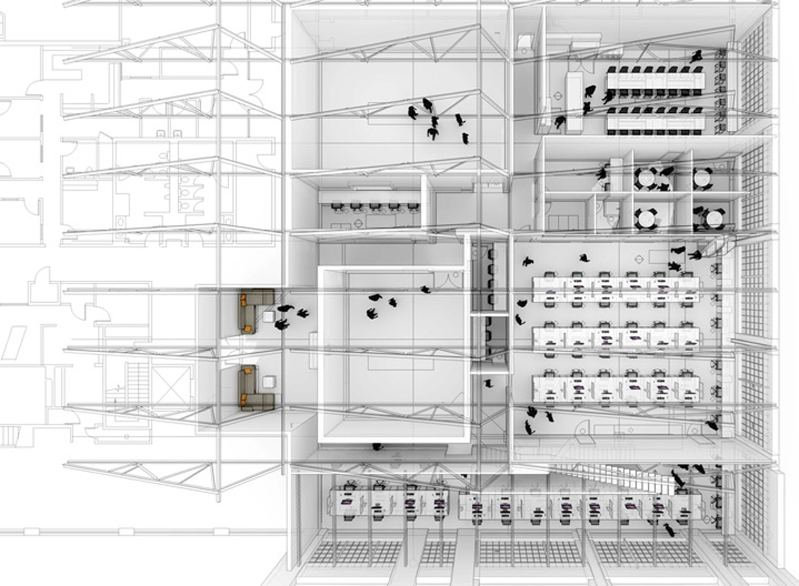
This designation includes, first and foremost, the two broadcast studios, which are the heart and soul of the operation. The design intent at these spaces is to keep the architectural moves highly functional but invisible. The spaces include large open areas for a stage, an audience, and all of that fancy equipment with which to film the sessions. Among the most important design aspects are acoustical separations, lighting at the appropriate color temperature, and a clear connection to the control booths. Other dedicated areas include the kitchen/lunchroom, a green room, breakout meeting rooms, server rooms, etc.
Open Work Studios
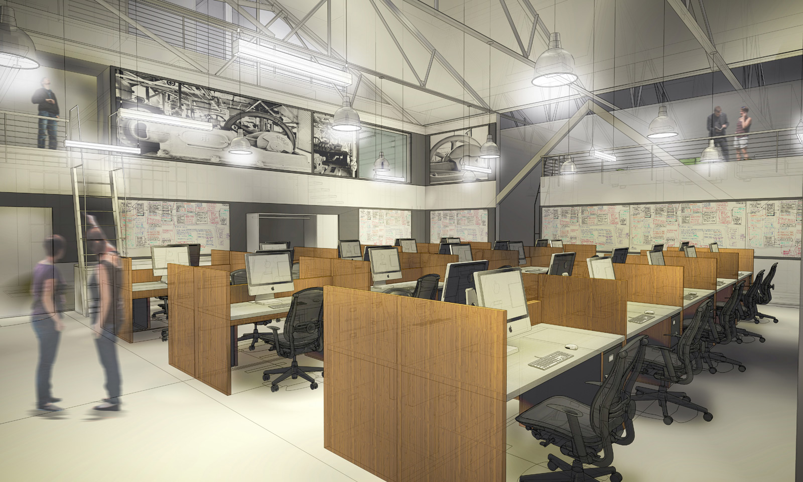
There are three dedicated work rooms (occupied by the experienced pros mentioned above), and in order to create a refined and orderly aesthetic, the design of the desks and work surfaces was of paramount importance. Long work surfaces of Europly with an aluminum veneer stretch from one side of these rooms to the other, while vertical privacy fins of Chestnut Strand Bamboo by Teragren march along and create a harmonious rhythm. The technical individuals working at these stations will have a variety of material and gadgets on their desks and we find that the bamboo fins give the overall room a sense of regularity. A common chair also helps calm the space; in this case, the Celle chair in black is being put to work.
Lower Function Datum
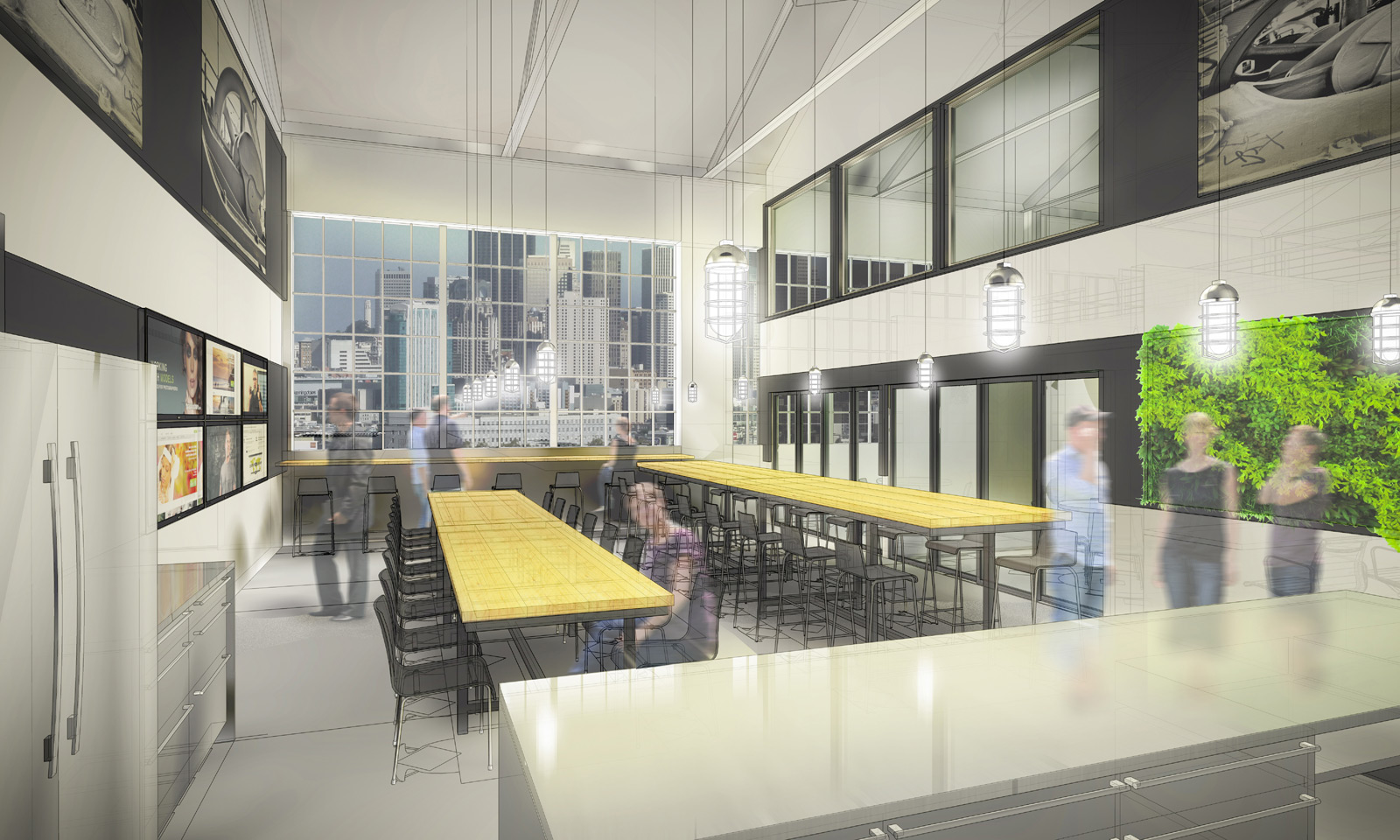
If there’s one thing we’ve learned about startup companies, it’s the importance of white-boards. No matter how many we include in a space, they always get filled with formulas, diagrams and strategery. For creativeLIVE San Francisco we decided to go all out and designate a datum band around all of the open work studios specifically for white boards. The white board panels are then framed with 2¼” wide Chestnut Strand Bamboo to correspond with the work tables. The top line of this white-board datum organizes other features within the room such as doors and re-lites. In spaces like the entry reception, the same datum band takes on other functions, allowing for flatscreens, greenwalls and other architectural features.
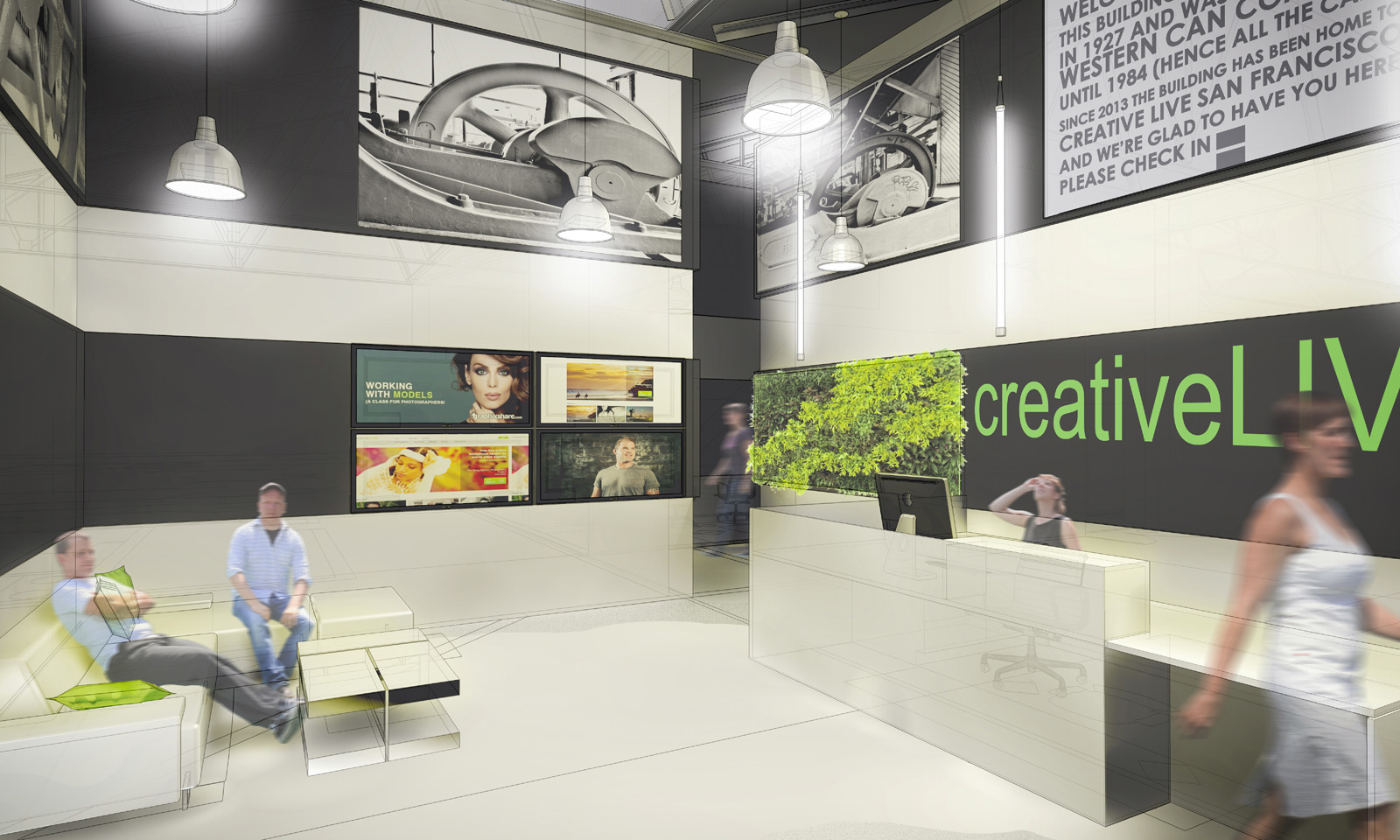
Upper Function Datum
One of the primary tasks of the design at creativeLIVE San Francisco is to contain the noise. When the studios are ‘On Air’ any outside noise is unacceptable; at the same time the workspaces and supplementary functions are bustling with people working and communicating. Because of this conflict, we designated a top datum band (above the white boards) to run large surfaces of acoustical panel around each of the workrooms. This acoustic panel is then covered with screened fabric that allows them to become artwork within the rooms; in this case we’re using imagery of the building’s industrial past as a cannery from 1927 to 1984. The large images of assembly line machinery document the building’s history, at the same time the images speak to creativeLIVE’s precise and organized nature. The upper datum also allows for a few cool anomalies like re-lites and loft spaces accessed via ladders.
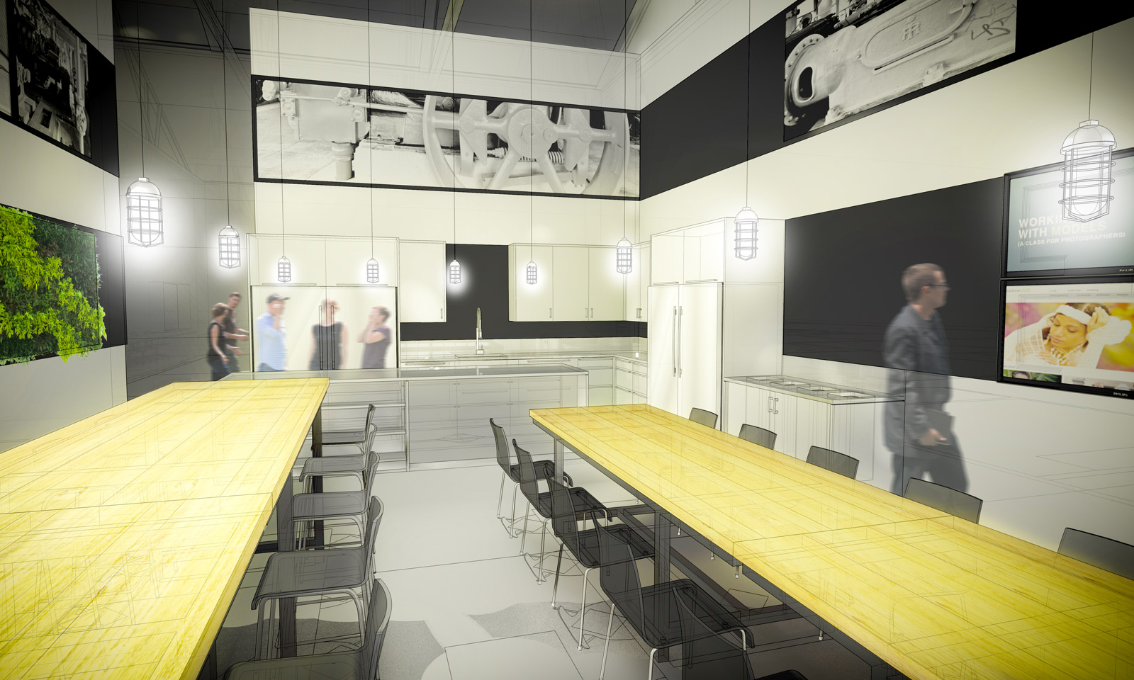
Existing Roof Structure
Part of good design is knowing what not to design. The existing roof structure of this industrial building is a beautiful arrangement of steel trusses forming a saw-tooth roof with clerestory windows. It was too gorgeous a composition to meddle with and, aside from some basic maintenance, we’re keeping it as-is.
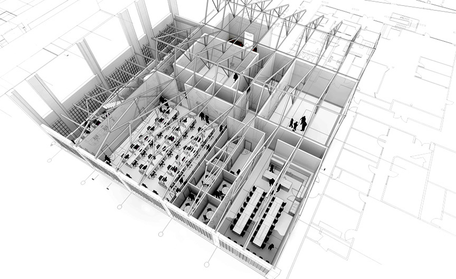
There’s an extraordinary team working hard on this project and shout-outs go to the local architect, Zack | de Vito, for being our eyes and ears on the ground, to Special Projects Division for all of the cabinetry, work surfaces and tables, and to the team at creativeLIVE for trusting us with their baby. Demolition is currently underway with construction commencing soon.
Stay tuned for construction updates, and cheers from team BUILD.
