[Photo via TTG]
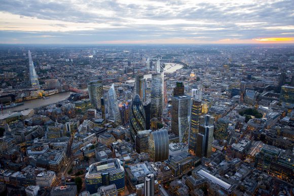
BUILD is on a UK tour this week which has provided an opportunity to check in with London’s design scene. While our time in England’s capitol was brief, we came away with 3 important insights that apply to our home base of Seattle as well as many other urban areas in the world. A huge thanks to all the architects, engineers, and design types we’ve met during our travels, as these lessons would not have been possible without them.
1. Markets don’t have to be precious.
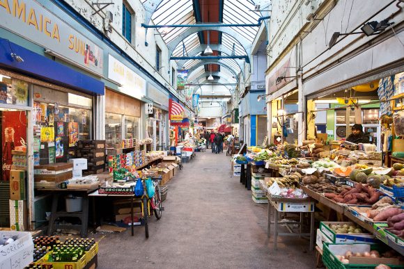
There’s an important movement currently happening in Seattle based around the concept of bringing restaurants, food producers, and shops together in covered, shared market space. These markets are typically re-appropriated from industrial buildings which lend well to open circulation while keep the rain out and the heat in. Markets like these are becoming extremely valuable to the urban fabric of Seattle and continue to build character within key neighborhoods. These projects also involve laborious permit processes and are expensive to complete. Because of the time and financing involved, the shops able to afford rents in these markets tend to be a bit exclusive, creating bespoke products for the well-to-do.
While in London, we visited Brixton Village which is also based on the marketplace model, but is simpler, grittier, and more affordable. The infrastructure of Brixton Village is kept to the bare minimum and shop spaces are plain but useful. The resulting restaurants and vendors offer a less restricted and more egalitarian environment. The variety of shops includes everything from taco bars to textiles and second-hand shops. The first Saturday of each month is also host to flea markets and community bake sales. The entire experience felt like a people’s market where all are welcome. The food was delicious and nothing was overly special.
[Images via Brixton Blog]
2. Old and new should complement, not conflict.
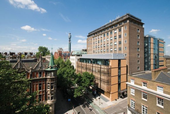
Historic architecture doesn’t intimidate Londoners like it does Americans. While it’s easy to infer that this is the case simply because they have more historic design to begin with, we beg to differ. We’ve spent enough time abroad to see the patterns, and we’re firm believers that Europeans (and Londoners) respect and maintain their history rather than trying to mimic, ignore, or destroy it. Because of this philosophy, London architects are able to design new buildings using the most modern materials and methods. This, in turn, allows for unhindered architectural exploration, and the evidence is everywhere. The poetic adjacencies between new and old have been pleasantly surprising and appear to be keeping the city useful and forward-thinking. The Roberts Building for University College London is a great example of this. The structure was designed by Grimshaw to strategically fit between existing infrastructure while complementing the traditional building across the street. This sort of balance is found all over the city.
[Images via Grimshaw]
3. Mind the gap.
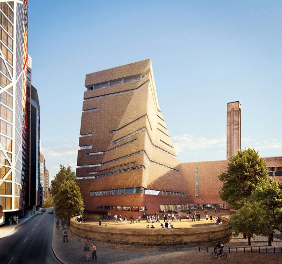
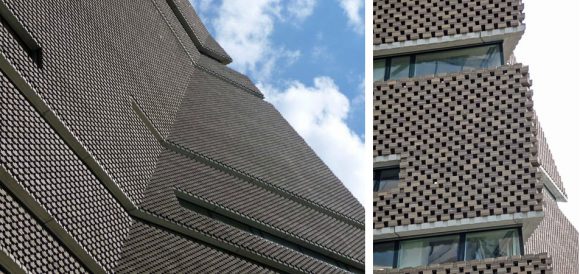
We’ve been discussing current events in London with dozens of architects and design industry professionals, and one thing is very clear: the gap between the super-wealthy and the working class is as wide as they’ve ever seen it and only getting worse. Design professionals with decade’s worth of experience under their belts are finding themselves financially excluded from living in the London metro area, all while working on high-end residences and exclusive condominium towers. This is to say nothing about the levels of outright poverty in the city. What strikes us most powerfully about the wealth gap in London is the frequency of extreme embellishment on many of its signature buildings. These buildings go foolishly and stylistically above and beyond the architectural exploration mentioned above. The addition to the Tate Modern is perhaps the most alarming to us with its £215M ($311M USD) price tag. On top of an obscene amount of money for a museum addition, the building uses a brick latticework rainscreen system to veil the glass tower underneath. This latticework seems unnecessary and highly problematic (how does brick latticework weather, keep the rain out, expand, contract, etc), not to mention all of the structural acrobatics that must be necessary to carry a cantilevered brick rainscreen 200 feet up the side of a structure. It’s tempting to rant about situations like this only because Seattle is barreling down a similar path without learning from other examples. The building boom in many European and American cities right now is shaping up to be the most dramatic of our lifetimes. In parallel and complete contradiction to this, we’ve never witnessed such widespread homelessness in places like Seattle. Architects and designers are just as responsible as developers and politicians to mind the gap and solve the problems of our built-environments.
[Images via Tate]
[Images via Jon Hill]
For the inside look on these travel adventures, take a peek and give us a follow on Instagram.
Cheers from Team BUILD


