[All photos by BUILD LLC]
The tail end of 2014 sped past like a blur. With three projects in full on construction mode, we’ve barely had a chance to pause. Managing construction projects requires laser-focus as we maintain quality of the overall assembly, while organizing some 60 separate vendors and contractors to provide and fabricate their particular part of the project, in conjunction and specific sequence related to all the others. It’s a constant effort to keep moving forward with all the moving parts.
And, It’s been a long while since we checked in with the Case Study House 2014 progress on the blog, so we’re taking a moment to give you the rundown.
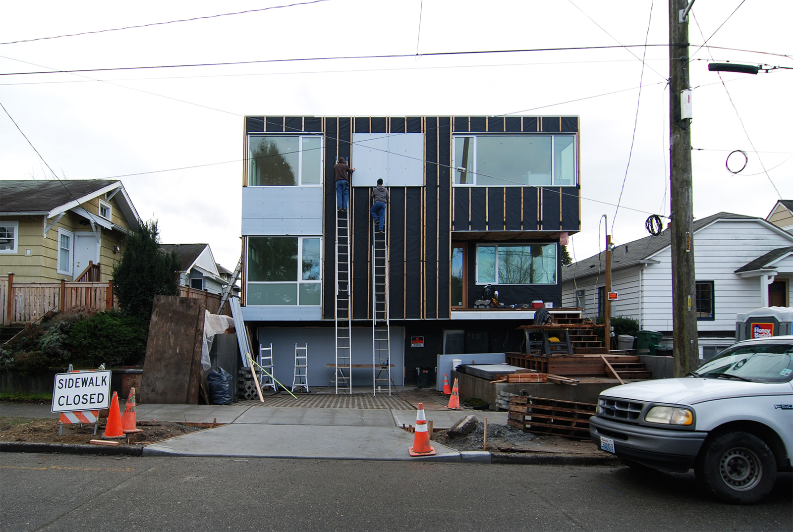
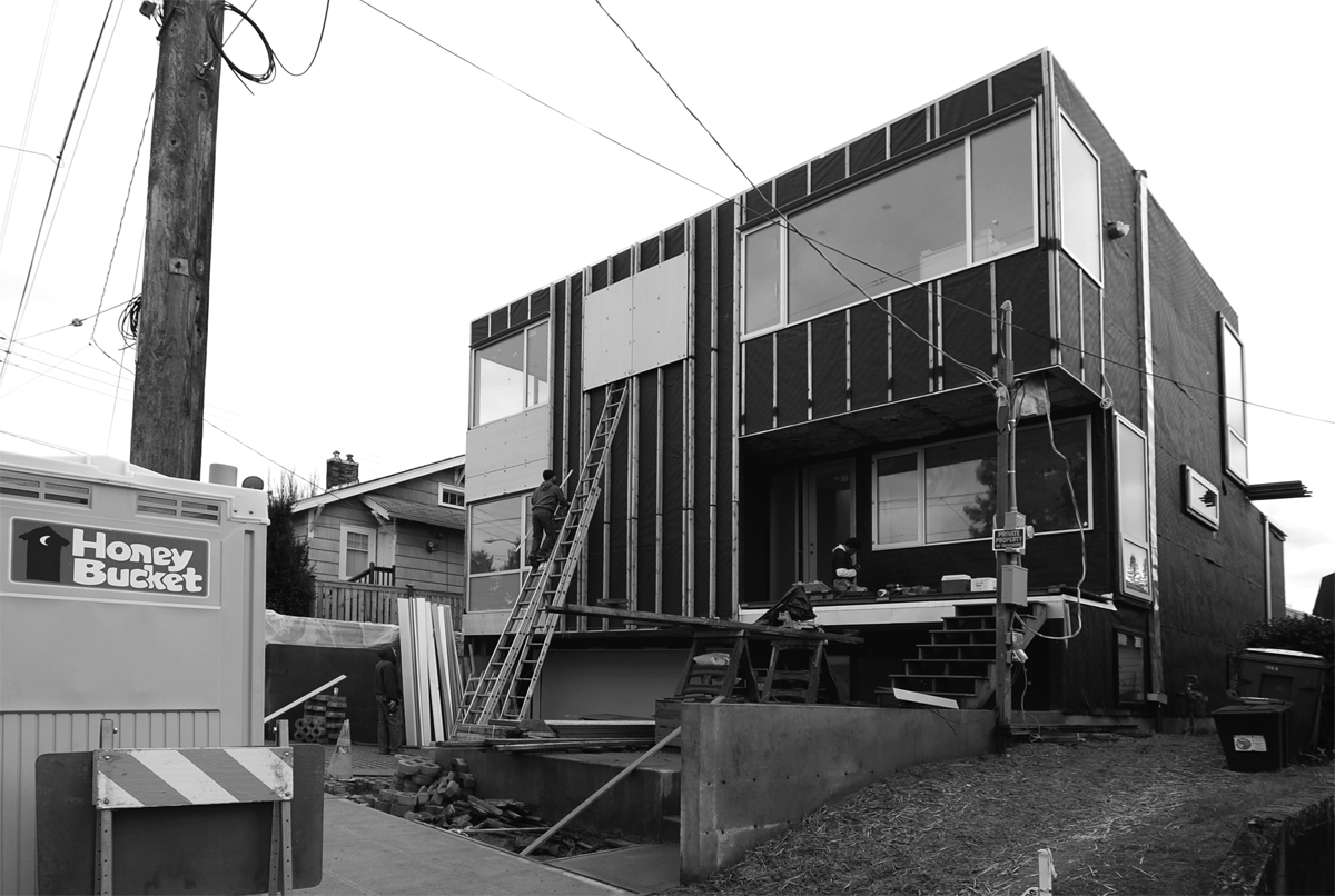
To date, windows are installed, drywall is in place, and exterior siding is in progress. To have drywall installed, or “interior cover” as we refer to it, is a big time milestone. The level of detail and attention to ensure all of our wall and ceiling mounted devices and hardware are set-up to be aligned horizontally (to reduce visual distraction), along with the painstakingly careful install of pre-drywall doors and millwork so that our project can appear extraordinarily simple, well, this is were the rewards for all the extra energy start to become evident. The serenity that is embedded in the finished project is now in place.
The critical path to completion is set and, off in the distance, a finish line is visible. While we’ve got our sights on completion by early spring, a few hurdles remain. CSH 2014 is a simple (appearing) house, but like any construction endeavor, we’ve had our share of challenges and opportunities along the way.

Site & Outdoor Living
The project sits on a small city lot, with a modest yard, part of which is taken up by an old garage being transformed into a new space. Elevated above street level, the house functions as a modern interpretation of the classic bungalow. The verticality and urban lot challenged us to create outdoor spaces adjacent to the house that flow from interior spaces. By carving out a novel outdoor space- one for each level- users enjoy varied experience of both the home and its site from distinct, vertical vantage points.

In lieu of a straight run of stairs, we decided to approach the front door with a series of tiers, changing material from concrete to wood as you get closer to the house — again, a modern interpretation of the classic urban stoop. A concrete landing surrounded by planters creates a natural spectator area, not unlike the bleacher seating we designed for one of our commercial projects. The front porch itself offers cover for the patio just outside the lower level flex space. Though not large enough to occupy, it provides useful covered storage area. In a similar fashion to the front stoop, the back stoop, partially covered, operates as bleacher seating for observing the activities going on in the backyard, providing a grounding and transition from more private space just inside. Covered and well lit outdoor space is imperative for a well-functioning home given our Pacific NW climate.
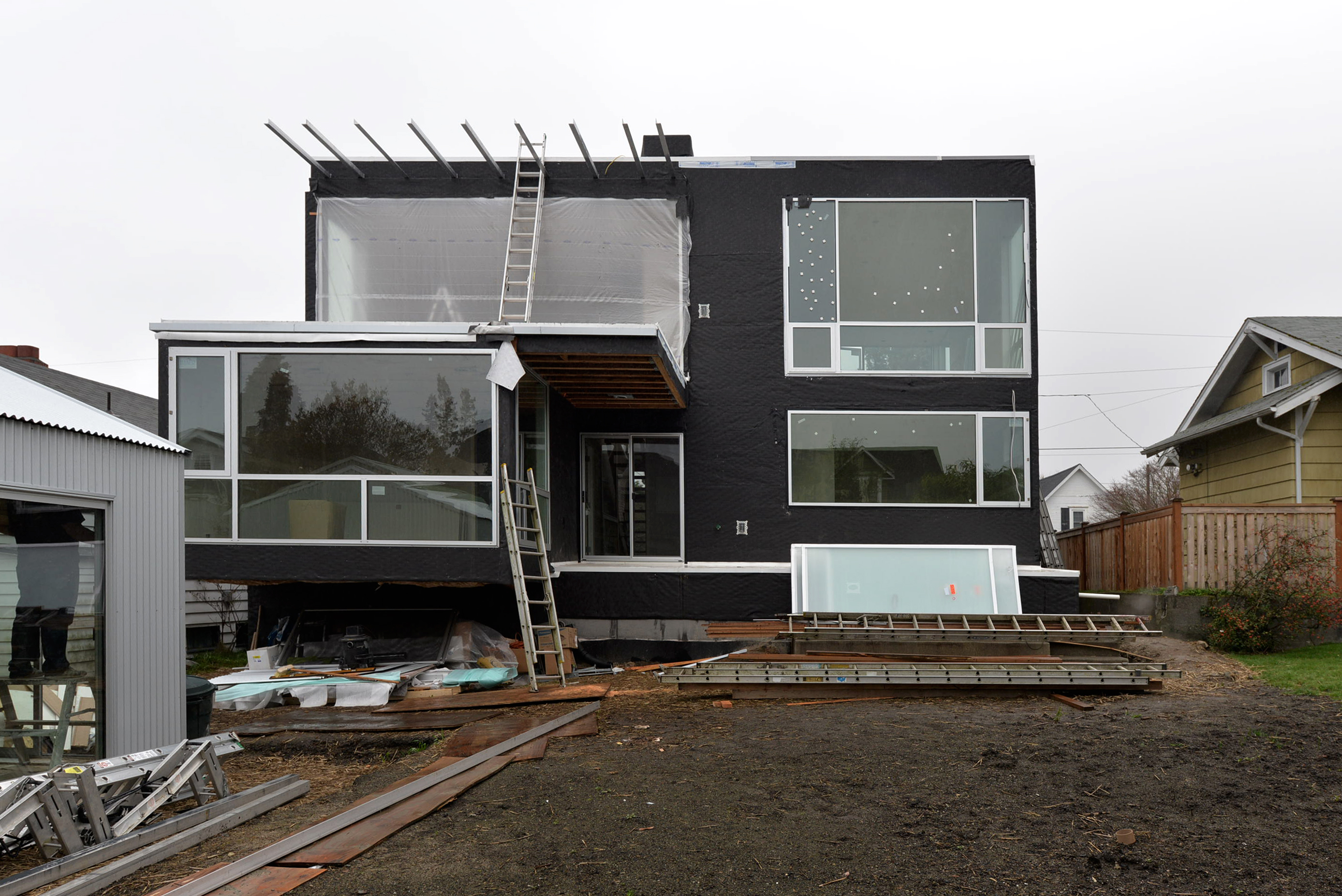

As is typical of our projects, the main terrace off of the living areas (here on the upper floor), serves as an extension of interior living spaces. We like to keep the indoor-outdoor connection as seamless as possible, going for large sliding or accordion doors with a low-profile track. Although the full-height sliders and special framing impact our budget, the benefits of having the indoor volume flow and strongly attach to the outside are evident in feeling more expansive, and having each space visually and literally, borrow off the other. The airy feeling becomes complete when indoor and outdoor blend together. And with a significant amount of canopy coverage, a grill, and a fire pit, the upper deck is going to quickly become a favorite all-season hang out spot for the family.
To cap it all off, we also optioned in the future roof deck and went forward with constructing this now. Given the site’s relatively high elevation, the roof terrace offers expansive city and mountain views, providing a daily reminder of why we value this corner of the world so much. With changes coming to the Roosevelt neighborhood with new development and the light rail station a stone’s throw away, the vertical nature of the house and terraces will provide a unimpeded view of the progress around us. A simple ship ladder and roof hatch at the top floor provide access, and we even took the dumbwaiter (in this case, vertical bar cart,) which starts in the garage and goes clear up to the roof. We can see this as an outdoor lounge from Spring through Fall.
Windows & Doors
Aluminum windows by Marlin, sliding doors, and full lite fir passage doors were used at the CSH 2014. The design aims to optimize southern exposure, views and outdoor access at multiple levels, so openings were designed to be large and access points seamless, where appropriate. On any project, windows are a critical path item, as their installation determines a point after which a bulk of the interior work can get rolling.
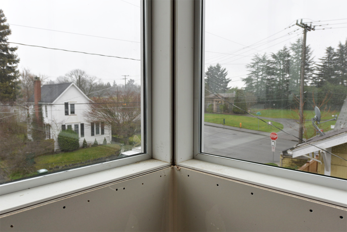
And, as we alluded to in the beginning of this post, homes that appear simple may offer even larger compexities. Large expanses of glass, offering airy views and transparency once installed, are quite the opposite sitting in the delivery truck. (Not to mention code-required triple glazing. Our backs hurt just thinking about it.) Throw in site constraints like small lots and narrow side yards, along with long lead times and back-ordered units, and we have a full-on project within a project: How to install large, heavy windows with limited access, and then field-glaze some of those units when installed. We used a large commercial lift for getting windows and glass to the appropriate levels. From there, it was a matter of getting our strongest folks available with glass cups, dexterity on ladders, shared ingenuity, and brute force. And then finally, bringing in our special glass installers to put many of the remaining pieces of glass into place, and topping out our seamless window package.
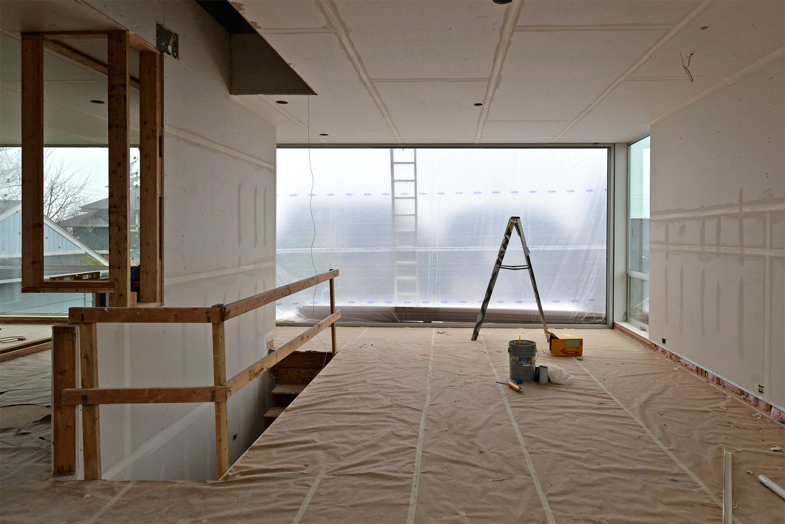
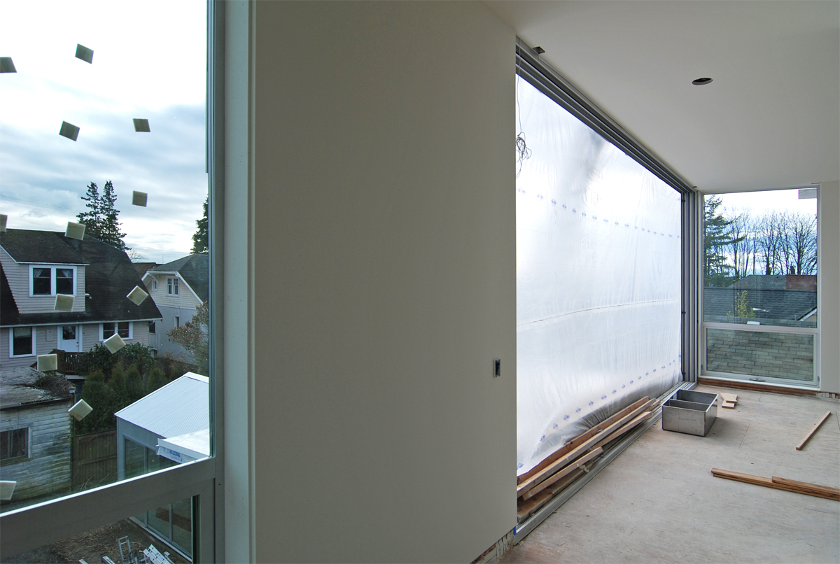
The lower level flex space and main level bedrooms were designed to have immediate outdoor access, and here we used Milgard sliding doors, which come in standard heights that match our interior doors. The upper level, which holds the main living/entertaining spaces, has access to the living terrace through large La Cantina sliders. These three-panel, 10′ tall siding doors are showing up on more of our projects for their generous openings, ease of use, and our general satisfaction with the product. Stay tuned for an upcoming blog post on the topic.
Exterior Finishes
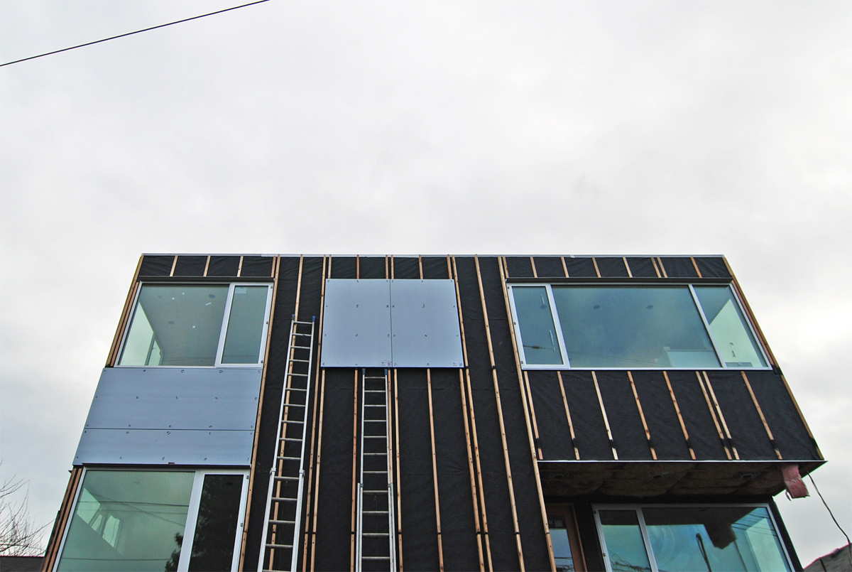
The exterior siding construction at CSH 2014 follow our BUILD devised rainscreen composition: vaproshield, flashing tape, furring strips, and siding material. Cedar siding and integral-color aluminum panels complete the exterior palette. We added some variation in the elevation plane at certain material breaks around the house. At these plane changes, windows are set beyond the sheathing and deeper furring strips are used to build up the plane that will be sitting proud. Further adding definition to the modern box, small horizontal sills are added to each window head, which offer protection for the openings. This combination of details provides some depth and activation of the building envelope, while providing better function for protecting tops of windows and allowing our exterior shell to be weatherproofed more completely.
Interior Finishes
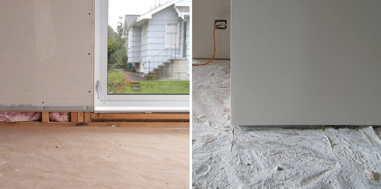
As far as interiors go, we generally stayed consistent at the CSH2014 with clean, modern finishes. Although these details take more time and skill to craft and install, we felt compelled to implement them fully to compliment the rest of the house quality. This is yet another instance in taking extra care to make the finished appearance quietly sophisticated. As one client commented, “sometimes we feel like we hired you to take our distractions away” (and there is much truth in that). So, flush base which blends seamlessly within the same plane as the wall finish is used at main living areas, applied base at bathrooms and closets, and a baseless reveal at the lower traffic areas with concrete floor (the lower level flex space).
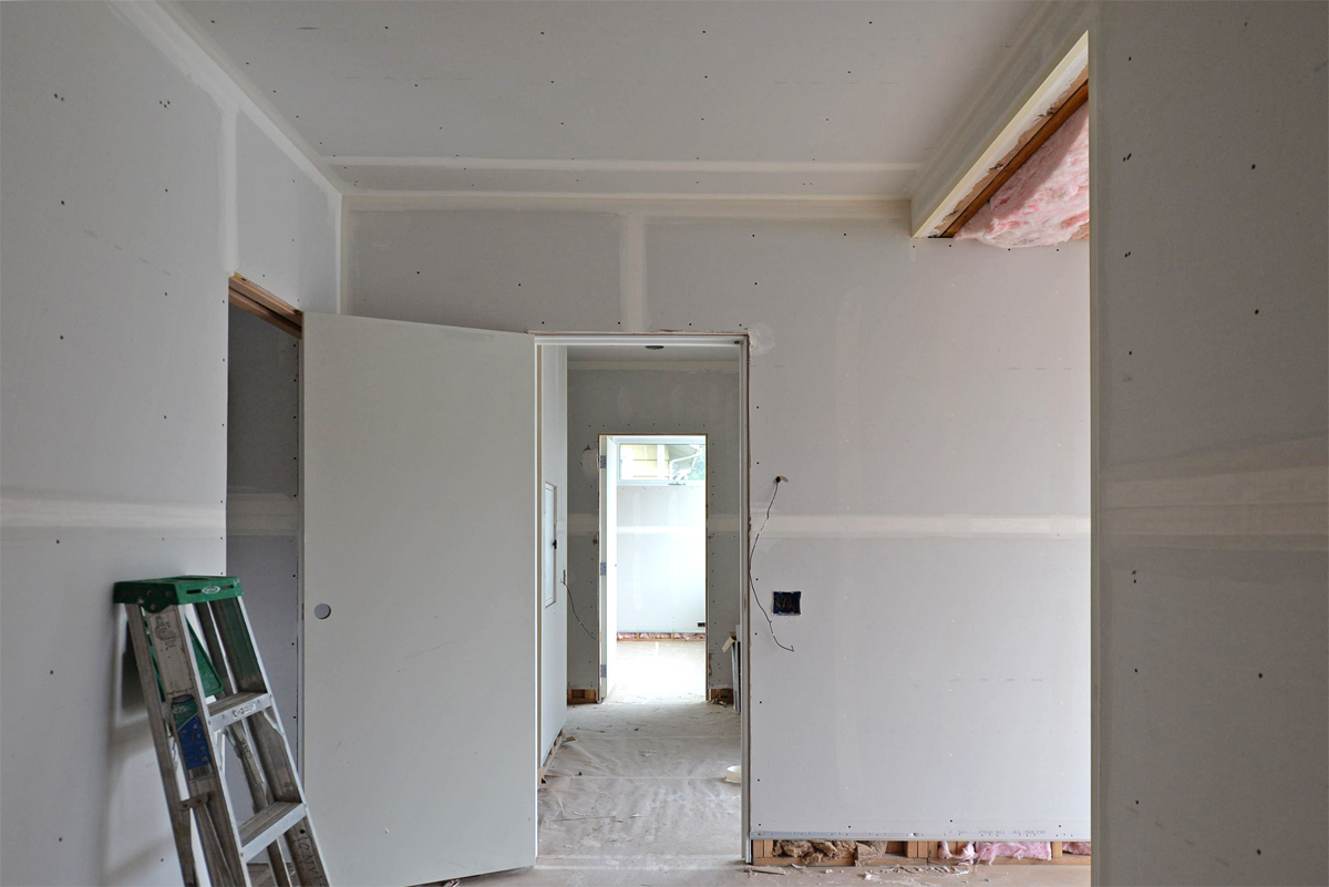
At interior closets, we use a Raumplus system, which helps to add lightness to the hallways and allows light to play and enhance these surfaces. We’ve even made their already slim profile slimmer by tucking the track into the ceiling.

Bringing material continuity from the outside into the Master Suite, we’ve taken advantage of the warmth of the cedar siding and soffit by extending this into the ceiling finish at the bedroom. We framed this space with a lower lid to achieve a transition between cedar and drywall as well as accommodate the necessary framing for the terrace above. At the floor to ceiling window, this cedar lid runs past the window head as a single plane, creating partial cover to the adjacent backyard terrace. Once landscaped, the backyard will provide a sanctuary view outside the bedrooms. The landscaping will emphasize the view, and enhance it as it matures over time. CSH2014 is largely about playing a longer game.

Building Systems
In this project, we’re using a radiant heat system throughout the house, and limited our eastern and western exposures since these systems can have slower response times to rapid changes in sun exposure. We’ve covered the topic of radiant heat before, but besides providing even heat underfoot while reducing humidity in the home, it also allows us to forego forced air systems with difficult to conceal ducting and hard to disguise register covers. Even though we have maximized the structure’s transparency for light and view, we took care in placing east and west facing windows so that our radiant heat system functions optimally, and are not thrown off by thermal gain from early morning and late evening sun.
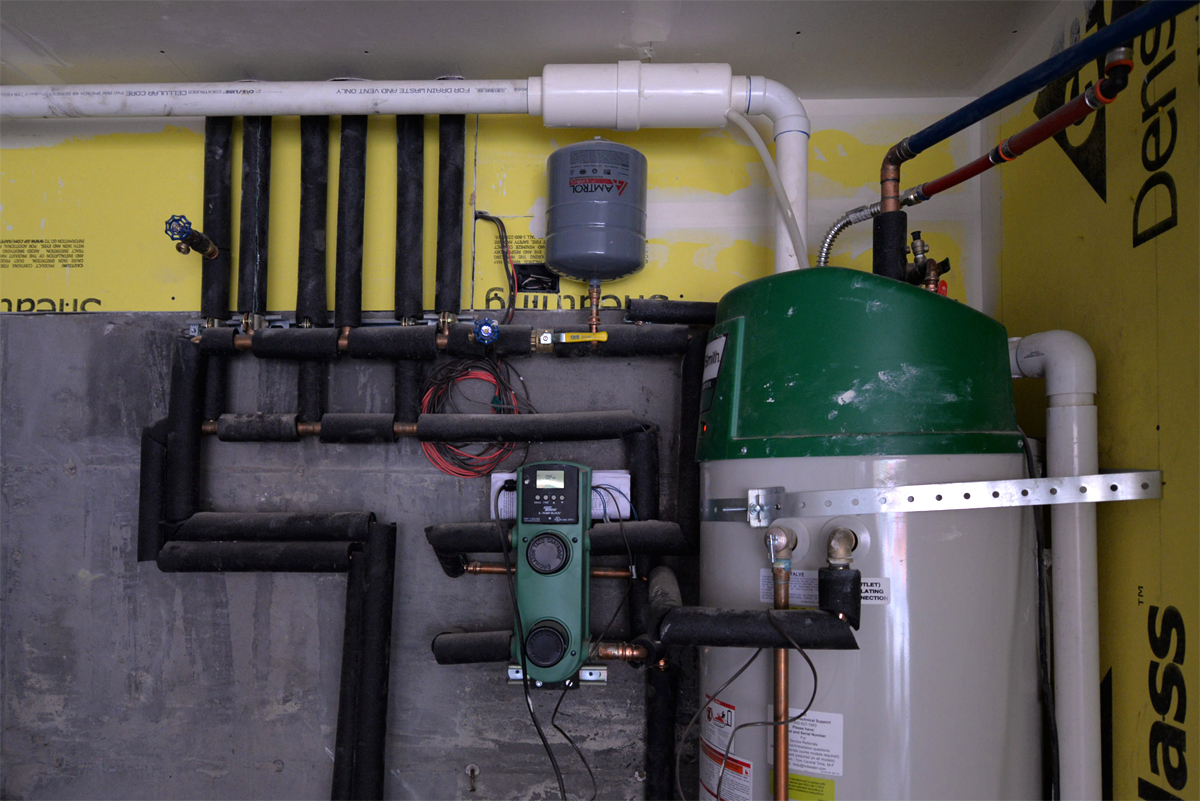
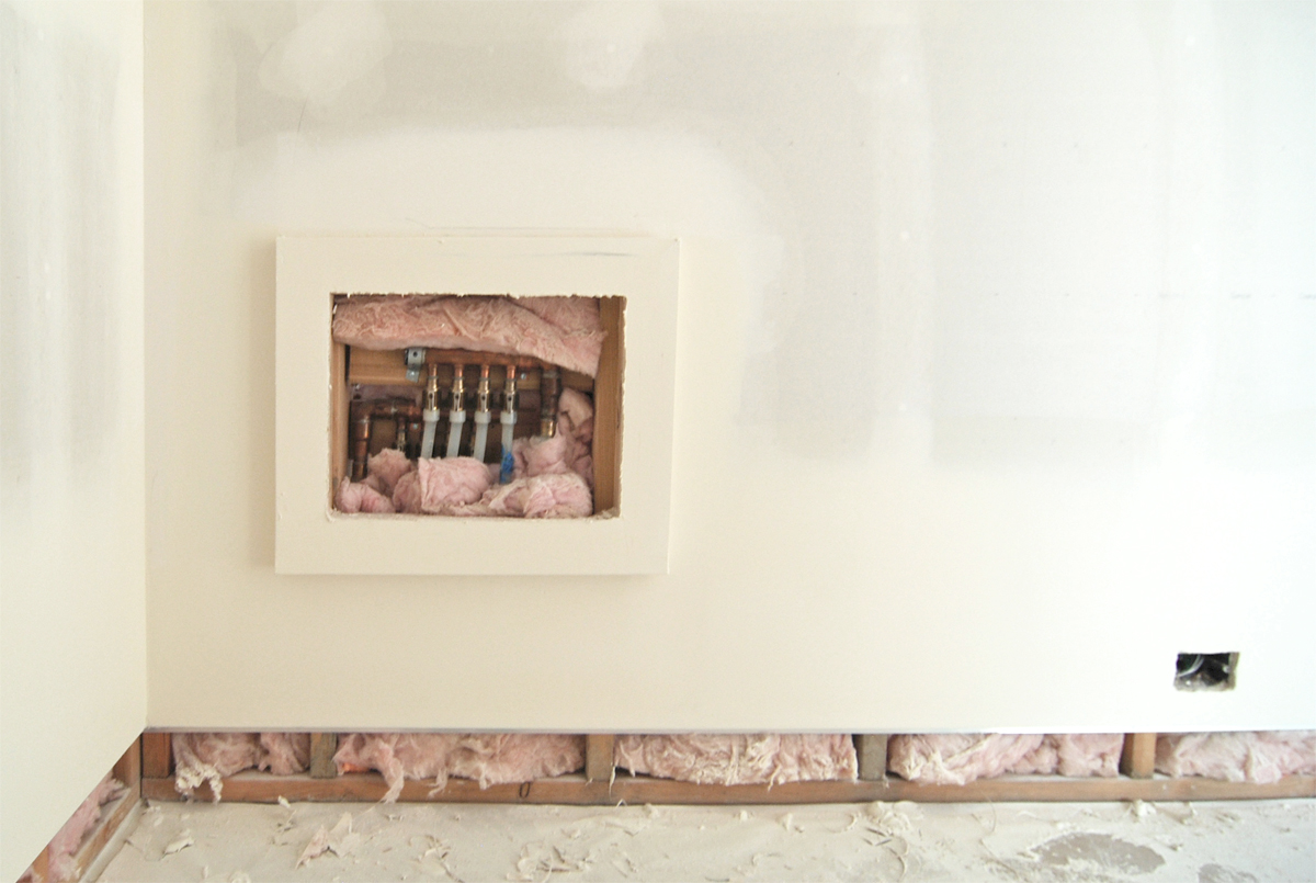
In lieu of a tankless system, the radiant tubes are heated via a dedicated line and heat exchanger branched off of the main high-capacity, high-efficiency water heater. This keeps the potable (regularly used water) supply lines for the rest of the house completely separate from the heat supply for the radiant tubes using this block exchanger. Going this route simplifies the overall system, generating heat from a single source, and requiring fewer mechanical components. As with all of our radiant systems, the manifold in each room is installed as out of the way as possible — set in the walls off the floor and tucked in locations where they’re accessible yet out of view, like under a shelf or inside a closet.
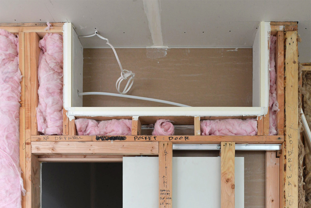
The living and entertaining area, situated on the top floor with full southern exposure, required a little assistance in maintaining comfortable temperatures because of how we approached the design in this area: we framed out a nook above the pantry door to install a mini split-system fan unit. The heat pump for the unit sits on the roof above. An added advantage of being on the top floor: the connection and installation of this small system was direct and simple. Additionally, the open plan and open stair core allows cooling to drop through the stairway to the bedroom floor below. We foresee this as an effective way to provide some supplemental cooling to the main areas.
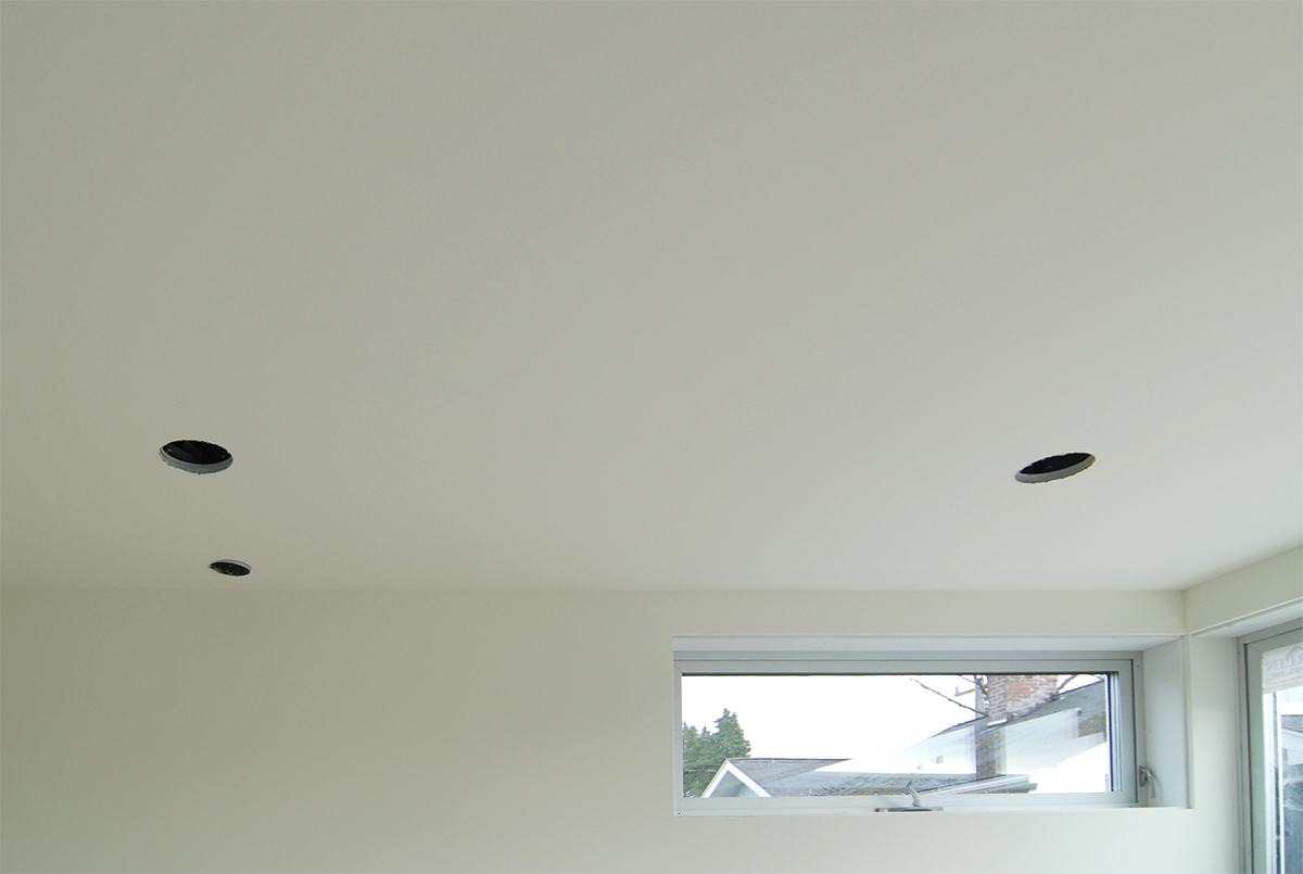
We have tried different methods to meet the code requirement of providing constant fresh air to homes via passive air inlets (PAIs, also referred to as ‘trickle vents’ since they allow a very small quantity of outside air to consistently trickle into the home). These are required since home construction has evolved to be air tight to keep the building envelope from experiencing moisture intrusion. In this case, the visual impact of the PAI has been intentionally minimized in the CSH 2014 by installing PAIs in the ceiling, aligned with can lighting, and venting them out the exterior wall aligned with other items like fan vents. Although it imposed some additional project management demands on our construction process, ou approach keeps our interior walls less cluttered and allows for consistent alignment of wall penetrations on the exterior wall. Another example of taking time to think through alignment of all items so that we avoid the visual clutter of less organized device lay-out.
Features
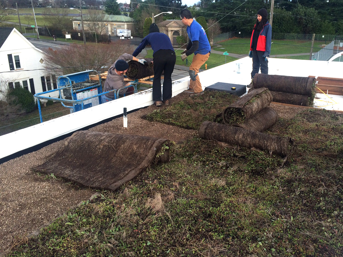
The new pervious surface requirements from the city means green roofs are going to be making a regular appearance on many of our Seattle projects. The green roof at CSH 2014, provided by Xero Flor, covers a significant portion of the roof surface, and doubles as an all-season green backdrop for the roof terrace experience.
The powder room at the upper level of the house was outfitted with a venting skylight, which opens automatically when the interior temperature rises, and closes automatically when it senses rain. While its function is more for venting, it also allows natural light into the space while maintaining privacy.
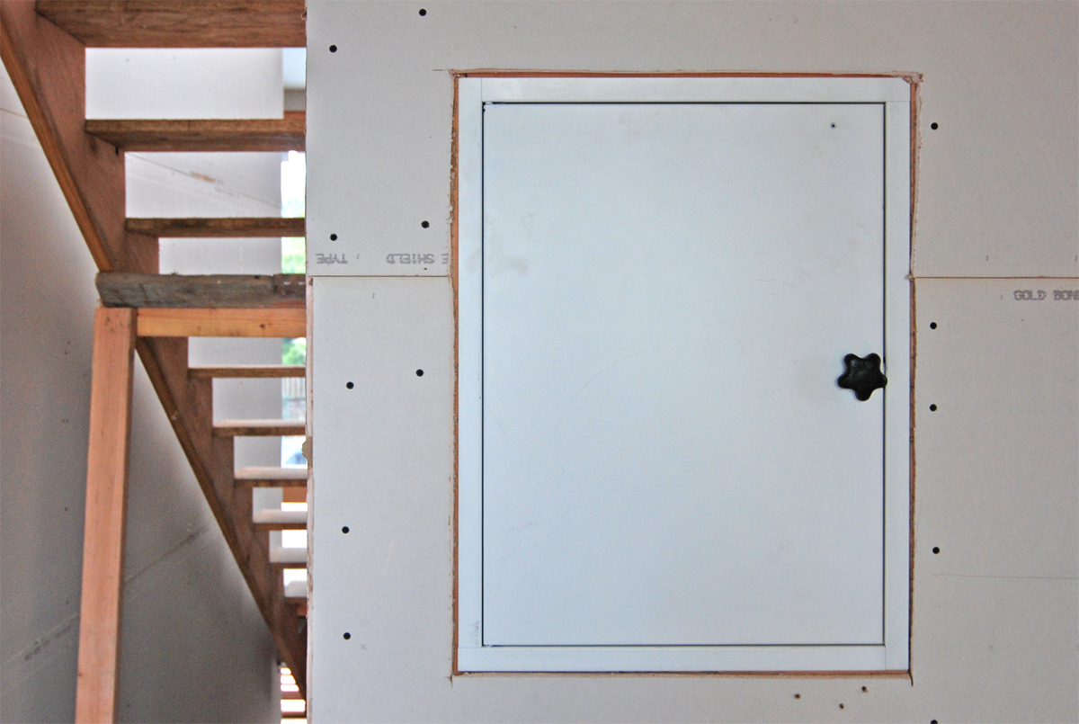
The benefits of installing a dumbwaiter at the CSH 2014 were brought up in an earlier post, due to its verticality and reverse floor plan, and had wondered why this useful feature isn’t more common in Seattle homes. The dumbwaiter shaft runs from the garage (where heavy grocery items can be conveyed up to the kitchen with ease) all the way up to the roof deck. With all levels containing habitable spaces, including the roof, it made sense to take the shaft all the way to the top, maximizing the functionality of this feature. One can envision using the dumbwaiter for other purposes, such as conveying laundry to the second floor adjacent to the laundry area. We enjoy reinterpreting the laundry chute reminiscent of Seattle bungalows, and re-purposing this function for a new era. A note to those who are considering designing a dumbwaiter into a project: currently, the city requires a special permit that seems about as complicated as permitting an elevator. Something’s amiss when a conveyance system for bottles of wine (operating at a power less than a garbage disposal — no exaggeration) is treated with the same heavy hand as a conveyance system for humans. But that might be a post for another time, and we’re not quite out of the heavily wooded forest on this issue just yet.
That covers the latest on CSH2014. There will be plenty more coming up on the blog about the project as we reach the final stretches of the construction phase. In the meantime, keep up with the week to week progress on our Instagram and Facebook accounts.
Cheers from Team BUILD


