[All Images by BUILD LLC]
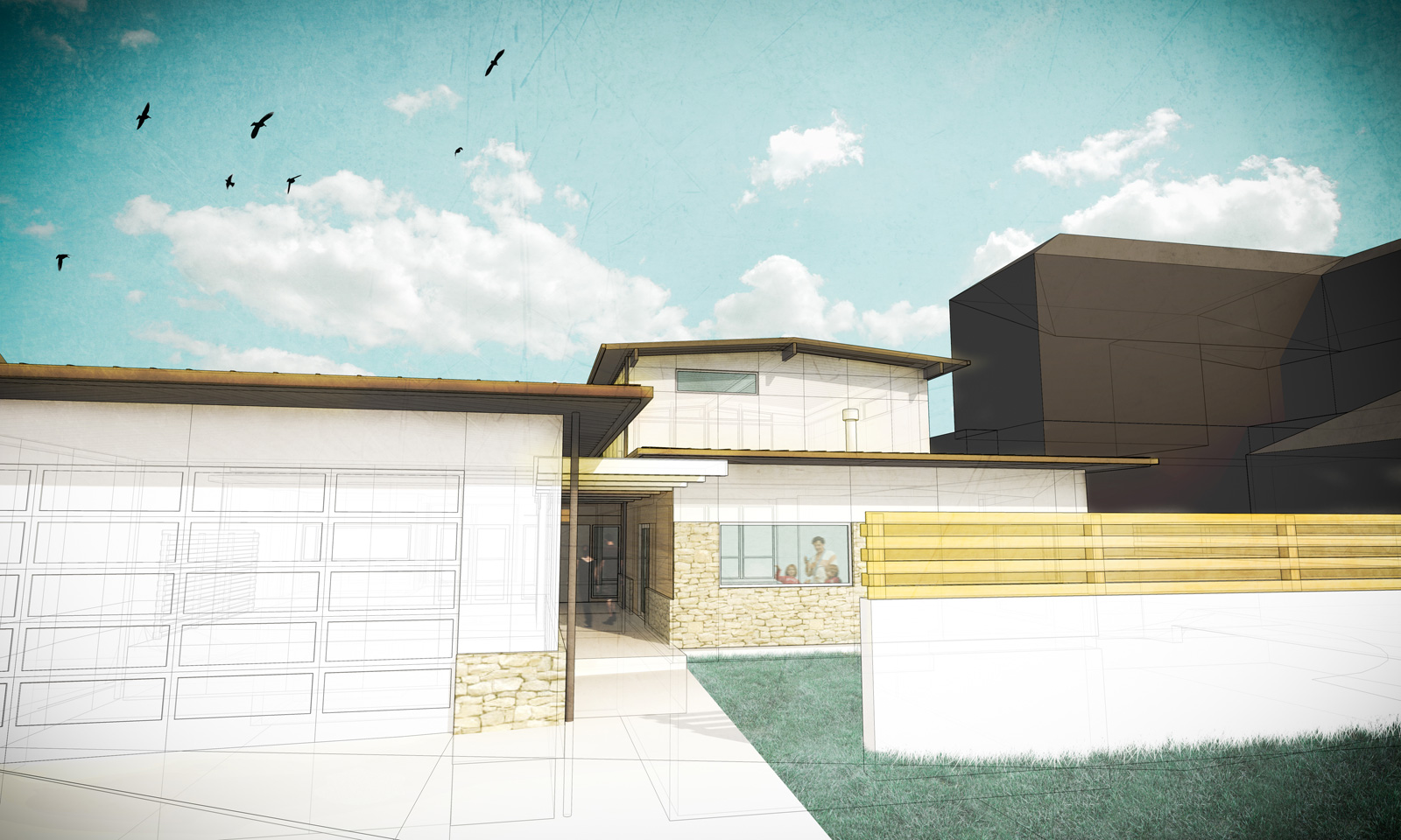
Over the past few months, we’ve been working to up our render game here at BUILD LLC. Today, we’ll take a look at why we think this work is important, what changes we’ve made to our three-dimensional modeling and rendering methods, and we’ll take a relatively shallow dive into that step-by-step process.
More and more, we’re finding renderings to be beneficial throughout multiple phases of our design and build process. Modeling (though not necessarily rendering) can be useful in-house, as we develop and articulate a design. It allows us to quickly understand everything that is going on in a project and how it’s all coming together. Often, things become apparent that weren’t via two-dimensional drawings. These quick hits help clear up design issues at either end of our process — from the initial massing to the detailing of, say, a light shelf.
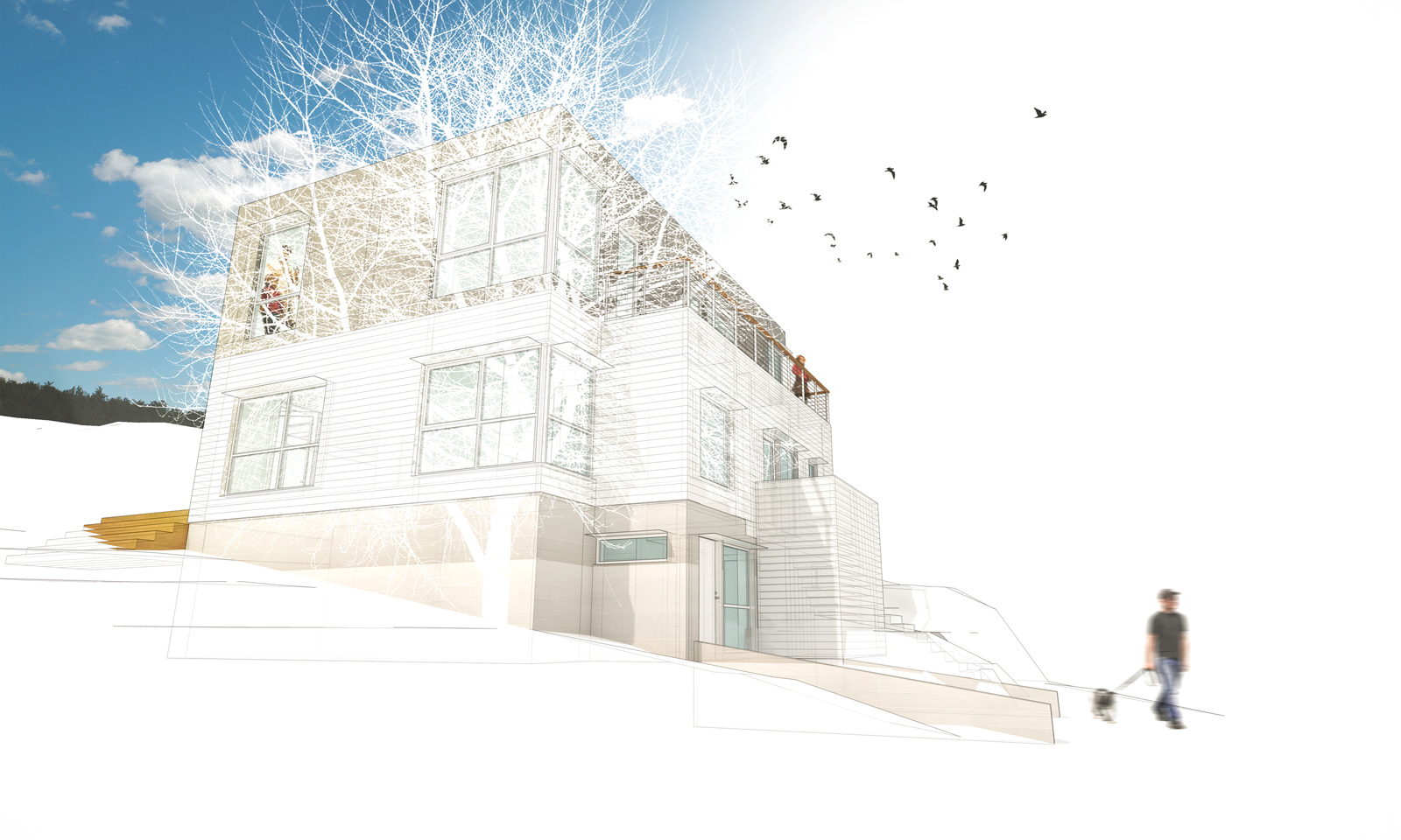
Not only do we benefit from renderings, but our clients do too. At meetings, after looking over a set of two-dimensional drawings, a few crisp renderings can add a level of clarity and understanding. While we never shoot for photorealism with our rendered work, (more on that later,) a rendering that starts to talk about materiality and experience is something we can get behind.
That these images have legs beyond client meetings only adds to their importance. We routinely supplement the BUILD website with renderings (until real-deal finished photos become available), use them on the BUILD Blog, and upload them on various social media platforms to keep people up to date on what we’re working on. Similarly, these very same images lend themselves to marketing or even obtaining financing, if need be.
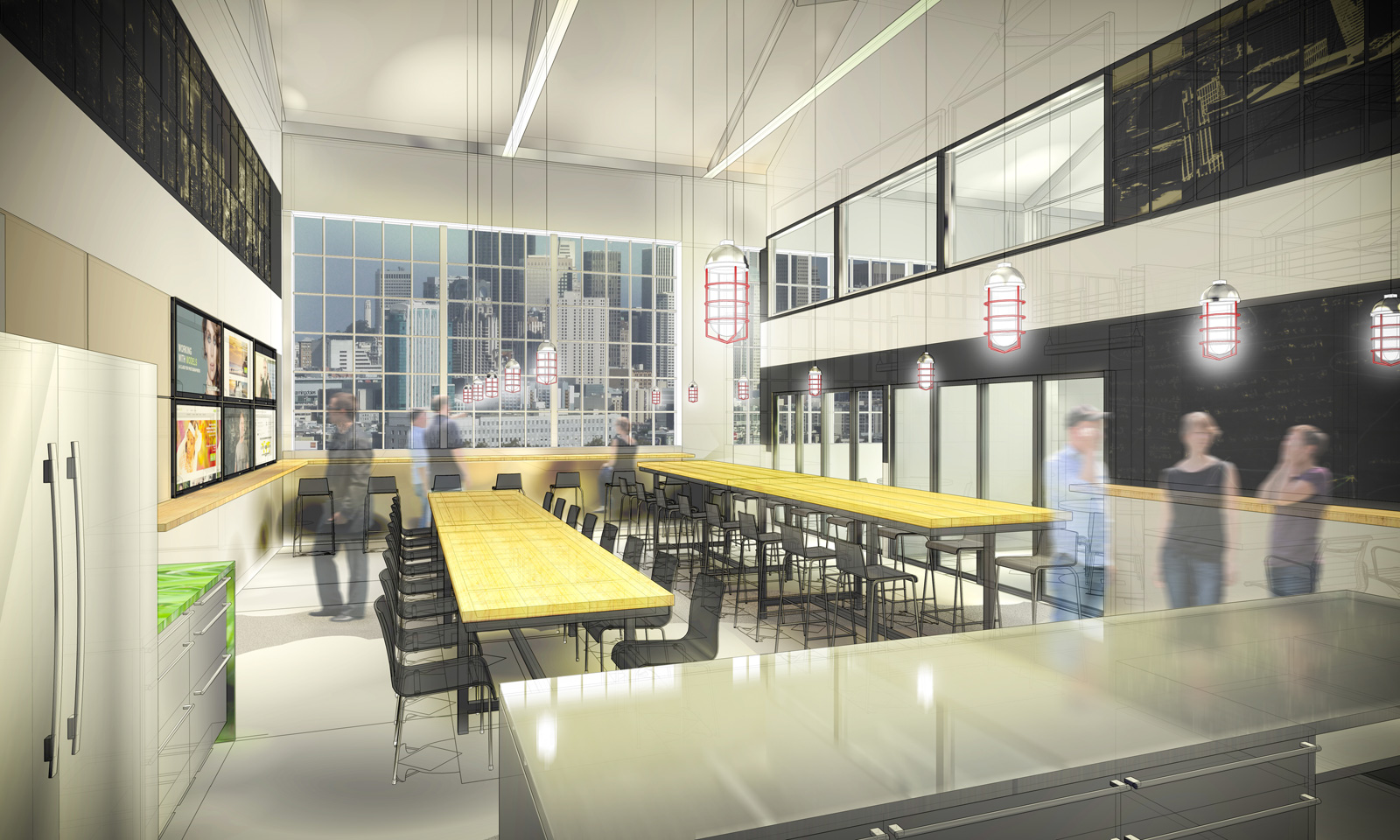
Now, let’s take a look at the ‘how’ of our rendering process. The exact steps we take differ from project to project, and also depend on the phase of design we happen to be in. In any case, these are the tools we use on a consistent basis:
Trimble SketchUp
We like to use SketchUp to model for a number of reasons: It works reasonably well with AutoCAD, allowing us to import plans and elevations to use as a base, as well as reference along the way. Just like AutoCAD, it is fairly “dumb.” It’s not prompting us to tell it about the buildup of a wall so it can model it for us. Instead, this basic modeling program allows us to realize three dimensional ideas, simply and swiftly. That said, we generally try to pack as much information into this stage in the process as we can. This means lighting, surface materials, and any details we can throw in to get closer to the real thing: flush base, SPD cabinetry offsets, operable windows, etc. And last, but not least, the basic package for SketchUp is free, which has quickly made it a universal program for 3D modeling.
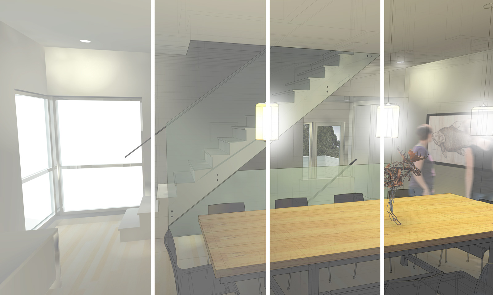
SU Podium
Podium is a SketchUp plug-in that allows us to output fully rendered images with minimal fuss. We’ve also experimented with Kerkythea and Maxwell Render, but Podium seemed like the way to go, mainly for its ease of use. At this stage, all we’re after is an image that is lit decently and can convey the elements which make the project special.
Adobe Photoshop
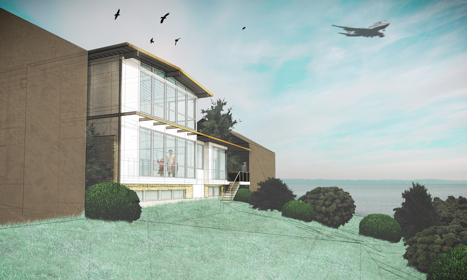
In Photoshop, we start off with our render from Podium and an x-ray image saved straight out of SketchUp. As we alluded to earlier, we like our renderings to lean more towards drawings than towards photos; they should serve as a vehicle to translate the mind’s eye. Achieving a photo-real image not only takes a ton of extra time, it can also negatively impact the perception of a project. A photo says, “This is exactly how it will be.” A drawing says, “This is where we’re headed.” The x-ray that we snag from SketchUp keeps our final images decidedly in the drawing realm. Beyond that, we use Photoshop to emphasize shadow and light, and to further clarify and call out design details. We also add entourage at this stage to bring scale and a little life to the image. Generally, this means people, plants, and backgrounds where applicable. Sometimes we’ll get a little crazy and even add birds and planes.
Adobe Lightroom
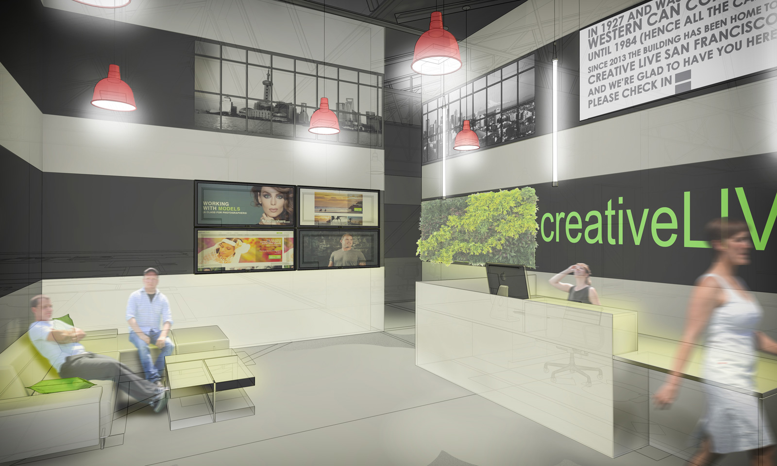
By this point, the image should basically be in its finished state. Since we have become so enamored with what Lightroom can bring to our photography, we’ve been experimenting with what it can do to “punch up” an otherwise completed rendering. We usually look to add vibrance that can be lost depending on how heavily we apply the x-ray layer during the Photoshop phase. We also add some vignetting. We find this makes the images more accessible.
Adobe Illustrator
For us, the Illustrator step in the process is optional. We typically use it to do nothing more than apply the BUILD “stamp.” In addition, we will occasionally overdraw in order to express ideas on a project that might not be conveyed otherwise — a roof extension, additional windows, etc.
There you have it, the basic why and how of our renderings. Feel free to share your tips and tricks in the comments below.
Cheers from Team BUILD


