There are more siding choices available than ever before in residential construction. Much of this is due to the technical advances and popularity of rainscreens here in the Pacific Northwest. In addition to providing a solid weather barrier, rainscreens allow the siding composition to keep a crisp, modern geometry. The look is so sharp in fact, that we’ve been pulling the exterior wall treatments inside the home on several recent projects; it’s produced a detail that has quickly become a favorite in our kit-of-parts. Today’s post reviews three projects that use the same wall assembly inside and out. Along with a review of these projects we’ll cover some details, techniques and visual tips for continuous indoor-outdoor walls.
[Photo by Art Grice]
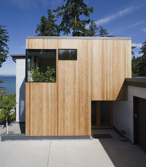
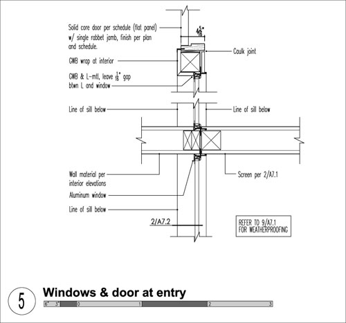
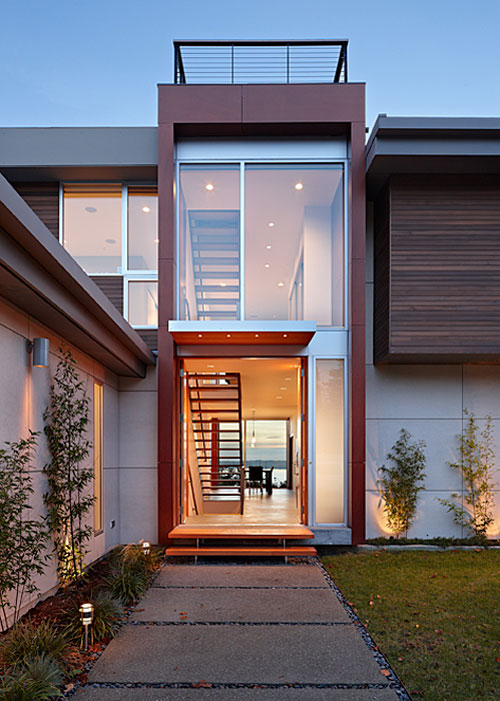
The Bainbridge Island Residence uses a CBF Cembonite rainscreen at the front entry. We like the machined look of the rainscreen panels so much that we brought the panel wall into the entry. The assembly inside is similar to the exterior –the exception is that the weather membrane used behind the panels at the exterior can be substituted with building paper inside (painted black to disappear in the shadows).
[Photo by Art Grice]
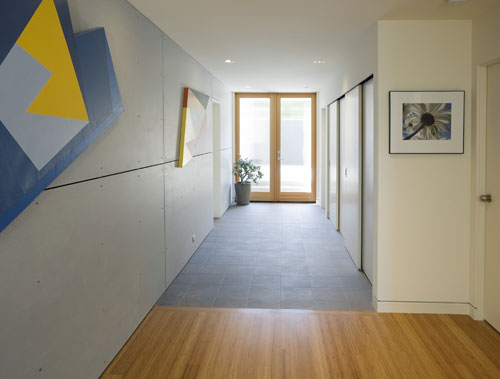
The continuous panel wall leads people into the entry area and creates visual harmony between the inside and outside. The design concept also takes what would ordinarily be a long expanse of gypsum wall board and creates a more interesting texture and geometry of the surface.
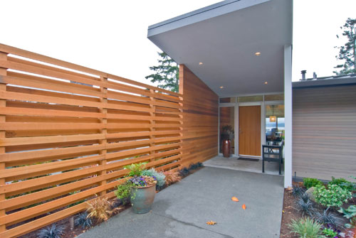
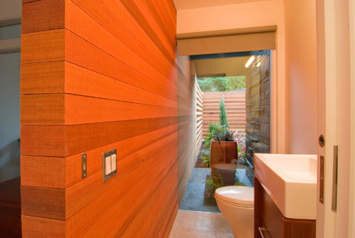
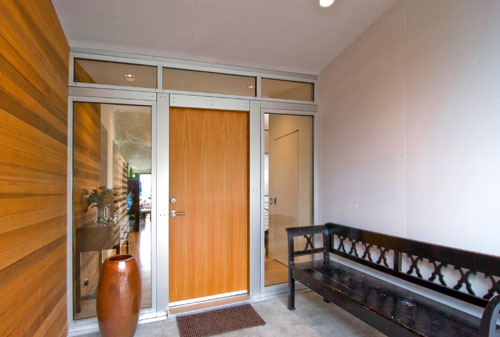
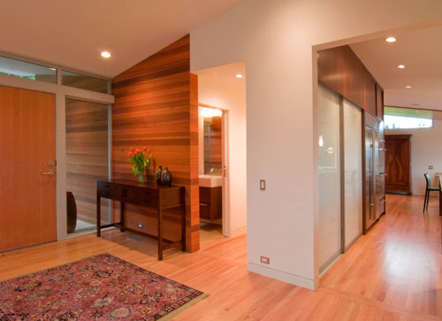
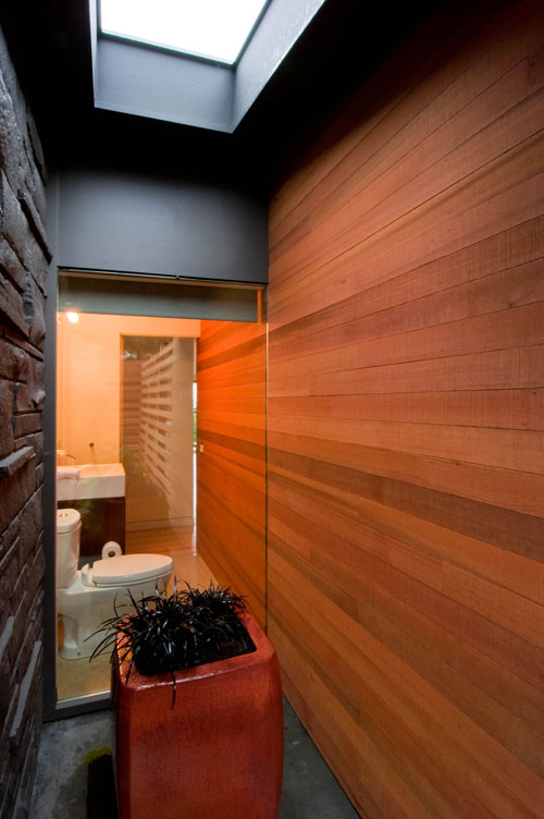
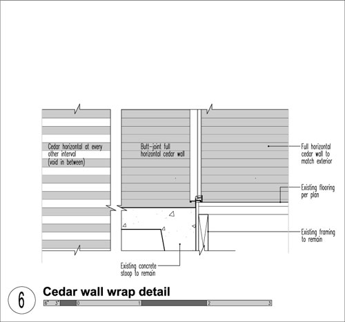
The Innis Arden Residence uses horizontal cedar boards that extend into the entry area, wrap the wall, continue through the powder room and terminate back outside. The design concept designates the entire wall massing as cedar. The cedar boards visually warm up the spaces and provide a textural backdrop to the entry and powder room. The wall assembly is conventional (rather than a rainscreen) and is identical inside and out. The cost of using cedar inside is, of course, more expensive than using drywall but the wall becomes a feature of the home.
On the Davidson Residence we used Prodema rainscreen panels to define the circulation volume –these panels wrap into the interior and terminate at different locations.
[Photo by Benjamin Benschneider]
We like to align the panel terminations with visual queues within the home –this lends a deliberate look to the wall panels and the overall geometry of the space. In the image below, the panels intentionally stop at the beginning of a horizontal window, framing the left side of the jamb.
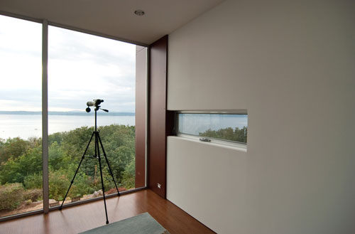
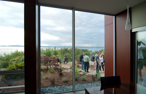
A door to the adjacent deck provides the stopping point for the panels at the main floor in the dining area (above) while the panels near the stair align with the top tread (below).
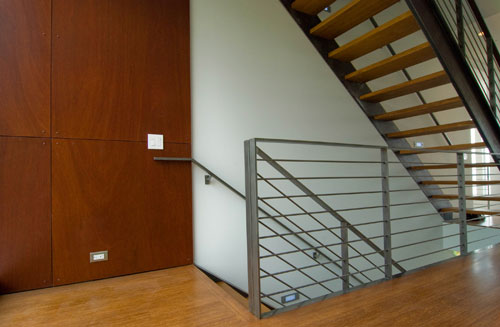
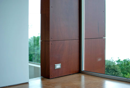
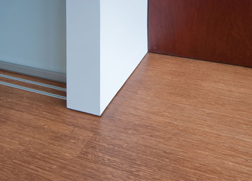
Interior wall panels also allow for opportunities with the architecture itself. The image above shows a vertical slot opening which is positioned to allow the panel material and the drywall to remain separate –this separation allows for a visual connection between the upstairs and downstairs. The transition below occurs at a perpendicular wall created by the laundry area.
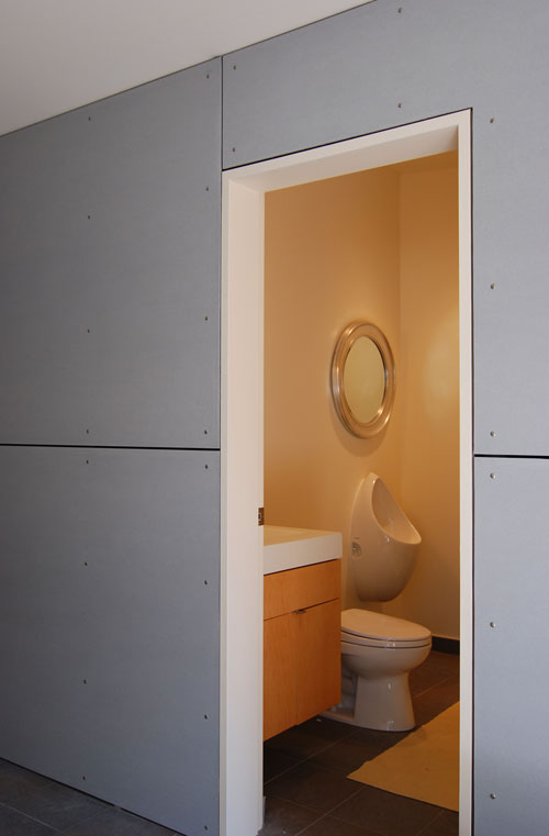
If detailed correctly, a paneled wall can also wrap around architectural items, like the powder room door below. The ¼” reveal between panels is maintained between the panels and the door jamb for a deliberate, crisp look.
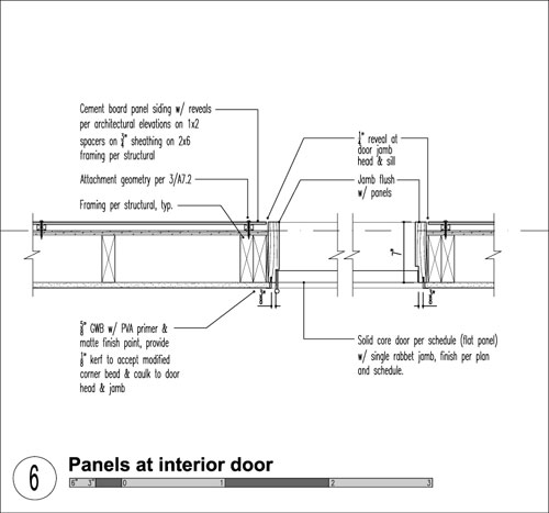
The continuous indoor outdoor walls tend to be cost-effective because the siding sub-contractor is on site anyway –having the siders continue the walls a bit further inside doesn’t add a huge amount to the bottom line. The detail adds a nice level of serendipity to the architecture of the home and creates some nice opportunities for pleasing design. Stay tuned, you’ll see this detail in a few up and coming projects as well…
Cheers from team BUILD


