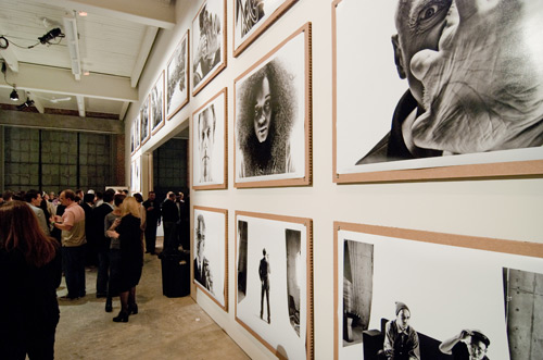
Sometimes architecture achieves its goals precisely because it doesn’t take center stage. Sometimes the right thing for architecture to do is take a step back and be the backdrop for people, art and celebration. That’s exactly the case with the new space that BUILD LLC just remodeled for Chase Jarvis Photography.
The space is 1 part think-tank, 1 part event space, a dash of media lab, and garnished with a creative environment to test new ideas. It’s raw, it’s gritty and best of all it’s not about the architecture. In fact, the design modifications to this industrial shell are discreet to the point that we hope you don’t even notice them.

We started with a 6,000 square foot brick warehouse in Seattle’s industrial South Lake Union neighborhood. The exterior walls are original brick with concrete columns. We think the exposed brick, along with the industrial early 20th century windows give the space a Brooklyn artist loft feel. So we left the exterior walls just how they were -they bring the grit and raw beauty to the game.
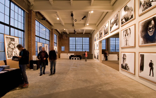
The most significant architectural move to the space is a large wall that splits the space in two. This created two huge rooms; CreativeLIVE and a think-tank space that each has better proportions than the single large room did. Each room now has its own character and a more linear geometry.
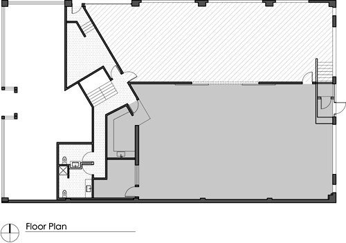
The separation allows for entirely different functions on each side of the wall at the same time. There will be a great deal of media and filming going on at the CreativeLIVE side, subsequently the visual and acoustic separation is a main driver for the design.
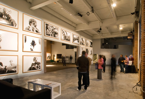
The simple addition of the wall also helps resolve a number of awkward angles in the main floor and mezzanine built in the 90’s. By bisecting this oddly angled assembly, the wall subdues the volume and the angles become background elements rather than visual statements.
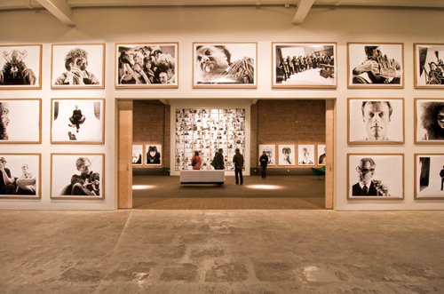
Within the wall is an opening 20’ wide x 10’ tall –two large “sliding walls” close off the opening when desired. The doors are finished with plywood on both sides and visually warm the space up a bit. You can see more about the door hardware in a previous BUILDblog post.
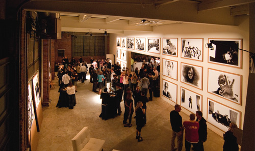
The space had seen decades of bad tenant improvements over the years – with the 80’s taking the award for most noticeable color scheme. A matte white paint was used to consistently cover the range of pastels and tie the disparate areas of drywall together. The white essentially takes the previous “accent walls” and turns them into inconspicuous backdrops.
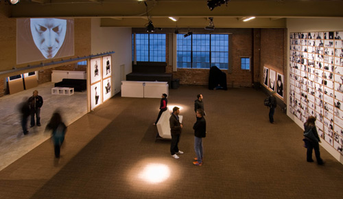
There isn’t much out there less inspiring than five thousand square feet of wall to wall industrial brown office carpet. Our strategy here was to remove it from the think-tank space exposing the concrete slab below. The slab was then cleaned up a bit, however its finished state is still relatively raw and textured. We kept the carpet in the CreativeLive space for acoustic purposes and since it’s a tight weave, equipment can still be rolled around on it.

The ceiling is actually quite interesting as the steel I-beams, purlins and decking are all exposed. A coat of white paint to cover up the “cigarette smoke yellow” cleans up the look and makes it more neutral in the overall composition.
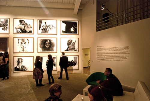
Additional updates include improvements to the emergency exits and hardware, security, sprucing up the bathrooms a bit and cleaning up the electrical. You get the gist.

Sometimes paint, a wall, a couple of cool doors and removing some carpet is the solution. It’s also very cost effective.

It’s pretty dang inspiring when a client throws a massive party full of Seattle’s cultural go-getters in the space you just completed. The extremely hard-working rock-stars over at Chase Jarvis Photography did just that with the launch of Seattle 100: Portrait of a City. Last week team BUILD got to see the space doing what it is does best: allow for amazing people to celebrate, incredible art to shine and beautiful things to happen. It was an incredible party followed by two days of open gallery, exhibiting 150 extraordinary black & white prints and multi-media projections. The exhibit has been extremely prolific with the book, website and additional launches like the one at the Ace hotel in NYC.

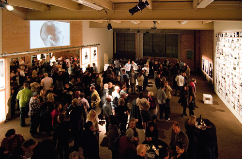
Cheers to people, art, celebration… and architecture inconspicuously doing its job.
All photos by BUILD LLC. For the behind the scenes, follow us on Twitter.


