Wrapping up the Cardboard Fort series, we present part 3, which delves further into the basic DNA of our design influences. Give most kids an appliance box and a roll of duck-tape and you’ll see creative genius unfold before your eyes. Join us as we provide a critical analysis of some (mostly) admirable cardboard forts.

[Photo by Stronger than Dirt]
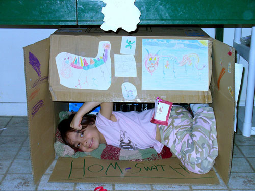
17. The design pays homage to the clean, linear work of Portuguese architect Eduardo Souto de Moura. This institutional project, apparently a school, upholds a high degree of design integrity with its symmetrical façade; it also preserves the natural look of the materials used in the construction. Grade: B+

[Photo by jaime.schmadeke]
18. We give high marks to not only the efficiency of this structure but also its ratio of energy spent on construction per usable end product. The simple A-frame structure uses the well founded crease-and-fold technique to create a continuous membrane wrap. It would also appear that the structure has been weather tested under non-hypothetical circumstances –always a plus. Grade: A-

[Photo by Icky Pic]
19. Heavily influenced by the work of Mexican architect and muralist Juan O’Gorman, this project hits a chord with its simple geometry and rich, colorful adornments. The operable panels create an interesting outdoor room however the interiors seem to be designed a bit shy of the programmatic requirements. Grade: B-

[Photo by ke_garrett]
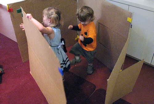
20. There’s no substitution for hard work and all the dancing in the world isn’t going to put walls in place. Grade: D

[Photo by jon_gilbert]
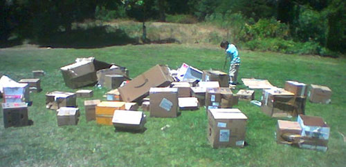
23. With the banking industry seizing up construction loans, many projects have been left in a state of limbo. We’re sensitive to the implications of the current financial climate and lean toward compassion with this project, which lost funding for its labor force shortly after the material drop. Grade: incomplete

[Photo by Simply Modern Mom]
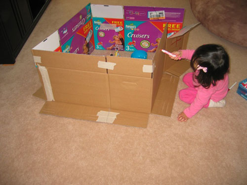
24. A deliberate and masterful work which presents its inner beauty as a pleasant surprise. A hidden panel of the seemingly banal façade conceals a pivot door at which point the viewer is introduced to a world of color and imagery. The exterior envelope uses attenuated connections and subtle graphics to keep the overall composition inconspicuous. Grade: B+


