Lately we’ve been covering some of our early design influences as architects and builders. Today’s post tackles part 2 of the Cardboard Fort Architecture theme and as we’ve been finding, even the most mundane of forts has deep architectural roots. Join us as we investigate the overlooked realm of cardboard fort design.

[Photo by Deen Taylor]
09. While the overall composition lacks design vision, proper credit should be given to the project’s roof mounted wind turbines. Unfortunately the structure raises important concerns regarding the structural integrity of the frame and the weatherproofing of the skin. Grade: C

[Photo by Camp Monserrate]
10. Drawing from Maasai tribe dwellings of Kenya’s Masai Mara region, the structure provides maximum function with minimal floor area. An open common area allows the family to gather while appendages to the structure offer privacy. The compact door opening and lack of windows protect the inhabitants from the harsh sun and heat while the primitive envelope construction allows for quick repairs. Grade: B+
[Photo by Dane Carlson]
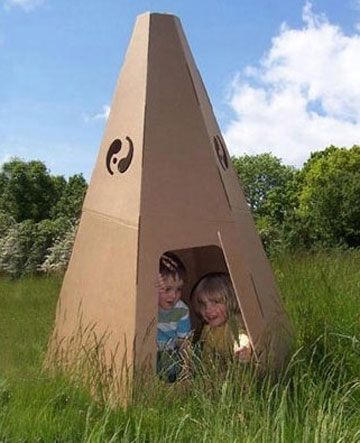
11. Complex in its pedigree, the structure honors the tradition of Native American Teepee construction while embedding Asian symbolism into the architectural facade. The yin and yang icons creatively employ a dual purpose as roof venting. Grade: A-

[Photo by CCCSTL]
12. Few projects have the necessary ambition to draw correlations from a work as renowned as the Great Wall of China, but this example pulls the concept off with zeal. We admire the “open-source” architectural vocabulary which allows the addition of future building blocks, hence continuing the linear geometry of the structure. A well positioned turret allows the inhabitant full view of the composition while a lower level offers protection and privacy. Grade: A-
[Photo by erin please]
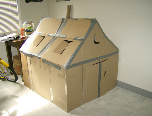
13. Inspired by sharecropper dwellings of the southern United States, this simple structure incorporates ample windows for circulation during the humid summer months as well as operable shutters to protect against the harsh sun. The half moon cut-out is also a humorous ode to the traditional outhouse. Regrettably, the project fails to include the proverbial front porch, a signature of the work from this era. Grade: B-
[Photo by hilariusaquarius]
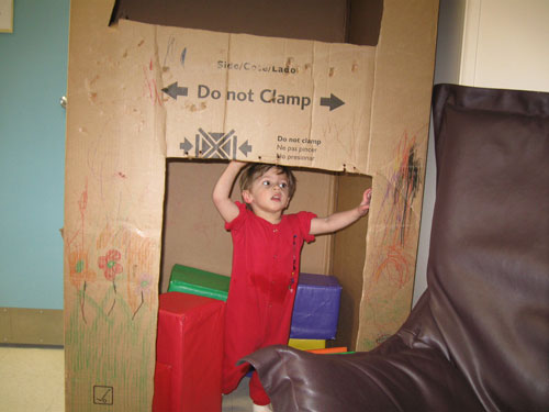
14. Sit down man, you’re a bloody mess! Flailing around your studio like a crazy artist will get you nowhere. Grade: D
[photo by mish guess]
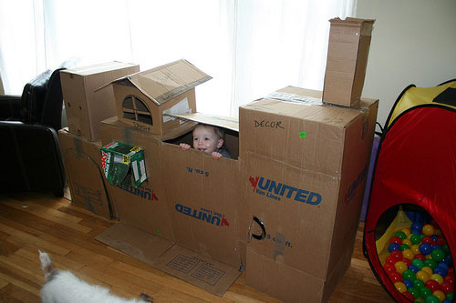
15. Moving from left to right the composition appears to include brutalist design from the mid-twentieth century, turn-of-the-century craftsman style (with a nod to the Palladian window), the shed style from contemporary northwest design, and the stone tower style from thirteenth century northern Italy. If our assessment is correct this composition is either an architectural history book manifest in physical form or a complete visual catastrophe. While there is an abundance of effort put into the work, the attempted combination of disparate styles is the downfall of this project. Grade: C-
[Photo by linein]
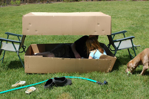
16. A brilliant structural concept that employs steel towers to keep the continuous roof membrane in tension. This same roof geometry is then mirrored in an amusing move to create the structures base. The clear span between base and header allows for a superb example of the ribbon window, popularized by the architect Le Corbursier in the 1920’s and 30’s. Grade: A
Check out part 3 of the Cardboard Fort Architecture series here.
For more of our shenanigans, follow us on Twitter.


