Before we were designing buildings and houses and remodels, before we went to architecture school, engineering school and the school of hard knocks, we were busy cutting our teeth on the basic building blocks of the design world. Along with couch cushion architecture, it was cardboard fort architecture that helped us figure out the ABCs of design and construction. Cardboard fort architecture remains an underdog of the design world and its high-time we gave kudos to the fundamental DNA that helped us get where we are today. We’ve rounded up a (mostly) admirable collection of projects, taken from a randomly conducted search on the internet. Join us as we take a critical analysis of the architecture, methods and design philosophies of discarded appliance box re-appropriation.

[Photo by Betzi]
01. Drawing influence from the European walled city, this open air community offers private shelter “pods” within the hardscape. We like that the courtyard anticipates the need for leisure by including seating and a storage container for sports equipment. Grade: B
.

[Photo by Stork’d]
02. Borrowing from the color scheme of Tschumi’s Blue-Condo project of Manhattan’s Lower East Side, the project attempts to create a signature geometry from the emphasized letter T. While we applaud the roof deck and operable facade, the project falls short of achieving a clear concept and the weatherproofing seems problematic. Grade: C-
.

[Photo by Mary Institute Country Day School]
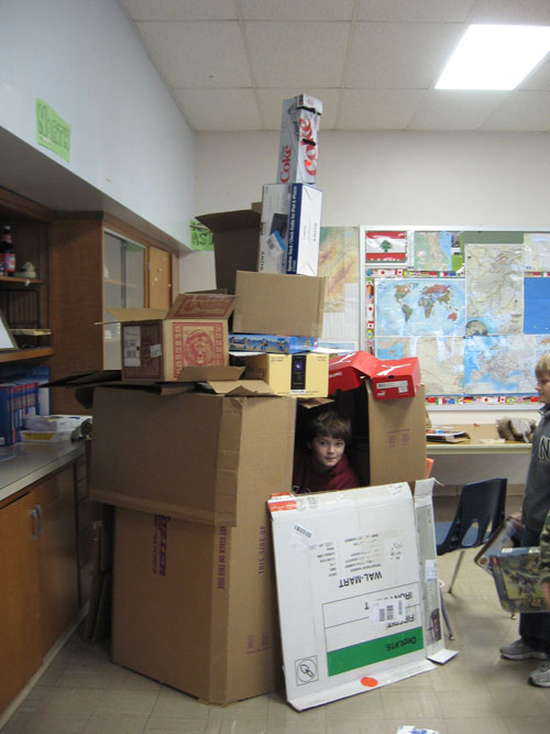
03. A clear derivative of the Tower of David in Jerusalem, the structure incorporates an amalgamation of weathered features to achieve a faux ancient Middle Eastern style. The traditional crenellation, capping the tower, has been cleverly replaced with a half-rack of diet Coke; the play on capitalist society is duly noted. Grade: B+

[Photo by Thingamababy]
04. Rarely do we see such a pure translation of Scandinavian co-housing. The separate facilities are clearly organized and a generous interior courtyard has been dedicated to community interaction. The flamboyant purple roofing membrane announces the “commons” which contains cooking, eating and socializing areas. A tour of the interiors revealed inhabitants perfectly happy with their neighbors and surroundings. Grade: A+
.
 [Photo by Imagine]
05. While overtly simple at first glance, we admire the “signage as architecture” idea and praise the concept of human interaction with the architecture itself. We also respect the ratio of occupants per square footage and penalize the project only for its lack of observing the manufacturers recommended orientation of install. Grade: A-
.

[Photo by Super Diary Boy]
06. Following Venturi Scott Brown Associate’s 1972 thesis, the architecture of this project is subordinate to the overall symbolic form. Emulating an everyday object, in this case a rocket-ship, the architecture becomes folly. While the style is often criticized for its use of irrelevant decorative elements, we commend its future-forward attitude and admire the use of aluminum wrap as water-proof membrane. Grade: A
.

[Photo by Wendy]
07. An unfortunate example of followers without a leader, this band of able-bodied young architects and builders are experiencing what is known in the profession as “design paralysis”. Grade: F
.

[Photo by Nora Evelyn]
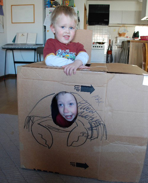
08. A brilliant move of minimalism and an ingenious notion of architecture as body armor. We love that the “skin” borrows stability from an adjacent structure and that the operable door panels conform to the demands of the occupant(s). The project does more with less and our only criticism focuses on the lack of roof protection. Grade: B+
For part 2 of the Cardboard Fort Architecture series click here.
For more of our shenanigans, follow us on Twitter.


