[Photo by BUILD LLC]
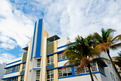
This time of year we like to escape the gloomy northwest and seek out the yellow rays of southern destinations. This time around we picked Miami for several reasons; the weather, the urban life, the design culture that’s been steadily growing, and Art Deco architecture. For today’s post we’re going to highlight some fantastic examples of Art Deco design and then we’re going to throw a bunch of BUILDblog opinion at it.
As designers of the current time, rooted in modern materials and methods, we were initially skeptical of the Art Deco philosophy. The design moves seemed flamboyant, the elevations overly glamorous. Such lavishness so easily leads to pure decoration and we’re rarely fans of fashion in architecture. However, this was a different place, another culture and the buildings represent a different time. Before making up our minds about Art Deco there was a due diligence required of us. So we photographed these structures in the bright daylight, we shot them in the glowing neon nights, we drank coffee under their sheltering awnings, we dined in their grand restaurants, we drank martinis on their terraces, we thoroughly kicked the tires on Art Deco. Our conclusion?
[Photo by BUILD LLC]
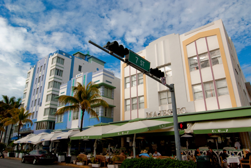
The Art Deco design philosophy is brilliant and necessary. We admire that the forms are derived from mathematical geometries and that the purpose of each and every element is still about function. It takes the efficiency of modern design and elevates it with a sense of determination.
[Photos by BUILD LLC]
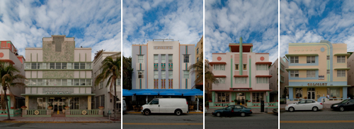
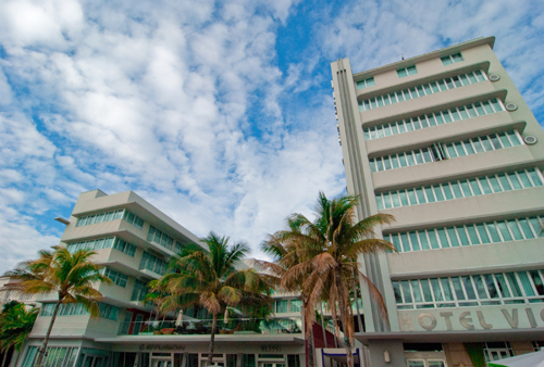
Many characteristics of Art Deco, which seem superfluous at first glance, have a role in the function of the structure. Color bands identify the entry as a means of way-finding, the horizontal eaves create consistent horizontal bands and at the same time shelter the windows from the elements, stepped facades clearly indicate which portions of the building are public as opposed to the more subdued private areas.
[Photos by BUILD LLC]
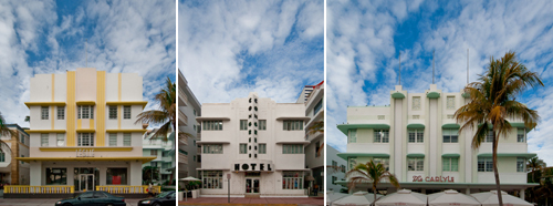
The structural members are often allowed to play a role in the façade, expressed in high relief or with bold colors. Different portions of the building are also defined with geometrical differences.

[Photos by BUILD LLC]
Most of all we love the integration of the building and signage. That the graphic, logo or name is so often expressed sculpturally as an extension of the built-form is beautiful and sensible. Such elegance between building and appendage makes most structures with their applied signage seem clumsy and unrefined.
[Photo by BUILD LLC]
We could go on all day about how the composition of these buildings adds up, how the architecture makes sense to us. But here’s the catcher, in order to understand and appreciate Art Deco we think these buildings need to be encountered and confronted. The philosophy of Art Deco has just as much to do with experience as it does with composition. These forms are about culture, life and spirit. You can study the elevation all day but without sipping an Americano on the veranda or having a mojito on the roof deck, it can’t be got. There is a fundamental study of architecture that comes not just from drawing lines and reading books, but from living amongst and being with inspiring design.
So have yourself a martini, experience some good design and have a great weekend.
Cheers from team BUILD
[Photo by BUILD LLC]


