[All images by BUILD LLC]
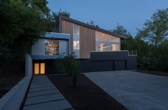
Last summer we wrapped up the Mercer Island Residence, located just five miles east of Seattle. The project is on the larger end of the houses we design and it also has a complex program of functions. The interiors put three different species of wood to work in order to achieve the desired performances and visual effects. Because the various colors and textures of natural wood can so easily conflict with one another, it’s an unusual move for BUILD to specify three entirely different woods at the interior of a project. Today’s post is a behind the scenes look at which woods we went with, how we used them, and the design strategies that we employed with this particular interior palette.

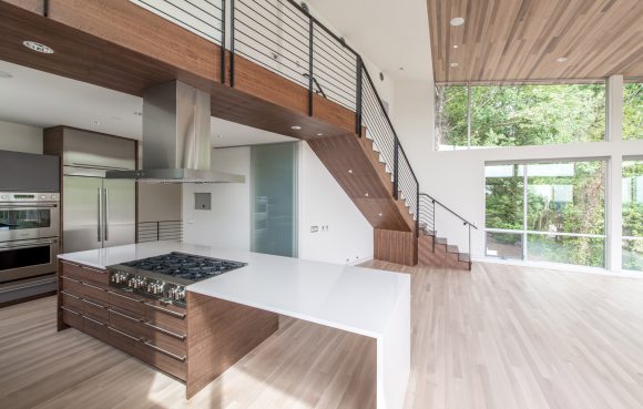
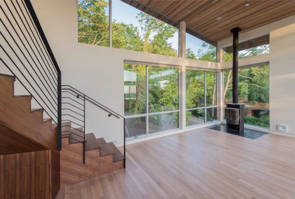
One of the first material decisions we make on any project is the flooring. As a result of its ubiquity on a project, the hardwood floor selection guides many of the subsequent decisions required to design a successful interior. Because of its stability and capacity to accommodate a variety of finishes, solid oak is often our go to floor for spaces that incorporate radiant floor heat, busy families, and pets. A highly durable, solid rift-sawn and quarter-sawn 3″ wide oak floor with a light gray stain was the perfect application at Mercer Island, and it occurs at all common areas above the ground level. The entire lower level is slab on grade which lends well to a polished concrete floor with radiant heat embedded within. An oak stair, leading to the upper level, distinguishes the two floor planes and creates a lighter, more refined feel to the ascent.

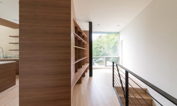
Gray laminate cubbies with an exposed ApplePly edge are tucked below the oak stairway to provide bulk storage for shoes and accessories. The Maritime Gray laminate keeps a neutral tone and allows the oak to be the primary feature of the stairway. At the top of the stairs, a darker walnut veneer is introduced into the materials palette as a drop-sort wall. This walnut was selected precisely because it offers enough contrast to the oak without competing with it. At the same time, the lighter striations within the walnut’s grain relate well to the gray stained oak floor.

The walnut wraps from the drop-sort area around the wall creating a cabinet-like volume that leads to the kitchen where a carefully composed palette of oak flooring, walnut cabinetry by Griffin Cabinets, and gray laminate face panels interface with the stainless steel appliances and Cascade White polished countertops by Pentalquartz. Walnut cabinetry also makes for sensible kitchen cabinets as the grain contrast can conceal the occasional stains and minor dings from daily use.

The cantilevered open walnut shelves running up the kitchen wall become a visual extension of the cabinets and a matching walnut stripe at the ceiling leads the eye to a stair volume above. The full envelope of this stair is intentionally accentuated with walnut veneer, allowing it to read as its own volume. The three stairs of the residence (two interior and one exterior) relate to the geometry of the ground floor and subsequently sit at a 15 degree angle to the upper level. This makes it all the more important that the stairs read as their own geometries, and the focused use of natural woods allowed us to achieve this.

At 750 square feet, the living room ceiling is a huge visual element. If finished with painted drywall, the lid would make the common areas feel sterile and plain. Because of this, we knew even as early as schematic design that this surface would need warmth and texture. The challenge, however, was with the selection of material. With oak and walnut already balancing each other nicely, we didn’t want to introduce a third wood type to upset the harmony and clutter the palette. However, the requirements of the living room lid really called for the tones and textures of natural wood. We ultimately decided on 1×4 cedar with Daly’s #70909 light-gray stain for two key reasons. First, cedar is a visually warm material that creates a cozy aesthetic in the living area, and second, because lightly stained gray cedar does an excellent job of mimicking the oak floors. This strategy allowed us to take advantage of the characteristics of three wood species while only aesthetically balance the colors and textures of two.

In addition, the use of cedar brings continuity between the exterior and interior palette. It’s a move we’ve done on a handful of past projects, whether it’s a cedar lid that bleeds out into an exterior soffit or a feature cedar wall that slides between the interior and exterior spaces. The extension of the cedar boards from the interior to the exterior is a detail worth discussing for a moment. While it appears the cedar boards transition seamlessly without interruption, technically, they don’t. The necessity of the window flange connection to the framing creates a break between the interior and exterior cedar boards. The longer cedar boards are attached first to the interior lid, then smaller off-cuts are color matched outside beyond the window flange by our meticulous finish carpenters. It’s less a matter of detailing and more a matter of clear communication and coordination on site.
The use of multiple interior woods gave us an opportunity to implement yet another strategy towards timeless modernism at Mercer Island. Variations on this theme will definitely be making an appearance on future projects, so stay tuned.
Cheers from Team BUILD


