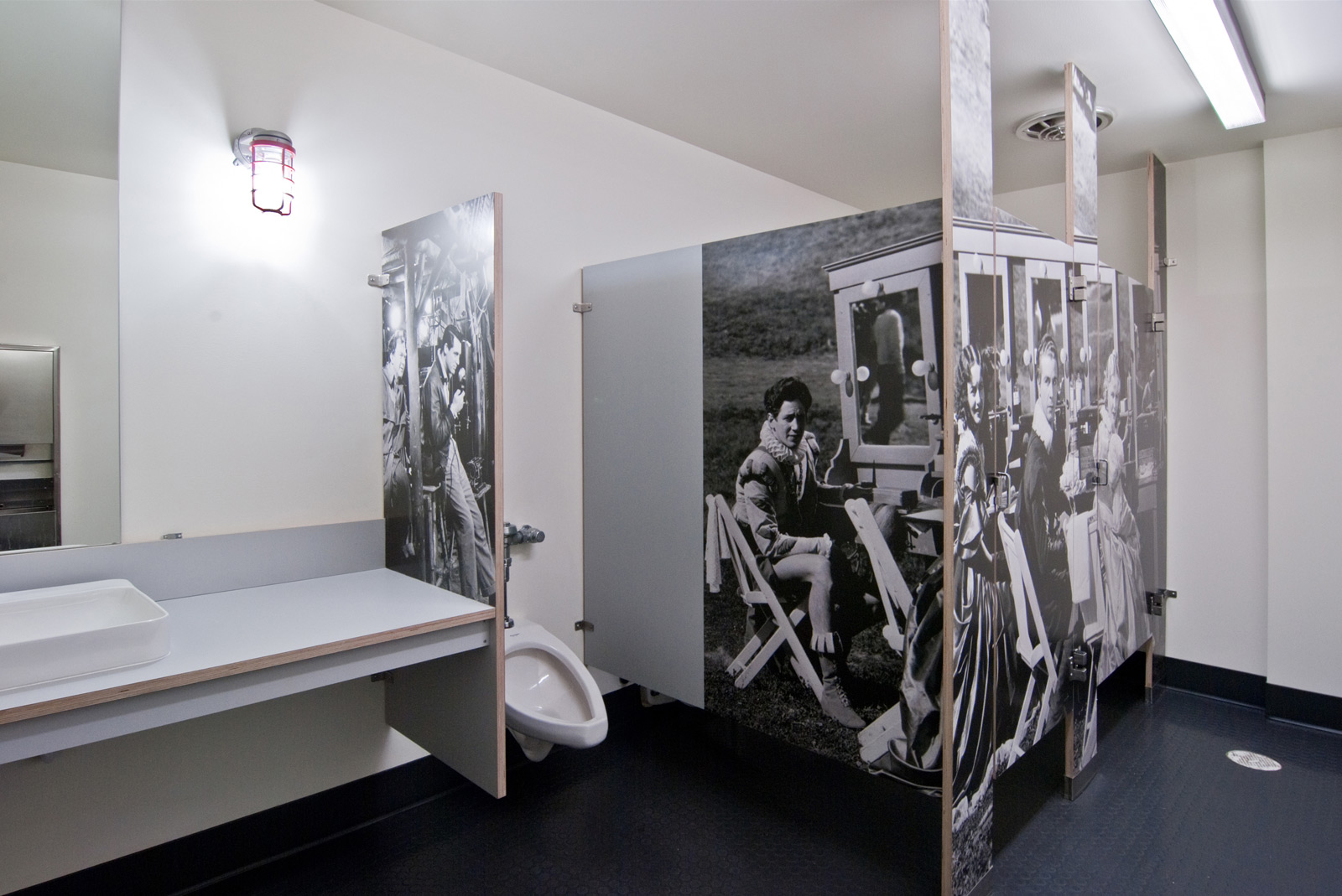
Back in August we posted an article on how to create a cabinet package veneered with graphics (photos, to be specific). We discussed all kinds of technical aspects, included a list of resources and covered what we learned from the process. Since then, we’re happy to announce that creativeLIVE Seattle has been completed. If you’re not familiar with what they do, here’s some cliff notes from their website:
 creativeLIVE is about providing the best free, live creative education on the web. From our studio in Seattle’s South Lake Union neighborhood, we offer free online workshops in photography, video, web and graphic design, app development and a wide array of other creative topics. All of our live creative workshops are available to watch for free in realtime. Once a live workshop is over, we edit the best of this content into easily downloadable files available for purchase through our online store. It’s that simple.
It’s a pretty cool program going on over there and we’re honored to have designed and built the creativeLIVE headquarters. While there are many aspects of this project to cover (like the lighting), for today’s post we thought you might get a kick out of the finished cabinet graphic package.
The graphics were applied in three distinct areas: the kitchen, the men’s bathroom and the women’s bathroom. BUILD and creativeLIVE decided to go big and to got black & white. Here’s why:
1. CreativeLIVE is an arts-driven company. They’re forward-thinkers and this was something that none of us had done before. The attitude was “let’s go on an adventure and see what happens,” and we’re always enthusiastic for those opportunities.

2. The place should have a narrative. We wanted the space to tell a story and the kitchen seemed like a great space to do so. It’s the primary gathering area for CreativeLIVE where the staff, guests and audience have lunch, grab a doughnut and a cup of coffee, and just hang out. The large vintage photo of a classroom lined with diligent students doing arithmetic speaks to the nature of camaraderie, learning and the occasional spitball.

3. They’re truly a fun tribe of people. Fun people have a healthy sense of humor and we all decided that places like the bathrooms shouldn’t be taken too seriously. As a self-referential move, the bathroom stalls were clad with classic Hollywood stars getting all slicked up on the set and in the dressing room. Admittedly, peeing in front of Cary Grant gives you the impression that social etiquette has really gone down the toilet.

4. Plant Easter Eggs to develop exploration. Many of the daily visitors to the space have never been there before. Pleasant little features like the cabinet graphics provide an element of serendipity and surprise around the building for people to discover. Navigating the building turns into curious exploration.
5. Use the ephemeral nature to benefit the design. The nature of a commercial tenant improvement is more transient than most projects (like a house), allowing more latitude with the architecture. The design doesn’t necessarily have to be timeless, it has the freedom to be — dare we say — stylish.
6. Everybody likes learning new things. This includes BUILD, SPD, creativeLIVE and the users of the space. While the process had its own set of unforeseen challenges, it’s always a perk to add another design badge to our scout uniforms.
Huge thanks to the hard working gents down at the Special Projects Division Cabinet Shop and to Blum for cranking out slick, modern cabinet hardware for this (and all of our cabinet packages). Credit also goes out to the Post-Intelligencer Collection, Museum of History and Industry for the school room image and to Magic Murals for the Hollywood set images.
Cheers from team BUILD


