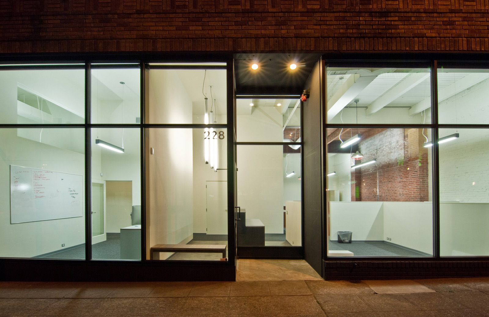
BUILD just completed a commercial tenant improvement (a “T.I.” as it’s known in the industry) for creativeLIVE in Seattle and the process produced some innovative and cost-effective design strategies. Because of the nature of a larger interior scope (~6,500 sf), the fact that the program includes filming and photography, and the rigorous energy code, the lighting package is an important part of this project. With the scale and complexity of a T.I. job, the lighting budget can easily skyrocket. To keep on target, we were diligent in our research and deliberate with decisions; subsequently, BUILD generated a commercial lighting package that’s worth spelling out. Here goes:
COMMERCIAL LIGHTING DESIGN STRATEGIES:
1. Unfortunately, there is a sea of mediocre commercial lights out there. Trying to filter through every commercial lighting website to find the diamonds in the rough can be extremely frustrating and is typically a huge time-suck. We tend to select a handful of brand names known for a modern aesthetic (or at least a non-ornamental, more industrial type of design philosophy) and search these sites thoroughly. Check out the specs below for the brands we gravitate toward.
2. Bare-bones light fixtures are very cost-effective and can be outfitted with custom screens to produce simple modern fixtures that are still less expensive than typical commercial lights.
3. Diagram out the lighting strategy into a set of logistics. On this project we used 3 guiding principles:
REGIONS that contain similar lighting types, usually in a field or grid.
SIGHTLINES that align runs or grids of lights (similar or dissimilar)
DIFFERENTIATE between lights that should only provide light (the fixture should “disappear”) and lights that become a design element (the fixture itself is an important piece of the overall design).
4. Use what you’ve got. Lighting design applies to much more than just the light fixture itself. If there’s a cool existing brick wall to illuminate or an exposed car-decking ceiling to highlight, the lighting package should incorporate these features as part of the design.
5. Keep a lighting “journal” up online so that it’s easy to share and access. There’s tons of websites, Tumblrs and meta-sites online for this. We’ve found that Pinterest is a good platform for us. This way when you’re surfing the web for lights, saving a photo and some quick technical info takes just a few seconds. After a bit of research you’ll have a complete list of everything you like all in one place.
COMMERCIAL LIGHTING SPECIFICATIONS:
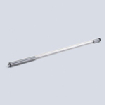 RL70 Fluorescent tube pendant by Waldmann in a metallic finish with hanging bracket
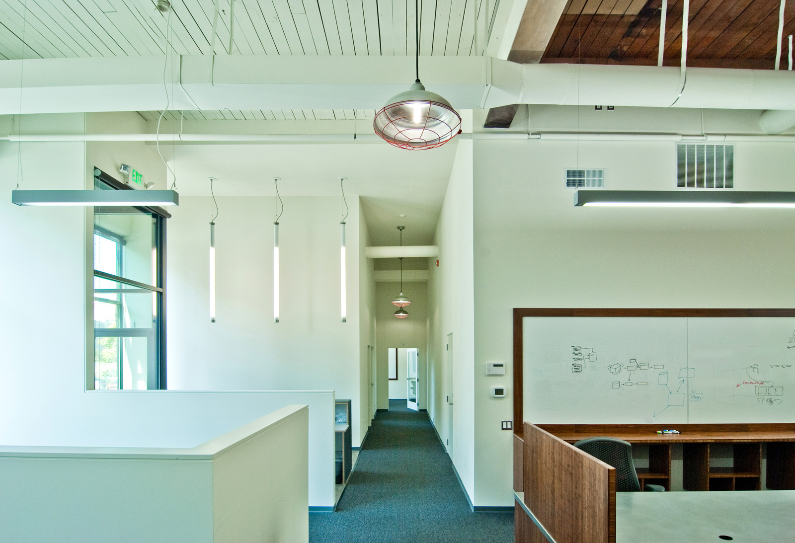
We referred to these fixtures as upside down light-sabers during the design phase and we used three of them at the front entry. They’re not cheap so they should be used judiciously and where they are going to be most seen and appreciated.

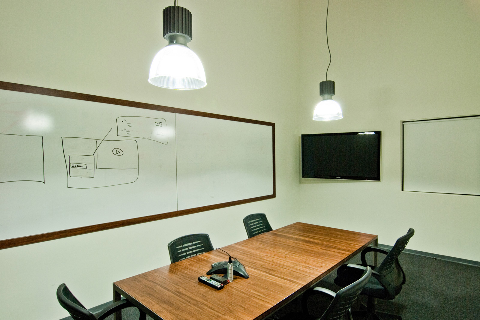
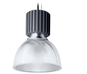 Pendalyte Power Head Gray Louver 404722XU3 by Lightolier (two 26 watt lamps)
These lights are serious business, so naturally we used them at the conference room. They’re on the expensive side of lights spec’d for this project and they’re located where they get the most bang for the buck, up in the front conference room where they light up the storefront.
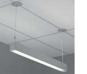 Spectral H-Profile Direct/Indirect by Lightolier in metallic, 4’ and 8’ lengths (T5 lamp up, T8 lamp down)
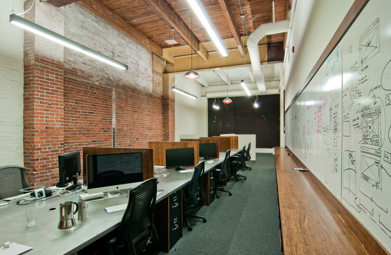
These are the fixtures for general lighting in work areas and private offices. The fixtures are everything they need to be and nothing more (nothing bugs us more than over-design). It’s important to keep these lights in nice straight lines, preferably centered on doors, hallways or other primary design elements. The uplight feature of these fixtures allowed us to highlight the car-decking lid of the original building.
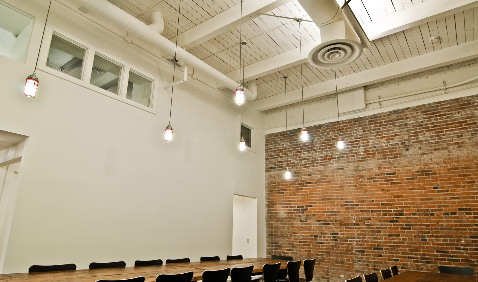
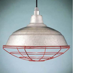 Barn Light Warehouse Pendant 96 Galvanized by Barn Light Electric (26 watt CFL)
The industrial, no-fuss red caged pendant fixture becomes a design feature in this application. The repetition of these pendants makes for nice site lines and the caging is actually quite functional, like when you’re moving large filming equipment around.
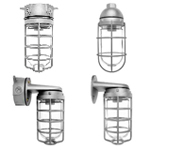 RAB Vaporproof lights
We’re big fans of these lights because they’re durable, cost-effective, exterior rated and have a clean modern aesthetic. They also accommodate compact fluorescent bulbs and do a great job of meeting the energy code. Three of the various mounting options were used on this job: the straight forward VX Box Mount at direct ceiling mount applications, the VP for pendants and the VXBR for wall mount applications. The cages of these fixtures were painted red on-site to match the red caging of the Barn Lights mentioned above.
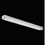 Fluorescent strip lights
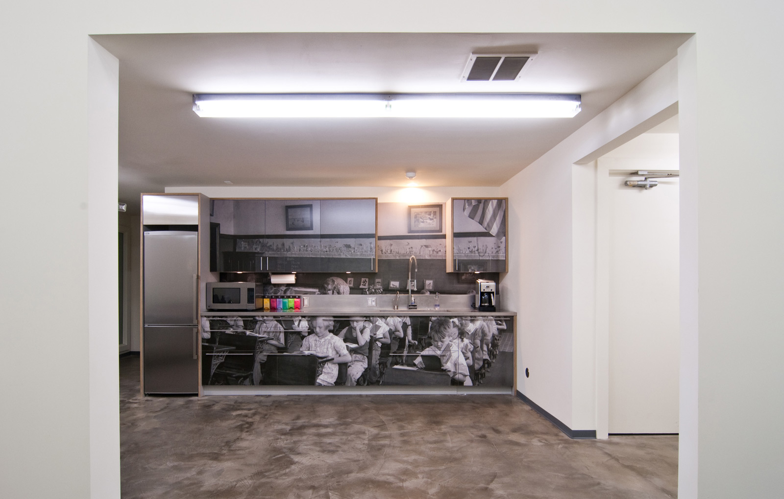
Think of these as bulk lighting; lines of these fixtures illuminate the filming studios, the lunchroom, storage rooms, kitchen, etc. We used the most cost-effective straight-forward fluorescent strip light available and upgraded it with a custom perforated steel housing. The finished look is handsome, modern and very effective –with only a slight decrease in foot candles.
There’s several additional design aspects on this project to cover and we’ll have more posts on CreativeLive to come, stay tuned. There’s more photos on our website and you can always get the behind the scene look on our Facebook page.
Cheers from team BUILD


