The BUILD research team is currently in sunny Phoenix Arizona and we thought we’d do a blog or two while we’re on the road. While Phoenix is mastering the art of sprawling beige suburbs, it does have its architectural gems. The beauty of actually being here and taking the shots is that we can get up close and personal with these buildings – so for today’s post we’ll be looking at some hot, modern details.
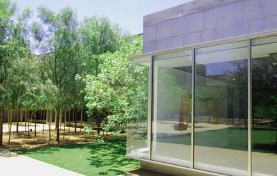
Scottsdale Museum of Contemporary Art
Few museums explore such masterful architecture while maintaining an intimate and personal scale. With a design dream-team of Will Bruder, James Carpenter and James Turrell, SMoCA is an exceptional place.

[photo by BUILD llc]
The original stucco box by architect Bennie Gonzales in 1975 is painted a dark eggplant; the new glass and steel addition become the focus.


[photos by BUILD llc]
The envelope is a simple but serendipitous skin of galvanized metal panels and stainless steel panels. The organization and geometry of the panels seems rational and poetic.

[photo by BUILD llc]
The “lantern” designed by James Carpenter includes angled etch-matte glass sheets with joinery of dichroic glass spacers. The assembly creates colorful light shards on the ground and leads visitors to the entry.

[photo by BUILD llc]
It is nearly impossible to be in a James Turell skyspace space with a camera and not take a disgusting amount of photos. Our advise – leave the camera in the car and just enjoy the space.

[photo by BUILD llc]
Phoenix Art Museum
The museum interiors and sequence of spaces are pleasing; however it is the building corners that produce that extraordinary element of surprise.

[photo by BUILD llc]
At most of the structure’s corners, behind discrete fin walls (which protect the art from the natural daylight) there are light filled glass apertures of varying sizes. Most of these quiet, light filled spaces contain chairs or a sitting bench for rest and observation. The museums outdoor gardens and courtyards can be viewed from these glass perches.


[photos by BUILD llc]
The Hotel Valley Ho
The original architect, Edward L. Varney, used a clever design of pre-cast concrete panels for the guardrails. These modules establish an ornamental repetition around the perimeter of the hotel and cast shadows that become important to the façade.


[photos by BUILD llc]
It’s a clever method in that it consumes the viewers attention – you don’t really notice that the actual envelope of the building is just painted brick and cmu block.

[photo by BUILD llc]
The concrete panels are attached with tube steel – this tube steel also creates a uniform guardrail height to meet the building code.

[photo by BUILD llc]
Pre-cast concrete panels also wrap some of the more prominent columns at the interior and exterior.

[photo by BUILD llc]
The rooms have been updated with clean, playful mid-century modern interiors. The stainless steel Seiho vent plays a role in the design aesthetic as does the etch-matte corner window around the bathtub.

[photo by BUILD llc]
More info about these projects can be found on our earlier post: Modern Tour: Arizona + New Mexico


