[Image Credit: BUILD LLC]
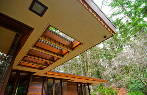
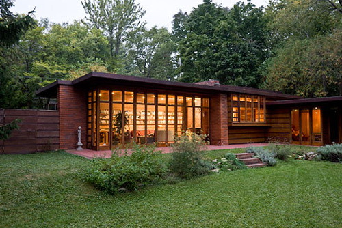
A couple months ago, we wrote a blog post about a Usonian home located in Western Washington designed by Frank Lloyd Wright. We had the rare opportunity to tour the home, and recently a similar opportunity arose. Last weekend, BUILD was fortunate enough to check out another local Usonian project, the Brandes House, located just west of Seattle in Sammamish, Washington. On this recent visit, we got to thinking about the context surrounding Wright’s pursuit of this democratized form of architecture, which only came to fruition in the later part of his career.


The Usonian Homes emerged out of Wright’s ideas explored in Broadacre City, Organic Architecture, and his longtime interest in designing affordable housing on a massive scale. The term Usonia was adopted because it was seen as a more appropriate term to reference the United States than “America,” and it reinforced the idea of a newness in “American” life and culture. Though the word clearly didn’t take off in the way some anticipated, it has nevertheless become a term loaded with significance in the architectural world.

[Image Credit: New York Times]
The first Usonian was built in 1937 on a dare. A friend challenged FLW to design and build a home for $5000. After Jacob House I (above), Wright went on to build more Usonians in the proceeding twenty years. These post-depression homes re-evaluated the necessities versus the luxuries of the single-family home. Gone were the servants quarters, roomy bedrooms, and large kitchens. Extraneous volumes like basements and attics were excluded as well. In this new model, Wright instead manipulated the compact houses by compressing/expanding volumes with strategic wall and ceiling placements. And what these homes lacked in sprawling square footage, they made up for in their connection to the exterior surroundings of the home — both visually and physically. The use of uninterrupted corner glass and direct terrace access make an otherwise miniscule bedroom feel less confining.


[Image Credit: Seattle P-I]
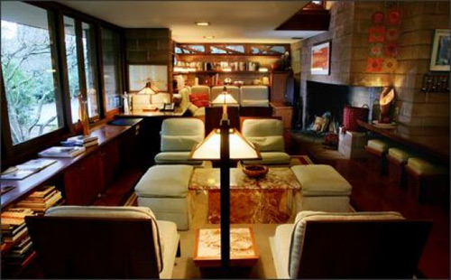
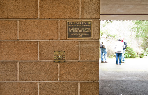
Materials used were simple and locally sourced. This accomplished both the need to keep costs down and the desire to have these homes feel like they belonged within their surroundings. The otherwise spartan concrete blocks at the Brandes House possess a natural rose tint and the walls are tapered with a stepped block pattern at key locations. This achieved two things: it made the building appearing to be emerging out of the ground at the exterior, and it created a cozier volume at the interior, at living room where the seating and fireplace are located, for instance.

[Image Credit: Seattle P-I]


The ultimate goal was to create a comfortable home for a mid-century middle income family while executing a thoughtful, modern design. The constraints of economy didn’t automatically disqualify quality nor beauty. It instead set a different departure point based on efficiency. The seas we’re navigating today aren’t far from what Wright faced in his days, riddled with their own post-recession design challenges. Quality modern architecture and affordability are commonly seen as mutually exclusive qualities. We don’t necessarily believe this to be the case, even today. Modernism ought to be accessible and reproducible, and we’re exploring the possibilities of connecting those dots at present. Stay tuned for more dialogue, design, and building on this front.

Big thanks to Larry Woodin for setting up these tours. We look forward to the next one.
Cheers from Team BUILD


