[All photos by BUILD LLC]
The volume of space an architectural project uses up in the built-environment is important on many levels. The surrounding context is full of significant considerations, like the relationship to neighboring structures, the pattern created by a row of houses along the street and the approaching view corridors. There are variables between the volume of the structure and the site itself, like whether the house maximizes the zoning footprint and the extent of connection to the surrounding landscapes and hardscapes. The volume has direct results on the experience of the architecture itself and affects the quality of the spaces within. It can be a difficult task “carving out” the massing of a project while keeping all of these factors in mind.

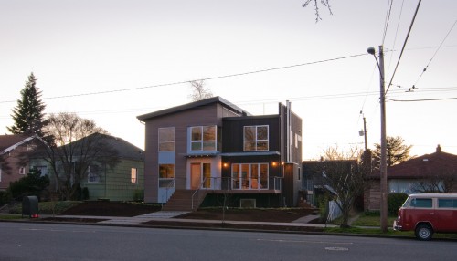
We recently finished up a residential project that involved many of these issues at a heightened level. The project is located in a well established and relatively dense neighborhood (for a single family zone) on top of Seattle’s Queen Anne hill. The finished result responded to each of the factors discussed above –filtered through the modernist philosophy. Today’s post reviews our thinking and design-decision making process on the project (and there may be a bit of post-rationalization in there too).
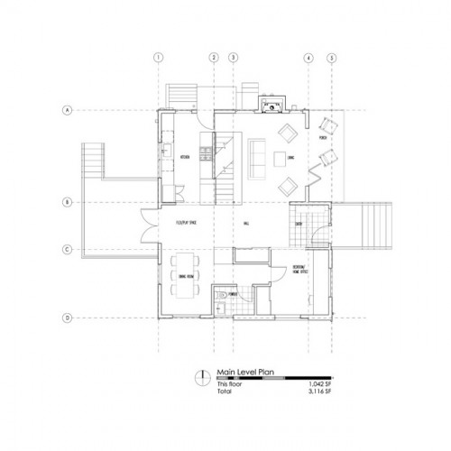
The concrete foundation of the existing home was maintained for a variety of reasons. It makes the construction much more cost-effective, it keeps the new home to a tidy footprint and it maintains the original sense of scale within the neighborhood. The basement is just a bit over 1,000 square feet which, multiplied by three floor levels, is plenty of space for the homeowners and their two children. Rather than expand out, the idea was to use what is already there and expand up.
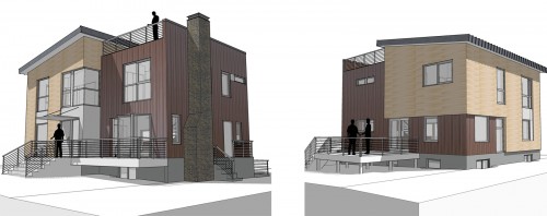
The neighborhood is a mix of housing styles -weighted toward craftsman style bungalows. In response to the smaller scale of these bungalows, the design of the home alleviates the overall massing by separating the home into two distinct parts. The two volumes are further differentiated with their siding applications: horizontal cedar with a light gray stain on the left and vertical cedar with a dark gray stain on the right. The visual creates a more granular massing and helps the new construction relate to the scale of its neighbors.
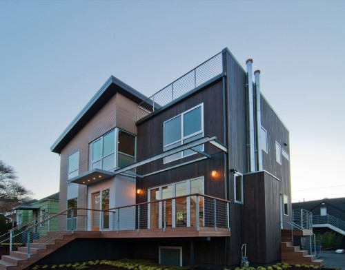
While the scale of the home takes cues from its context, the level of transparency does quite the opposite. We’ve always found craftsman architecture to be dark and dreary inside, with little connection between interiors and exteriors. From the start, we wanted to create a high level of transparency for the home; this was achieved through large panes of glass and operable accordion doors. During the day the house has a strong relationship with the yard and adjacent decks. At night it becomes a glowing beacon from the adjacent view corridors.
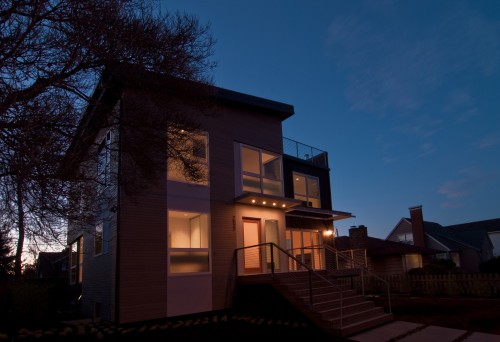
Queen Anne is a walking neighborhood and a family neighborhood. During construction we were constantly amazed at how many people walked by the home on an hourly basis, many of them stopping to chat. To a greater extent than most of our projects, the front of this home plays an important role as a gesture to the pedestrian realm. Without jeopardizing the family’s privacy, we wanted the design to be warm and welcoming toward the sidewalk. Our interpretation of the modern stoop greets visitors and allows the homeowners to hang out and chat with neighbors.

Inside, the home benefits from direct relationships to adjacent outdoor spaces. Large doors allow interior spaces to open up and take advantage of outdoor spaces when the weather cooperates. Integral canopies screen the sun and keep the rain at a distance.
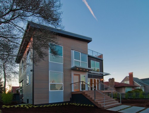
In many ways the home draws on the characteristics of the traditional bungalows that populate this neighborhood. A modern interpretation of these characteristics allows for a home full of lifestyle opportunity and connection with the neighborhood –all wrapped in a crisp, modern design.
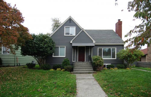
[Existing Home]
Cheers from team BUILD.


