[All photos by BUILD LLC]
With the recent completion of the Fremont View Apartments (FVA) and their entry onto the rental market, it’s an ideal time to review the interior material palette and the strategies behind its selection. One of the most notable design influences for FVA’s 29 units is the variety of layouts, created by the unique stacking of floors along the southern-facing hillside. This Tetris-like arrangement resulted in 19 distinct unit configurations, including studios, open one-bedroom units, one-bedroom, two-bedroom, and three-bedroom apartments. Given this built-in variety, the design team felt it was essential to apply a clean, cohesive palette to the interiors. Reflecting on the project, five key strategies contributed to the successful final result.

[All graphics by Column]
1. Engage a branding and graphic design team early in the process.
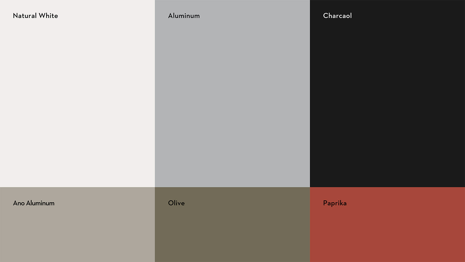
Selecting the right agency and beginning the design work early is essential, as the design DNA they establish will guide numerous decisions moving forward. We collaborated with the innovative team at Column and couldn’t be more pleased. They contributed a curated color palette (shown above) and a refined graphic design language (below) that permeates every detail of the project. Establishing the brand system at the project’s outset allowed subsequent design decisions to flow smoothly, supported by informed expertise.

2. Let the structure play a role
Due to the construction type and assembly methods, the FVA building features several concrete floors and ceilings. A core design philosophy at BUILD is to showcase the character of intriguing materials rather than covering them up, allowing them to enhance the final product. Exposed concrete floors and ceilings are prime examples, and many FVA units feature polished concrete floors, panel-formed concrete ceilings, or both.

3. Identify a Timeless Material Palette and Maintain Consistency
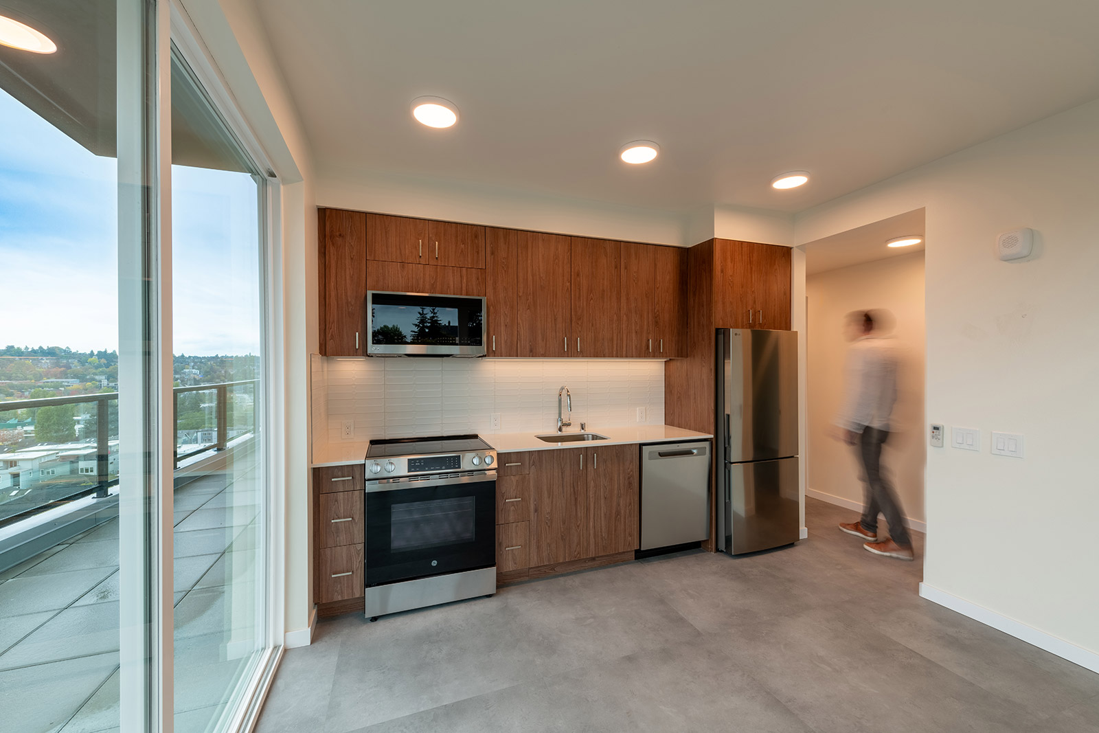
Given the variety of unit layouts, it was essential to create a cohesive interior aesthetic throughout the project. Additionally, the team aimed to future-proof the design, avoiding fashion-driven trends that could lead to costly remodels in the coming decades. This approach led to a timeless material palette, thoughtfully selected to support the building’s achievement of a 4-star Built Green certification.

The material package includes walnut cabinets from Abodian with Richelieu stainless steel pulls, White Sand countertops by Saxum, and low-VOC 36” x 36” vinyl floor tiles by Mohawk Group (in units without concrete floors). Polished chrome faucets from Delta and Moen, along with a stainless-steel appliance package featuring GE, LG, and Summit brands—sourced from Metropolitan Appliance—complete the interiors.

4. Go easy on the embellishments
A well-curated, disciplined material palette allows for a few embellishments, but these must be carefully chosen to avoid overshadowing the overall design. This approach is exemplified in the kitchen tile backsplashes, where matte white Paddington 4” x 16” wall tiles from Portobello add just the right touch of character and playfulness to the kitchen design.

5. Hack the product
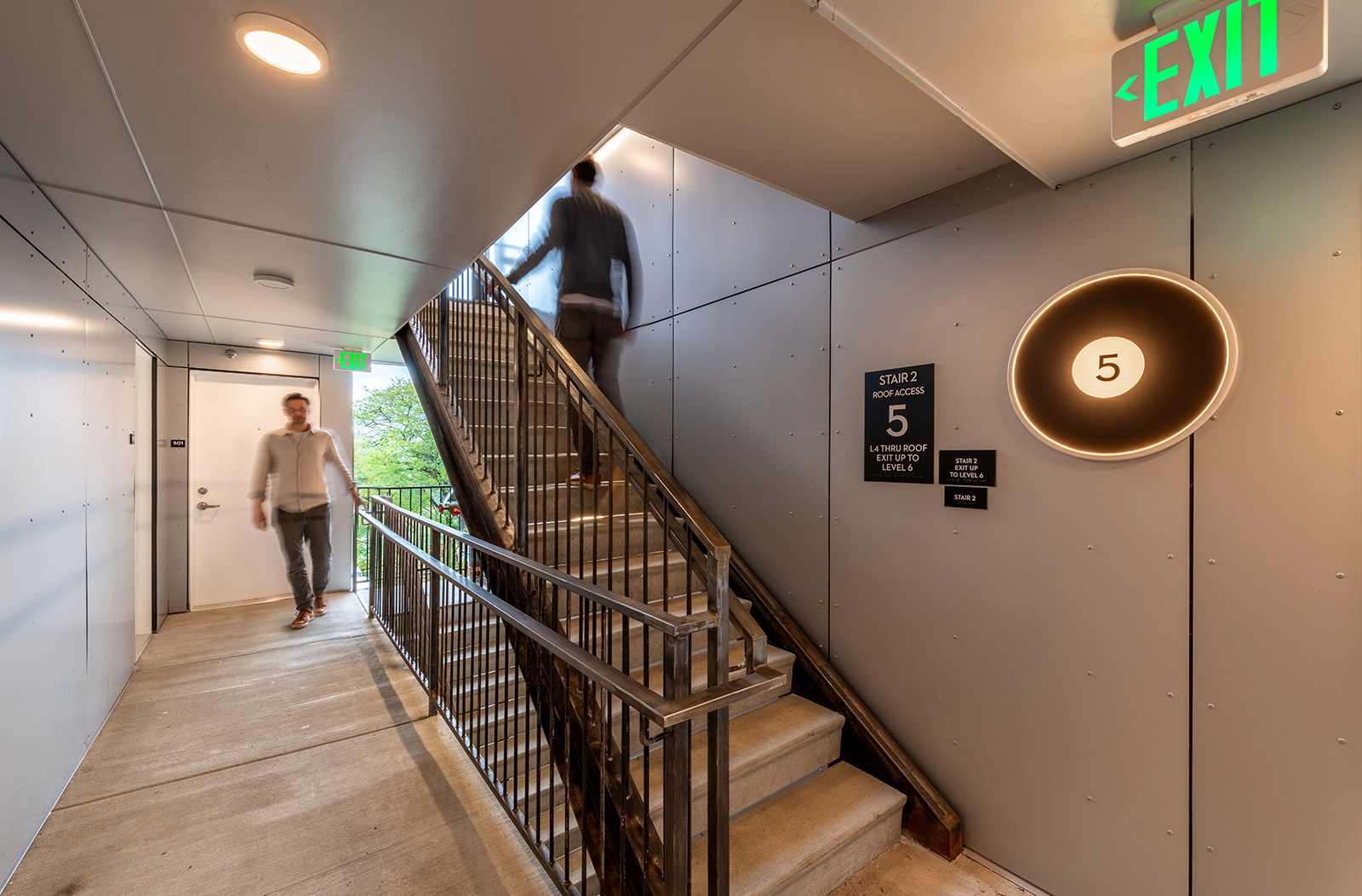
With eight levels and two separate entrance floors, wayfinding is essential at the Fremont View Apartments. To address this, simple, cost-effective 22” diameter LED disk lights were installed on each level and customized with black stickers displaying the floor number. This approach not only enhances navigation but also reinforces the branding package, adding a unique touch to the common areas.

While numerous aesthetic strategies and design techniques are employed throughout the Fremont View Apartments, these five stood out as the ones that most effectively enabled the development, design, and construction teams to make efficient decisions and deliver a thoughtful, inspiring result. Many more photos of the completed project are available here—stay tuned for additional coverage of this building.
Cheers from Team BUILD


