 KUGGEN, photo by Tord-Rikard Soderstrom
Back in 2014, BUILD met with Swedish architect Gert Wingårdh at his Stockholm headquarters to discuss his impressive roster of forward-thinking public and commercial designs. With completed projects in Scandinavia, Northern Europe, and the US, Wingårdh has designed work ranging from embassies and university buildings, to shopping malls and air traffic control towers. BUILD and Wingårdh discussed the design of golf clubhouses, how to keep your clients happy, and what it means to be a maximalist. We hope you enjoy this interview from our archives and part 2 can be viewed here.
What have been the most important career moves you’ve made in order to secure the large public projects for which you’re known?
The most important factor is that we have not disappointed our clients, which means that we still work with many of them after 20 years; building trust and keeping clients has been key for us. This focus on client relations even applies to projects that may not move forward. For instance, we won the stadium design competition for Stockholm’s 2004 Olympic Games, and although Stockholm lost it to Athens, we created good relationships with Swedish politicians and civil servants that benefitted us later on other projects.
How do you determine whether a potential client is a good fit with your office?
It’s great when a client is an end user of the project, as they’re building something that they will eventually use. Anytime we have had a bad experience, it’s typically been because we were working for a third party—a builder or developer who puts the finished product on the market.
What strategies work best for engaging a client in the design process?
Being very open. The best relationship between a client and an architect is one in which each side respects and learns from the other. It’s about showing mutual respect and thrilling a client with ideas that grow from what they originally gave you. We say that we always want to give the client what they didn’t know they wanted. But in the end, the design should still be what the client desires, not the architect.
You are known for breaking away from the highly functional “international style” in the 1980s. What were your reasons for doing so?
First, I think breaking away from the establishment is a very typical thing to do in one’s twenties. Secondly, I started studying architecture in the early 1970s, when Europe was living through post-1960s movements that were quite radical. In Sweden, this meant that as an architecture student you were not supposed to be studying form and proportion or making reference to any great architectural heroes. Rather, you were supposed to be on the work floor, considering the life of the workers, how to lay factories out or manufacture goods.
I was very intrigued by Venturi, Izenour and Brown’s Learning from Las Vegas, and I developed an awareness similar to the pop artists of the time. For me, reading through it was like browsing through a book on Richard Hamilton or Robert Rauschenberg. Then I read Complexity and Contradiction in Architecture, which is also very persuasive. I thought the idea of “double coding” so that a design has something to offer the layman and the Harvard architect was brilliant.
Did you visit Las Vegas thereafter?
Yes, I absolutely hated Las Vegas, and I’ve never felt any desire to return. But I had many positive experiences elsewhere in America.
Can you explain your thoughts on being a “maximalist” or practicing a kind of modern Baroque?
I started out studying art history and gravitated to the work of Francesco Borromini for his manipulations of classical architectural forms and his geometric vocabulary. The Baroque mindset was very intriguing to me, and I felt a similarity between this and Venturi’s argument about the decorated shed, as both made use of exaggerated geometries and architectural exuberance.
How did your studies benefit your work?
The early teachings of my art history education were the most important to me. The idea that architecture could be considered art was central to my learning. I was fascinated by how an art historian could read the horizontality of a Frank Lloyd Wright project, or make connections between Corbu’s spaces and Cubist paintings. Writings on these subjects had a tremendous influence on me, as did the early essays by Peter Eisenman and Michael Graves in Oppositions magazine. I always enjoyed looking at their plans and reading the underlying arguments.
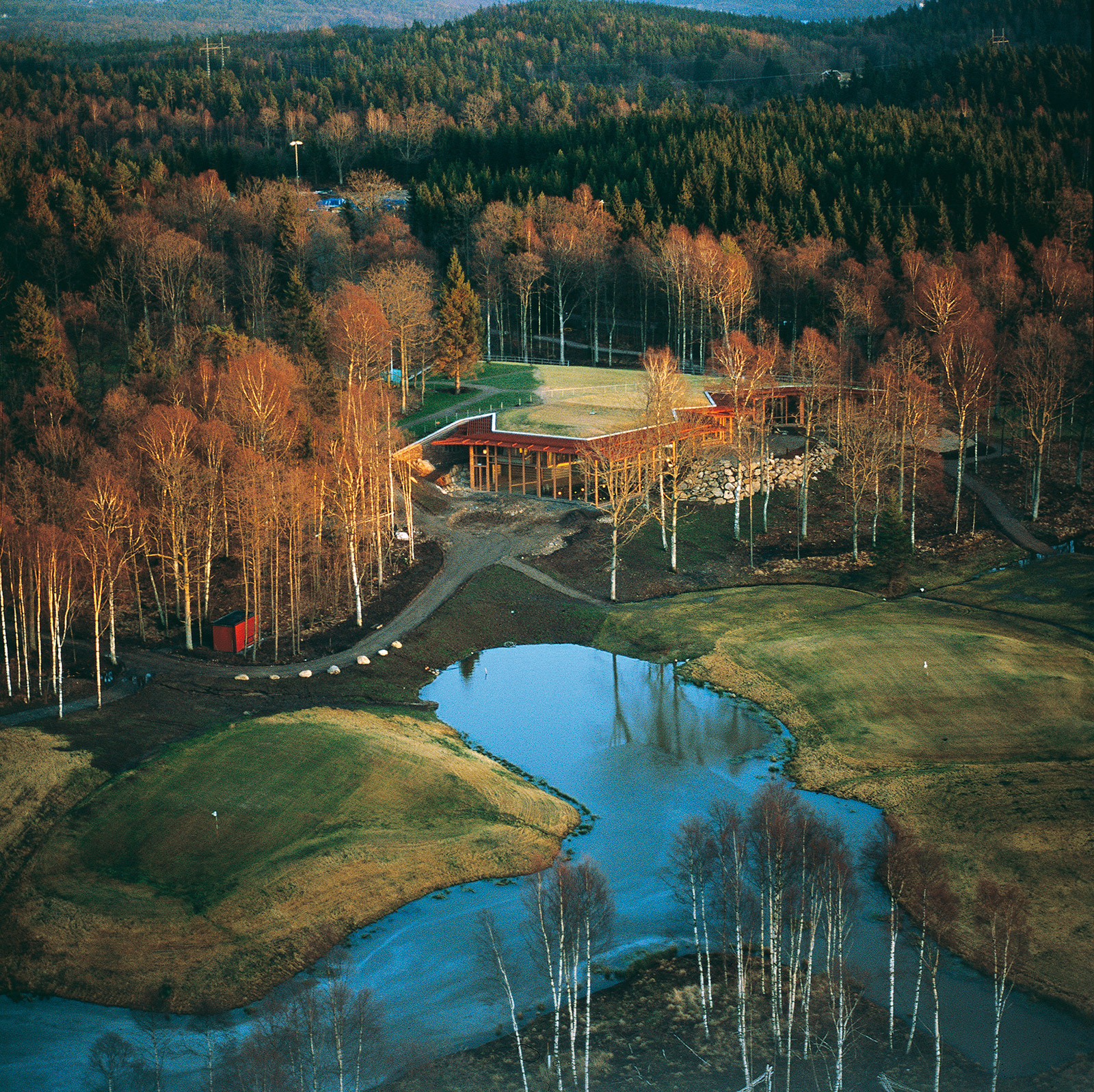
The entire structure of the Oijared Golf Clubhouse hides discretely underneath the course’s turf, and the interior establishes a design-forward aesthetic, which couldn’t be further from the look and function of an American golf clubhouse. What was the design process like on this project?
This was my first true commission beyond interior projects. I was in business for nine years before this client walked in and said he wanted a golf course clubhouse that was also an art museum. He said that he wanted the clubhouse to be as interesting as the Louisiana Museum of Modern Art in Denmark. I wanted to do the project in line with nature, and the design was influenced by Emilio Ambasz because his buildings are often covered in turf and appear to melt into the landscape.
One of the challenges was that the first tee was on top of the roof; we didn’t want to have a railing and yet we had to prevent people from falling off the building. We were influenced by the deck guards of horizontal netting seen on aircraft carriers. This trellis structure was laid out on overlapping 15-degree angle grids and is a bit complicated. The building was well received and stood out because it paid attention to detail. Wingardhs received Sweden’s highest architecture prize for this building that year, and it essentially established our firm and we went on to win additional competitions.

OIJARED GOLF CLUBHOUSE photo by Stefan Hallberg
Was it intimidating to get a project of this scale as your first commission?
No, it was not intimidating—in fact, to my mind it was long overdue. Architecture is a persistence game, and you have to be at it all the time in order to get opportunities. At that stage in my career I was young, hungry, and I was ready to do something important.
How did you get a project like the Arlanda TWR flight control tower for the Stockholm airport?
I.M. Pei turned the project down and the Stockholm airport opened up the design to an international competition. We competed with a number of firms, including Aldo Rossi, and we won.

Left, ARLANDA flight control, photo by Ake Eson Lindman; Right, KUGGEN, photo by Tord-Rikard Soderstrom
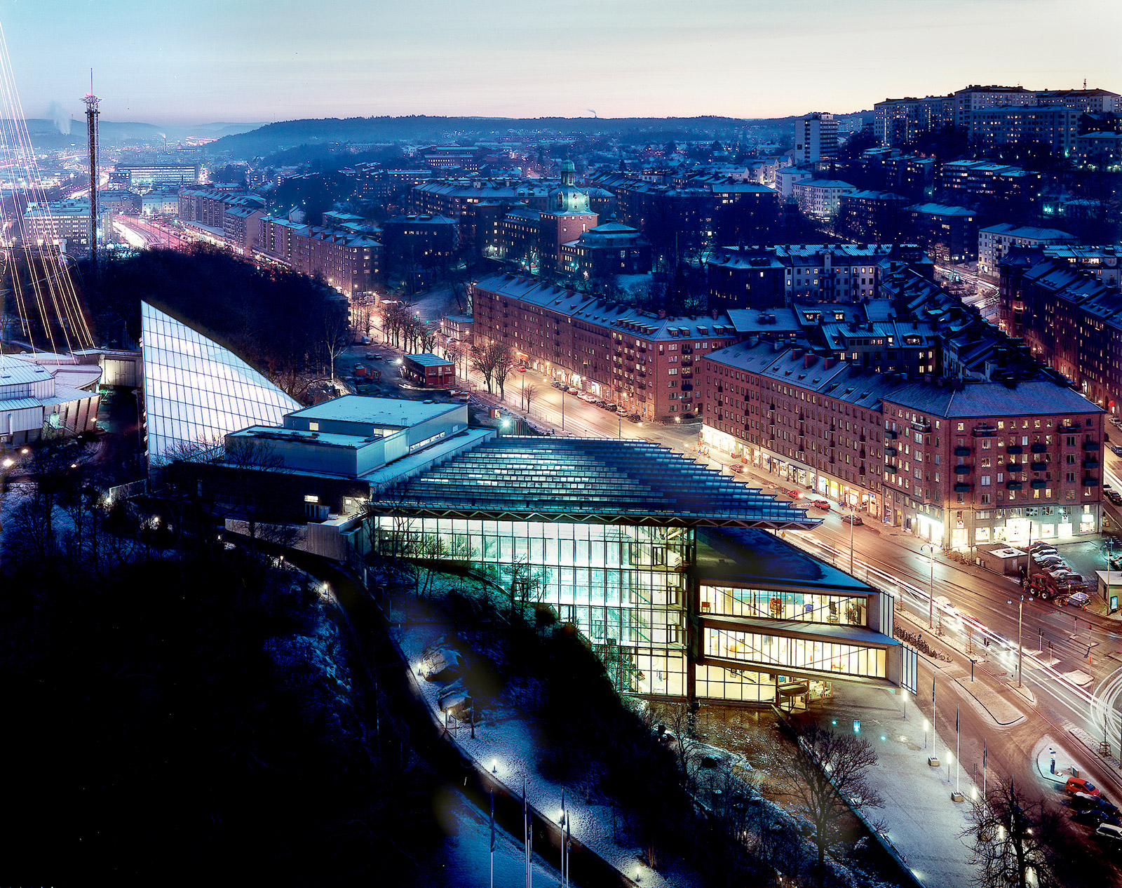
How did your design process shape the highly expressive Kuggen building in Gothenburg, Sweden?
The clients were greatly influenced by the Stata Center on the MIT campus, which was designed by Frank Gehry. They said that they couldn’t afford a Gehry and asked if we could produce a Gehry on the cheap. There was an existing courtyard on the site and strong winds made it unpleasant, so the client requested a kiosk-like building that could be inserted inside the courtyard to reduce the wind-load and create a meeting place. The design evolved into a series of meeting rooms arranged like the petals of a flower, and the plan used staggered floor plates. The design turned out to be very rational, as it progressed from something free form to something very concentrated.
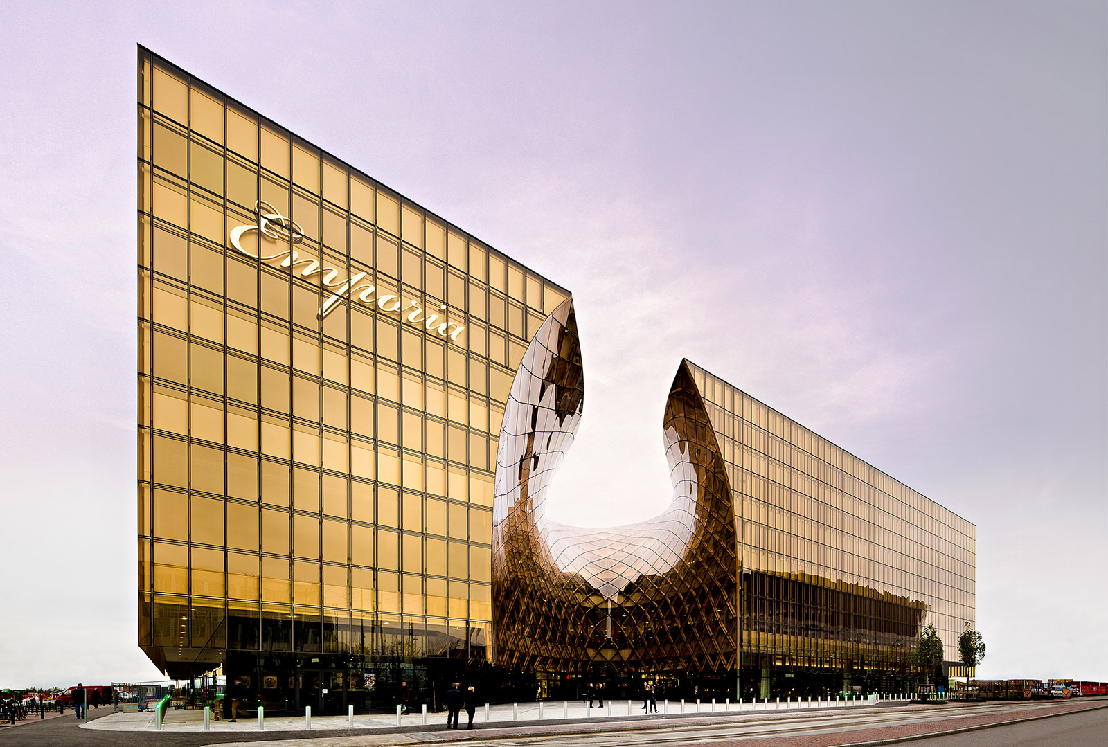
How did your design for the Emporia shopping mall in Malmö develop?
The first strategy for shopping malls in Sweden is to try and hide the building. The second strategy is based on the fact that people lose interest in malls that all look like each other. The third strategy is not to use strong colors because they draw attention away from the shops. For the design of Emporia, we decided to differentiate it by doing something contrary to other malls. We contended that we should use strong colors because that would distinguish this building from other malls, and we won the day with this argument.

EMPORIA, photo by Tord-Rikard Soderstrom
The building for the Universeum in Gothenburg, which you designed, is a resource for science education, but the structure itself seems to teach a great deal about architecture. What do you hope people take away from the Universeum architecturally?
There is a tremendous amount of transparency in the building: if you push an elevator button, you will see the mechanics moving and you can see the ductwork. The exposed wood structure is also very self-instructive, as the viewer can see and understand the structural systems. In preparation for designing the building, we toured many science centers throughout Europe. We were often told that no matter what you do, you should plan on remodeling a portion of the building at some point because you never know which exhibits will be most important. That led us to choose a wood concept so that the building could be easily modified in the future without undergoing a major remodel. This adaptability translates into the built form and communicates itself to visitors in revealing where things have been modified over time.

UNIVERSEUM, photo by Ulf Celander
Is it important for your buildings to have a narrative?
Yes, but you never know which came first: Did you have the narrative when you started the design, or did the story develop as the building came together?
What advice do you have for young architects?
Stand your ground as an architect. You will become educated, and you will become an expert in architecture. When you meet people opposed to your design ideas, you should feel assured that you actually are the expert on the subject. You should carry the day with your argument for a design solution.
 Gert Wingårdh studied economics, art history and architecture in the 1970s at Gothenburg University and Chalmers University of Technology in Sweden. He founded his firm in 1977 and now employs a staff of 175 in Stockholm, Malmö and Göteborg, Sweden. The award winning practice specializes in architecture, urban planning, interior design and landscape planning. Wingårdh has completed projects across Sweden as well as internationally with design competitions representing a large part of the office’s business operations.
Photo by Jacob Karström


