[Photos by Andrew van Leeuwen]
For the initiated, the architectural pilgrimage is part design passion, part field research, and part recharging the creative batteries. There’s also the occasional fourth component of bragging rights, depending on how far the traveler(s) had to drive, train, bus, or walk. The tone for the architectural pilgrimage is typically set within academics, where it’s important to shift focus from books to actual buildings via group field trips. After college, and in the profession, many keep the ritual alive—whether these pilgrimages become trips in and of themselves, or whether it’s a matter of dragging friends and family a few miles off course during a road trip to check out an architectural masterpiece.
For the uninitiated, those outside the design ecosphere, the architectural pilgrimage may seem absurd. Wait, you spent six hours traveling just to see a building?! You climbed over a fence and trespassed to experience a courtyard?! Really? Countering these perfectly rational questions, the architect typically responds with something about it being a Louis Kahn. Who? And such is the struggle for we architects to properly convey the gravitational pull of visiting an important piece of architecture in the built environment.
The fact of the matter is that there’s a depressing abundance of mediocre and thoughtless design in the world, and architectural gems give us hope. For many, these works reinforce that our studies weren’t for not, and that there is extraordinary design to achieve if you’re willing to work for it. For others, these pilgrimages are reconnaissance missions to learn and gather from the masters—there is no book that documents great design as magnificently as the one-to-one scale model. And for others still who are just along for an adventure, with any luck they will have a good story to tell. We’ve traveled far and wide for all of these reasons, and now a few years out of college (er, decades), we work in these architectural pilgrimages when we can (and as our friends, partners, and offspring will tolerate).
Last summer we made a needed pilgrimage to the Mount Angel Abbey Library—one of only three buildings in the United States designed by the Finnish master architect Alvar Aalto (1898 – 1976). Just 10-miles off Interstate 5 in Benedict, Oregon, the bucolic approach winds through a landscape dotted with family-operated wineries and breweries with monastic roots. Turning into the Abbey gates and climbing the hill, statuaries march along the path and allude to something extraordinary. These 14 Stations of the Cross deliver the visitor to a grotto at the top of the hill, and from here the Abbey unfolds. Winding through the campus, the library is discretely tucked into a circumference of Romanesque architectures.
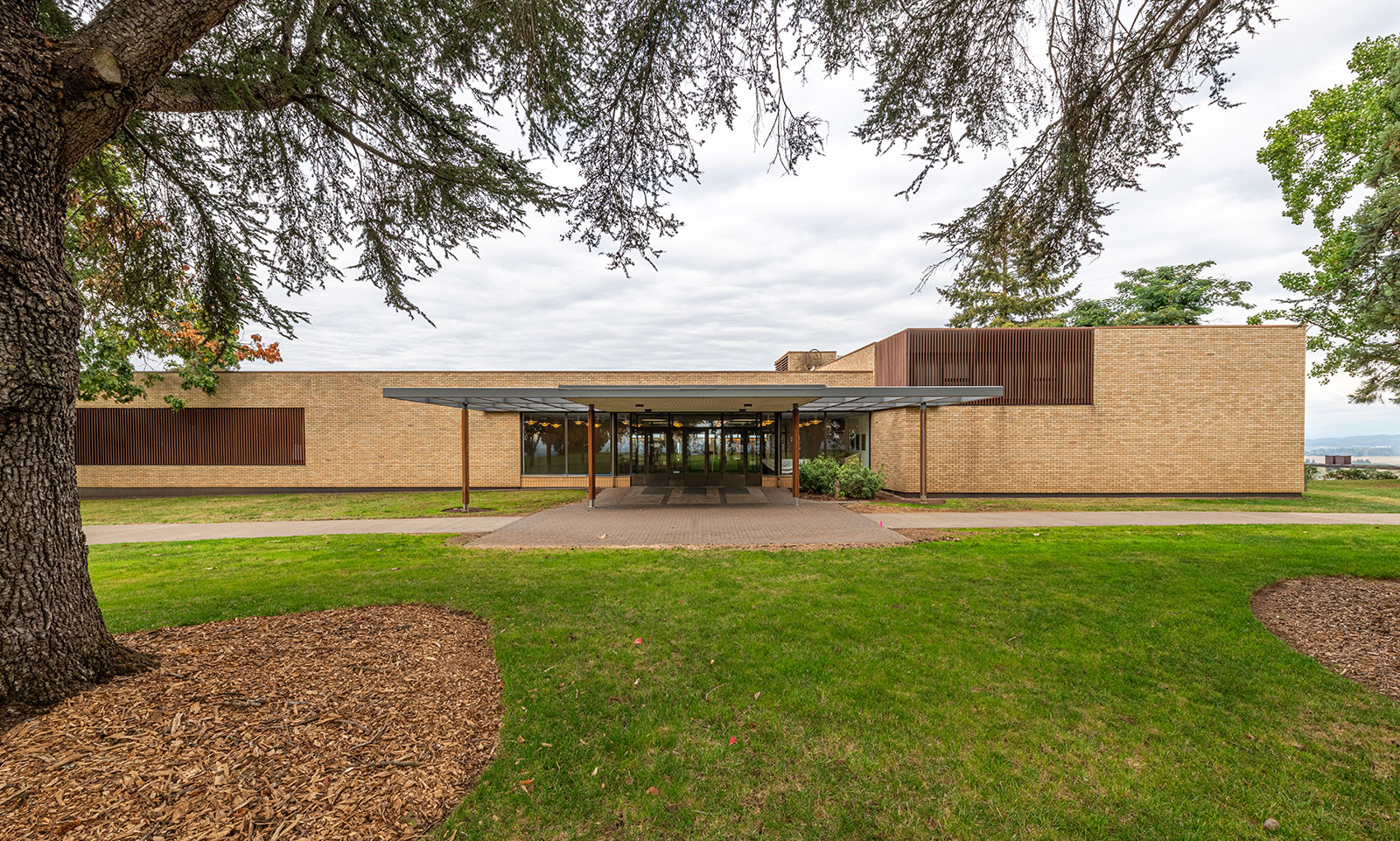
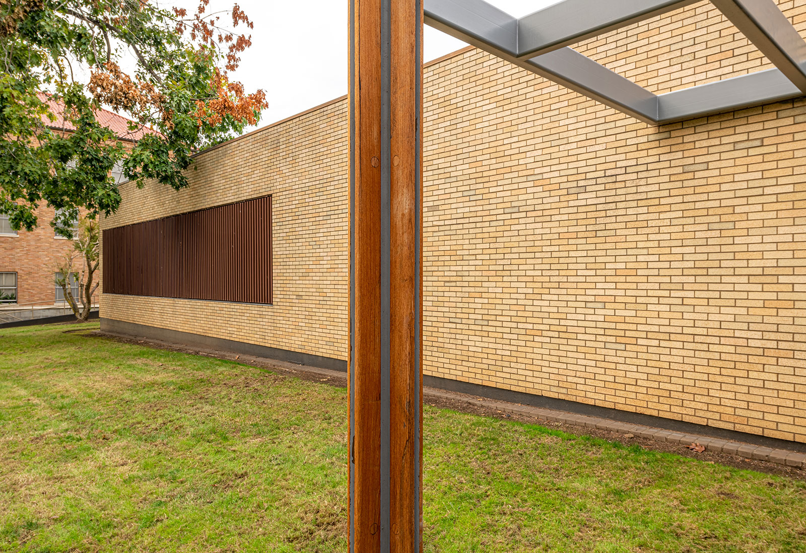
Without interfering with the other structures or demanding attention, the front elevation of the library asserts itself as a product of modern design. Unadorned expanses of brick are notched at just three locations: the building’s entry, and two window bays overlayed with wood screens. A long, sleek entry canopy, held up by four attenuated steel and wood columns invites visitors into the vestibule.
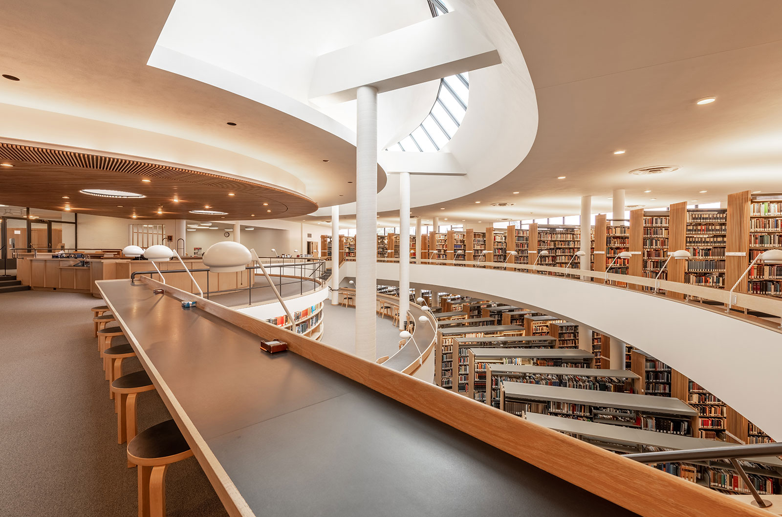
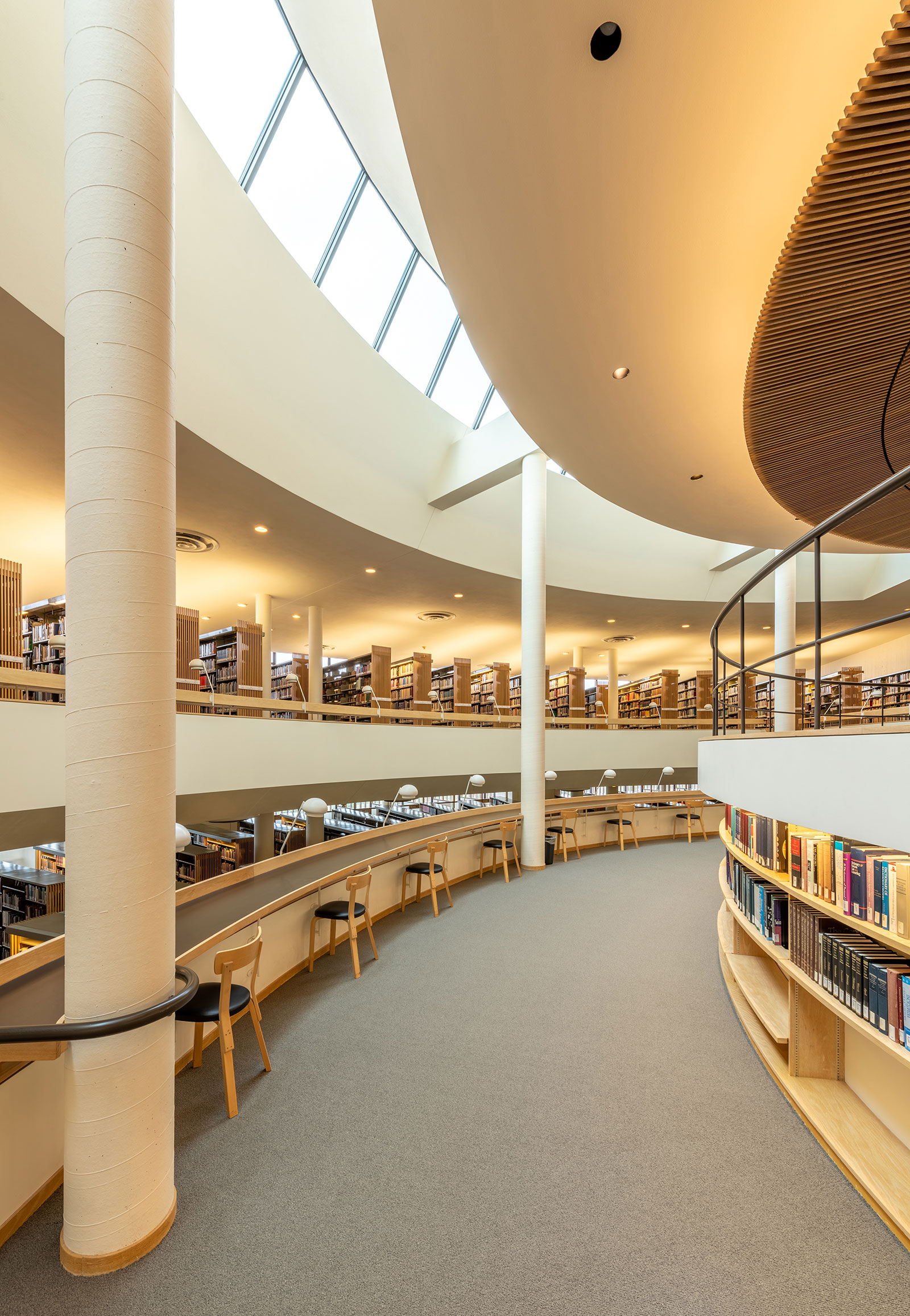
A low entry vestibule then leads to the library’s reception desk, and the epicenter of the structure’s geometry. From here, the compressed entry and reception spaces open magnificently to the light-filled volume of the collection and circulation spaces. An arced slice at the ceiling allows light to flood into the building and wash each surface with a subtle, warm glow.
A quick study of the architectural drawings suggest that the circular rings extending outward in plan are slighting skewed—a move requiring the wit and confidence of a master architect. It’s rumored that the original architectural drawings remain on-site, and are sometimes available for view.
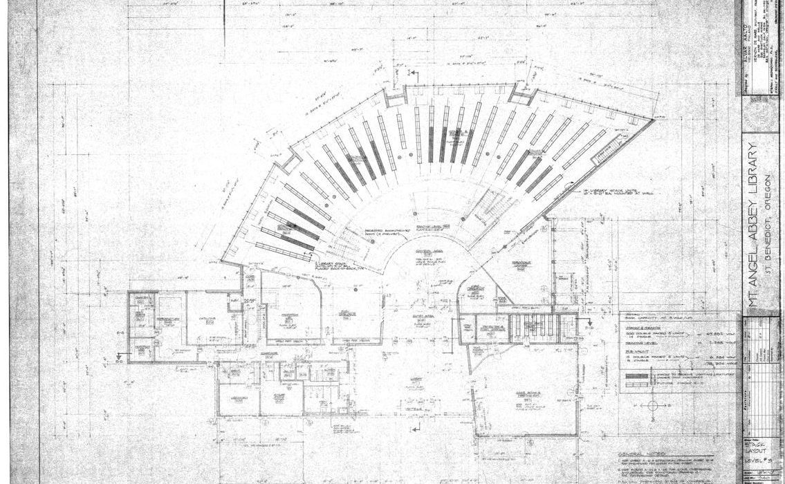
[Drawing courtesy of Mt. Angel Abbey]
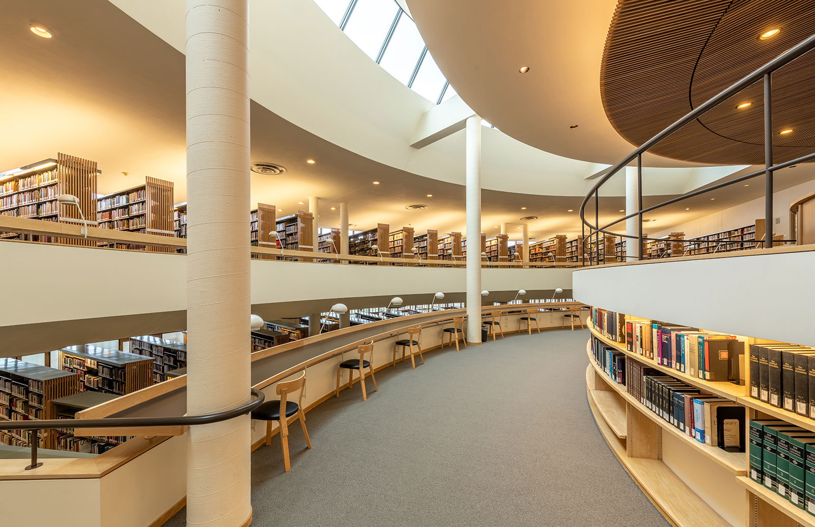
No tour would be complete without descending the staircase and winding around the corridors to experience how the light cascades down through the interiors. From below, the layers of architecture become apparent, and Aalto’s understanding of three-dimensional space is truly revealed.
Of all the characteristics embodied within the Mount Angel Abbey Library, perhaps the most immediate is the profound sense of harmony. Everything from the geometrical rings and lightwell, to each perimeter lamp and chair works in tandem to produce an orchestrated aesthetic. Every light fixture and vent is located exactly where it is supposed to be. The environment is the product of consideration and mastery.
Critical to the original design concept of the space is the tidiness maintained inside and out. From the sparse but immaculate grounds, to the well-ordered interiors, every piece of furniture is rotated on axis, and every lamp is aligned and at attention. It’s tempting to imagine a team of monks, at the end of each day, with rulers and compasses recalibrating the library to the exact architectural specifications.
Back outside, visitors would be remiss to skip taking a lap around the structure, as abundant design lessons are conveyed. Here, even the library’s service entrance has been thoughtfully designed and well executed. Wrapping around the building, the design aesthetic translates to a smaller scale of openings and screens, while views are directed to deliberate landscape nooks.
But it is at the building’s north elevation where true design discipline is masterfully demonstrated. The potential of a sweeping view across the Willamette valley is sacrificed with a brick wall at the upper level in order to maintain focus on the library’s true purpose: books, literature, and scripture.
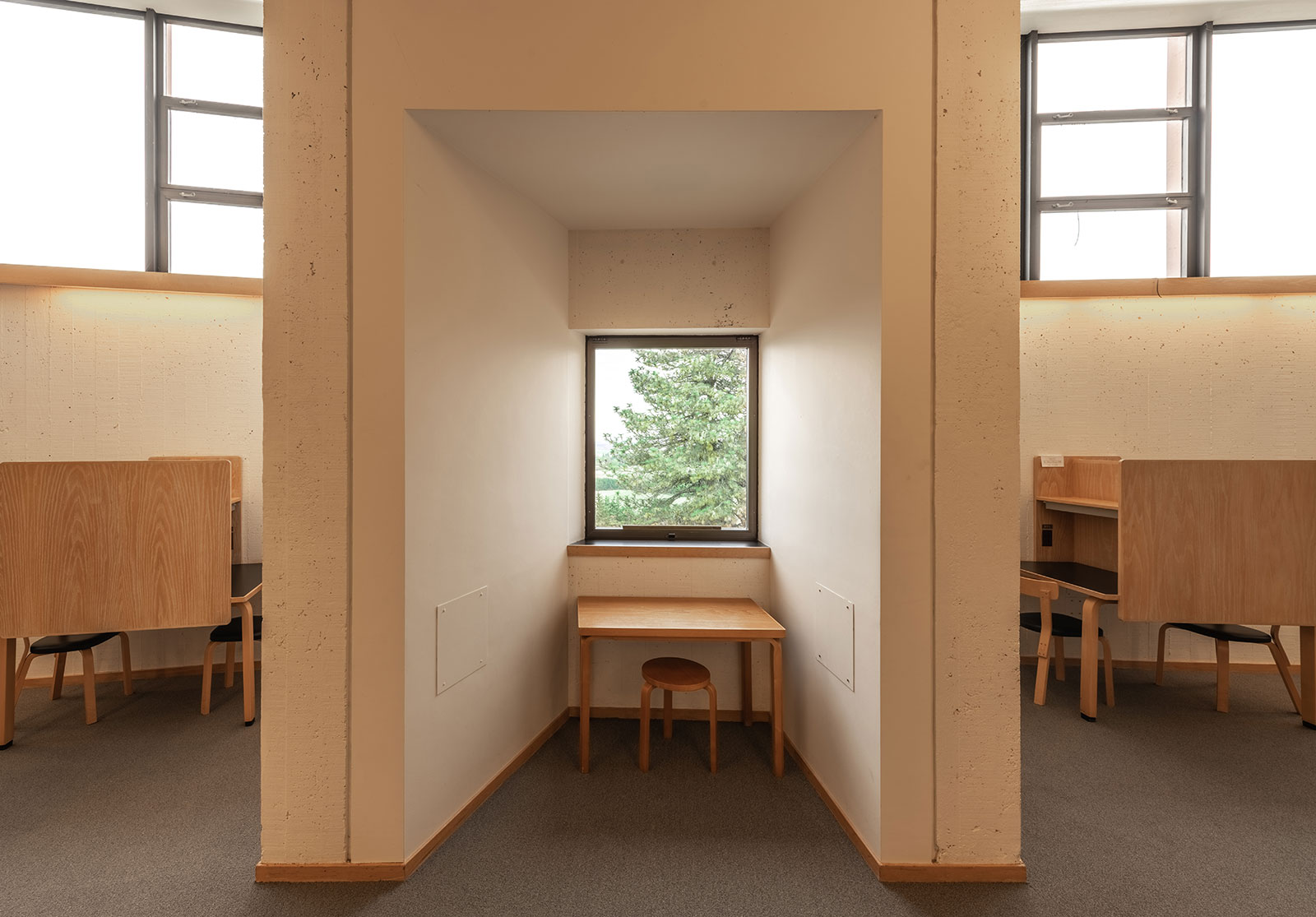
While skylights and a band of clerestory windows wash the room with natural light, a view to the valley beyond is reduced to just three intentional study nooks located at the perimeter notches. These little portals to the outside make it clear that a building of this significance and intricacy needs to be studied from the inside and out. An appreciation of this project requires an approach from both ends to understand the architecture.
There are hundreds of pilgrimage-worthy architectural destinations in and around the Pacific Northwest, and the Mount Angel Abbey Library hits all the notes. It reminded us of our college days and the thirst we still have for great design; it added a few tools to our architectural toolbox; and it was just the right amount of adventure. Though we took a leisurely drive to the site and didn’t have to scale a single security gate, we’ll still claim what bragging rights we can.
Cheers from team BUILD


