


[All images by Andrew van Leeuwen]
This fall an important publication about the life and work of Paul Kirk and the Puget Sound School will launch. Finally, a book that documents what many consider to be the most important moment in Pacific Northwest modernism. While the focus is on the importance of Kirk, the story includes the contributions of many other giants, including Royal McClure, Fred Bassetti, Gene Zema, Ralph Anderson, Bob Chervenak, and Arne Bystrom. The team responsible for the book represents a current zeitgeist of modern thinking and designing in the Puget Sound region. It was authored by Grant Hildebrand, designed by Ryan Polich, produced by Lucia Marquand, published by ARCADE, and distributed by the University of Washington Press. We were honored to contribute dozens of photographs to the book, and the images led us on countless adventures around the Pacific Northwest.
It would be trivial to claim that the lessons learned and conveyed are merely about design. Our observations, understandings and takeaways were informed not just from the record of physical architecture, but from the people, environments and artifacts that make these places significant. The stories told by their caretakers, the interweaving of nature over the years, and even the furnishings play important roles. Sometimes just a sliver of a view from the approach lends an important clue about the DNA of a design.
Most of these lessons aren’t news; many of them are known quantities, but the modern day push for efficiency, optimization, and the almighty pro forma have weakened their influence. Others have been lost or forgotten over the decades, outmaneuvered by the drama and sensationalism that have become the unfortunate currency of modern design. These ten lessons speak of a timeless architecture—they prioritize performance and lifestyle over spectacle, and transparency and integrity over arrogance. Lastly, it’s worth noting that these are just our ten. When reviewing the book, chances are you’ll have your own ten, and we want to hear all about them.
Great modernism doesn’t have to be precious
Most of Kirk’s projects were simple buildings made from standard lumber. His Fairview Avenue building on Lake Union presents a tapestry of thoughtfully assembled conventional beams and columns infilled with glass panels. The harmony of the design relies on a working knowledge of lumber and connections, rather than precious materials or expensive techniques.

Respect the structure
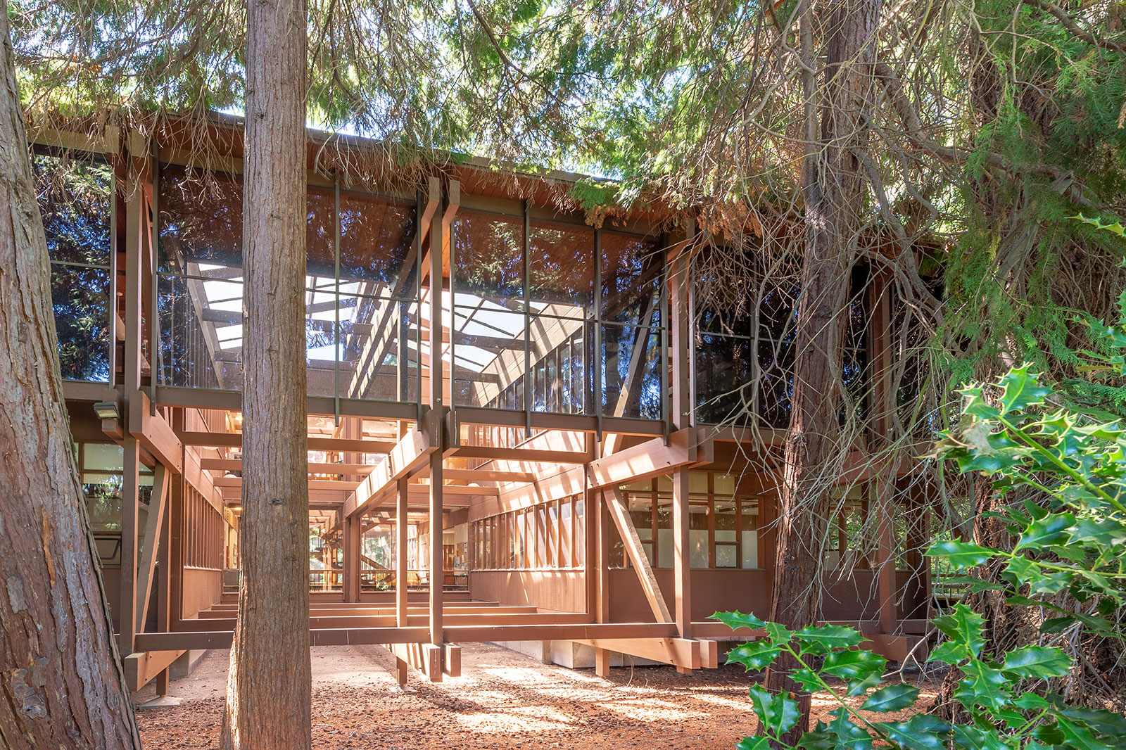
Perhaps the most respected characteristic of the Puget Sound School was the belief that the structure of a building should be celebrated and not masked by an architectural façade—the structure was the aesthetic. This philosophy is on full display at the elegant Runions House, designed by Ralph Anderson, where the cantilevered drop beams, columns and joists are each given an important and artful role. Here, even the support beams under the roof joists are fully expressed, creating a deep shadow line and allowing the protruding window bays to appear all the more pronounced.

The interior of the Japanese Presbyterian Church by Kirk reveals a rational and authentic structural expression. The logistics are clearly laid-out in the nave where beams hold such importance as to become an integral part of the light fixtures.

Demonstrate how the building goes together
People appreciate seeing how things go together—it appeals to the sensibilities and feeds the curious mind. Winkenwerder Hall at the University of Washington displays the mechanics of a building perhaps better than any other in Kirk’s portfolio. For the design conscious, there’s gratification in understanding the relationship between paired beams, columns, and the structural framework they collectively create.
Rhythm is more important than drama
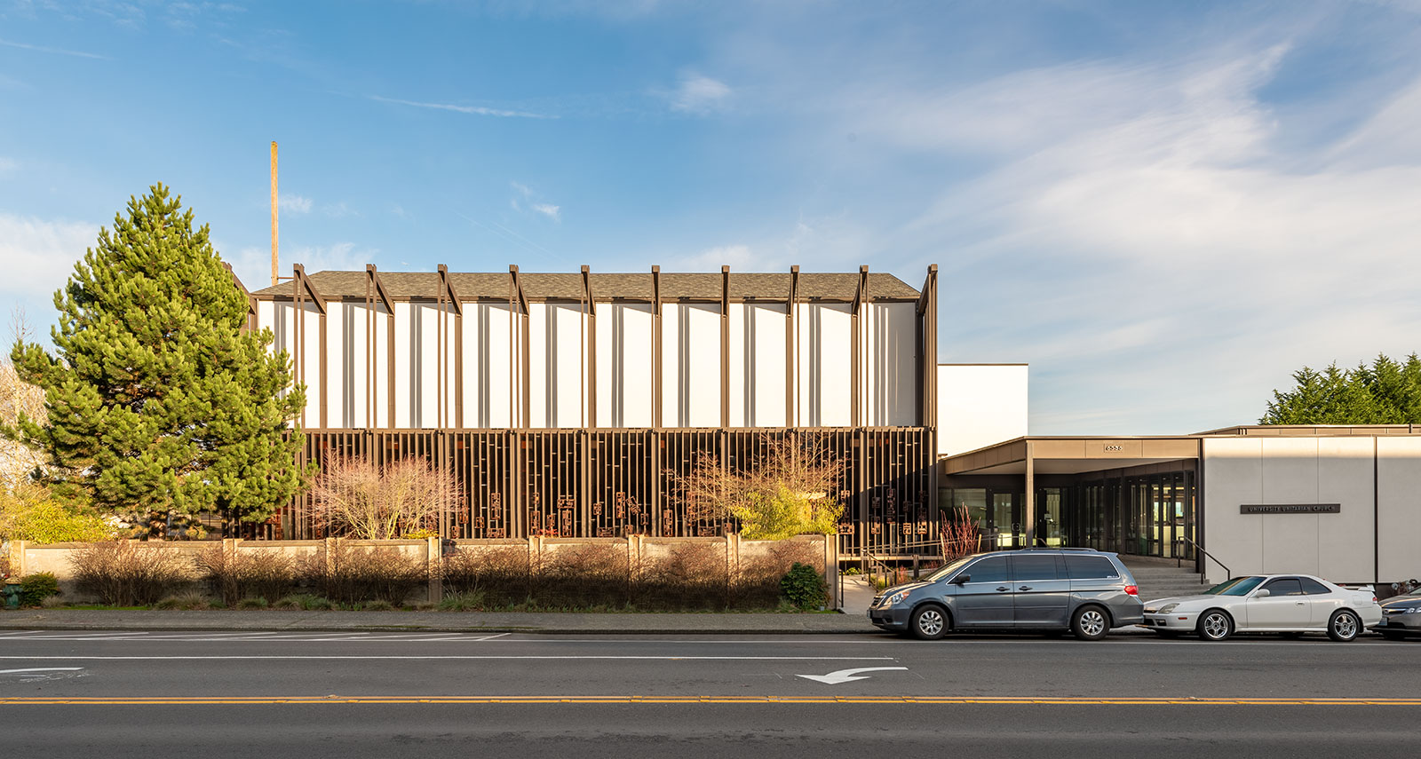
Kirk was a master at establishing rhythm in architecture and protecting it throughout the entire design process. Nowhere is this better realized than at the University Unitarian Church in Seattle’s U-District. A measure of eleven beam-column connections create ten bays; each bay is then divided into a screen of eight verticals that sit proud of the window wall. Add light and shadow and the composition is a delicate play of geometry, constantly changing throughout the day.
Let the function become the aesthetic
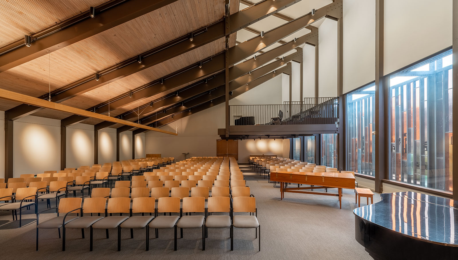
Inside the Unitarian Church, the primary beams of the nave subtly taper at their ends. Architects who paid attention during their structure courses understand that this is a direct translation of the beams resistance to the physical stresses at work; the cross section of the beam is shallow at the ends to resist the lesser shear forces, and it is deeper at the center where the moment forces are greater. For the uninitiated, there is simply a visual elegance to the attenuated curvature of the beams. Regardless of structural knowledge, one can appreciate that the beams are everything they need to be and nothing more.
You can only break the rules if you understand them
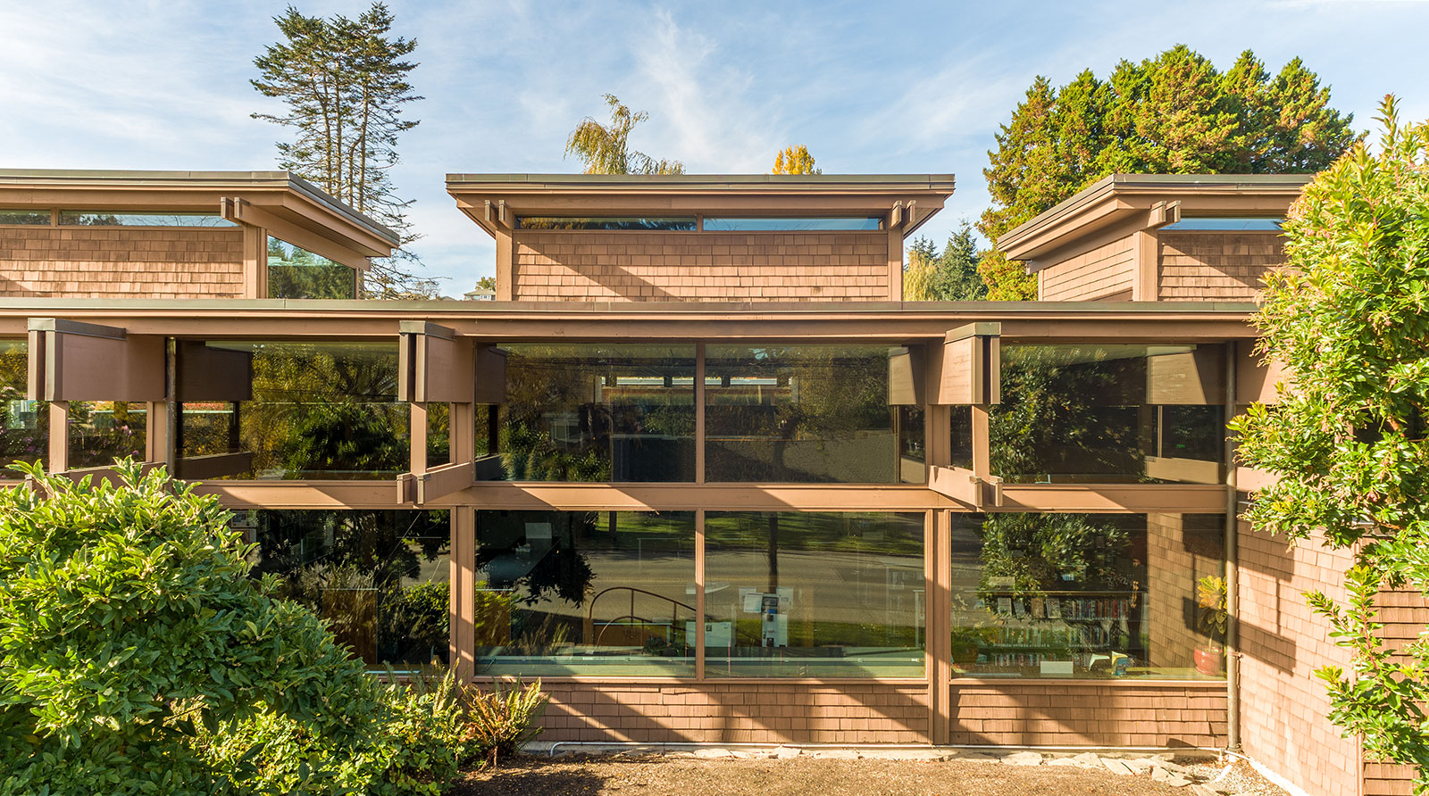
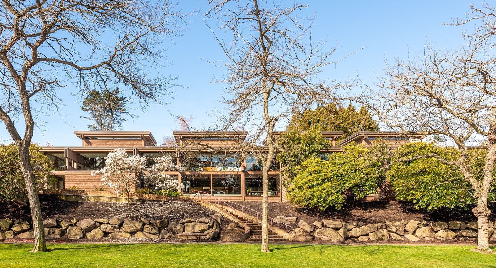
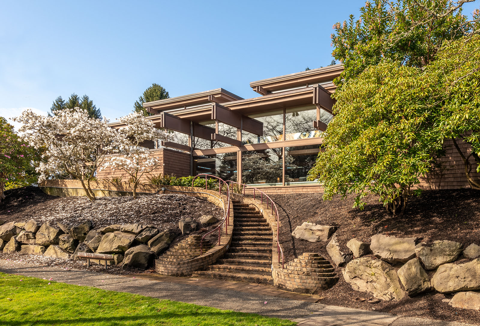
There is a visual pleasure offered by the poetic variations of an ordered structural system, and no project demonstrates this better than the Magnolia Library. Ten beam pairs create a symmetry of four roof monitors. Each roof monitor is then repeated at the east elevation with a protruding bay except at one key location.
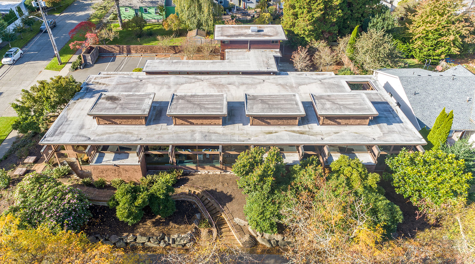
The second bay from the left is eliminated for two important reasons. First, it allows a better sequence of experiences ascending the exterior stair, including a reveal of the building’s structure along with a peek at the interior. Second, it allows the primary interior space a view out to the east.
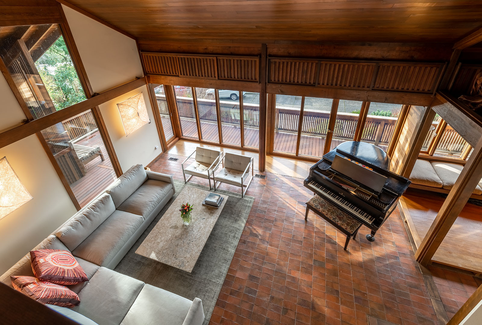
Architectural intimacy is a lost art
One of the most surprising epiphanies in photographing these projects occurred at the interiors, which exude a deliberate and measured intimacy. We found the most enjoyable example to be in Ralph Anderson’s Runions House where the cantilevered living room creates a cozy perch for six or eight people.

The mid-century modern masters knew that bigger is not always better when it comes to gathering spaces, no matter the program. The Magnolia Library (above) does an extraordinary job of creating intimate reading nooks based on the geometrical divisions previously discussed, while the Japanese Presbyterian Church (below) uses an intentionally proportioned light monitor to bring a sense of intimacy to the congregation below.

Volume over square footage
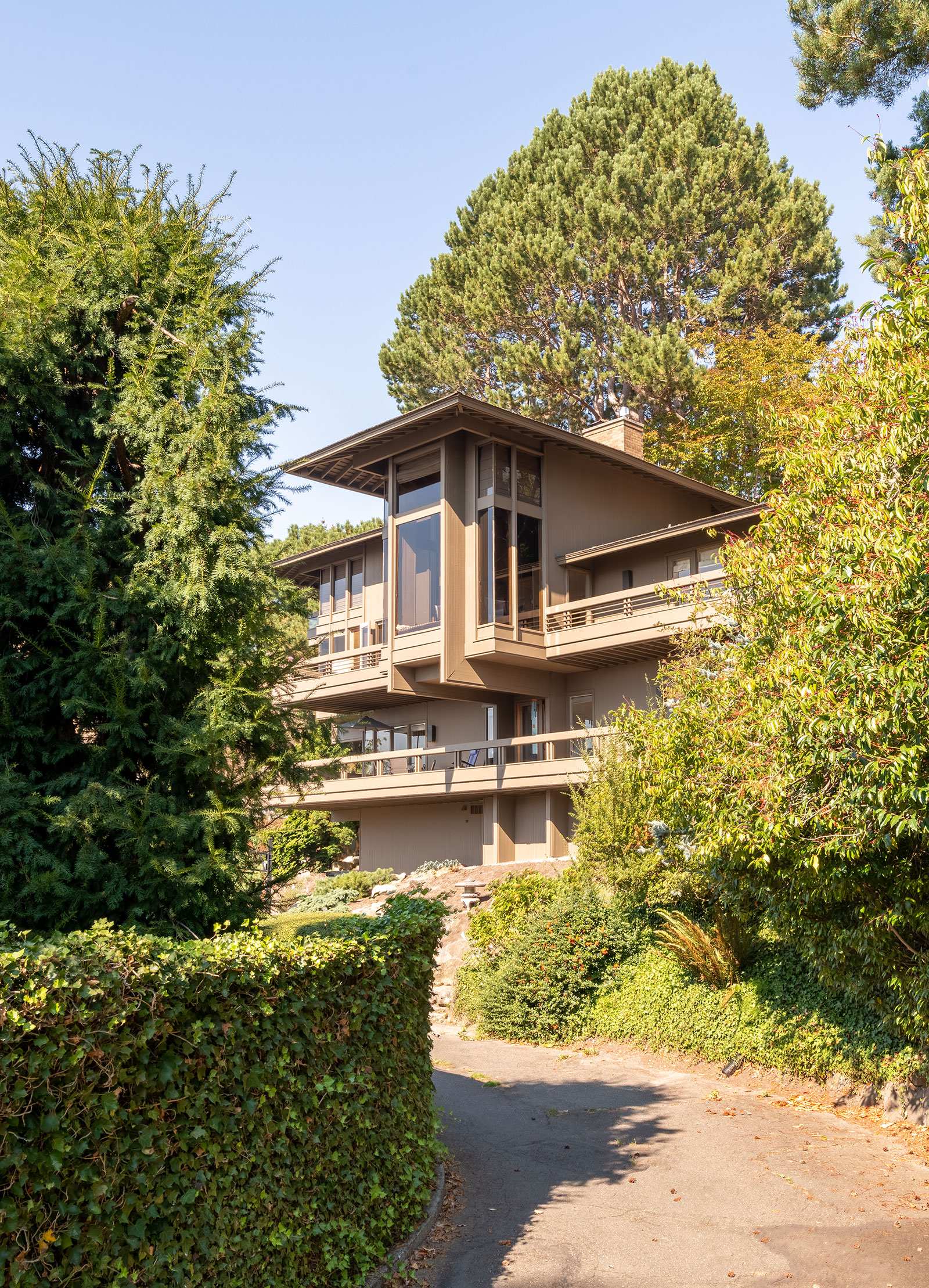
Over the last 60 years, architecture has steadily lost the battle of double-height spaces — such as lofts and mezzanines — to the financially motivated demand for more square feet. While the latter bolsters a resale value on paper, the former creates an atmosphere and poetry few area calculations can rival. Gene Zema’s own house in Seattle’s Laurelhurst neighborhood sets the bar with its vaulted ceilings and double-height living room. The interiors are airy and spacious without losing the intimacy so important to mid-century modern design.

Anticipate nature
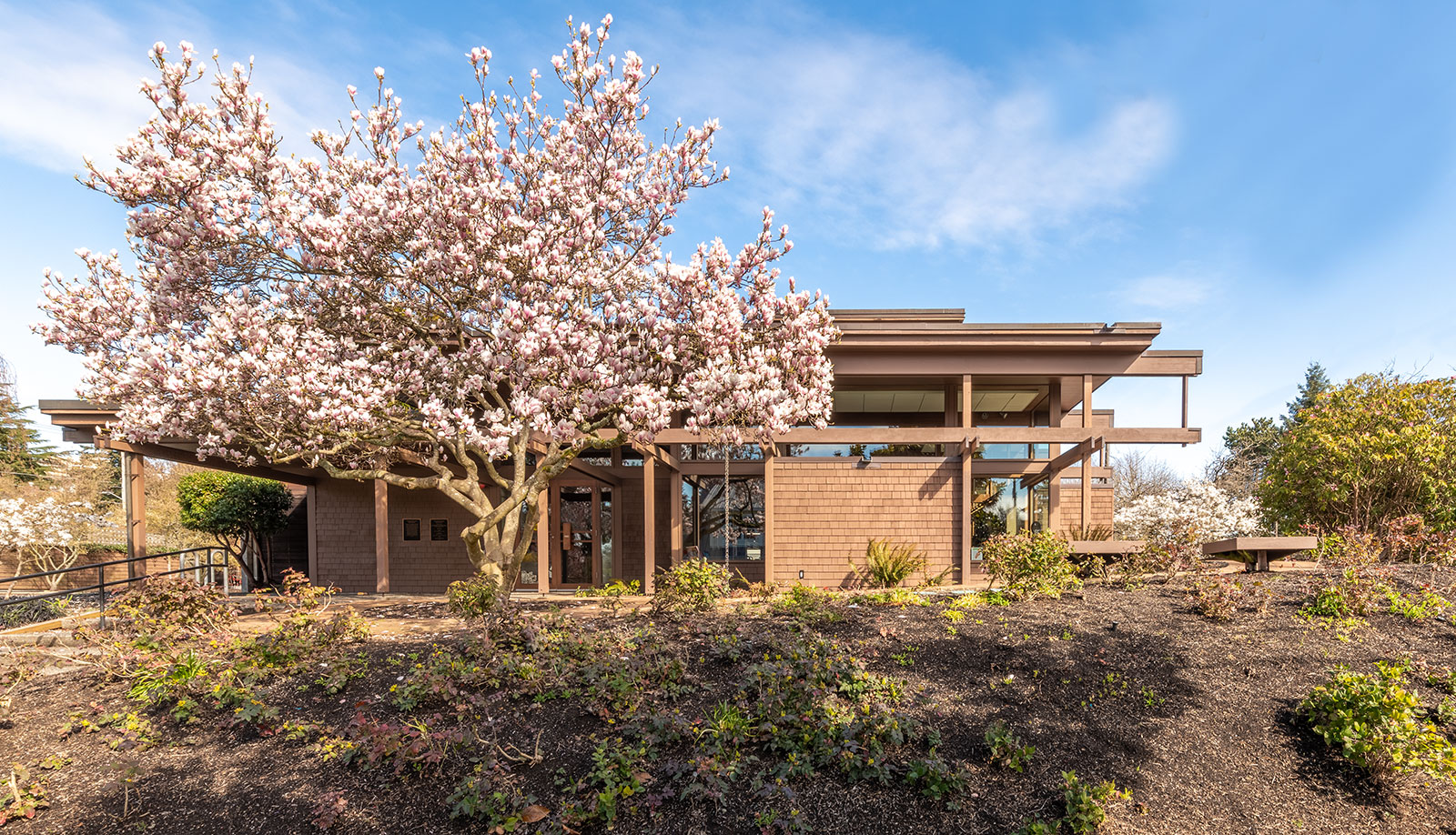
The delicate dance between nature and architecture was well known to the Puget Sound School, and the choice of a landscape architect and landscape elements were careful decisions. Many of Kirk’s projects set a stage for a spectacular landscape feature, such as the tulip tree poised at the south façade of the Magnolia Library.
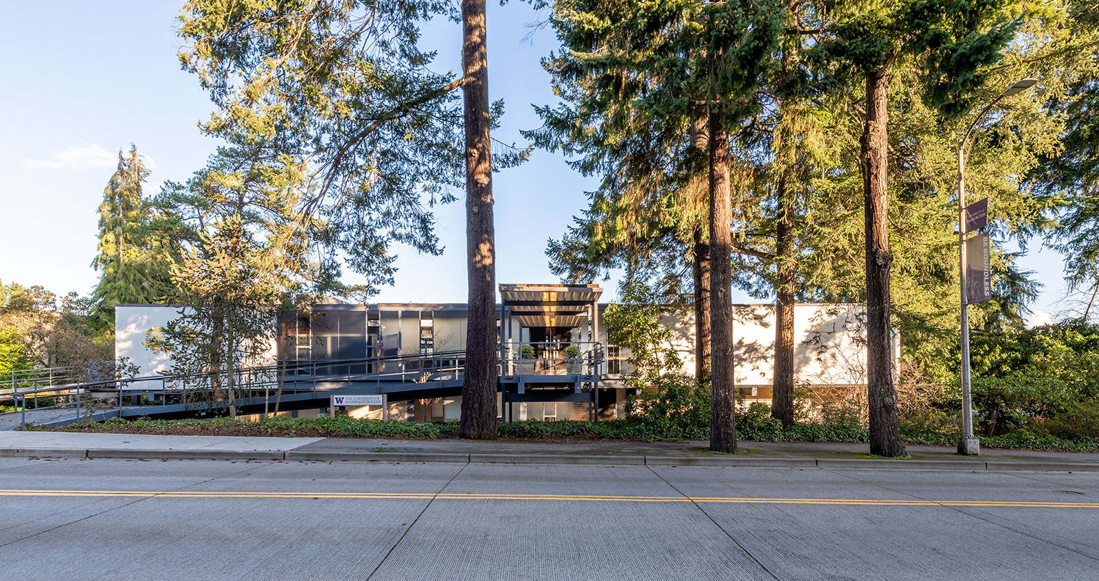
The University of Washington Faculty Club juxtaposes the simple volumes of the building against a collection of tall Douglas firs; the shadows from the branches are displayed on the structure’s canvas—the building needs the trees and the trees need the building.
Don’t lose the poetry
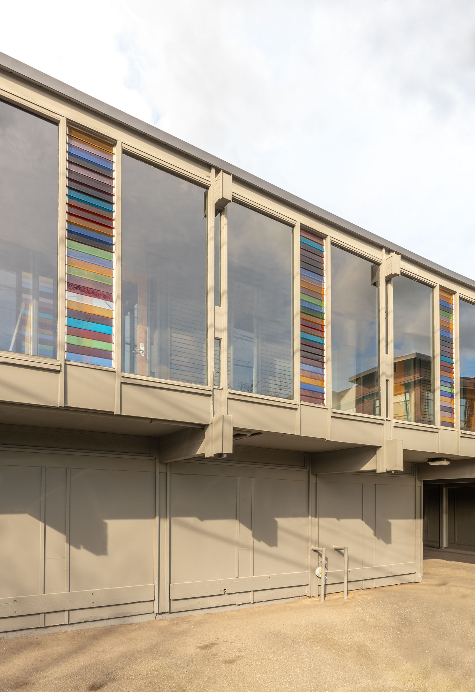
The loss of poetic design is all too often the casualty of a rigorous expression of structure, however the Puget Sound School had clever strategies for retaining the poetics in their compositions. Kirk’s tactics often introduced colored glass at key moments of his buildings’ geometries, which can be seen at his Eastlake building in the colored louvered glass at intermediate bays.
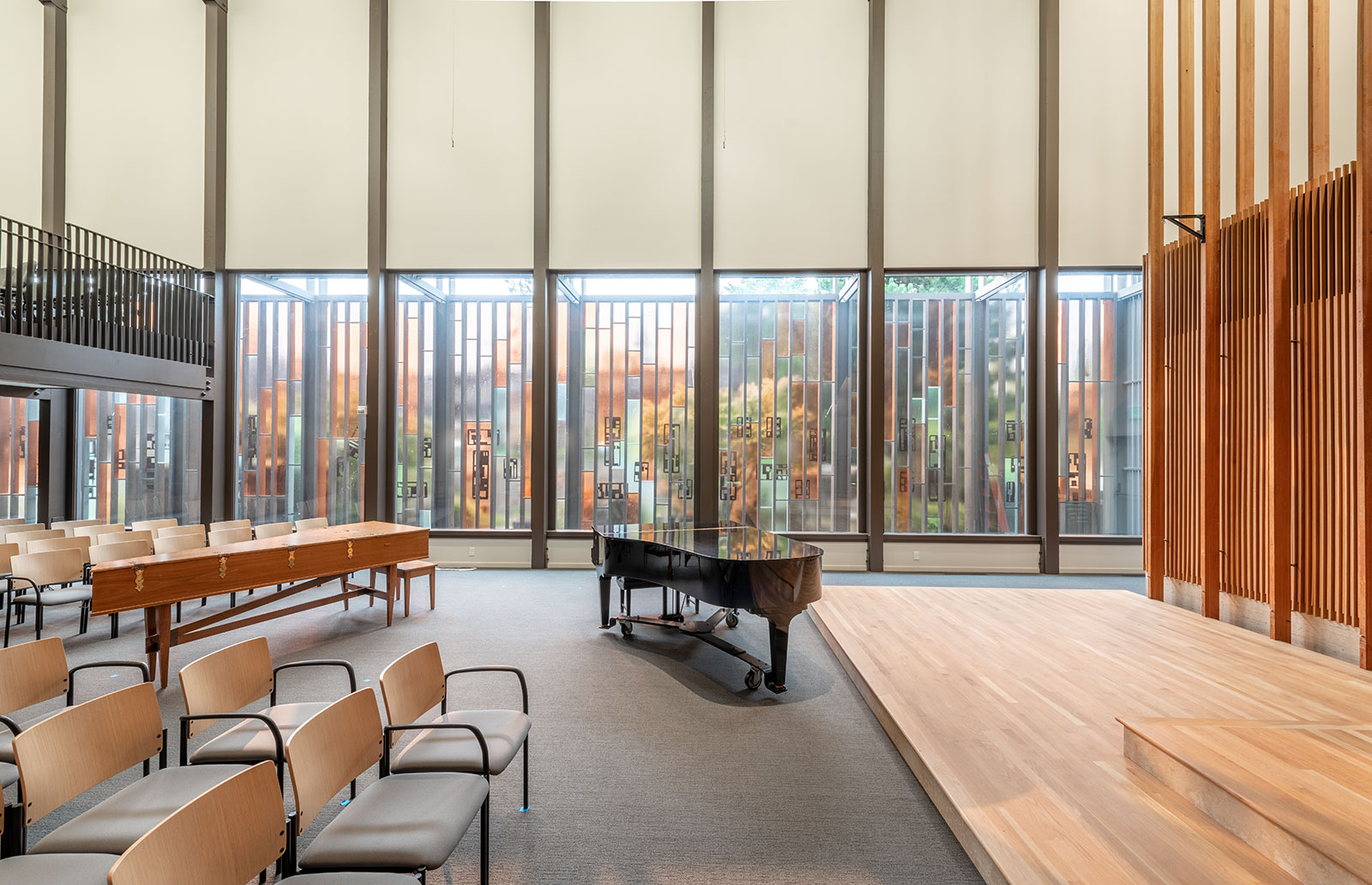
Opportunities within the geometrical framework are also on display at the Unitarian Church, where the screens are divided into eight verticals, creating a framework to introduce colored glass and pattern.
Lastly, Kirk and the Puget Sound School knew full well that, when executed correctly, layers of structure, marching down the length of a building, held an inherent poetic language. The Magnolia Library represents this nicely at the east entrance where the landscape architect Richard Haag added a curved stair, which guides visitors and controls perspectives.
We would offer that these ten lessons are more important than ever in these unprecedented and challenging times. Construction costs in the Pacific Northwest (and elsewhere) have increased so dramatically that they have become debilitating. Making the most of what is imperative for every project — structure — removes the superfluous and allows architects to strengthen the relationship between what a building does and how it looks. Meanwhile, the pandemic, variants, and related health concerns have caused people to rethink how they gather at home, and how a rightsized-scale supports this. Smaller, more intimate spaces may very well be embraced as desirable environments to live and work in for years to come.
Finally, the loss of poetics in design has reached its own recession in the built environment. Public-facing architectures that incorporate articulation, granularity and serendipity are now a rarity. The Puget Sound School offers lessons on how to get them back. Translating these ideas to our current times and modern materials can help architects and designers create dignified buildings that people aspire to be in once again.
Cheers from team BUILD