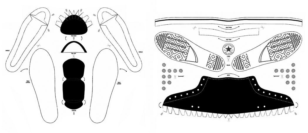
Last summer we took our (almost) annual trip to Manhattan to catch up on design, culture, and all things urban. We’ve got a healthy list of regular spots to check in with, and one of our favorites is the Converse Flagship store in SOHO where we can stock up on sneakers. Walking into the spacious, brightly colored shop felt different this time, though. Something was off. The shoe designs lining the walls didn’t have the design sophistication and appeal and we weren’t drawn to any of the shoes like we’ve been on previous visits. We couldn’t quite put our finger on the reason, as the space still seemed energetic and creative. Then one of the cheerful salespeople explained that the shop had gone “maker.” Shoppers, or makers, were now invited downstairs to the Converse workshop where an overwhelming array of fabrics, shoelaces, soles, and other materials were displayed. Makers were encouraged to create their own designs from what Converse calls its “Blank Canvas Customization Platform”.
Curious about the process and products, we perused the design options, ran our hands over the stacked rolls of fabrics, and asked a lot of questions. Then we watched and waited. Makers bumbled around the Customization Platform selecting shoe components with the all the whimsey of assembling a plate of food at an all-you-can-eat salad bar. There was much debate about whether to match the inside color with the outside color. Then there’s the dilemma of the tongue‒what color should it be if you chose asymmetrical colors for the shoe, the makers pondered. There must have been 30 colors of binding to choose from, and another 30 for the lining. Then there’s the stich color options, and how do you pass up a color named “particle beige”? Can’t decide on a color for the laces, fear not, they also come in rainbow for the maker who just can’t commit. Would you like your eyelets in Rose Gold, Antique Brass or Metallic Silver? Optional heel stripes? Have you considered rubber sidewalls? They come in five colors. Want racing stripes? There are ten color options. Want a patch logo? There are nine to choose from. Needless to say, the design options were entirely, completely, ridiculously overwhelming to people. A quick calculation on the customizable design section of the Converse website suggests that there are over 470 trillion shoe combinations. This figure doesn’t even include the customizable text you can specify for the sidewall. Trillions of possible shoe designs and we left the shop with zero pairs.
The reason we didn’t purchase new sneakers that day wasn’t because there were too many choices; in the design world, there’s a certain amount of comfort in knowing that there are infinite design possibilities. Rather, it’s that there was no mastery behind the results, no design discipline. What attracted us to Converse brand shoes in the past is that there was an experienced shoe designer behind the scenes‒a designer knowledgeable about the hundreds of components that go into a shoe and experienced in their multitude of combinations to make a congruent finished product. Because of this knowledge and experience, such an expert presumably designs with a particular philosophy or thesis in mind.
While there were instructive guides on the walls of the Blank Canvas Customization Platform, which suggested compatible components and well-suited color combinations, no one seemed to be paying any attention to them. The complete freedom of choice was simply too irresistible to be bound by guidelines. The shoes being produced, as well as previous examples on display, fell somewhere on the aesthetic scale between mediocre and downright unattractive. The results illustrated a lack of thoughtfulness because the design process was bereft of a code of aesthetics or design discipline. And for good reason; no one in the room, including the staff providing advice, was a shoe designer.
It could easily be argued that these are just shoes so what’s the big deal? People should be allowed to design and wear whatever they want. Which is true. But the shoes are anecdotal. The same design agency found at Converse is being advocated across the maker movement and at much larger scales‒scales that affect more than just the owner of a pair of unflattering shoes.
The crux of the matter is that design is never a blank canvas. There are always design limitations, thresholds and drivers, whether the program calls for a shoe or a building. A masterful designer knows how to use those factors to the benefit of the finished product and the end user. And, really, the only way to become a master at something is to spend thousands of hours doing that thing, whether it’s designing a pair of shoes or architecting a house.
There’s an inherent idea with the maker movement that anyone can make anything anywhere. And while that sounds compelling, it ignores an important factor in the design world: good design requires a depth of knowledge about materials and sourcing, along with an expertise about assembly and details. Good design requires mastery.
We’re not advocating that the maker movement is a bad thing. On the contrary, we’re glad it’s out there and being explored, but it’s often being promoted in ways that are counterintuitive to its success. In the example of the Converse retail experience, the Blank Canvas Customization Platform may seem exciting and design-forward, but the reality of it was overwhelming, and the end products lacked design appeal. It ignored the most important quality of design: mastery.
Cheers from team BUILD


