[Images courtesy of Balmond Studio]
Last summer, BUILD met with engineer-architect-artist, Cecil Balmond at his London Studio to discuss his most recent projects and the thinking behind his experimental design process. Prior to opening Balmond Studio, his career spanned 40-plus years at Ove Arup & Partners where he worked on pioneering projects with renowned architects all over the globe. Balmond discussed the notion of architecture in a dynamic environment, the designer’s intuition, and his most recent projects. Part 1 of the interview can be read here.
Tell us about your previous role as Deputy Chairman at Arup, where you led thousands of engineers and architects.
There were seven of us on the board of directors at Arup and I was head of building business globally with around 6,000 people under my supervision. When I joined, Arup was a company of about 5,000 people and when I left it was 11,000 people. The job was a huge bureaucratic task in one way, but on the other hand, I was the only director who had an active design group. My design group ranged from 25 to 60 people and we handled about 30 jobs per year. I would choose two or three of these projects and I’d personally lead the design.
It was at this time that I began setting up the Arup architectural practices in Beijing, Shanghai, and Turkey, as well as the sector architectures such as ARUP Sport and Arup Health. Arup Sport was a great success and we hired expert architects to lead the projects, like Richard Rogers and Norman Foster.
How would you characterize the spirit at Arup?
Arup was a special organization because really it was led by Ove Arup at the beginning, who was a philosopher and a mathematician more so than an engineer. He was a man of the world with open ideas. That way of being really filtered down to certain people, like myself and others, who, if I’m honest, believed in design, and not necessarily engineering or architecture. Design was a much wider thing to us. Architecture had its own expert skill zone, and when it comes to the real grit of architecture, the specifications, window schedules, and the engineering, there is a horrendous, humungous amount of calculating to be done. But those are the mechanical parts of it. A great engineer is simply wonderful to watch at work because they’re intuitive, and I don’t just mean structural engineers, but environmental engineers, lighting engineers, etc. They’re dealing with intangibles almost, and yet they have an intuition that influences the building in a very holistic way. This method of working significantly contributed to my thinking that there are no limits in design.
Was there a particular moment or project that encouraged you to formalize your practice as an engineer-architect-artist?
No, it’s like a lot of things in life, you drift. It’s a question of being an opportunist. Occasions occur where your instinct is primed to take advantage of key opportunities. If you are a creative person, you are pushing, not knowing what you are pushing at and then something comes up and you just jump, you take it, and I think my career has been a series of those jumps.
There was a cathartic moment at about age 35 when I was smoking outside my office and decided when I went back in I could never do the same thing again. It was that decisive, I just knew. But I didn’t know what was next. So, I went back in and threw out all my learning and started learning again. I went through a personal mentorship for the next five years. I studied at night, going back to the original treaties of mathematics, going back to the three forbidding books and six postulates of the Greek mathematician Euclid. I went back to the very first precepts set by the Greeks, like the philosophy of the point above a line, above a plane, the line being drawn through thepoint, above the plane, being parallel, and so on. The books written about those postulates engaged my mind totally. It provided me with a mobile sense of geometry. Those postulates soon led to the idea of proportion.
The next step took five to ten years and it involved believing in a mobile sense of geometry, where forms are constantly in motion and architecture is only a snapshot in time. This led to a proportional sense of space and ultimately an episodic treatment of design. This sequence was dependent on releasing my hand and thinking more freely. It required that I start thinking differently about design, that buildings don’t stop at the four corners, and that they don’t necessarily have to have a floor, a roof, and sides. It was a personal odyssey of unlearning and it is key to the work I’m doing today.
Is there a common way that you approach each design project?
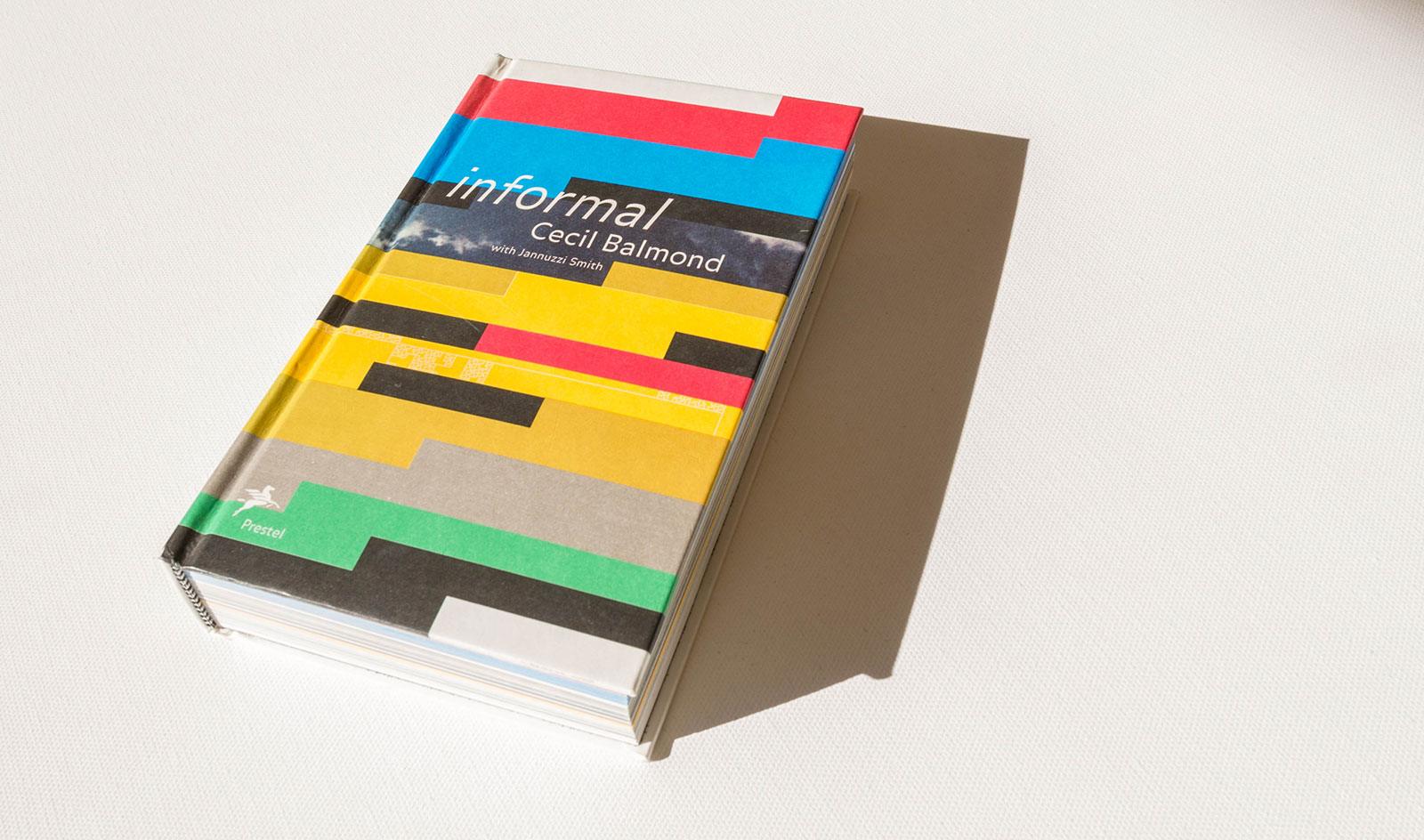
The way I work is generally scale-less as an idea. I tend to start with a metaphor or a feeling, something really vague. Then comes a sketch of something in space, some notion of space, or more accurately the notion of the intersection of space between it, it’s interiority, and the relation of the context of where it is. Just purely conceptually and it’s nothing to see yet. It might just be a few lines or a blotch. Then comes the idea of what is it. Is it art, engineering, or an architecture piece? Then comes the functionality, then comes the choice of scale. Once you choose scale, the material locks in. If it’s very small its thread or wire. If its humongous, its steel or trusses. Then comes configuration of scale. Last of all would be structure — actual structure as it means to an architect today. The actual skeleton, the actual thing is the last thing. If you start with that at all, you’ve lost the building. You’ve lost the spirit, you’ve lost what the building can do. At the end of my book Informal, there is a very interesting table of the hierarchy of decision making that goes through my mind.
You note that challenging assumptions is critical to your work. What is a recent example where challenging an assumption made a significant difference to the outcome of the project?
Toyo Ito and I designed the 2002 Serpentine Gallery Pavilion together and we decided to start with a box. Upon looking at a map of London’s Hyde Park, where the Pavilion is located each year, we realized that the park is a collection of crisscrossing lines. Then came the idea that this pavilion is the gathering of lines. We started playing around with algorithms and the type of geometries similar to the movement of a ball around a billiard table until we hit upon a geometry that came back on itself and completed the box. This exercise allowed us to break the boundaries of the envelope and challenge the notion of the box. Even though it was a 50-foot by 50-foot structure, the viewers inside had no idea that they were in a box. Spatially, it was much bigger than the bounding box of its geometry.
Tell us about your discovery of aperiodic tile invented by the mathematician Robert Ammann.
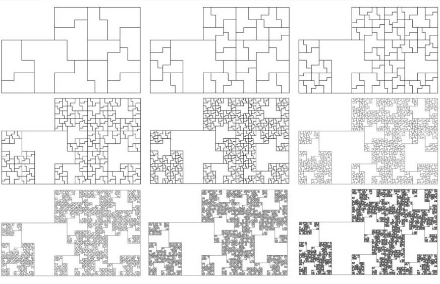
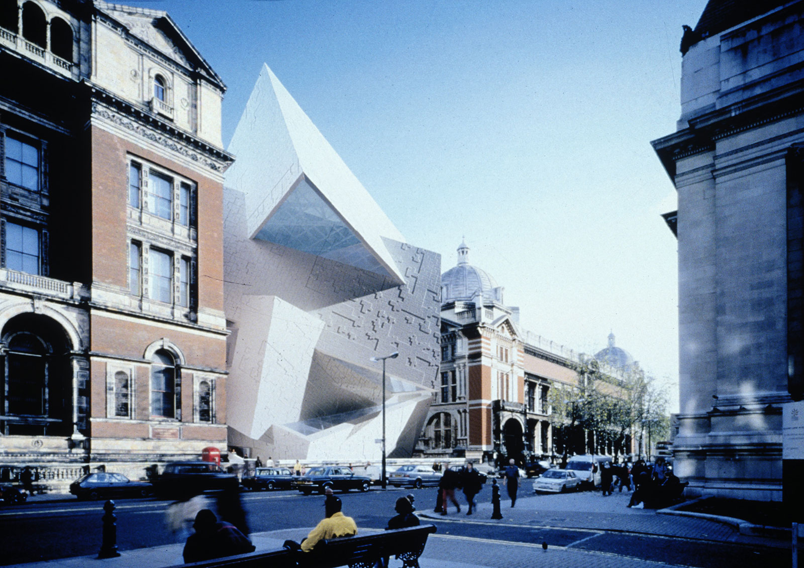
20 years ago, I felt that architects and the graphic arts had no idea what mathematics does, so I started researching numbers. I quickly realized that the prime numbers have powerful sequences that are unpredictable. They look like a kind of music when I interpret them, and they’ve held my interest for years. The geometry of these tiles is based on the prime numbers and this is what makes them aperiodic in that their assembly results in a new pattern each time — they never repeat. Daniel Libeskind and I applied the tile to the V&A Spiral which is the proposal for an extension to the Victoria and Albert Museum in London.
Your QXQ project addresses the need for prefabricated, modular housing. In your experience, what are the hurdles of implementing prefabricated, modular housing on a mass scale?
It’s the biggest challenge in the industry and no one’s cracked it — not even Arup. Years ago, they went in with a huge contractor here in the U.K. who does housing and they spent a lot of money researching prefab design. The result ended up looking like every other prefab. And that’s the problem, because in the end, for mass production, you need corners and right angles, and once you have corners and right angles, to save money you close the surface and then you’ve got a box. You can go and cut corners and triangles out and make it look interesting, but it’s still a box. You haven’t cracked the sense of living.
In order to be successful, prefabrication shouldn’t start with conventional ideas. It would be great to think that prefab housing could inject a new idea of living in such prescribed spaces. No one has been successful at this yet and I tried a bit with the QXQ project. So many boxes have already been done and I don’t want to do another box. What can I add to it apart from cuteness and your sensibility of design? I was interested in refuge housing and wanted to investigate low technology, using my ideas to make things less expensive. I wanted to try to use architecture in adaptable ways using cheap materials but highly sophisticated design techniques to make an interesting statement while being functional. My design started with a dodecahedron and sliced off parts. This allows stacking in any direction and, interestingly, it created the idea of a colony of tightly fit modules rather than a collection of prefabricated homes. All the sudden, you’re into biomorphic design and while the architecture and structure are straight-forward, the services become challenging. Where do the ventilation, water, and sewer systems fit? We haven’t quite cracked it yet. We’re building two units as a test, but we really need to build 12 of them to check our assumptions, and we need to be building hundreds of units to be commercially viable. There are a number of interested clients from all over the world and a particular army was interested in 40,000 units. That’s the kind of scale we need to make the concept great, but we need to get the first one right.
Rem Koolhaas cites that, “through your work, engineering can now enter a more experimental and emotional territory.” Are academic engineering programs following your lead?
I know certain architecture and engineering programs have taken my books as curriculum. The Scandinavians were the first to take up Informal, then some universities in the States and in England started using the book. I think it’s impacted young architects more than the engineering community as I suspect that the engineers may be enticed by the work but are afraid to pick up the book because the thinking is so radically different.
How has a non-linear approach to design affected the other areas of your life?
I started organizing parts of my practice at Arup in a non-linear basis and it was very successful. Rather than applying top-down thinking, I began using an informal, emergent thinking. As an example, I deliberately don’t file my books, so I go searching my library and randomly pick a book, and then open up to the middle of the book and I read. That immediately kicks me into something I never even thought of. In the early ‘90s I became convinced that the world was non-linear. We simply fight it to be linear in order to understand it. But actually, it was not understandable in the first place.
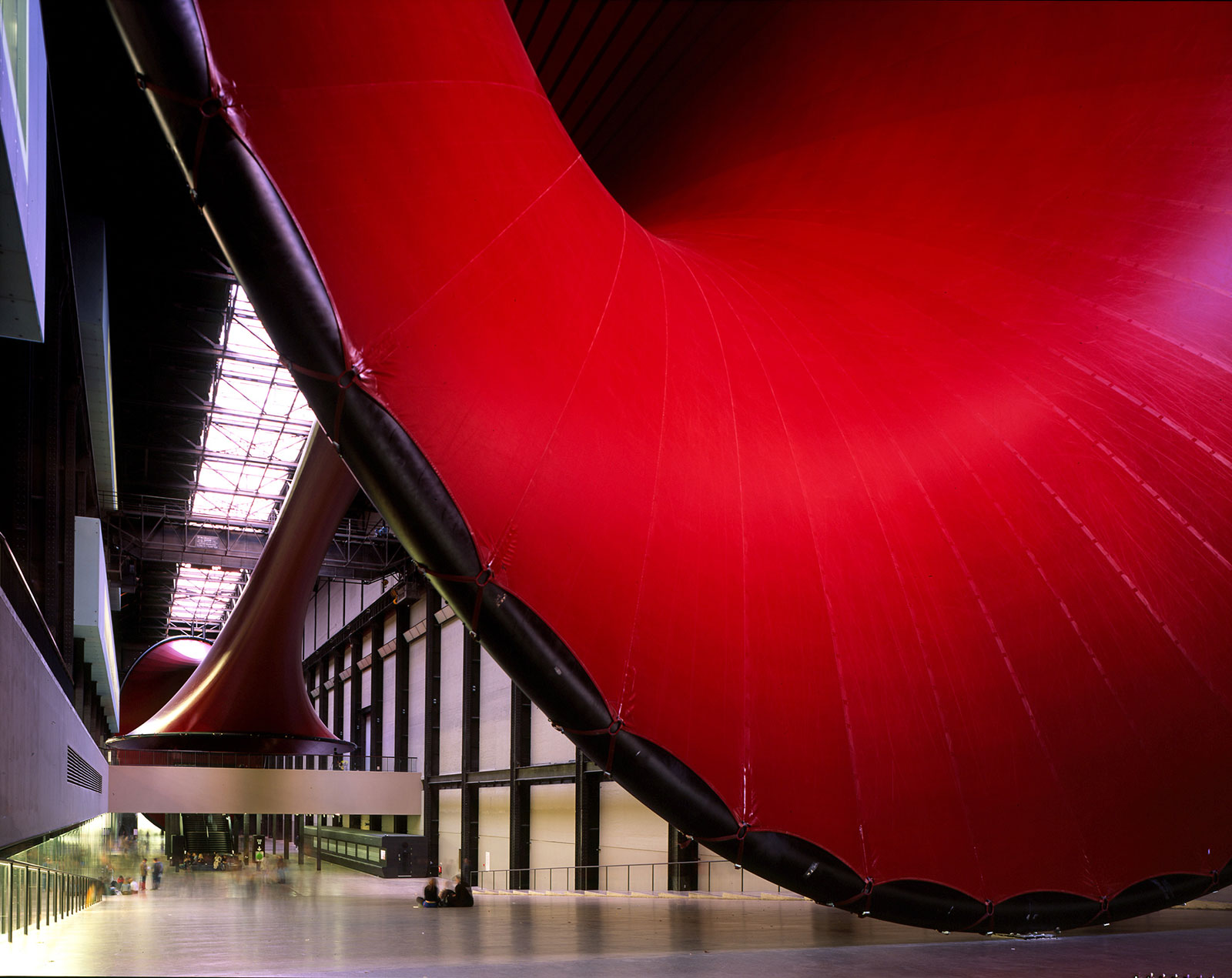
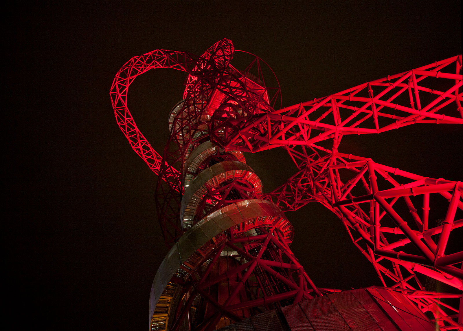
You’ve had a synergistic relationship with artist Anish Kapoor, including your collaborations on the 2003 Marsyas exhibit at the Tate Modern, the Temenos sculpture in north England, and the Arcelormittal Orbit built for the 2012 summer Olympics. Tell me a bit about the balance you two have found working together.
Anish and I came together originally for the Marsyas exhibit at the Tate Modern. It’s not so much the mechanics of the form making with Anish, it’s more about the discussions we have of what does it mean. I think that’s the driving spur between us. The mechanics of how you make the form is part of whoever’s skill set it falls under. So, if the items involve big spans, I’m doing it. If it’s an issue of color and surface, he’s doing it. Creative tensions about what is good or not arise, but it’s precisely these discussions that lead to the power of the form. It’s about a visceral reading of the form and how it moves you physically.
In any of these designs, you’ve got non-linear architectures and engineering forms, but it seems like you’re typically able to use a standard kit-of-parts like steel channels and I-beams. Do you feel that the materials and parts ever limit the form factor?
No, because I always take the materials as a given out of pragmatism rather than thinking that I’m going to invent a new material or form. This isn’t to say that you compromise what you’re doing, but you need to rationalize how you’ll build a design and in that comes certain decisions to make about the material.
Do you have any structural inventions that you’re particularly proud of?
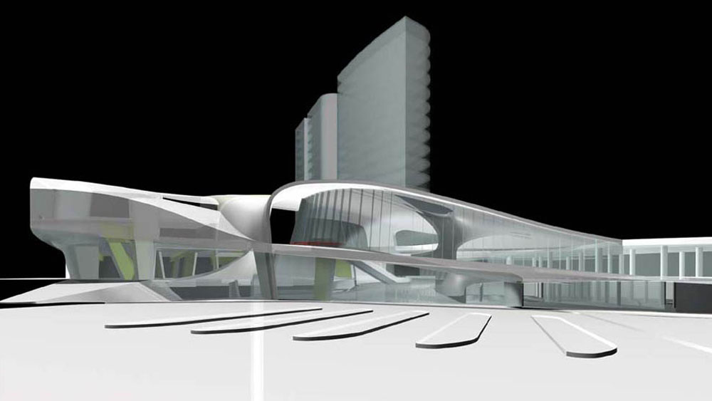
The roof of the Arnhem Centraal project in the Netherlands includes a giant column that’s approximately 100-feet wide. It twists in space to support the roof and ground floor planes and it’s one of my best inventions. I thought the design would be prohibitively expensive, but it wasn’t.


