
[Image credit: Microsoft]
On May 23rd ARCADE Magazine will host designer, writer, and researcher Bill Buxton for their Spring Salon held at the swanky Cloud Room on Capitol Hill. Bill currently holds the position of Principal Researcher at Microsoft and he’s the closest human we’ve ever met to the Dos Equis Most Interesting Man in the World — only Bill can do it all without the beard. The event is being moderated by our very own Andrew and Kevin, and there’s only 60 seats in the house, so grab your tickets and come join us for an evening of extraordinary design talk, paradigm shifting ideas, and an adult beverage or two. There’s more info about the salon on ARCADE’s blog and Facebook event page.
Needless to say, we’re very excited about the event and today’s post is equal parts tribute to Bill Buxton and primer on some of his work, ideas, and life experiences. Educated in music and armed with a master’s degree in computer science, Bill has spent 30 years observing how people use technology, while applying those insights to the human-computer interaction field. His interests also include film, literature, and art. He’s been awarded four honorary doctorate degrees, has received numerous professional awards, and has given dozens of talks. As an accomplished equestrian, cyclist, and outdoorsman, Bill is a true renaissance man of the information age. If you’re design-minded, Bill’s personal mantra should also hit home:
“Ultimately, we are deluding ourselves if we think that the products that we design are the “things” that we sell, rather than the individual, social and cultural experience that they engender, and the value and impact that they have. Design that ignores this is not worthy of the name.”
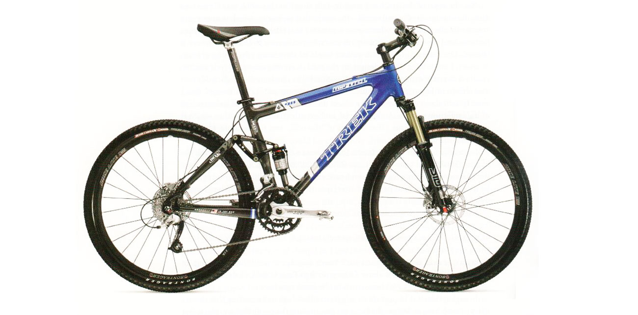
A great example of this mantra involves the Trek mountain bike he designed for world champion Roland Green.
[Image credit: Trek Bicycles]
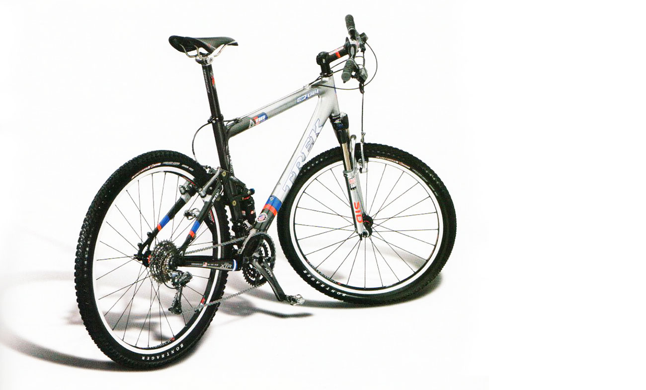
The image above shows a typical picture of how a mountain bike might be marketed. The CGI image below takes it a step further and shows a more dynamic version of the bike with a heightened stance, indicating that a mountain bike is more about character than just a bike.
[Image credit: Trek Bicycles]
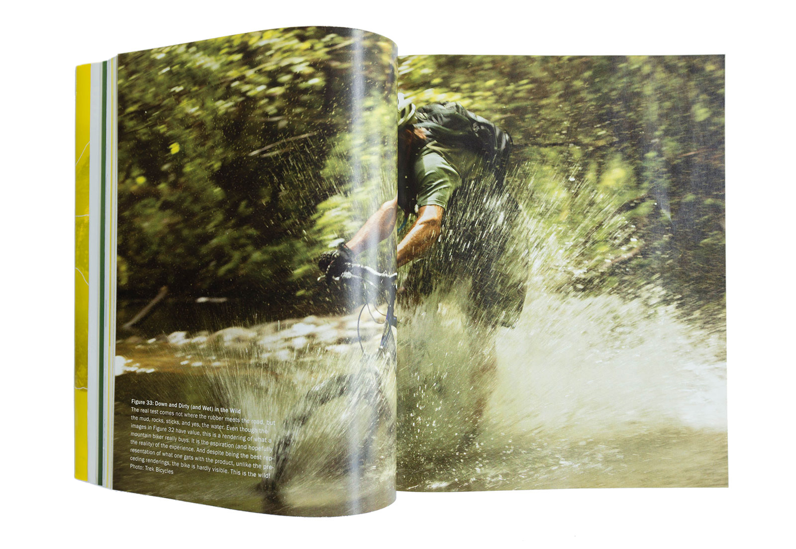
But according to Bill, the best picture of his bike is the one shown below, a picture in which you hardly even see the bike. It reinforces that the experience and emotional response of the object is more important (and more marketable) than the product itself. In his own words “a mountain bike is a thing that lets you scare yourself silly, with a reasonable sense that you might not die, and you’ll end up with a smile on your face and go back for more.”
[Image credit: Trek Bicycles]
In addition to the experience being more significant than the object, masterful imagery like this is at work around us all the time and once you start looking for it, you’ll notice that it’s paired with the most intelligent companies in the marketplace. The kind of companies that are insightfully deliberate with how they promote their products. It’s an important part of what makes a product successful.
Having played an instrumental role in companies like Xerox PARC and Alias Wavefront, along with his current position at Microsoft, Bill has a keen awareness of the implications of success and its dark side. He sums it up thoughtfully in an article he wrote for Business Week in 2010 titled “The Problem with Great Ideas:”
“Here’s a backward proposition for those of us who strive for great design and innovation: The better we do, the bigger the problem we make. We may think that bad design is the “enemy” and that our holy grail is to stomp it out. But displacing poor design should be relatively easy for a trained professional. No, the real enemy is great design. Why? Because great design takes hold, gets traction, and takes on its own inertia—which makes it hard to replace. And replace it we must: Everything reaches its past due date. Design is no different.”
When we first came across this idea, we had to read it a couple of times because it takes the traditional appreciation of success and flips it on its head. In fact, the more of Buxton’s writing that we absorb the clearer it becomes that he’s processing the world at a much more sophisticated and forward-thinking level.
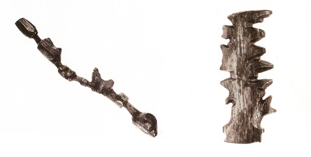
In 2007 Buxton published Sketching User Experiences, a book critical to anyone in the design or engineering professions because it gets to the fundamentals of the design process and tackles the topic of holistic, real-world solutions. Perhaps our favorite example is the 3D wooden maps used by the Inuits of east Greenland. These handheld maps tangibly document the fjords, mountains and places where one can land a kayak. The genius of these three dimensional maps is that they’re waterproof, they can be used inside mittens and, best of all, they float — all without a battery. In Bill’s own words, this example reinforces his thesis that “in order to design a tool, we must make our best efforts to understand the larger social and physical context within which it is intended to function.”
[Image credit: Greenland National Museum and Archives]
Another great example from the book uses a comparison between juicers to prove that great design is no accident. The difference in the quality of experience between one juicer and the next does not result from some undisciplined “flash of genius.” Buxton goes through a rigorous analysis of two similar looking (but experientially different) juicers to ultimately set up a convincing case that if something as simple as a juicer requires this much effort to achieve a high-quality experience, complex products require a commensurate level of the appropriate skills and a rigorous, specialized design process.

[Image credit: Smart Design]
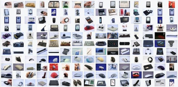
Buxton has also been collecting interactive devices for the last 35 years. The collection is both a historical archive and, in Buxton fashion, makes for a powerful sociological critique. He asks, “Look at the collection and then try and convince me that our slow rate of progress is due to a lack of technology rather than a lack of imagination.”
[Image credit: Microsoft]
To Buxton, designers should be hunters and gatherers. Life is too short for bad instructors, and if the waste basket isn’t full, you’re not doing the work. The examples above are a small snapshot into Buxton’s relentless pursuit of innovation, human values, and the experience of design. We hope you’ll be able to join us on the May 23rd to hunt, gather, and help fill up the waste basket.
Cheers from Team BUILD


