[Photo Credit: Emmanuel Combarel Dominique Marrec Architectes]
The term contextual is an important one in the design world. Being architecturally contextual signifies that a design both takes cues from its surrounding environment while maintaining its own identity. In the most poetic of situations, contextual architecture can further distinguish its surroundings and even offer appreciation to specific environmental features.
Formal definitions offer some useful perspectives:
- Dictionary.com defines it as: “The definition of a word or symbol by explaining the meaning of the phrase or statement in which it occurs.”
- Your Dictionary states: “The definition of contextual is depending on the context, or surrounding words, phrases, and paragraphs, of the writing.”
- While Cambridge Dictionaries offers: “It’s impossible to understand the nuances of an isolated word without some contextual clues.”
Our takeaway from these definitions is that the term contextual requires reading and interpreting the circumstances to properly understand the addition, whether that addition is a word or a building. Switching gears to the built-environment, we’ve come across some striking examples of contextual design in the last several years that further develop the conversation.
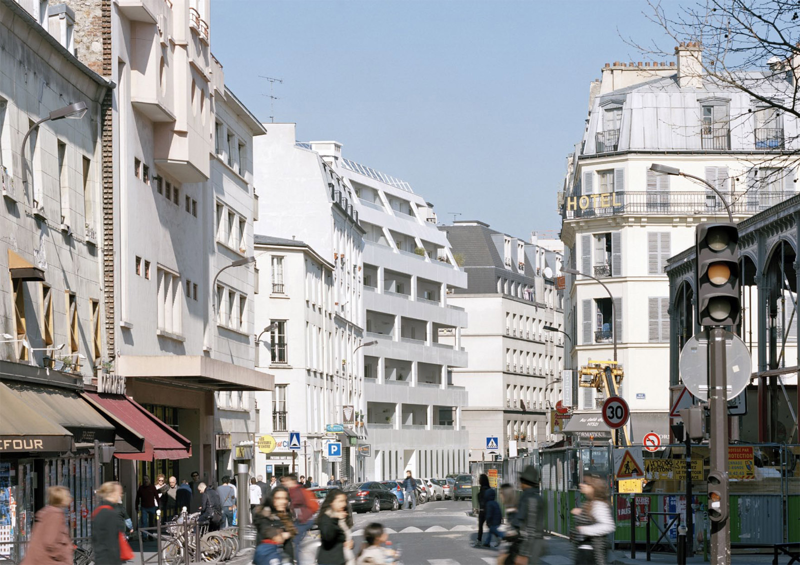
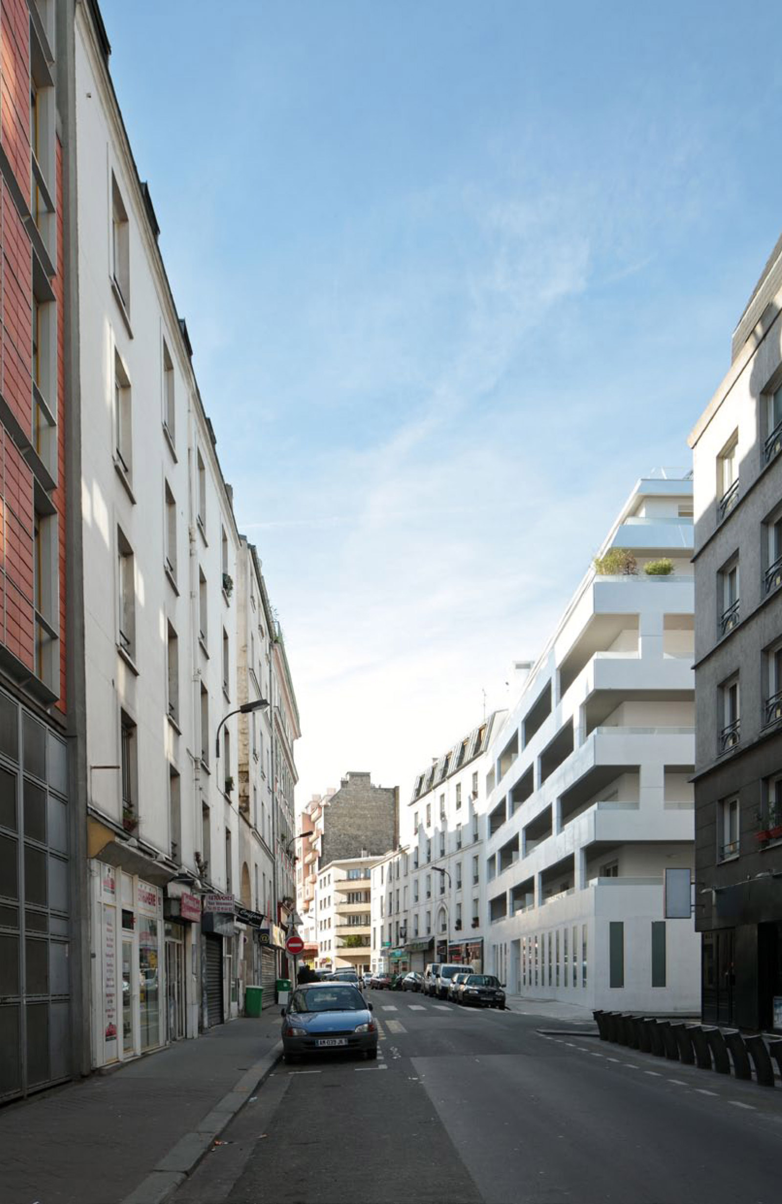
The 7 Passage Turquetil building by ECDM Architects is a quiet, modern example of contextualism set within the traditional fabric of Paris. It’s worth pointing out that while the structure takes direct geometrical and tonal cues from the adjacent buildings, it doesn’t copy these buildings or get in their way. 7 Passage Turquetil maintains its own identity by using materials and methods of the current time. As a gesture of respect, the simplicity and restraint of the new building allows the more ornamental historic buildings to take center stage.

[Photo Credit: Emmanuel Combarel Dominique Marrec Architectes]
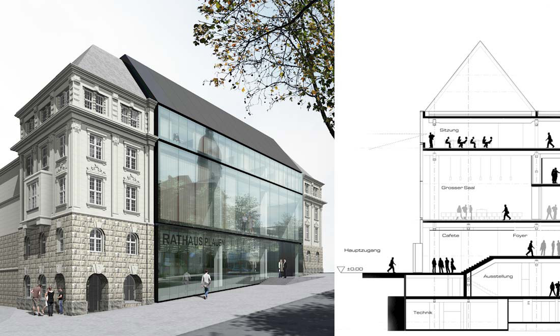
In another example, the proposed design for the town hall in Plauen, Germany by Berger Roecker Architects uses two traditional buildings as bookends which inform the scale, massing and horizontal datum lines of the new structure. The application of simple, modern materials elevates the stature and appreciation of the traditional surroundings. The old and new enter into a collaboration of function and aesthetics.

[Photo Credit: Berger Roecker Architects]
The Echo House addition in Dublin by Gumuchdijan Architects is prompted by the scale and massing of an existing Victorian residence. The clean lines and transparent façade of the addition nearly disappear, thereby highlighting the traditional counterpart. The two halves establish a yin and yang relationship with one another, making each other necessary.

[Photo Credit: Gumuchdijan Architects]
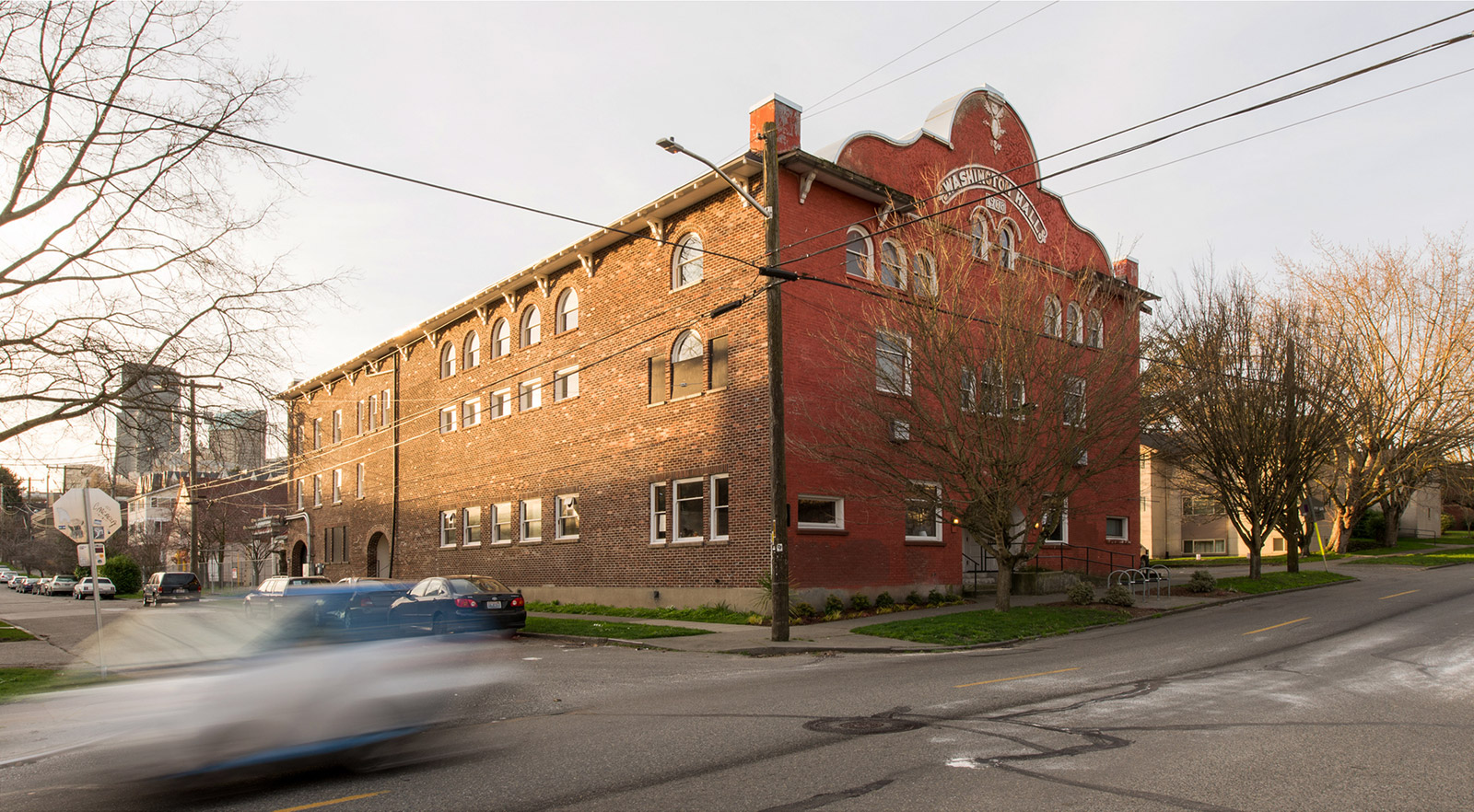
These sites provided excellent studies as we work through the design on the First Central Station project here in Seattle. The southern-most building of the project, fronting Fir Street, sits adjacent to one of the most important buildings in the community, Washington Hall. Constructed in 1908 by The Danish Brotherhood in America, Washington Hall is as historic as they come in the Pacific Northwest. The landmark has been host to musical greats such as Duke Ellington, Billie Holiday and Jimi Hendrix and has provided generations of Seattleites with a place to dance, socialize, gather and work. It’s a rare opportunity to not only continue the urban fabric of an important neighborhood, but to create an architecture that reinforces an important cultural hub.

[Photo by BUILD LLC]
The concept design for First Central Station takes three important cues from its historic neighbor. First, it acknowledges the height of Washington Hall by bringing the roofline across as an important material break in the new building. Secondly, the massing of Washington Hall is reflected in the protruding white box geometry which frames the living units of the new building along Fir Street. The equal proportions of Washington Hall and the First Central Station frame are pronounced, while the adjacent portions of the new building are pushed back. This geometric strategy keeps the streetscape in scale. Third, the darker material palette on the east elevation of the new building becomes backdrop and allows the red façade of Washington Hall to visually stand out along 14th Ave.

[Image by BUILD LLC]
Like the three examples above, we think it’s important that Washington Hall be respected and acknowledged without copying it or getting in its way. The simple, restrained aesthetic of the new development places emphasis on the unique qualities of the old, such as the arched windows and entryways at Washington Hall. This balance of new plus traditional opens up significant cultural and social opportunities while honoring the history of the site.
There are few greater achievements in design than creating useful, harmonious layers of architectures from different eras which all work together beautifully. And here is no exception. A thoughtful architectural response is an important one for the community surrounding Washington Hall, both in preserving its past and preparing for its future.
Cheers from Team BUILD


