[Image Credit: Arch Daily]
As part of a team of architecture firms, we’re currently working on a series of large scale multi-family, mixed-use buildings in Seattle’s Central District. The size of these buildings reach dimensions as large as 65 feet tall and 200 feet long. Their massing is truly at the urban scale and the program within necessitates an efficient and repetitive layout of spaces. While these factors translate into rational and disciplined envelopes, good urban architecture is responsive to the inhabitant as well as the pedestrian. The architecture of these buildings should identify opportunities within the underlying logic to develop variation and relief at the exterior. The architecture should invoke curiosity; it should have personality.
Getting our heads around the elevations of buildings of this scale was an excellent opportunity to brush up on some of the master architects of the past century. Diving into our library of favorite architects, we came out with 5 individuals who were true masters at modulation and articulation of a building’s façade. Today’s post reviews a handful of their projects and the primary lessons from which we’re drawing.
Walter Gropius
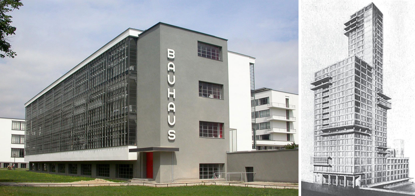
The Bauhaus School, Dessau, Germany, 1926 (below left)
Lesson: BOOK-ENDING
The dominant elevation on the Bauhaus school is almost treated like fabric, maintaining a strict geometry but articulated as a texture. Most significant to the elevation is a book-ending technique where the vertical circulation corridor provides a monolithic anchor to the building.
[Image Credit: AIDEC WORLD + StudyBlue]
Competition Entry for the Chicago Tribune, Chicago Illinois, 1922 (above right)
Lesson: FLOOR PLATE EXTENSION
The structural floor plates of key areas on this proposed design for the Chicago Tribune Tower are cantilevered, creating distinct geometries and developing a hierarchy of spaces. Presumably, there are distinct and significant functions planned behind the enhanced frames.
Giuseppe Terragni
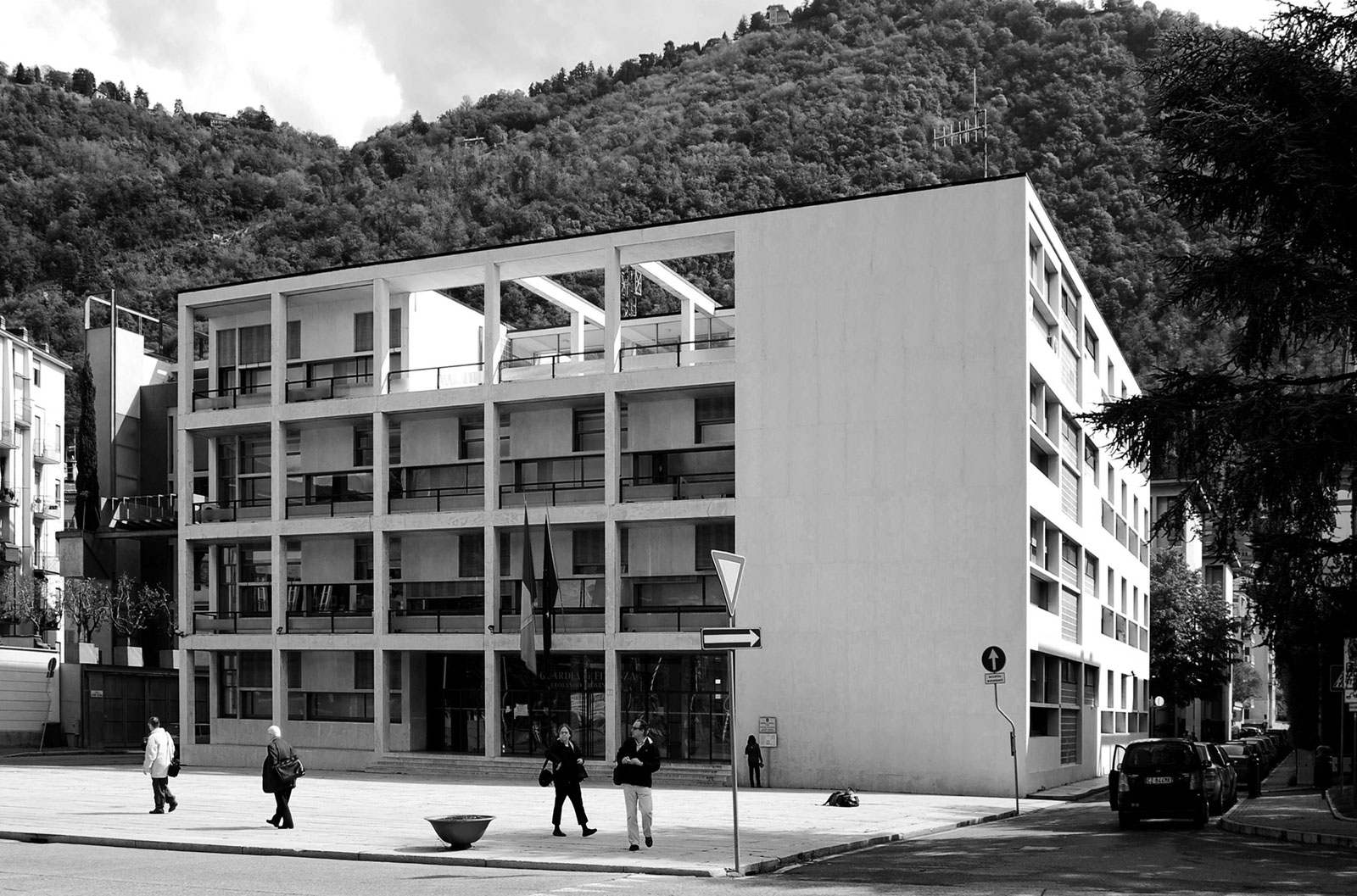
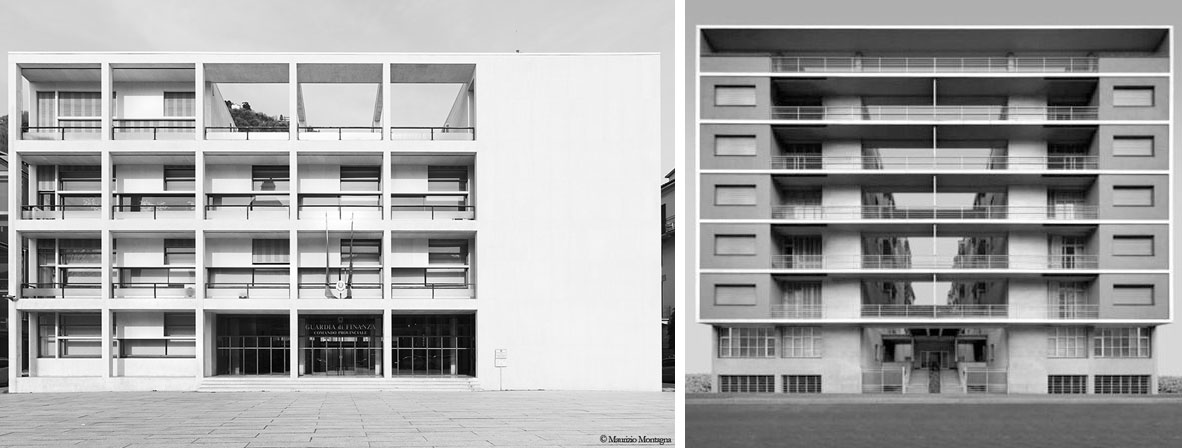
Casa del Fascio, Como, Italy, 1936 (below left)
Lesson: LAYERED GRIDS
Casa del Fascio sets up a clear distinction between the five bays of attenuated grid and the two bays of solid massing. A secondary layer of contrast is more subtly introduced by way of three different functions behind the 20 grid bays.
[Image Credit: Padiglione Architettura + e-motion-lab]
Casa Rustici, Milan, Italy, 1935 (above right)
Lesson: COMPARATIVE DEPTH
While there are a number of differing depths explored in the façade of Casa Rustici, each is measured against the constant datum of the horizontal floor planes. This clever method of exterior circulation enhances the effect of each depth plane while establishing a perfectly symmetrical elevation.
Le Corbusier
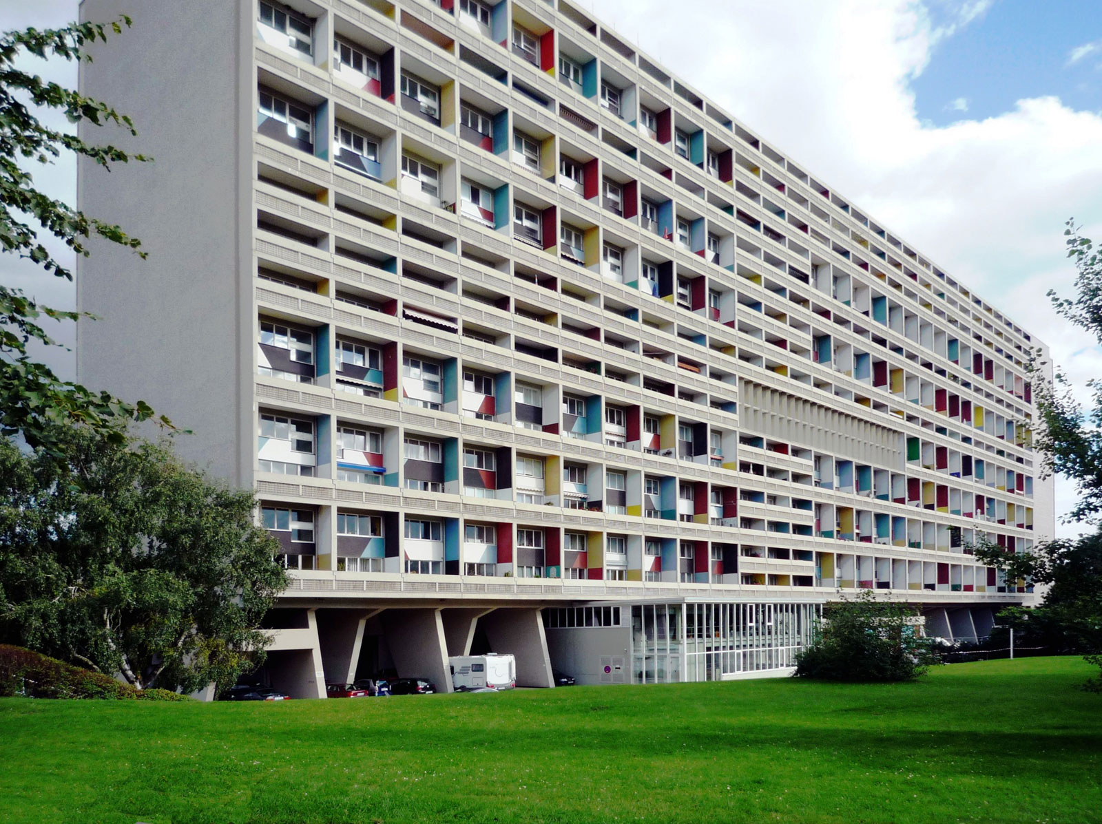
Unite d’Habitation, Marseille, France, 1952
Lesson: VARIATION AS ORGANIZATION
The elevation of the Unite d’Habitation takes the extension of the structural grid a step further and develops the cells within the grid. Differing guardrail and sunshade geometries, as well as their orientations, are grouped together into blocks. These contrasting blocks combine to form a modulated elevation. Color schemes applied to the vertical planes, by artist Nadir Afonso, randomize what would otherwise be a very severe façade.
[Image Credit: Wikipedia]
Alvar Aalto
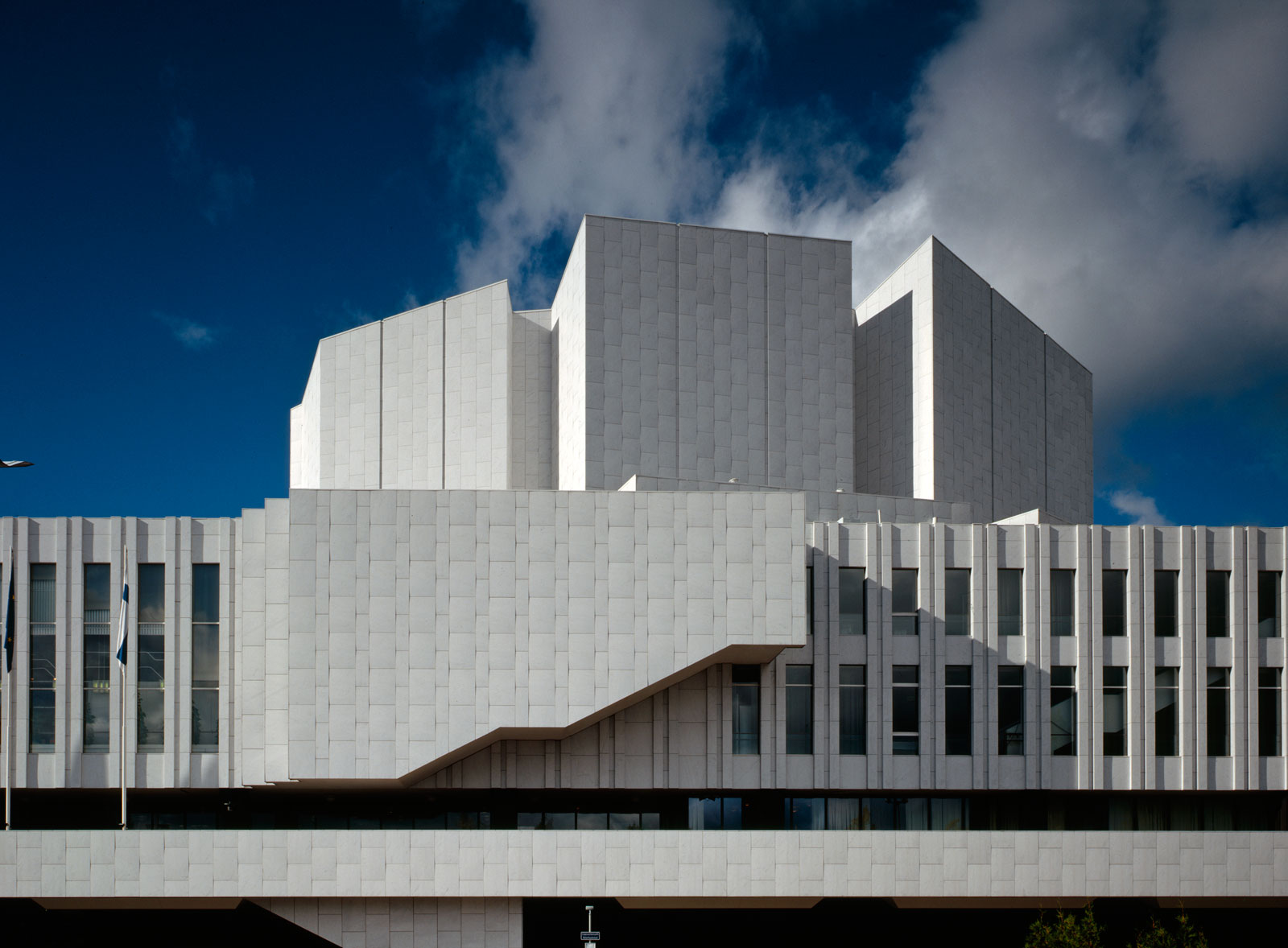
Finlandia Hall, Helsinki, Finland, 1971
Lesson: FUNCTIONAL ANOMALY
A simple and easily identifiable stair function is extruded from an otherwise repetitive elevation on Finlandia Hall to bring depth, shadow, and a bit of playfulness to the design.
[Image Credit: Finlandia Talo Huset Hall]
Ricardo Legorreta
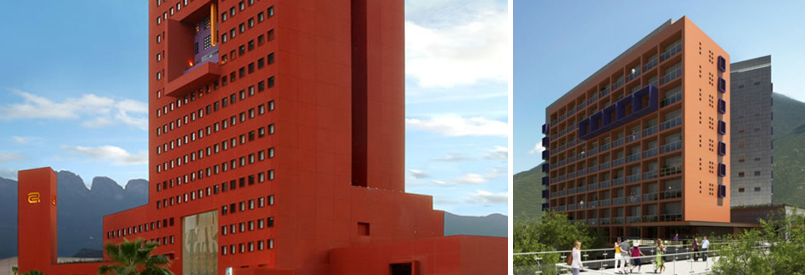
Camino Real, Monterrey, Mexico, 2007 (below left)
Terra Esperanza, Guatemala City, Guatemala, 2013 (below right)
Lesson: CHANGE OF PLANE AS CHANGE OF COLOR
Both the Camino Real and Terra Esperanza projects use a bold plane change (recessed or pronounced) to introduce a new color/material into the elevation. The Camino Real example suggests that the façade surface is peeled back to reveal the structure’s internal layers.
[Image Credit: ArchiTravel]
These five modern masters offer a kit of parts that we’re incorporating into our own thinking with large scale buildings. One could dispute whether some of the projects illustrated above actually create enjoyable urban environments, and there are entire courses dedicated to this controversial topic (some are even political hotbeds of debate). All debates aside, each of these examples offer deliberate and successful elevation strategies. A careful balance of the right strategies applied thoughtfully and responsibly has significant potential to create articulated, timeless buildings of human scale.
Cheers from Team BUILD


