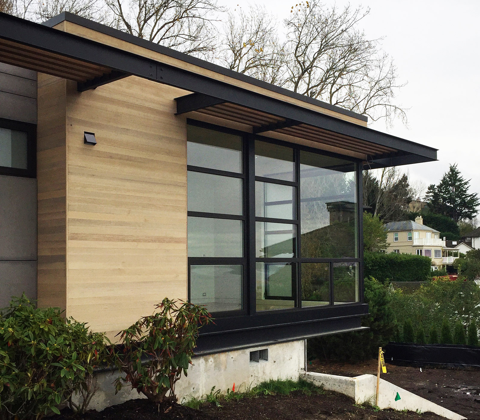
[Single Family Residence in Magnolia, photo by BUILD LLC]
The roster of projects currently in design at BUILD spans everything from large apartment buildings to custom single family residences, and everything in between. This bandwidth of projects allows us to apply our skills to living spaces of all scales and master housing as a typology. Along with this purpose, comes an invaluable test of modern design. All too often, sleek, inspiring modernism is thought to be the result of exclusive, custom residences commissioned by society’s elite. On the contrary, we’re firm believers that good modernism can apply to design at any scale — for renters, homeowners, and wealthy patrons alike.
It’s important to note that we’re not referring to a modernism of slick and trendy embellishments. The modernism that concerns us has both feet on the ground. It is a straightforward modernism for the usefulness of everyday life — we refer to it as sensible modernism. This brand of modernism is inspiring and forward-thinking while maintaining a pragmatism about it. We often say that sensible modernism is everything it needs to be and nothing more, and there’s no better way to filter down the possible design strategies than by applying them to a range of project scales.
If an architectural strategy is essential to the design of a tidy apartment as well as a spacious single-family residence, it’s usually the mark of sensible and timeless modernism. These strategies are limited, but when we discover them, they go straight into our bag of architectural tools. Decades of experience have taught us to nurture, protect, share, and even defend these strategies, and today’s post will examine five of the most important ones.
Generous Glazing
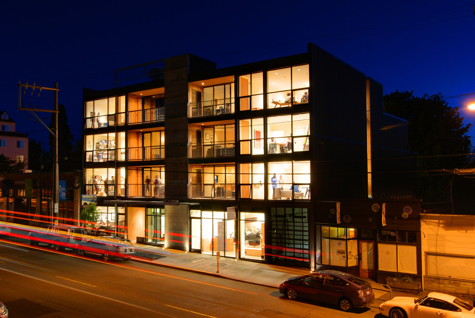
As achievable as this seems on a single-family residence, getting floor to ceiling windows through the design process of a multi-family development can be quite challenging. Big, beautiful, windows let in an abundance of natural light and offer more opportunities for natural ventilation. We believe these are basic life qualities that all people should have access to. Floor to ceiling windows also offer more transparency between the indoors and out, and encourage eyes on the street, making urban environments safer. We like to design window packages as generous as possible and include operable panels away from lines of sight to minimize interference with the light and views.

[Park Modern, photo by BUILD LLC]
Interior Alignment
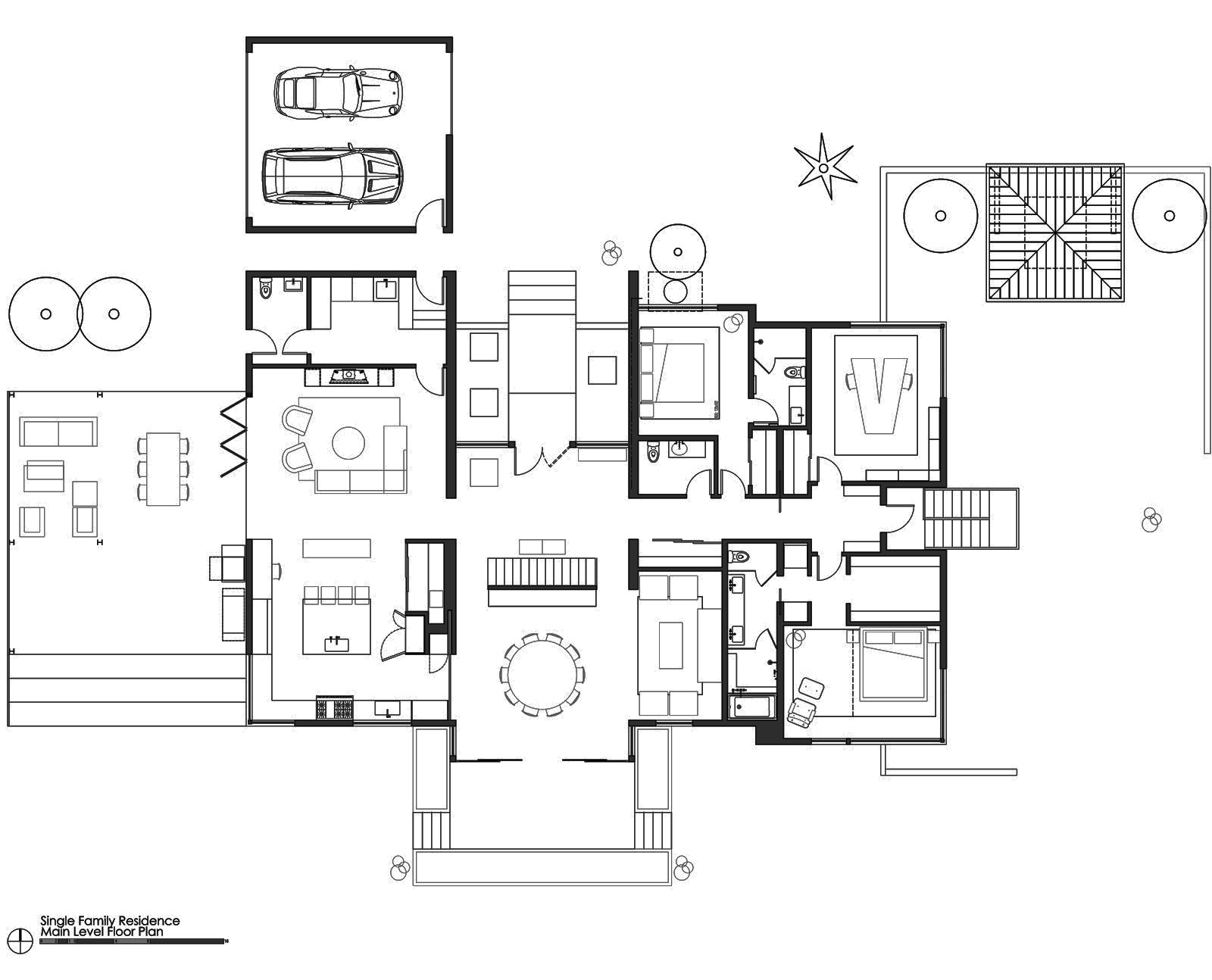
While lining-up walls, doors, windows, and other interior components seems like a no-brainer, a simple Google search for “floor plans” not only assaults the viewer with all scales of cluttered and convoluted design, but proves that the merits of clean lines are missed by homeowners and architects alike. The simple exercise of alignment creates a harmony within a space and, whether it’s consciously recognized or merely felt, design harmony has a significant influence on life harmony at all scales. We like to align the doors of opposing walls down a hallway and even mirror bedrooms as to provide harmony within the plan.

[Single Family Residence in Magnolia, plan by BUILD LLC]
Sightlines and Focal Points
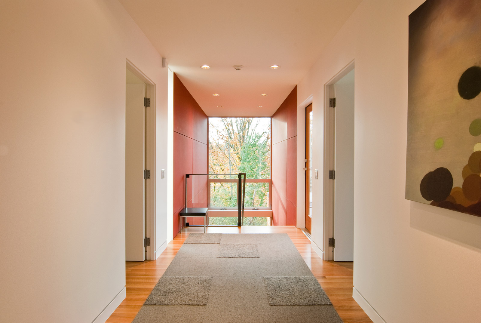
Intentionally designing hallways and corridors to include opportunities for art, views outside, or avoiding design dissonance has a tremendous effect on the experience of a living space. Under the best circumstances, we’ll terminate a hallway with floor to ceiling glass and a view to a significant landscape feature. When a window is not possible, we’ll designate space for a sculpture or wall hanging. If creating space for a significant focal point isn’t possible, doors, windows and other architectural features should at least be configured as to not conflict with the alignment of the view axis (e.g., you shouldn’t see half a doorway at the end of a hall). This is simply good planning at any scale.

[Single Family Residence in Bellevue, photo by BUILD LLC]
Keep It Orthogonal
Angles, especially the notorious Spec Builder 45° Angle Extravaganza are typically used to reconcile plans that haven’t been well conceived. Or used as an attempt to make spaces seem more dynamic in the vein of corner fireplaces and angled kitchen islands. Thoughtful, efficient design doesn’t rely on gratuitous angles; the wasted space muddies the layout and the finicky angles make detailing unnecessarily more difficult.

[Park Modern, plan by BUILD LLC]
Orderly Circulation
Circulation paths don’t always have to be straight lines and 90° angles, but circulation that seems to senselessly meander through a variety of interior living spaces only enforces the fact that it was not thought through. This type of aimless circulation path deteriorates the function of spaces and eats up precious square feet. We favor straight, dedicated lines of circulation, and when space is tight, the circulation can overlap with other functions in a manner that makes sense, such as a galley kitchen.

[First Central Station, plan by BUILD LLC]
These five strategies of modern design can be applied to various scales of modernism, and the images above provide examples from projects both built and in design. Perhaps best of all, these strategies don’t necessarily cost more — their successful execution is typically a matter of planning and defending good design from the start. And whether these design strategies hard at work are recognized is beside the point. The strategies improve the quality of life and offer a healthy and harmonious backdrop for inhabitants to make the space their own.
Cheers from Team BUILD


