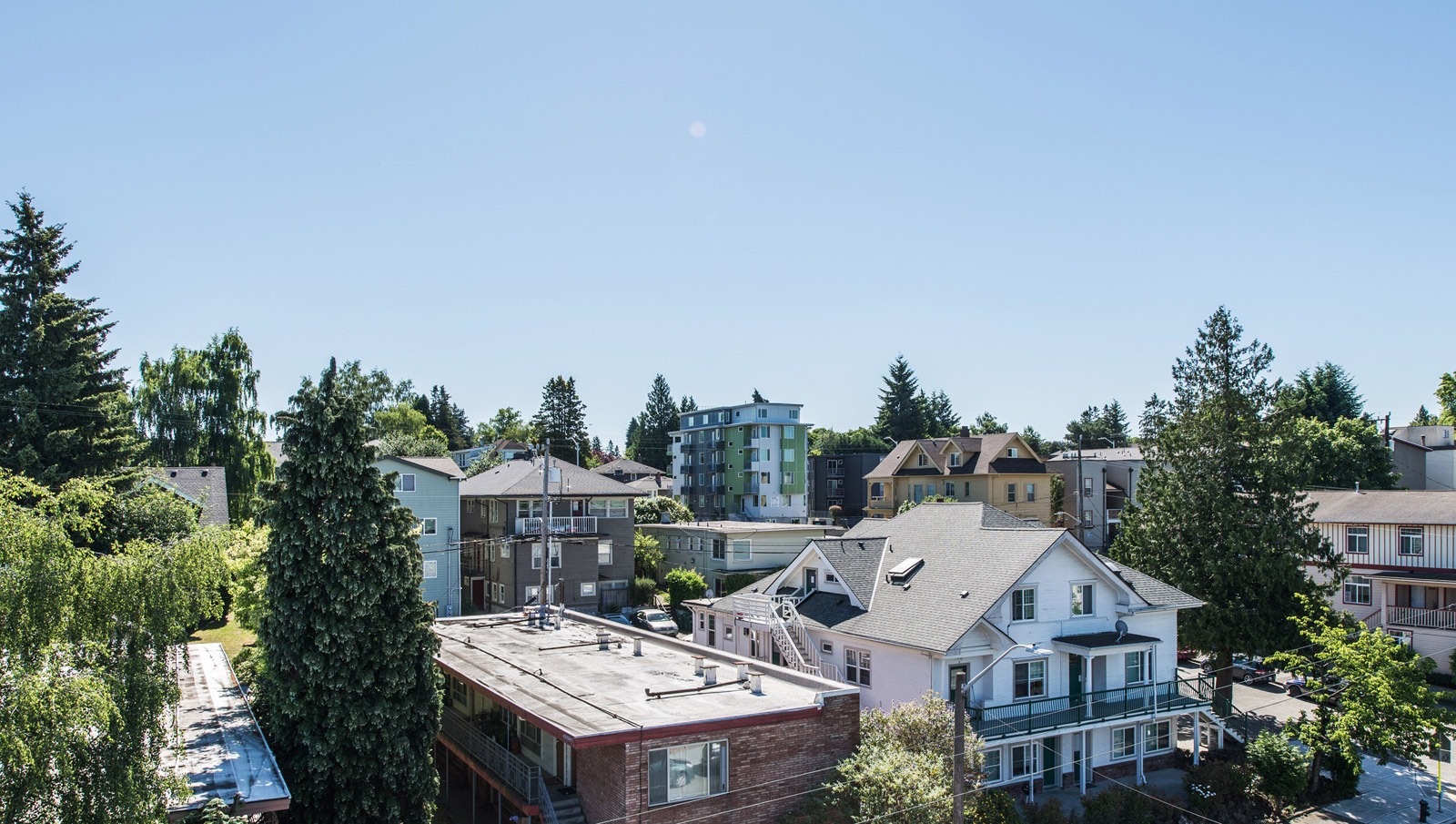
[All images by BUILD LLC]
Within the last couple of years, the popularity of micro-housing (aka pod apartments, aPodments, microunits, or microflats) has been on the rise in the U.S. These one-room, self-contained living spaces are typically designed to accommodate a sitting space, sleeping space, bathroom and kitchenette, all within a minimal floor area. Here in Seattle, there are dozens of micro-housing developments cropping up lately, each with individual unit areas ranging between 150 and 350 square feet.
Along with the popularity of micro-housing comes all of the edgy design competitions, the alluring coverage on architecture blogs, and the zippy marketing campaigns. But despite all of this high gloss publicity, we’ve noticed that people speak the term micro-housing with cautious suspicion, and usually punctuate it with a sigh. We’re no exception here at BUILD, and each time we see a new aPodment building go up in town, it’s difficult to suppress the skepticism.
It’s worth noting that we’re proponents of smaller, smarter living spaces, both in philosophy and in practice. For the most part, we think that people can be perfectly comfortable in much smaller living spaces. With this in mind, however, it occurs to us that there is probably a bare minimum that humans need to be healthy, happy, and useful. Heck, even chickens are required to have a minimum square footage of space to be considered “free range.” As architects and builders it’s hard not to wonder: how small is too small, and when we get there, will we (collectively) recognize the threshold of acceptable standards of living?
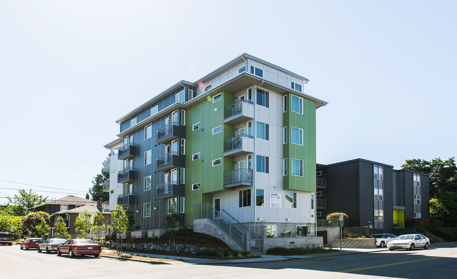
Just recently, our own neighborhood was graced with the Palermo aPodments. In fact, they’re in direct view from the Park Modern. Architecturally, we’re not big fans of how the building looks, but we’re the analytical type, so before we reach any conclusions based on aesthetics, we thought it only prudent to analyze the data. Today’s post examines the metrics of a typical micro-housing unit with a few comparisons of relatable proportion. So here goes.
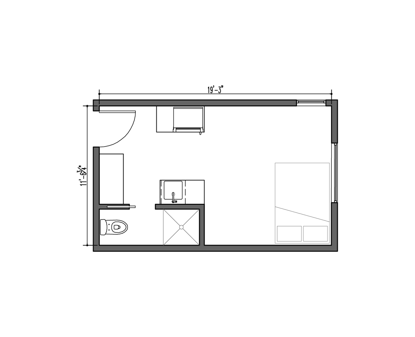
Typical Micro-Housing Unit
Notes: this unit happens to be from the Cubix Apartments in North Seattle, but we’ve found that most of the floor plans, amenities, and prices are similar to other micro-housing units around town.
Area: 222 SF
Monthly Cost: $695 and up
Cost Includes: Utilities, internet access
Amenities: Shared rooftop deck
Upgrades: Onsite storage available
Marketing slogan: “Everything you need. Nothing you don’t.”
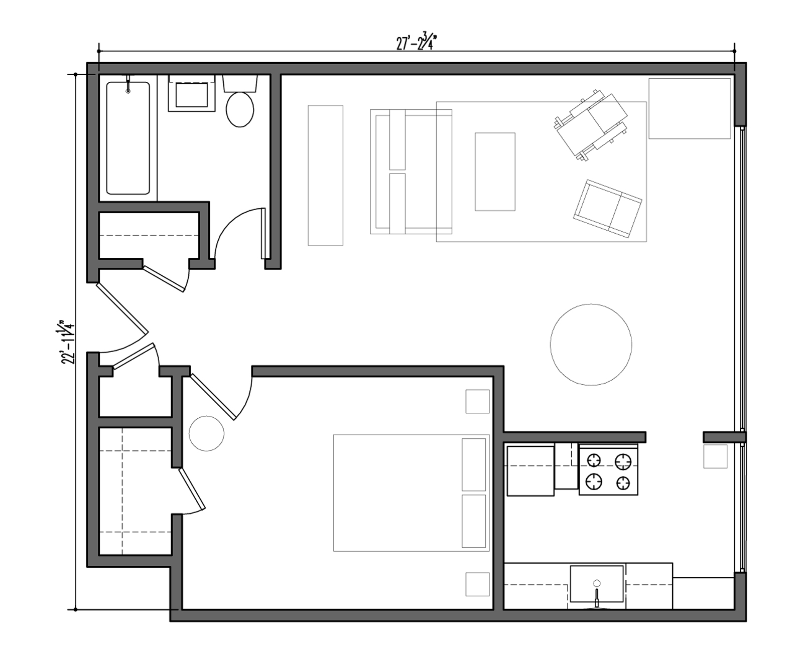
Average Mid-Century Apartment
Notes: We pulled information and the floor plan from a unit here in Seattle on Queen Anne hill, but there are many like it in urban areas.
Area: 616 SF
Monthly Cost: $1,500
Cost Includes: Utilities
Amenities: There’s usually an oak hardwood floor underneath the pet-stained carpet
Upgrades: Parking
Marketing slogan: “On the bus line.”
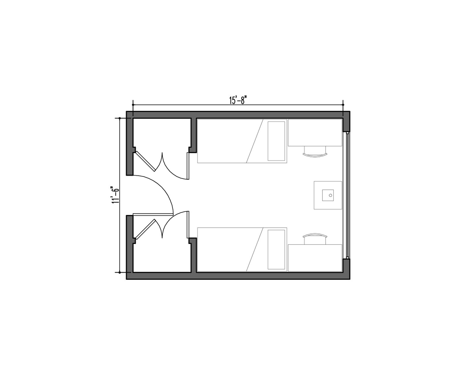
Typical Dorm Room
Notes: You know the drill, this is the Freshman Special, two-student dorm room with perfectly symmetrical sides and plenty of wall space to hang those crappy bracket shelves. We pulled our information from the dorm system just down the street at the University of Washington, however this unit layout is typical at public universities around the country.
Area: 180 SF
Monthly Cost: ~$775
Cost Includes: Utilities, internet access, cable TV
Amenities: Parties
Upgrades: Kegerator
Marketing slogan: “Love where you live. Live where you learn.”
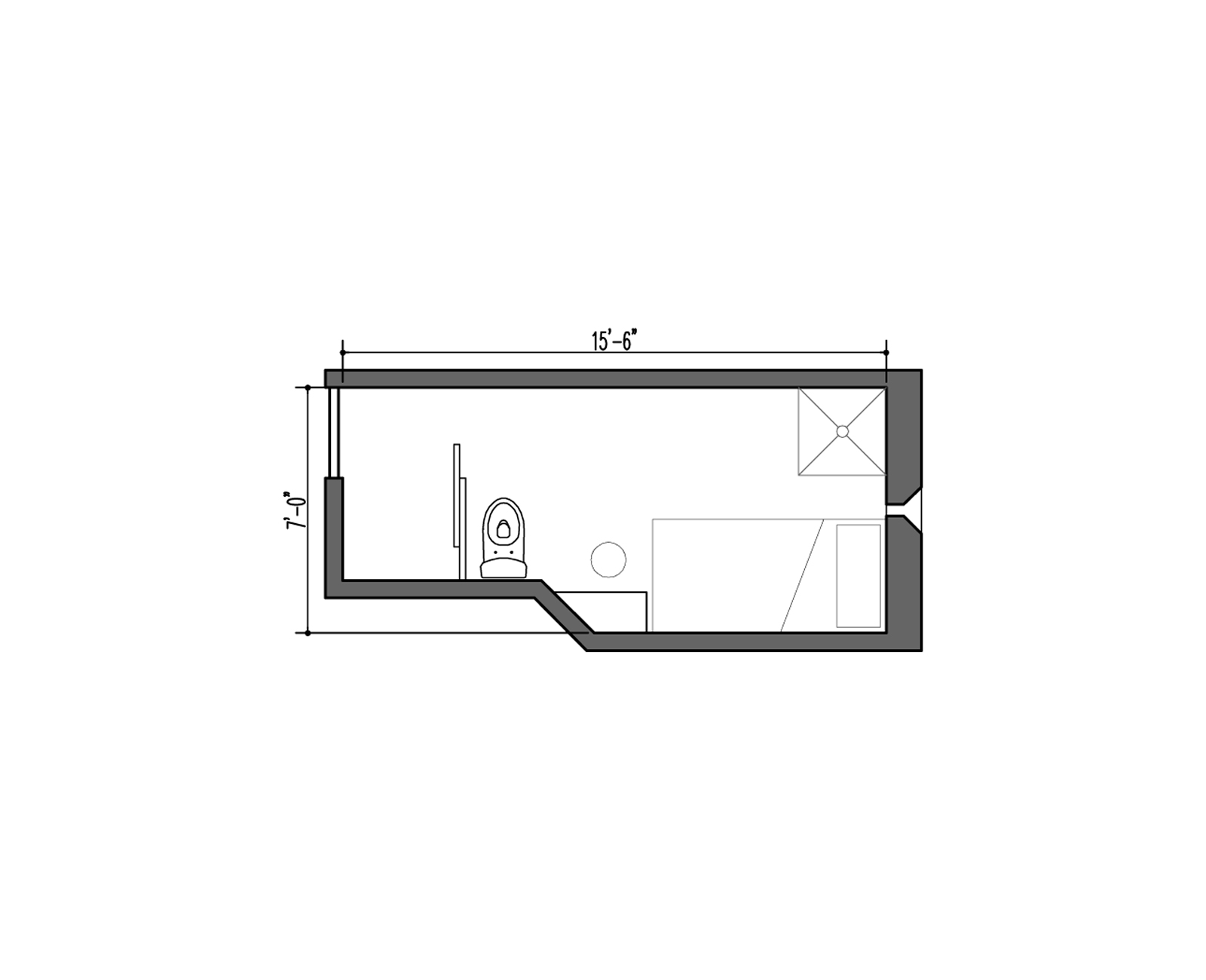
Supermax Prison Cell
Notes: These come in a few different flavors and, since we’ve never stepped inside one of these, we’ve done our best to gather information online.
Area: 80 SF + 10 SF “shared” vestibule
Monthly Cost: Technically free (cost to taxpayers = $5,167)
Cost Includes: Meals, clothing, linens, security
Amenities: Workout facilities, cafeteria
Upgrades: Depends on how “connected” you are
Marketing slogan: “The Architecture of Control”
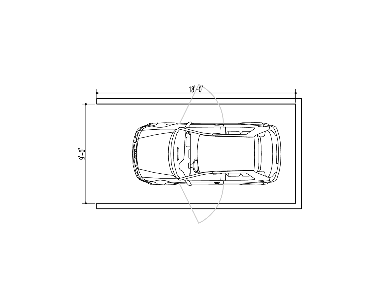
Medium Parking Space
Notes: this is the basic large size parking stall ubiquitous throughout the United States of America.
Area: 162 SF
Monthly Cost: $150 (in Seattle)
Cost Includes: Space for door swing
Amenities: Concrete floors, coveted raw/industrial look
Upgrades: Accessibility parking
Marketing slogan: “Save time, pay by phone.”
Summary
After doing our homework and comparing the metrics, Team BUILD came to several conclusions regarding adequate living space for a person’s well-being. Unless you’re a college student or a convicted felon, the requirements that we generated should include the following for each living unit:
-
• A bare minimum of 325 square feet of area
• A kitchen with a refrigerator, stove, and sink (not just a kitchenette with a mini-fridge and a hot plate)
• A built-in closet (we’re embarrassed that we even have to state this)
• A sink in the bathroom (again, embarrassed)
Given the guidelines above, some micro-housing units could actually make the cut, which we’re all for. If a smart, small space is well designed, we truly believe that people can live with less. But there’s one additional qualifier that came up time and again in our study. Many of the micro-housing ads and websites we studied relied on the same design & marketing strategy of “trading in quantity for quality.” It’s a design philosophy that we’re completely aligned with, provided that the trade actually occurs. And this is where most of these projects fail. While micro-housing successfully minimizes living space, they fail to supplement it with quality. This quality could be included in any number of ways. At the planning level it could be incorporated with usable communal kitchens or enjoyable common outdoor spaces. At the detailing level it could be integrated via big, operable windows or a well-designed envelope by an architecture team that’s actually concerned with balance and visual harmony. But instead, most of these buildings are highly profitable boxes for living, nothing else.
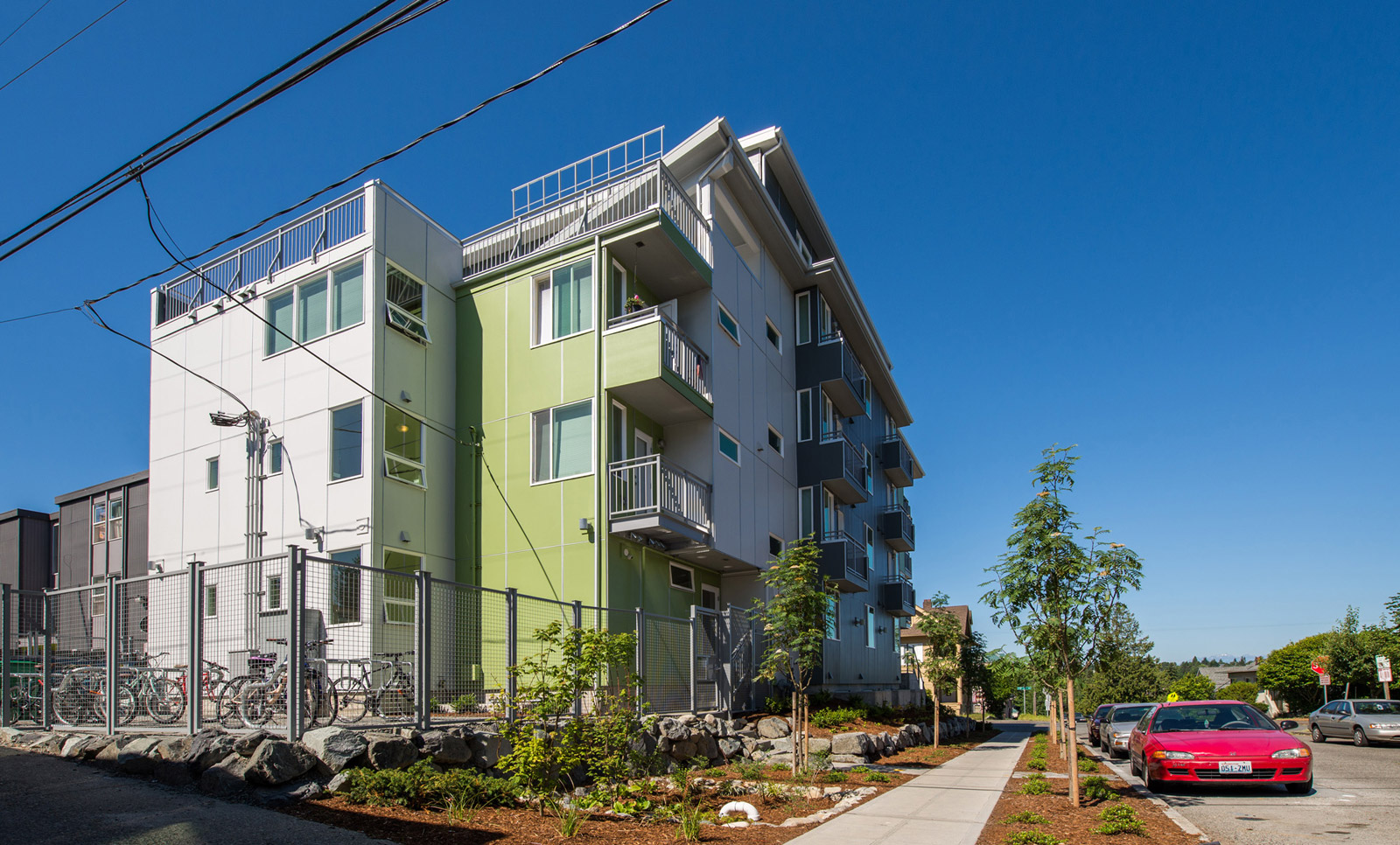
There are undoubtedly some good micro-housing examples out there, though we’ve discovered very few. Until the scales tip toward actually trading the quantity with quality, we’ll maintain a healthy doubt in the micro-housing movement.
Cheers from Team BUILD


