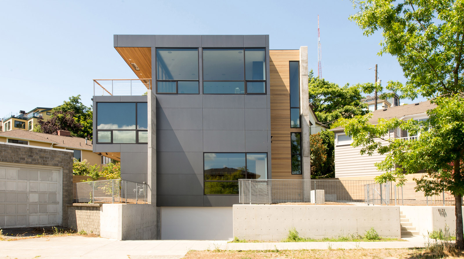
[All photos by BUILD LLC]
BUILD LLC just completed a new single family residence located on the south slope of Seattle’s Queen Anne Hill. It was a tricky project because of several site constraints and the ever restricting building code provisions. If you follow the BUILD Blog, you know that we love to turn limitations into opportunities for good design, which makes excellent data for today’s post. Here’s the breakdown:
THE CIRCUMSTANCES
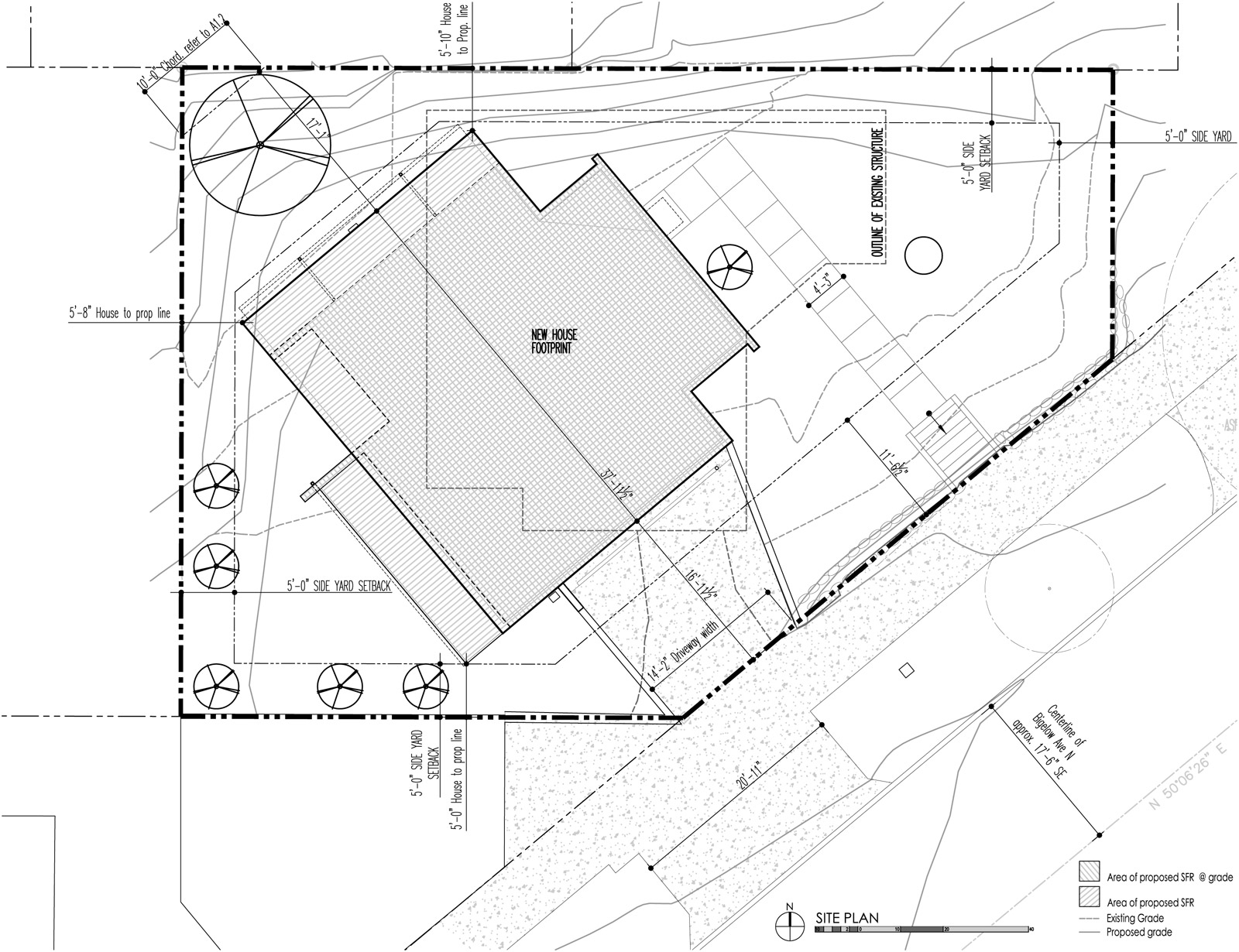
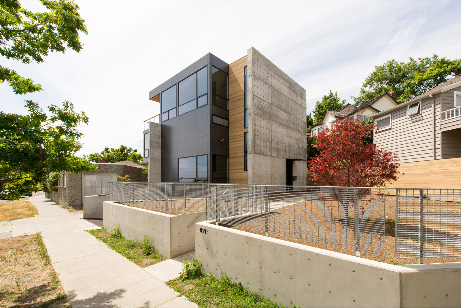
The lot area is a tidy 4,500 square feet with applicable setbacks, leaving a buildable area of 2,843 square feet. There were certain features inherited with the lot, such as the existing curb cut and retaining walls at the south end of the property. An existing and non-conforming concrete masonry unit garage on the adjacent parcel is also tight up to the property line and needed to be considered with the proposed design. Despite these limitations, it was clear that the site had the potential for extraordinary views that the design needed to optimize.
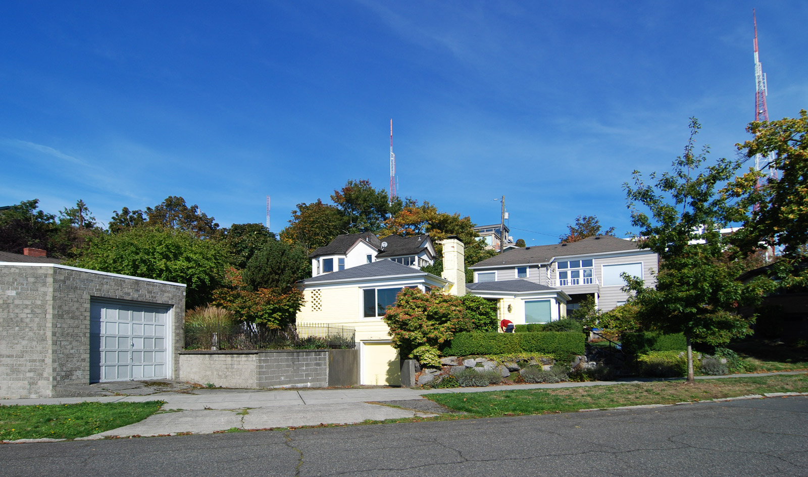
[Original house on the property]
THE CHALLENGES
Storm water management has become an increasing concern in the Pacific Northwest and stringent building codes limit a proposed residence’s footprint to 1,500 square feet. The footprint of the new structure, along with the sidewalks and driveway is 1,778 square feet and while this is compact we still had an excess of 278 square feet to deal with. To mitigate this overage, we planted additional trees and used a permeable driveway surface, both of which limit the amount of storm water leaving the site without the need for expensive infiltration facilities. These methods maximized the amount of impervious surface area, while keeping the permitting process as simple as possible.
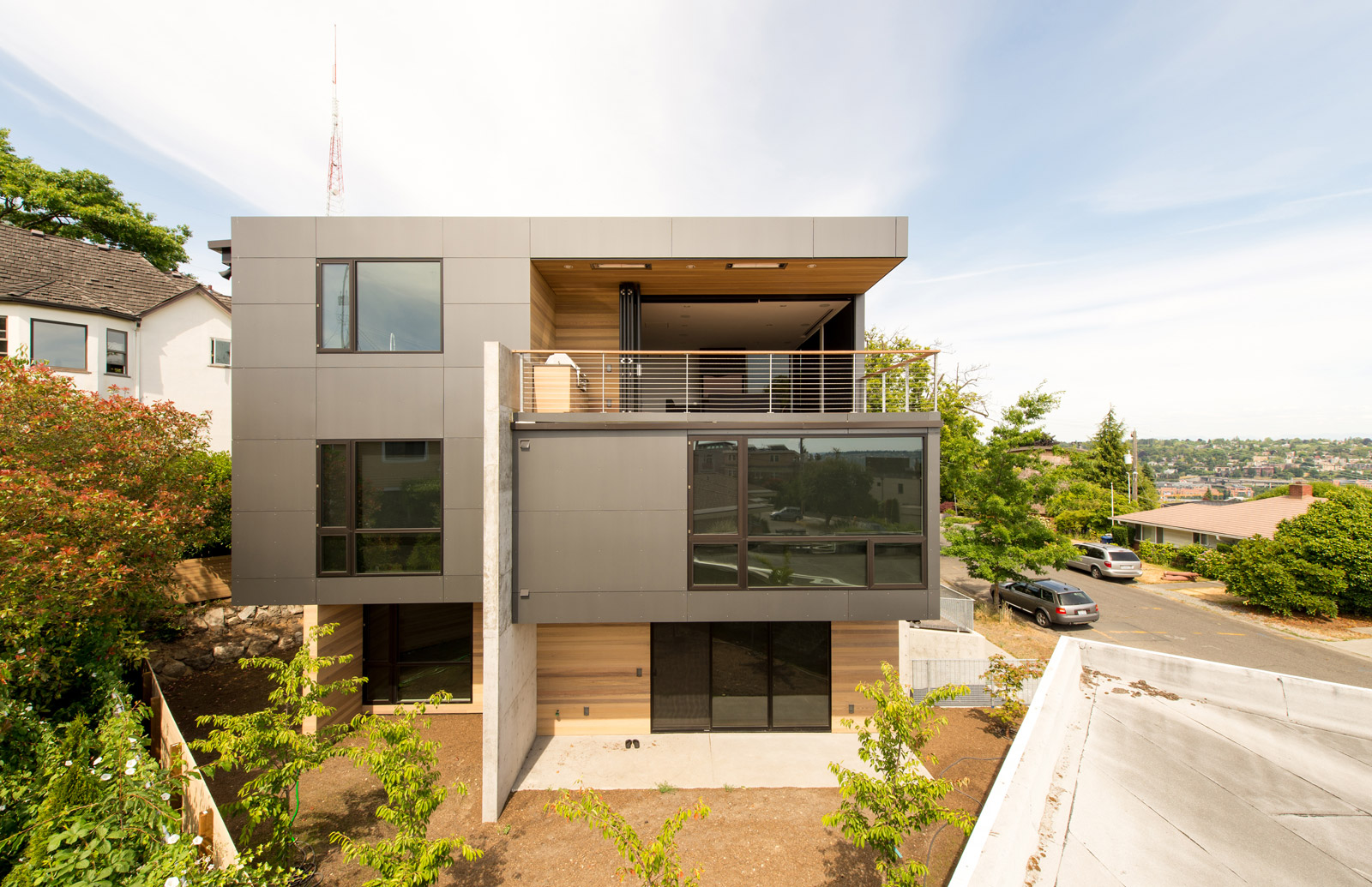
Fitting the necessary functions into a tidy footprint of roughly 1,100 square feet necessitated a structure of four levels and, in many ways, became a game of Tetris (more on this below). Subsequently the 30’ height limit was an important factor in determining the massing of the house.
It’s also worth noting that the median between the property and the street is managed by the Parks Department which required additional permits for use and temporary storage of materials.
THE PROGRAM
The interior functions include the typical common areas (living room, kitchen, dining room) along with two bedrooms, a master suite, a guest suite, a family room and an office space, in addition to the necessary bathrooms, utility spaces, garage, and circulation requirements. In order to achieve the desires relationships among these different spaces, and maximize the natural light and views, the massing exercise led to a tall, skinny form as illustrated in the study diagram below.
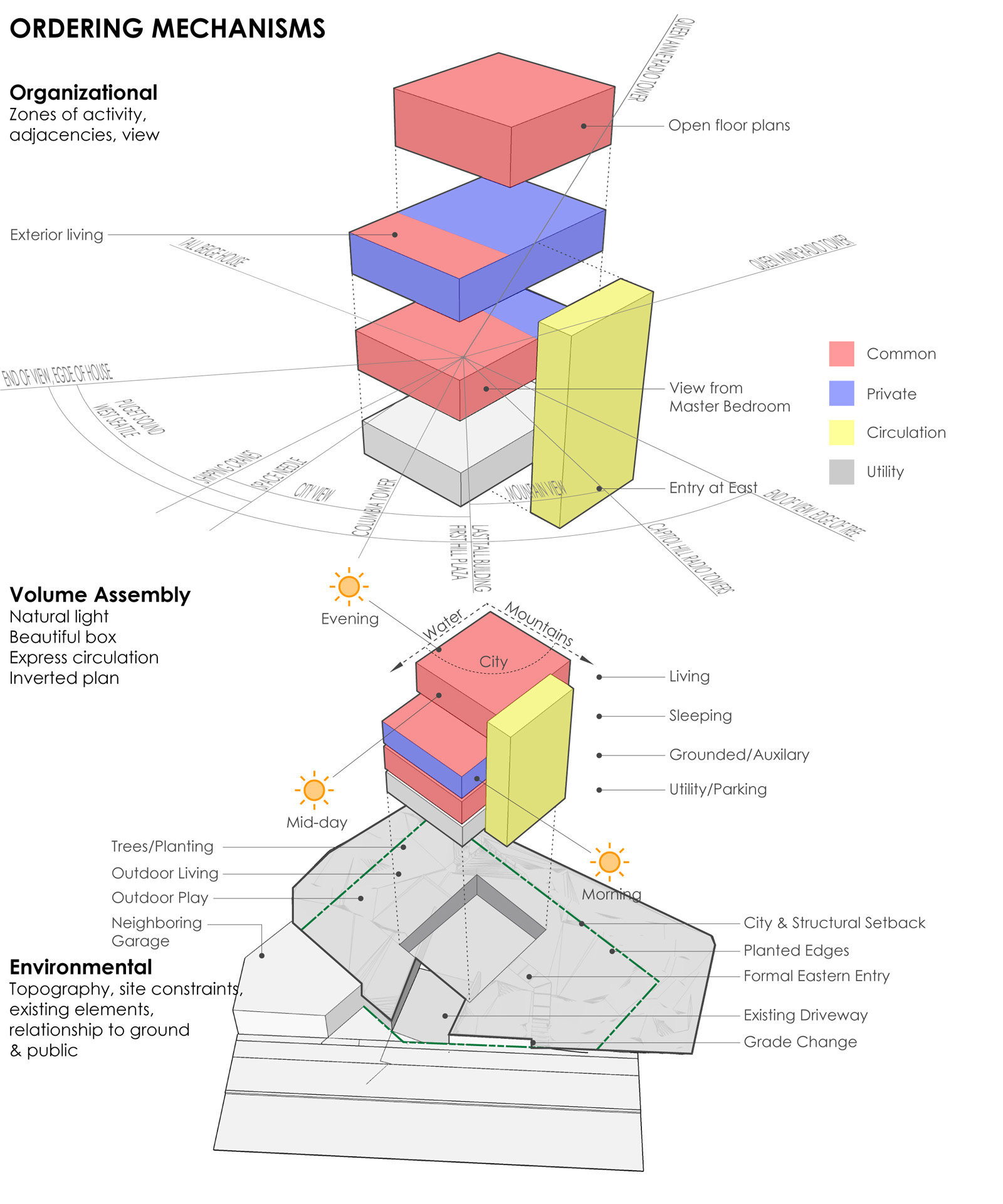
Because the views of Seattle, the Puget Sound, the Cascade Mountains, and Mt. Rainier were important at the common areas, the design uses a reverse floor plan. The living, kitchen, and dining areas are organized on the top floor, while the bedrooms and more private areas of the house reside on the 2nd and 3rd floors with the basement and utility spaces below grade.
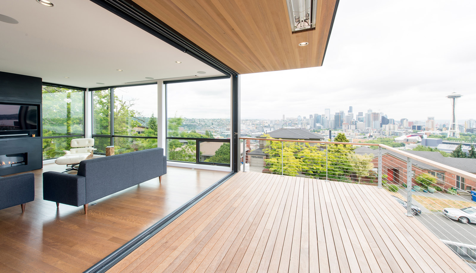

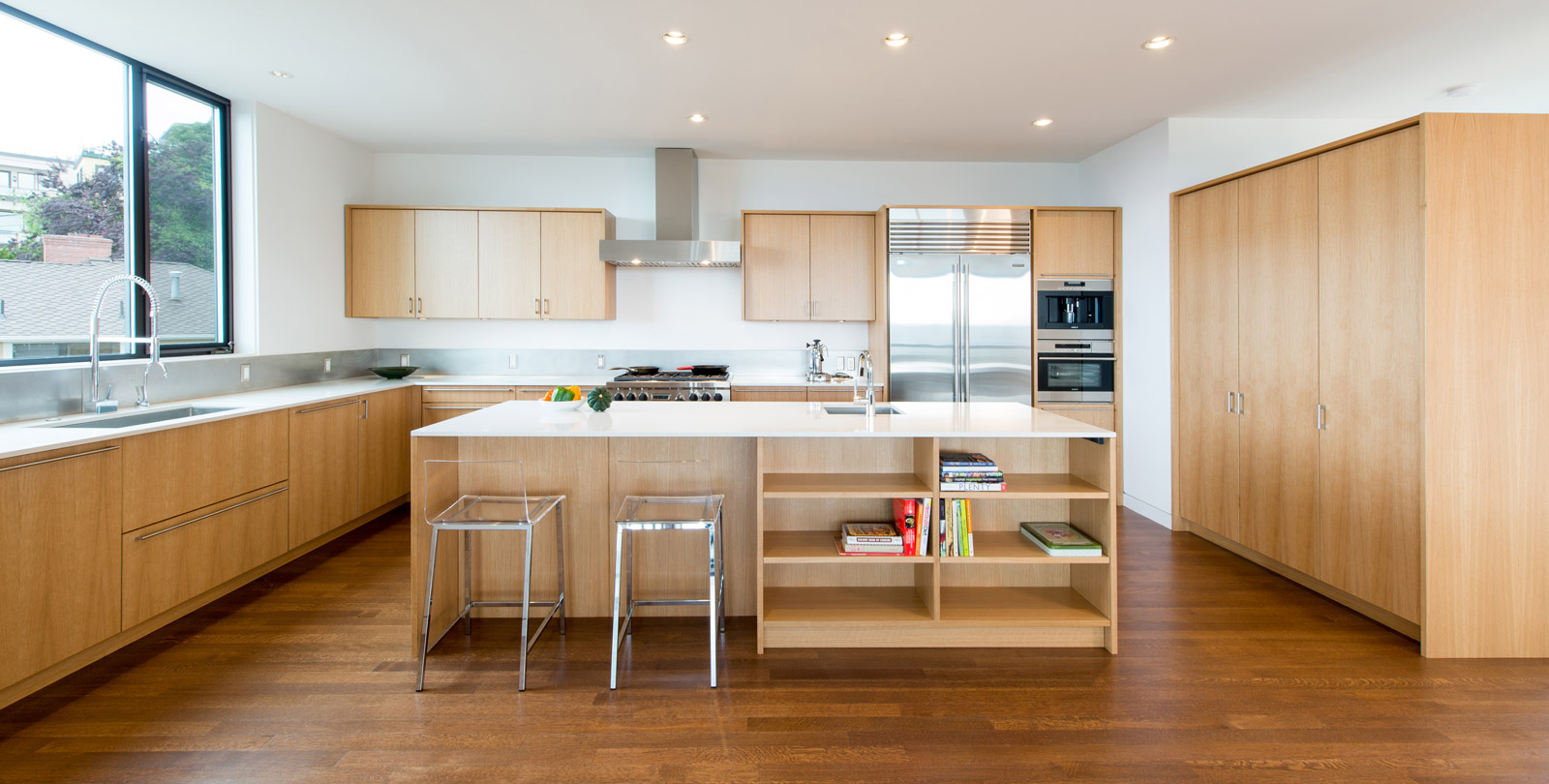
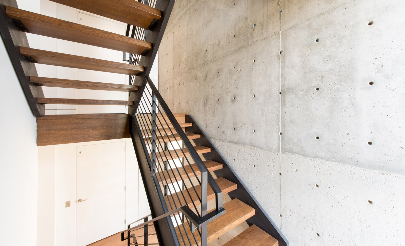
In order to efficiently serve each of the four floors, a dedicated circulation core at the north contains all of the vertical circulation. The biggest challenge of the reverse floor plan is reaching the kitchen from the garage with groceries, kids, and everything else included with the family of four lifestyle. A small residential elevator solves this issue by providing quick and easy access from the basement to the top floor.

DESIGN CONCEPTS
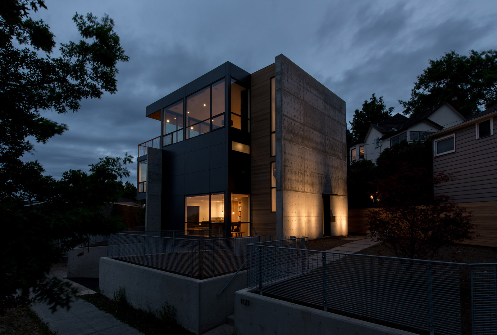
The stacked program of this residence is both unique and intricate, allowing the envelope to take significant design cues from the interior functions. In other words, the house looks like what it’s doing.
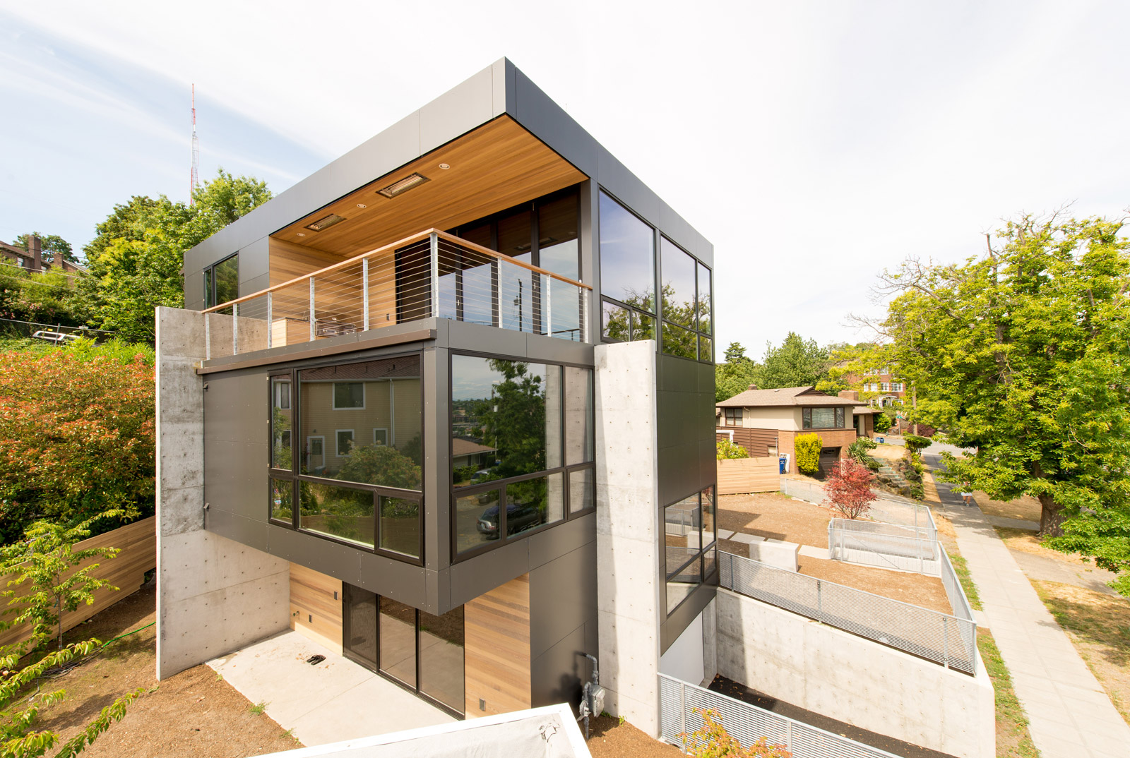
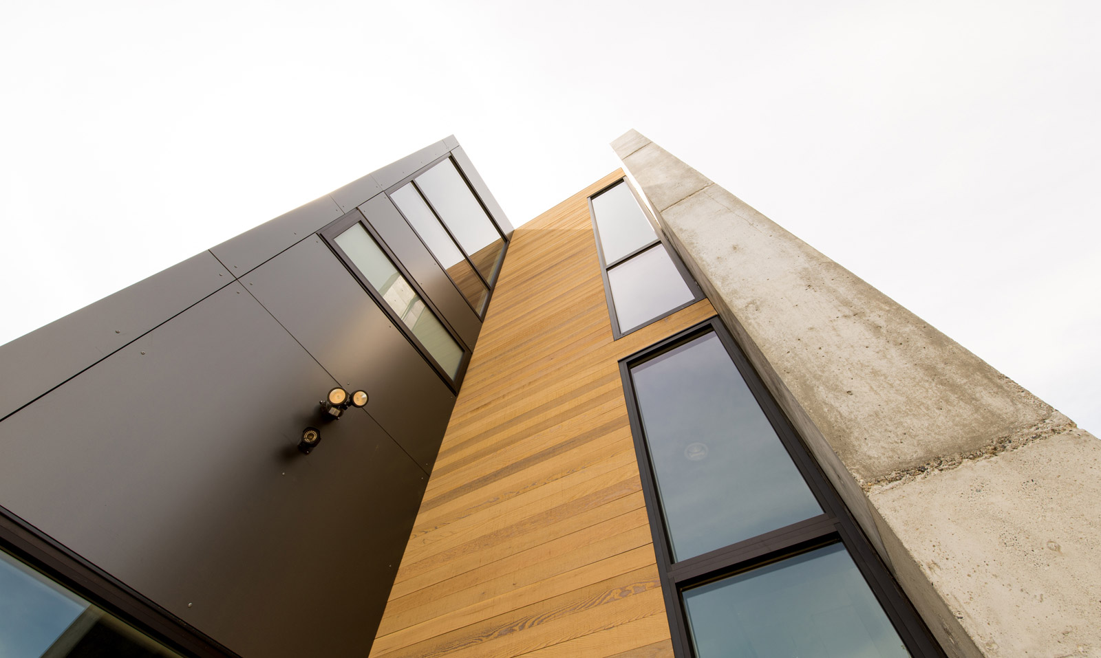
Three primary materials are used at the envelope. The solid masses are enhanced with aluminum rainscreen panels and the windows are bronze anodized aluminum. This darker tone allows the warm cedar to pop at the circulation core and the recesses below cantilevers. Prominent walls within the house were formed in concrete and extended beyond the envelope out into the landscaping. At the north elevation of the structure, a 30’ tall concrete wall bookends the structure, provides a dramatic entry point, and serves as a backdrop to the landscaping.

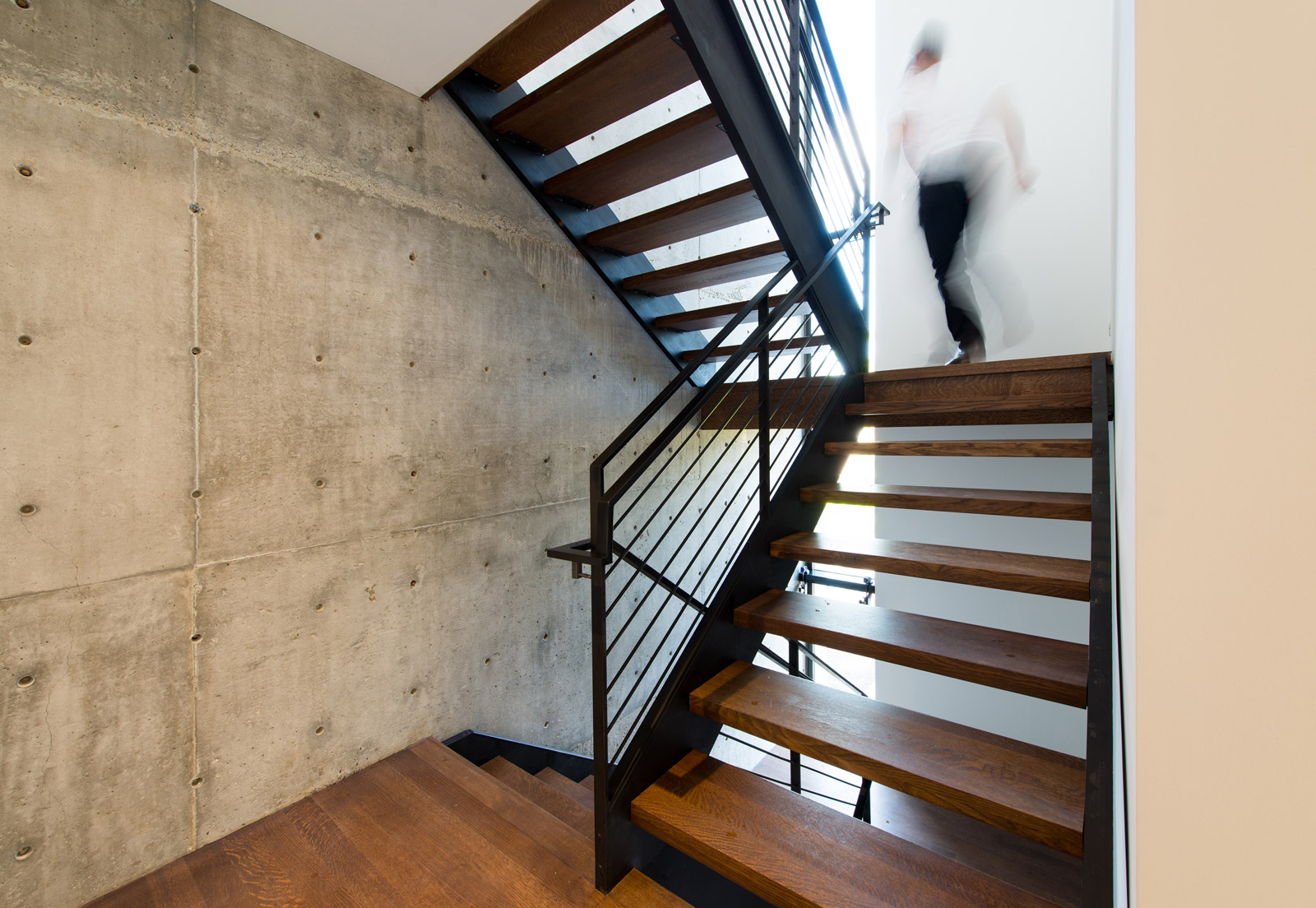
Inside, the concrete walls play an important role adding texture to the interior material palette and enhancing the connection to the exterior.
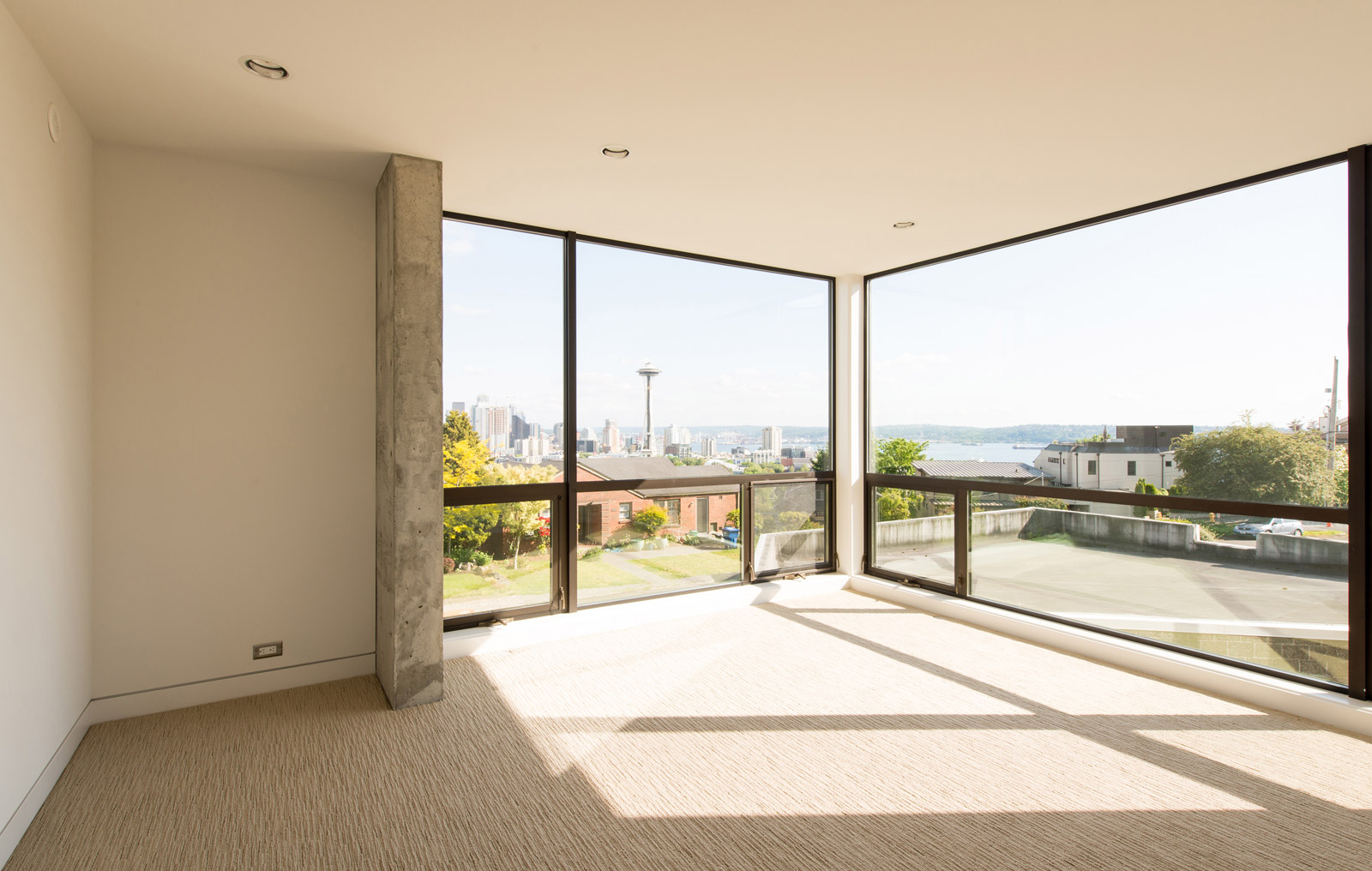
The stairway provides a peek to the view beyond via a vertical slot window. Stair climbing visitors are rewarded at the top as the common areas open up and provide stunning views of city, mountains, and sea.
QUANTITIES
The cost of the home came in at $255 per square foot. For a detailed analysis of how this number is computed, we highly recommend taking a spin through our residential construction budget cheat-sheet. With the booming real estate market here in Seattle we estimate that the project has already established (or exceeded) its market value. From start to finish the construction took approximately 11 months.
RESOURCES
Aluminum rainscreen panels manufactured by Oculus
Bronze anodized aluminum windows by Marlin and supplied by Goldfinch Brothers
Accordion door by La Cantina
Rift and quartered white oak flooring with Swedish finish and gray stain by Olde English Hardwoods, Inc.
Single-ply PVC roofing by Esary Roofing and Siding
Concrete work and framing by Modern Shelter
Plumbing fixtures supplied by Keller Plumbing Supply
Interior steel work by Modern Metal Works llc
Interior glass by Herzog Glass
Appliances by Metropolitan Appliance
Tile by Pental
Elvoron residential elevator by Garaventa Lift
Thanks for following the coverage on the Desai Residence. Stay tuned for additional posts on the details, specifications, and design strategies behind this project.
Cheers from Team BUILD


