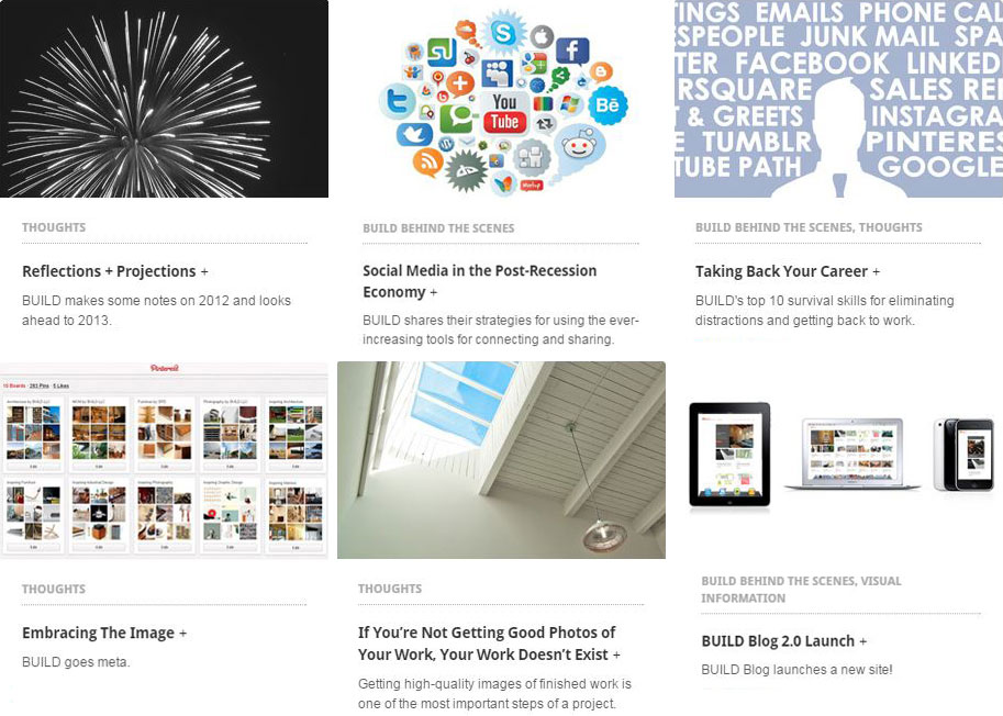
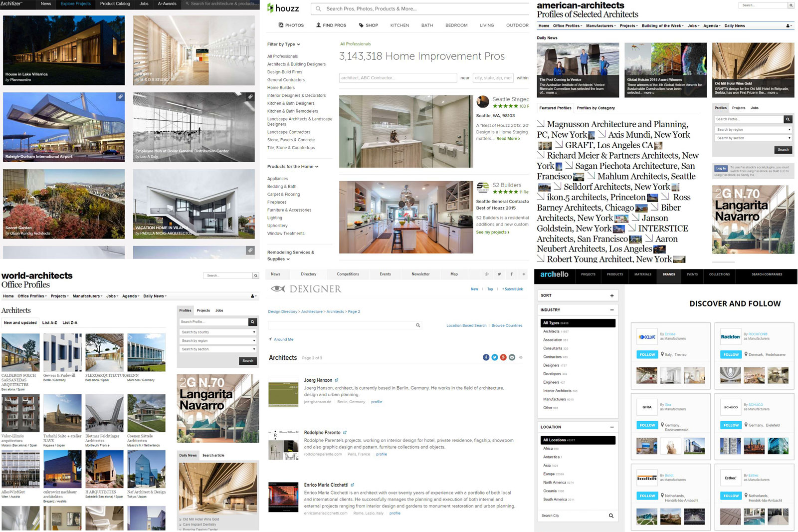
The design profession has witnessed an explosion of portfolio and firm profile websites in the last few years. Houzz, Archello, Architizer, Dexinger, World Architects, American Architects,… There seem to be more of these platforms popping up every time we check our inbox. This is all in addition to the now traditional platforms of social media like blogs, Twitter, Facebook, and LinkedIn. The bright side is that there are abundant opportunities to market and publish your design work out in the world. The challenge now is managing content on all of these platforms, which can easily turn into a full-time job. How does a firm filter through all of the available platforms? And once decided, how does a firm appropriately manage the time required to keep each profile up to date with content?
As architects and designers wade further into the waters of social media (by choice or by force), it’s more important than ever to determine the effectiveness of any single platform among the endless sea of options. With less time than ever, deliberate social media choices can lead to effective promotion with a minimum impact to the day’s schedule. Conversely, poor social media choices can waste ridiculous amounts of time, muddy your brand, and relinquish control of valuable content and images. Here at BUILD, we use five simple filters to sift through the candidates. These allow us to effectively decide where to invest our social media time, energy, and effort.
1. Social and Shareable.
Does the platform share the data? The operative concept for an effective social media platform is to share data and be, well, social. The current standard is the ability for the content generator as well as the fan or follower to share between multiple platforms with a single click. At its most basic level, portfolio sites need to provide links back to the architects who are supplying them with free content and images. Nothing perplexes us more than giving away our high resolution photos to social media platforms, only to have a roadblock tossed into the sharing stream for fear of driving traffic away from their own site. It goes against the very nature of why we’re all involved and invested in these platforms to begin with. Recently, we’ve opted out of platform invitations simply because of this refusal to be shareable and provide even a simple link back to the BUILD website. The social media outlets we stick with allow for sharing without the roadblocks.
2. Audience and Critical Mass
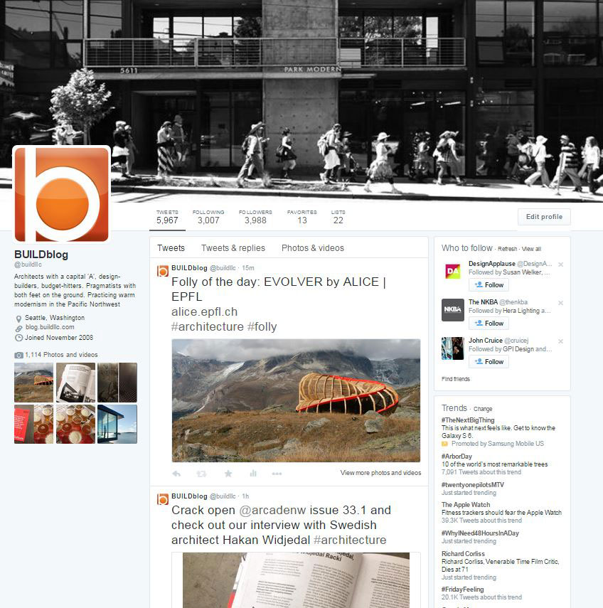
With any social endeavor, digital or analog, the benefits lie in the people who are participating. A wealth of active people on a platform means a large audience, and the opportunity to capture the interest of folks who may not be directly involved with architecture and design (e.g., friends, family, clients). Sites like Facebook and Twitter, now the grandparents of the social media family, offer this level of critical mass. For platforms that communicate with a wide cross-section of society, we tend to share general information which might include book recommendations, a new blog post, or photos of a completed project. On the flip side, a more pointed approach may be appropriate for certain content. Our audiences on platforms like Instagram and LinkedIn lean more towards students and professionals in our industry. The content here may be as specific as a sketch or a model shot. Thoughtfully selecting which content to broadcast on which platforms respects the specific audiences and optimizes the social media traction.
3. Content Control and Maintenance
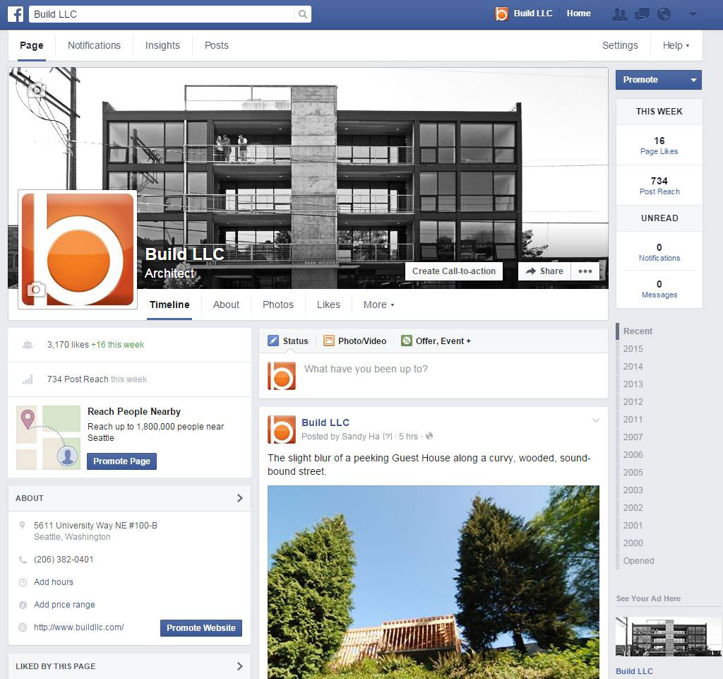
The ability to control our own content as well as the time invested in uploading said content is a big driver in filtering our options for social media sites. We like to update our website with current construction photos, share new (and past) blog posts, and promote our website and blog through social media — and we prefer to manage these actions on our own watch.
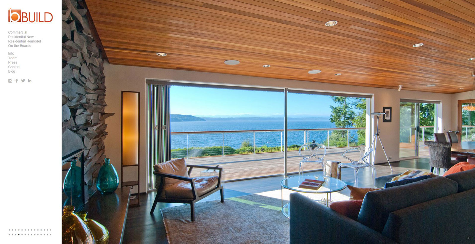
[BUILD Website]
The years of frequently updating the BUILD website and launching a fresh post each week on the BUILD Blog has established a solid foundation of original content out there on the web. When folded into our social media package, this material offers a stream of content for the newer platforms and each avenue becomes a natural extension of our website, blog, and community. Thankfully, the blog and website offer us the latitude to opt out of portfolio and firm profile sites which are reaching a fever pitch online. Our two cents: Buyer beware. Many portfolio and firm profile sites out there are advertising hard to become your firm’s one-stop web presence, and they offer a tempting level of convenience. However, while you won’t have to fiddle with hiring a web designer or fine-tune a website template, you’ll be handing over the keys to your content and images, which is incredibly valuable (for you and for them).
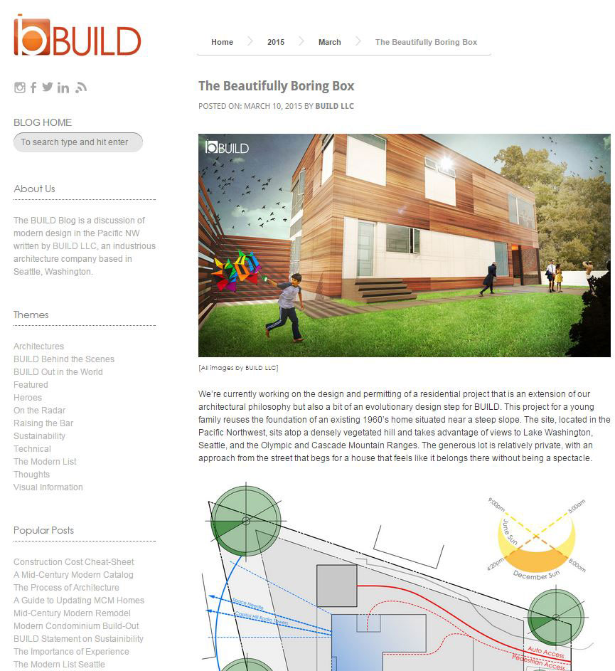
[BUILD Blog]
4. Unique and Purposeful
We took the position several years ago to only join social media platforms if they offer something different than the ones we already have in our sphere. Be it a different audience, a different type of content, or anything else we haven’t yet imagined, we’re looking for no redundancies. First, it keeps us interested. Second, it keeps our audience interested. Each social media outlet is an opportunity for us to show different sides of our firm. What inspires us, what we’re thinking about, what we’re currently making, and so on. If you’re only interested in one part, great, we’ve probably got you covered. If you want to know (almost) everything about who we are, what we do, and (sometimes) where we are, connecting with us on all platforms is what you are probably already doing.

It’s also worth mentioning that we don’t jump on absolutely everything just because it’s new or different. Some platforms have obvious red flags that take them out of consideration almost immediately. If it’s untested because it’s too new, we may wait to jump on later or not jump on at all. And if over time a platform has displayed an undetermined usefulness, we may not write it off completely, but set up a profile that’s kept mostly inactive until we find a good purpose for it. If we don’t, we may jump ship.
5. Engaging and Fun
Probably the most enticing quality of any platform is whether it’s fun to use. If it’s not fun, it will be quickly abandoned, no matter how much hype is generated on the tech blogs. On a similar note, the longevity, assuming that’s the developer’s goal, is embedded in whether or not the platform is engaging and informative. And a platform’s mobile-friendliness is no longer a nice feature, it’s a prerequisite. The tools built for mobile (with limited website interface, like Instagram), benefit from the fun and ease of use for anyone with a smart phone and two minutes to kill.
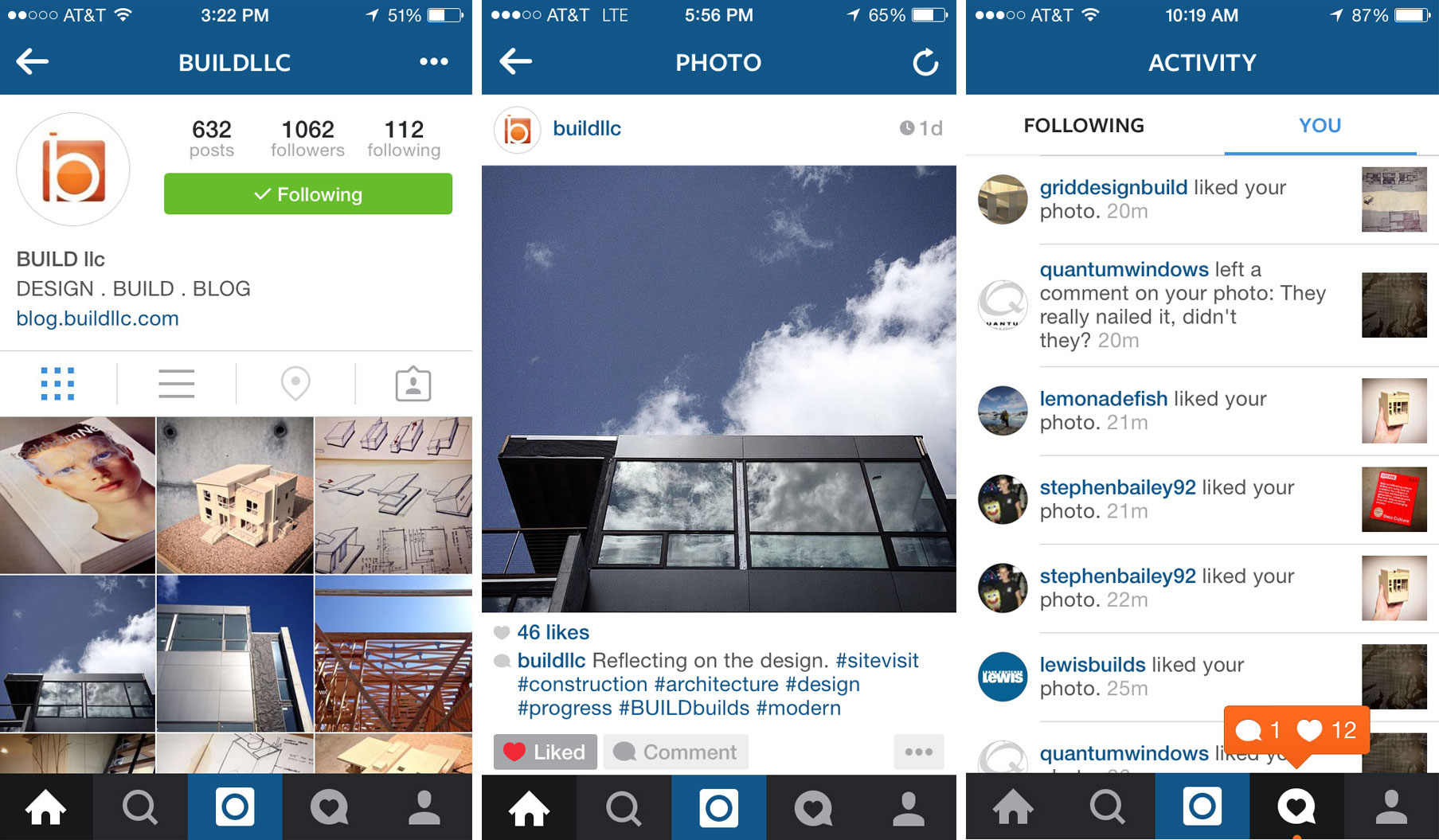
We’ve been judicious with our selection of social media platforms and seem to have found our stride. For now. It’s helped us connect deeply and widely with a continually growing community of designers, architects, students, clients, and just people out in the world interested in good modern design. As the waters of social media continue to shift and flow, forward-thinking firms can easily be prepared for the next wave. We hope our few bits of wisdom learned from years of trial and error help those just getting their feet wet to those ready to take the deep dive.
Cheers from Team BUILD


