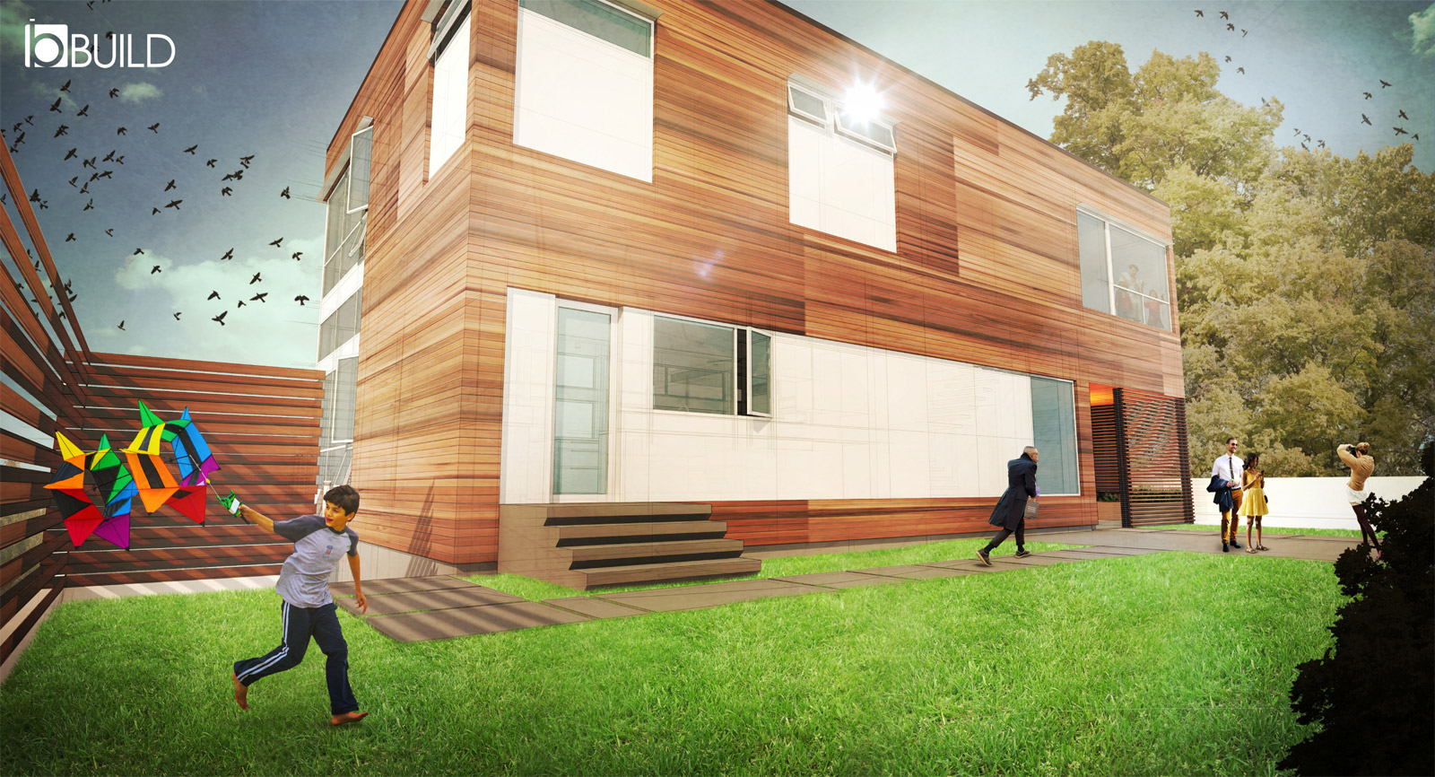
[All images by BUILD LLC]
We’re currently working on the design and permitting of a residential project that is an extension of our architectural philosophy but also a bit of an evolutionary design step for BUILD. This project for a young family reuses the foundation of an existing 1960’s home situated near a steep slope. The site, located in the Pacific Northwest, sits atop a densely vegetated hill and takes advantage of views to Lake Washington, Seattle, and the Olympic and Cascade Mountain Ranges. The generous lot is relatively private, with an approach from the street that begs for a house that feels like it belongs there without being a spectacle.
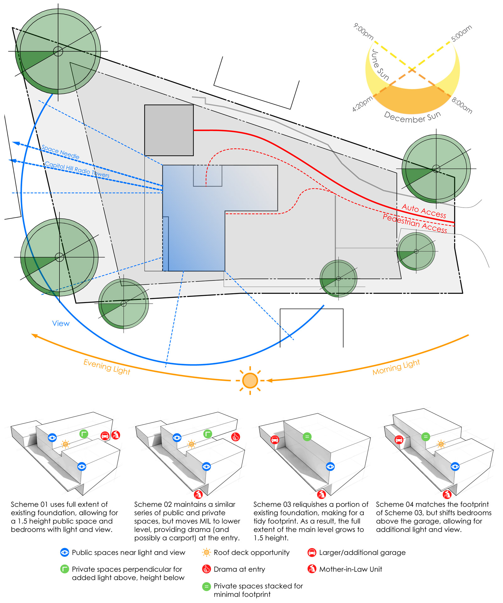
Several important factors were evident early on in the research process such as the strict limitations imposed by the land use code on a property with steep slope and related setback buffers. The concrete in the existing home was in excellent condition, providing the opportunity to reuse the foundation. Capturing the views and useful outdoor spaces were paramount to the home owner’s desires for the new residence. And lastly, the owner’s program didn’t require keeping the entirety of the existing foundation.
A handful of general factors played a role in the design as well. These included the ever-increasing scrutiny from building departments on single family residences, rising construction costs, and the expenses associated with the growing list of consultants required for a residential building permit.
These general and project-specific factors led to a slightly different architectural response — one of increasing simplicity — a design process of reduction. As the project plays out through client meetings, permitting, and eventual construction, we’re seeing this response as increasingly important to the evolution of our design and construction language. Of course, it’s one thing to say it, and another to do it. So let’s get into the nuts and bolts of how these ideas are being applied to the built-form.
Minimize the footprint. Generating a series of diagrams based on the function of the homeowner’s lifestyle helped us identify elements that were necessary and those that weren’t. Stacking functions vertically within the home added efficiency, developed a clarity of the program, and allowed us to shave an entire 1,000 square foot wing of the existing foundation off the site. With this wing removed, the proposed house footprint could become the intersection of two simple boxes, one for the garage and one for the house.
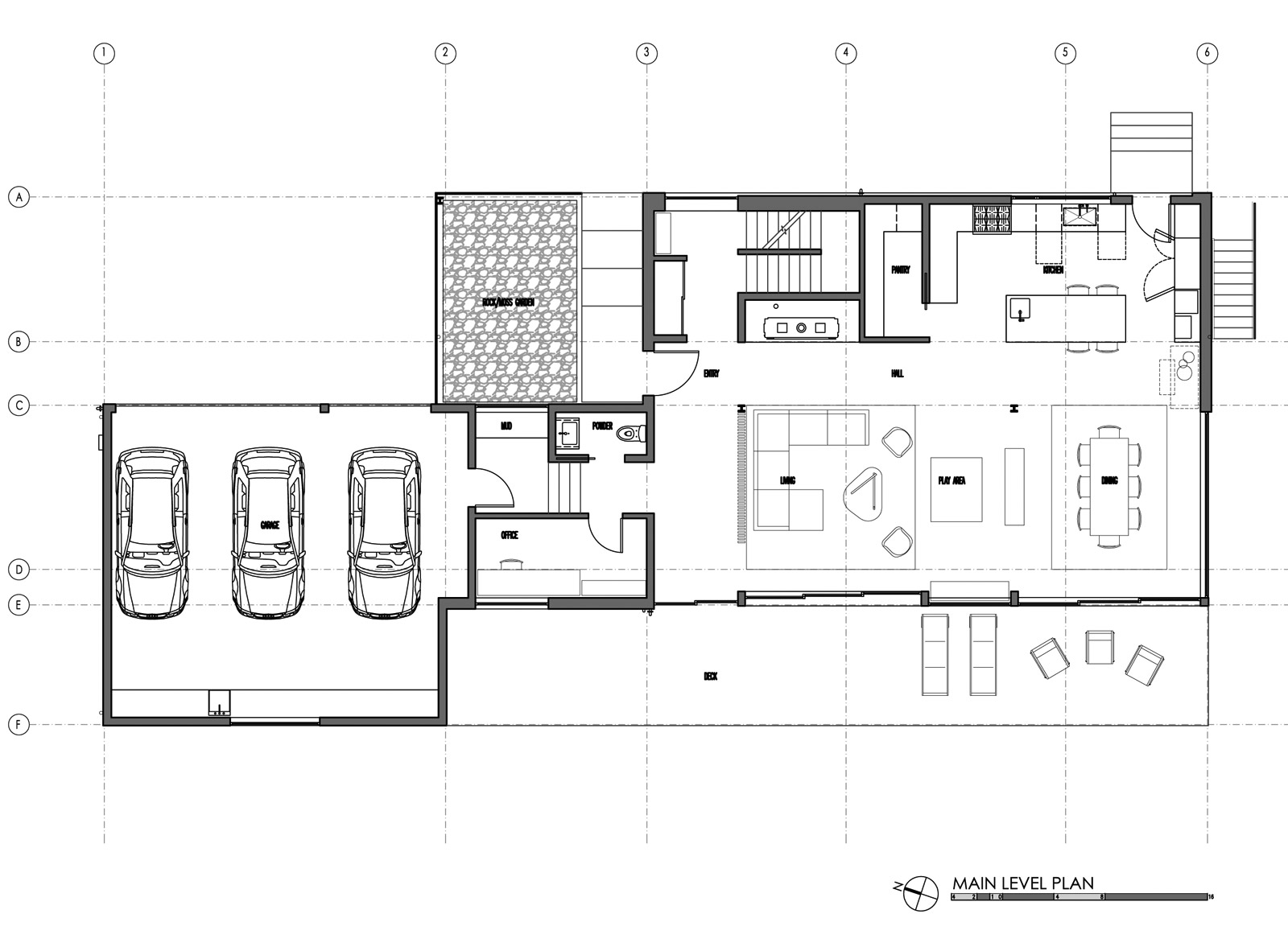
Identify and optimize the boundaries. On this particular site, the house can be rebuilt on the existing foundation without triggering a list of special environmental and critical areas permits. This code provision even allows a higher proposed structure (3 stories) than the original house (2 stories), so long as the new structure does not extend past the existing foundation line. Learning the intricacies of the code provisions, playing by the rules, and optimizing the possibilities within these boundaries keeps the project out of lengthy and expensive additional reviews. The reductionist strategy mentioned above not only applies to the architecture, but to the permit process itself.
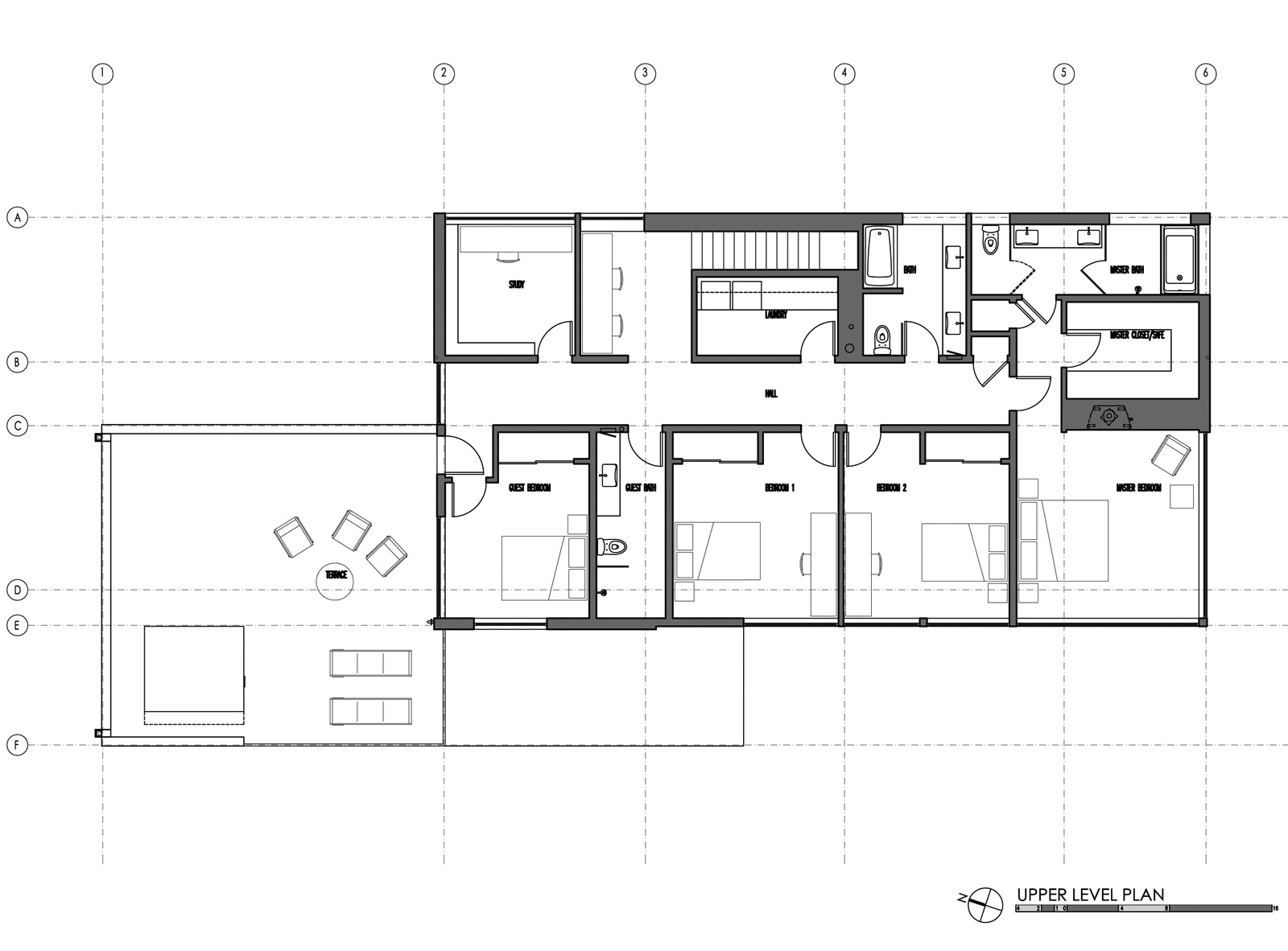
Maximize the assets of the property. Rebuilding the framing on the existing foundation and adding another story creates tremendous value for the residence and lifestyle within. The upper story organizes the bedrooms appropriate to the views, with the master suite positioned for western views to Lake Washington, Olympic Mountains and sunsets while the master bath captures views of the sunrise over the Cascade Mountain range during a morning shower. Kids’ rooms and the guest suite also offer unimpeded views west.
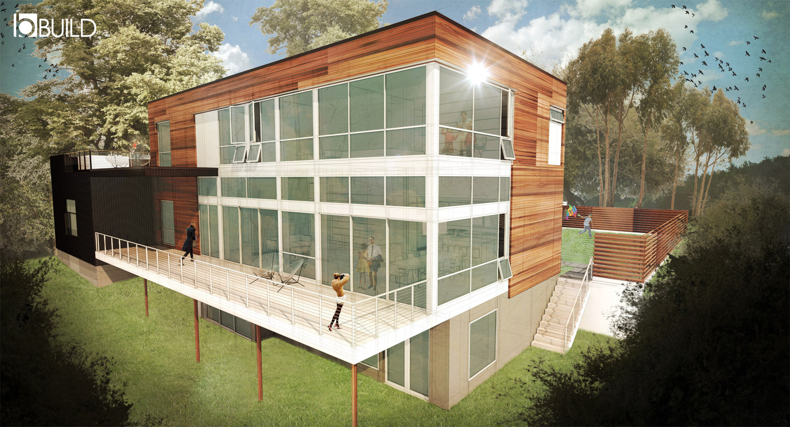
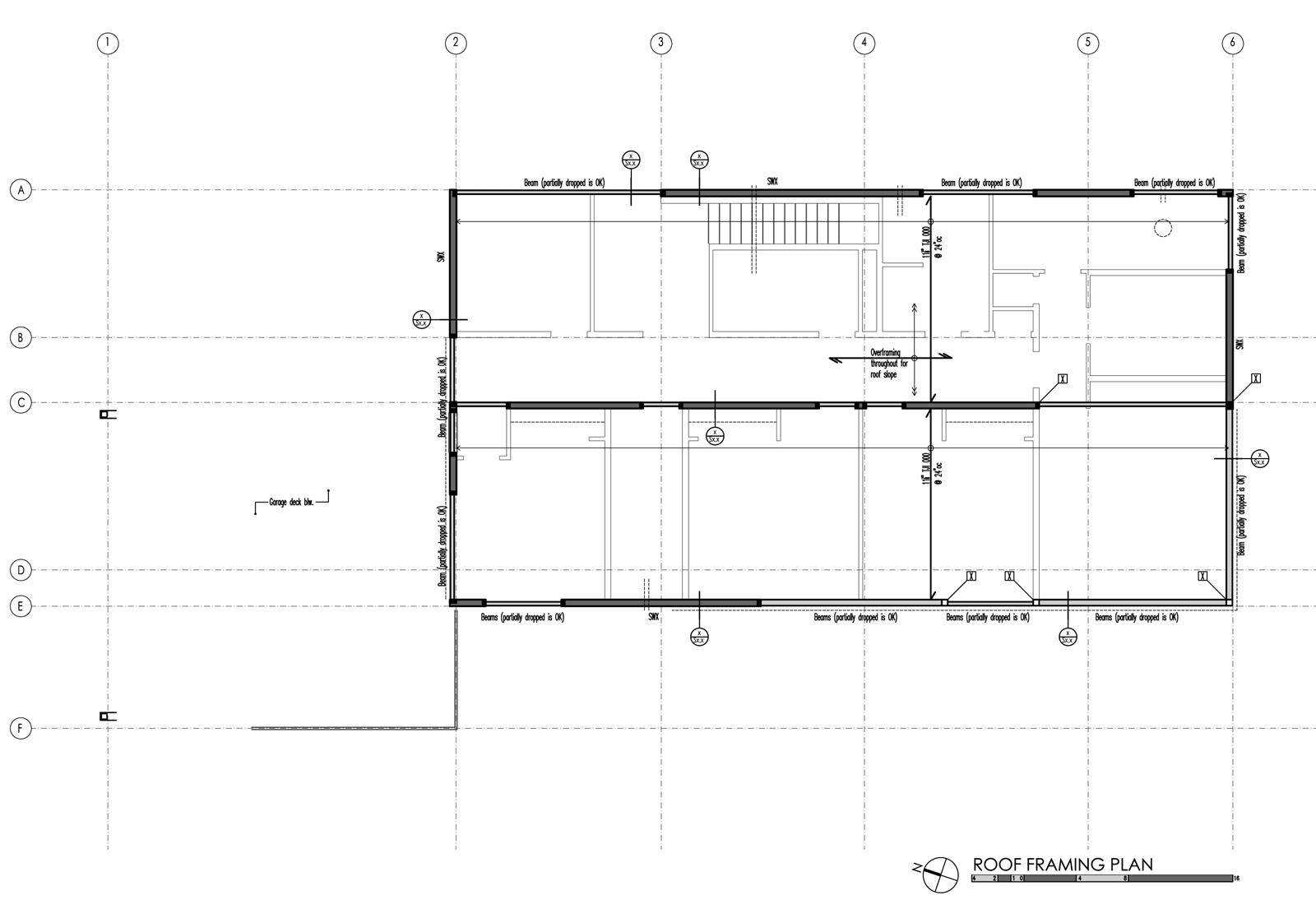
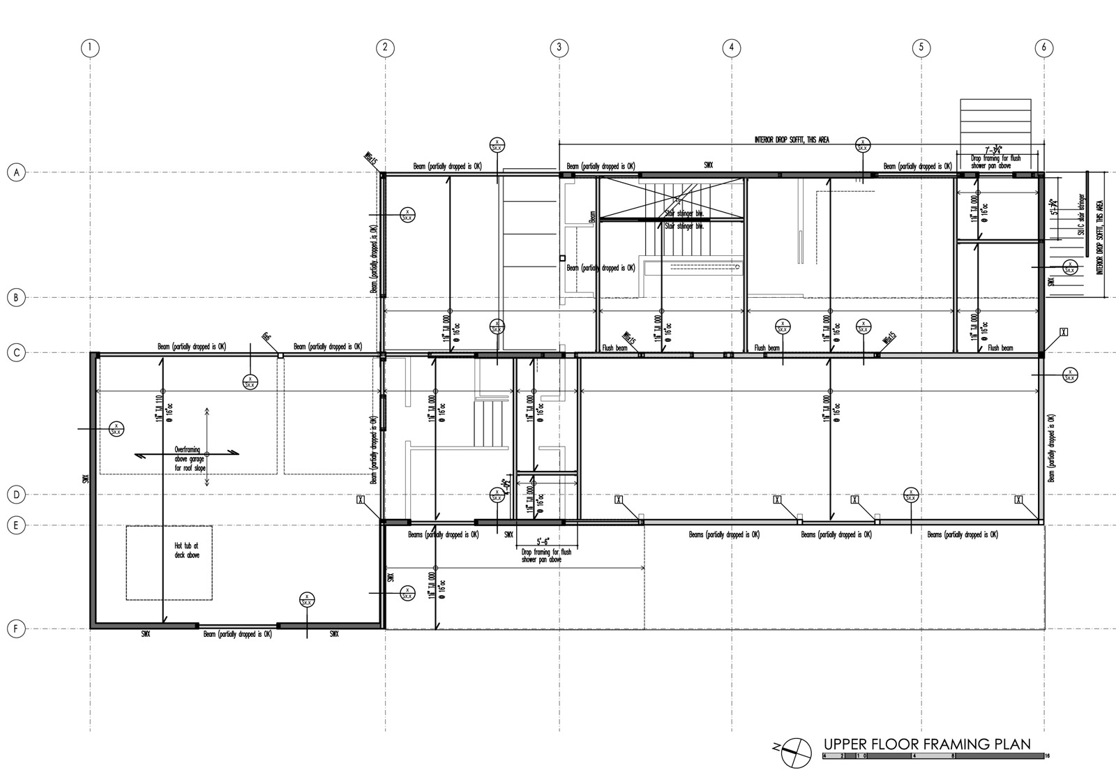
Keep it structurally simple. We can’t emphasize this point enough. As jurisdictional requirements continue to escalate, we are constantly surprised at the heavy-handed design of structural systems, even for residences. The result of these mounting permit requirements means a more complicated structural system, a more expensive framing package, and higher costs for structural engineering services. We kept the structure of this house simple to the point of being dumb. All windows sit lower than the ceiling level so that drop beams may be used at any header location, allowing standard-sized beams to be used everywhere, with plenty of room around the framing to fit them in. The window wall facing west is stick-framed with plenty of lumber for window flange attachment. The roof and floor joist runs are separated into two bays supported by shear walls and post & beams. No dramatic cantilevers, no steel moment frames, no complexity.
Harmonize the interior with the exterior. Perhaps the most important factor regarding the home’s aesthetics, the envelope was married to the interior function early on in the design process. The design team and owners decided that, for a residence advocating modern harmony, the two should be intertwined. Interior functions are strategically placed so that items like windows and doors translate intentionally to the elevations. Windows, doors and openings carefully align with each other at the skin without compromising the floor plan. Think of it as a simple grid that wraps around the house that any openings in the envelope must obey. This strategy has been challenging as the exterior elevations sometimes guide the interior design moves and plan changes pull more threads than usual, but the method has created an honest expression of what the house is doing.

Follow the Rule of 3s. In most situations, we like to keep the exterior envelope to a palette of 3 materials. With the emphasized reduction, this project takes the prescription quite seriously. The garage box uses a dark bronze corrugated metal with a tighter 1-1/2” profile by AEP Span and the house box uses 1×4 T&G horizontal cedar with a reddish-brown stain from Dalys. The 3rd material of the palette is linked to the Marlin clear anodized aluminum windows –4’ x 8’ aluminum panels by ALEX, which match the window system, are recessed at a long horizontal bay at the east, and as infill at the windows walls to the south and west. At the upper floor the aluminum panels create larger geometries for the clerestory windows and help them align with other envelope features.
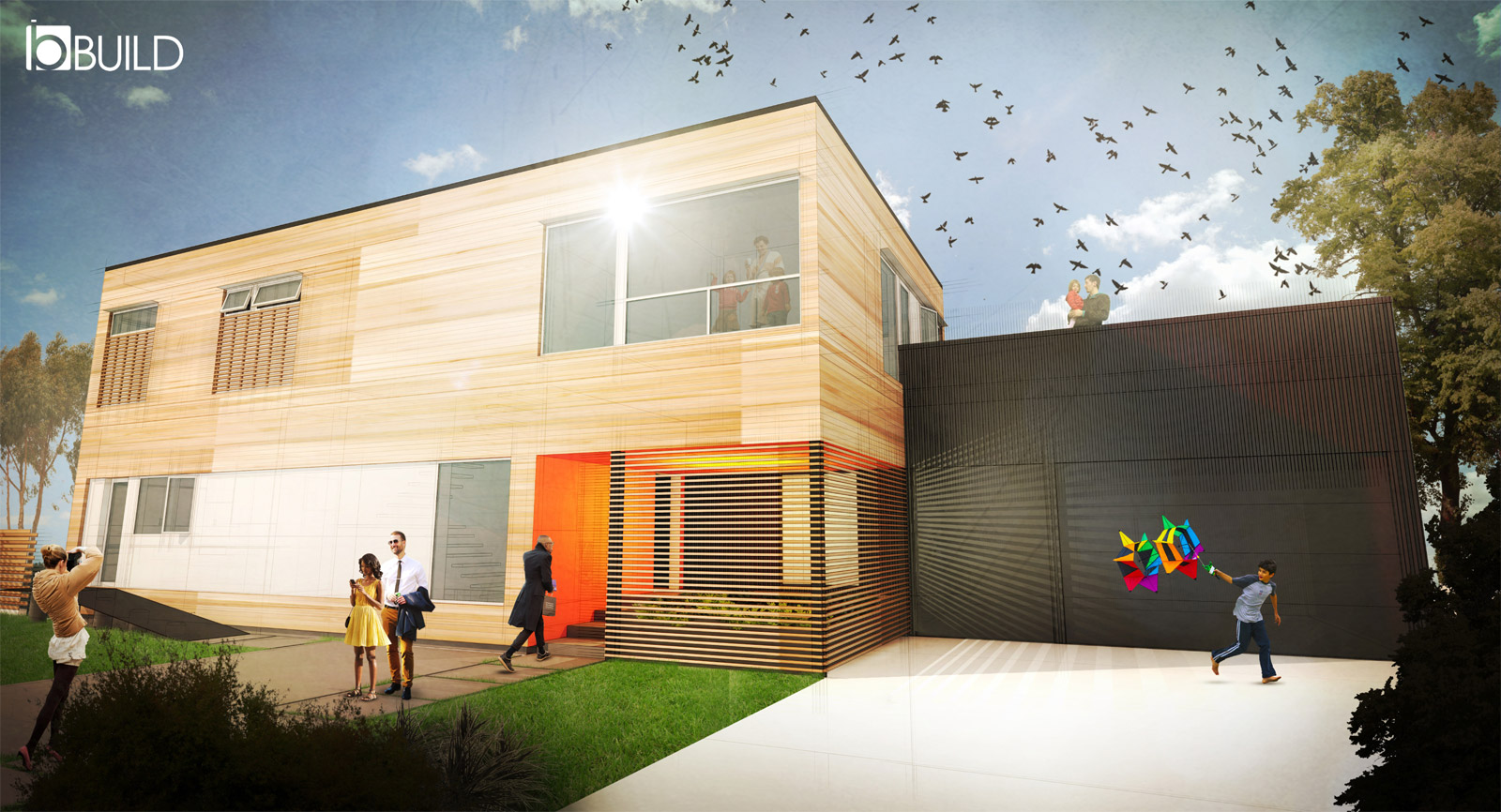
Know when to break the rules. With any strict rule, it’s also important to know how and when to break it. We break the Rule of 3s mentioned above at the entry where the box is notched and the envelope is punctured. Here, the cedar translates into a slatted screen and the entry notch reveals a warm orange panelized siding. An entry moss garden greets visitors and provides a peaceful entry to the residence. At night the entry volume glows as light reflects off the orange siding and illuminates the cedar slats.

Exercise design discipline. Each of the bullet points above creates a response to the project factors while simultaneously establishing a guideline for the design (and eventual construction) of the project. The design process on a project like this is less of an artistic exploration and more of a scientific study followed by a handful of design strategies. We like to think that the logical answers are already out there, it’s just a matter of the architectural team curating a simple, authentic aesthetic out of those answers. In this case, we arrived at a beautifully boring box which we feel is the appropriate response to all factors considered. This method of architecture might surprise some, but we find it to be sensible and predictable. It also requires a great amount of discipline from both the design team and the homeowners.
As with most of our projects, this residence was designed using established systems while also testing out a few new concepts, materials, and design moves. We’ll keep you posted as to how these strategies perform through the permitting process, construction, and eventual occupancy.
Cheers from Team BUILD


