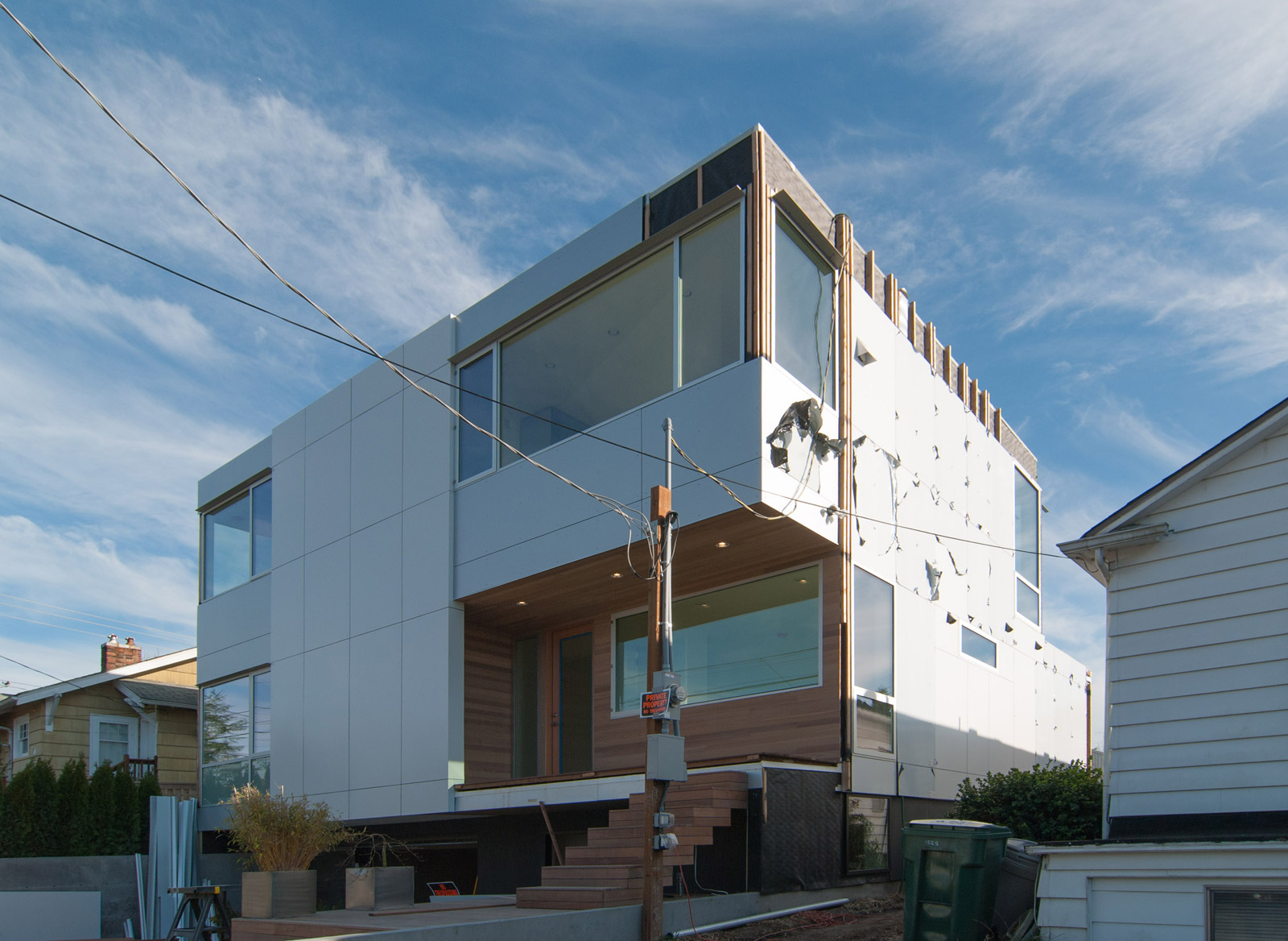
[All photos by BUILD LLC]
As the most visible aspect of any building, the exterior finish is a public face of the design, contributing to the look and feel of a neighborhood street. But it also has the critical role as the structure’s first line of defense against the elements. With the Case Study House 2014 in the final stretch, it’s a good time to take a close look at some current techniques and design concepts for exterior siding. (Also relevant to the siding discussion are previous posts on board and batten, cor-ten steel, and 10 things you should know about siding.)
DESIGN CONCEPTS & GUIDELINES
Following the Rule of Three
We incorporate the Rule of Three into most of our work, which prescribes that the exterior material palette include three dominant materials or colors. Our architectural studies, personal observations, and professional experiences have led to a simple conclusion over the years: three is often the magic number on residential envelope. On the CSH2014 we used white and silver aluminum rainscreen panels and lightly stained cedar. Like any good rule, there are also design savvy methods to break the rule (as sticking to 3 materials can often be challenging) and we’ll discuss that below.
Simplifying the Lines
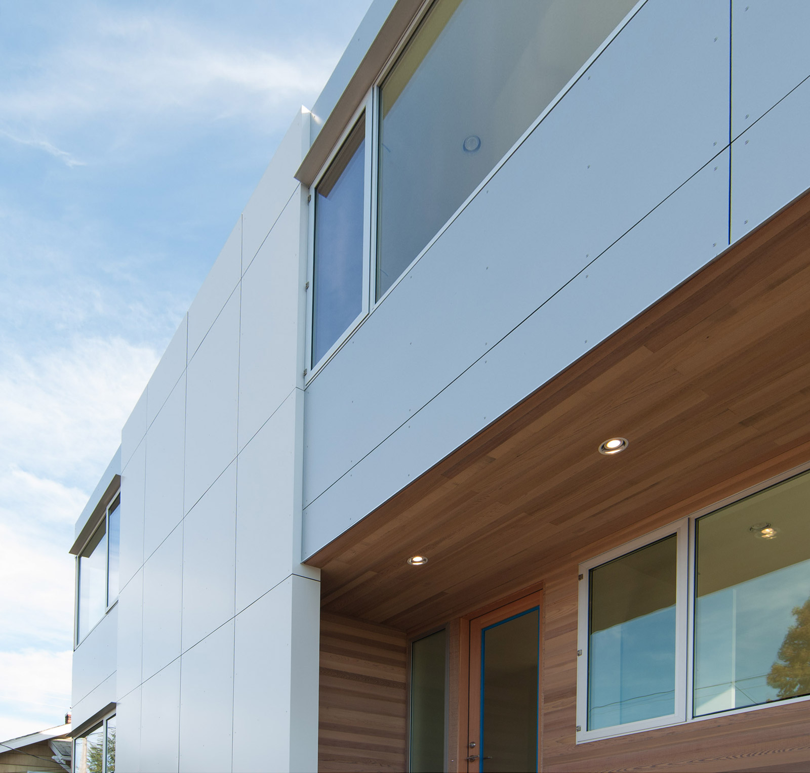
The importance of keeping the siding system simple in appearance (and installation) cannot be overstated. When it comes to panelized systems, design trends tend to dictate geometries or visual games, and our advice is to politely ignore them. Stay the course and line things up, keeping the siding patterns to simple lines and grids.
Enhancing the Corners
True corner windows (glass meeting glass) are costly, design-intensive, (unless you live in Palm Springs, you’ll need an energy consultant on board the project,) and superfluous when it really comes down to it. The glazed corners of a house can be expressed through conventional, cost-effective, and durable means. Our strategy is to create inset bays at the corners to differentiate between the walls and fenestrated (window) corners of the house. We’ll get into the detailing of this technique below.
Warming Up the Palette
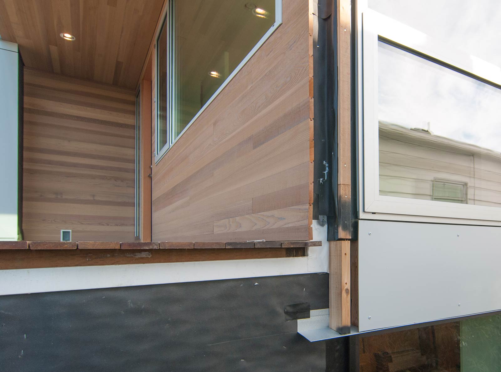
The envelope of most structures needs to be weather-proof, durable, and low-maintenance. This often requires sturdy materials that may not provide all the warmth, texture, or detail we envision for the final product. Strategic locations around the envelope, like subtractions in the volume, offer opportunities to add more refined materials to the exterior palette. We like to use pre-stained clear cedar at these subtractions, as these areas are more protected from the elements and are typically points of entry/exit (where one is up close to the material finish). These locations can also create opportunities to extend the warmer material to the adjacent interior spaces.
Building in the Weathering
It’s imperative to understand how a material is going to weather and change over time. Selecting the correct wood stain for cedar walls can set up the cedar to match the natural silvering process of ipe decks over time. Good design predicts not just how something is going to look when it’s immediately finished, but also ten and twenty years down the road.
With these general design concepts and guidelines established, let’s get into the nuts and bolts of the specific materials and techniques of the Case Study House 2014.
PANELIZED SIDING
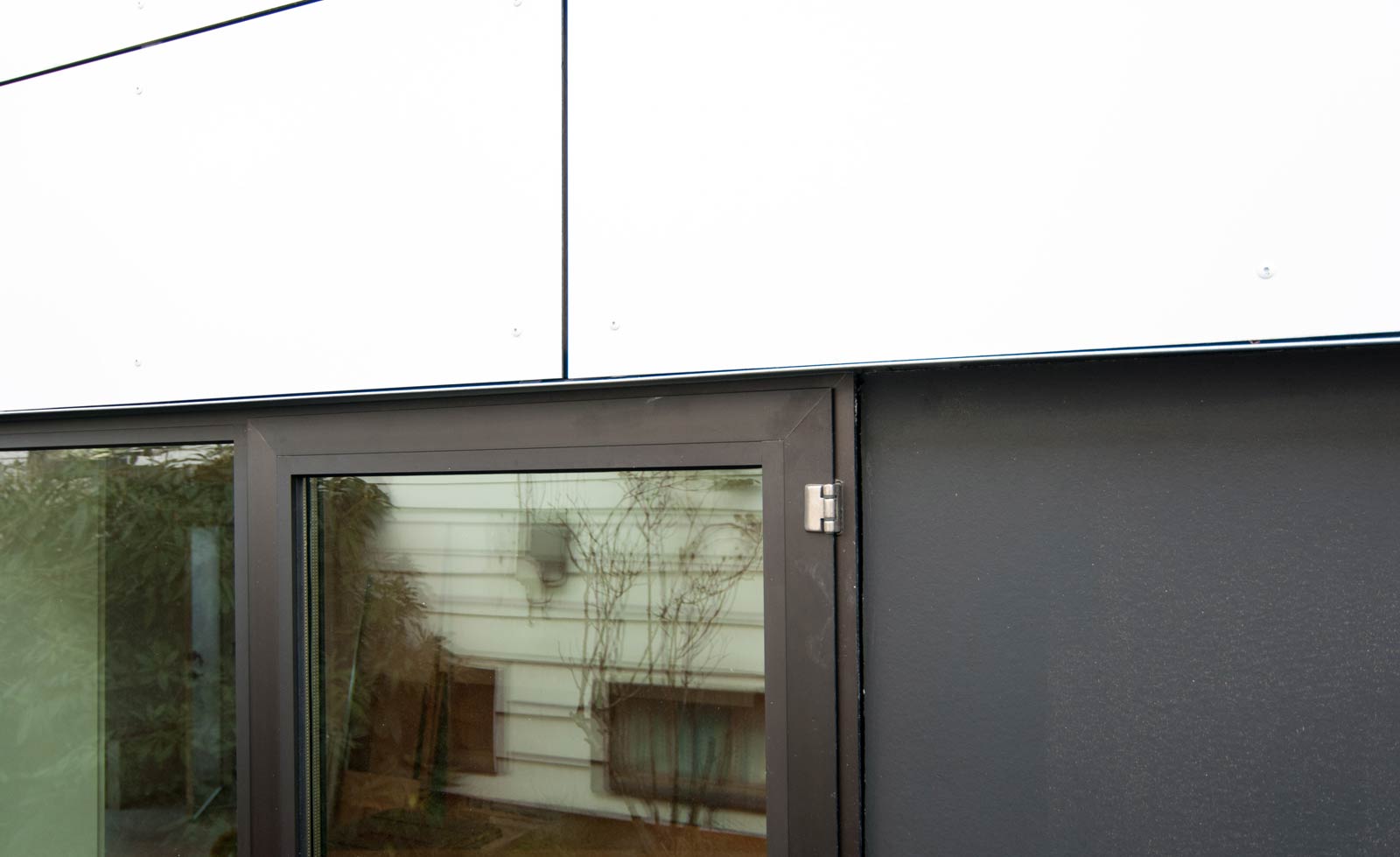
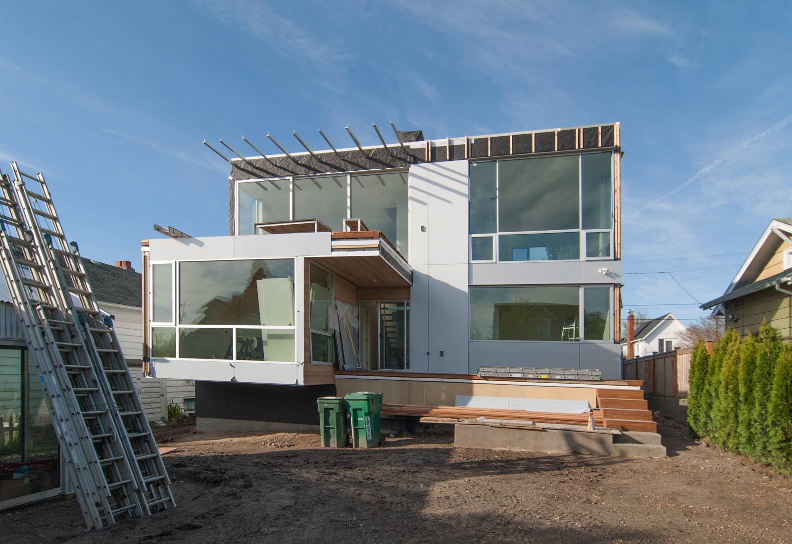
The CSH2014 uses two colors of aluminum composite panels made by Oculus. The ALX 05 Pure White panels are used at what we refer to as the field of the envelope (areas without windows). The ALX 01 aluminum colored panels are used adjacent to windows because they closely match the clear anodized aluminum windows by Marlin. This technique helps reduce the number of materials at the exterior and allows the windows to read less like punctured openings and more like an integral assembly (the result reads more like a space craft than a pin cushion) .
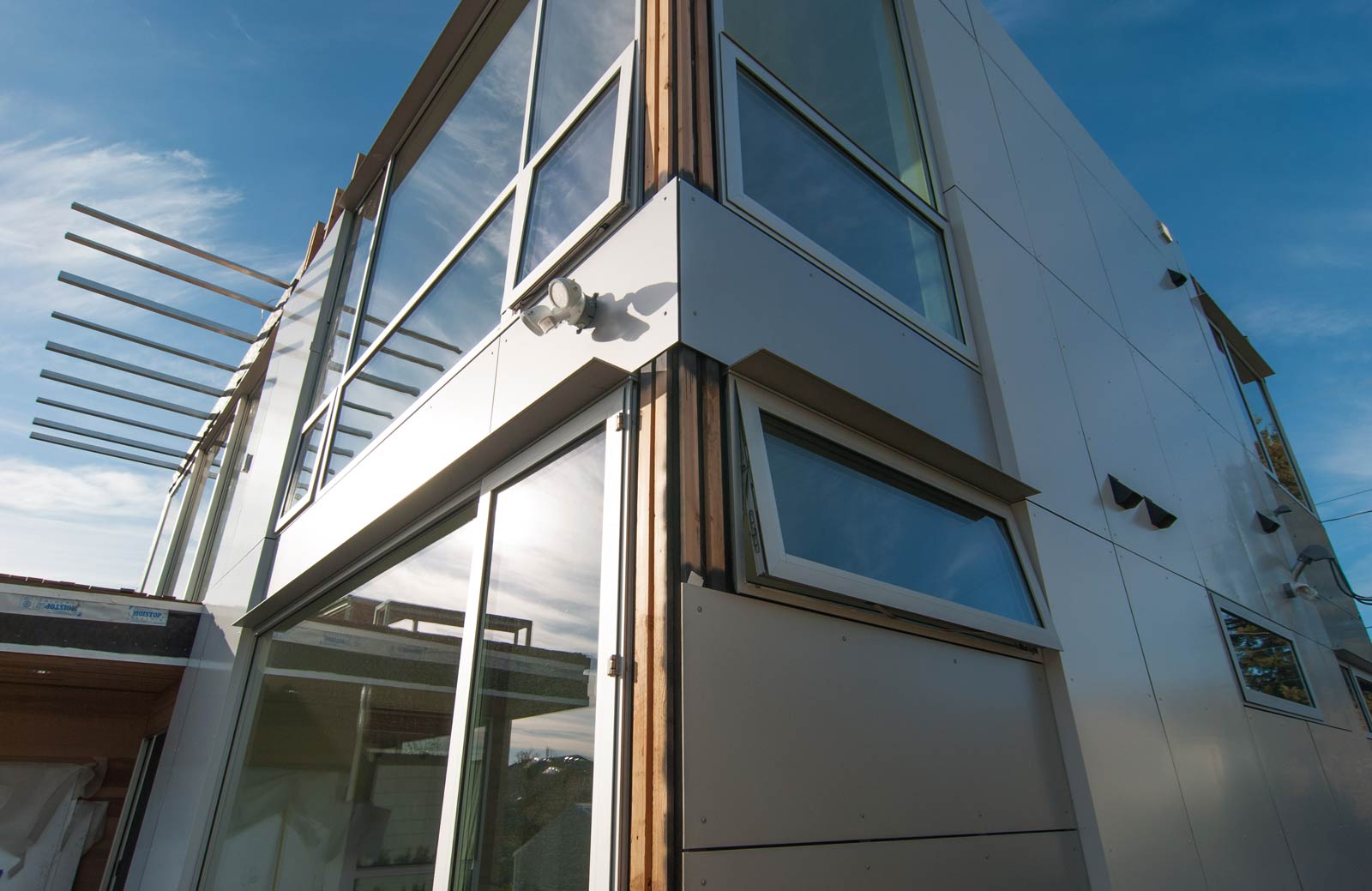
The corner window detailing mentioned above relies on two different rain screen depths. At the field, the vertical runners of the rain screen are thickened to 3.5”. At the corner inset panels with the windows, the runners remain at a more typical 1” depth. The difference in plane creates a reveal between the white field rain screen panels and silver corner panels. This offset, plus the change of color from white to silver creates a more refined, attenuated visual effect at the corners of the house. We initially conceived of this thicker 3.5” depth as a means to conceal downspouts, electrical strikes, and the like, but grew to really appreciate the additional aesthetic qualities.
The aluminum panels used at the rain screen are unique in that they can be notched and bent. This malleability allows the panels to fold around corners as a continuous aluminum wrap. While this produces an elegantly seamless transition, the method is a bit unforgiving — if the notching isn’t perfectly executed and the aluminum layer breaks, the sheet becomes scrap. Pro tip: our siding installers started bending the material into a bed of sikaflex sealant and letting the material set. This achieves a very rigid and durable corner. The CSH2014 also implements this panel wrap technique at roof parapets, (with parapet flashing underneath,) further streamlining the elevation by eliminating the flashing line at the roof.
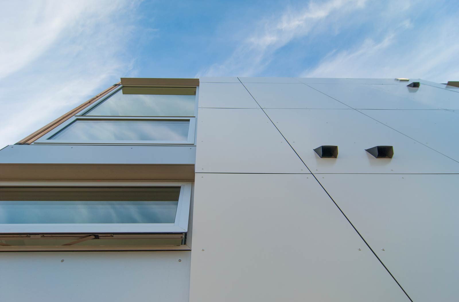
As mentioned in the design guidelines, lining up the rain screen panel breaks with other fixed elements of the house creates a deliberate aesthetic and provides a straight-forward decision making process. While the 4’x8’ (or 4’x10’) rain screen panel sizes provide the critical geometric parameters, items like window mullions and changes of plane provide excellent cues to locate panel breaks. While the protective plastic has yet to be removed in the image below, the break lines are still evident and show this alignment relationship.
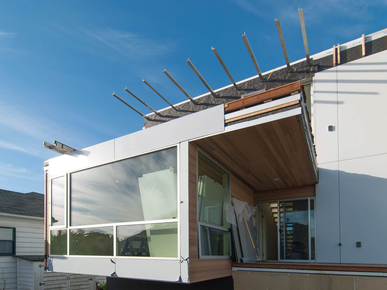
While allowing the panel fasteners to have a pronounced design geometry of their own has its merits, the more experience we have with panelized rain screen systems, the more we lean toward suppressing the fastener altogether. One of the benefits of the Oculus panels is the integral color fasteners supplied with each color ordered. These color-matched fasteners are largely inconspicuous and provide a clean, unencumbered look without having to go through the acrobatics of trying to bury them.
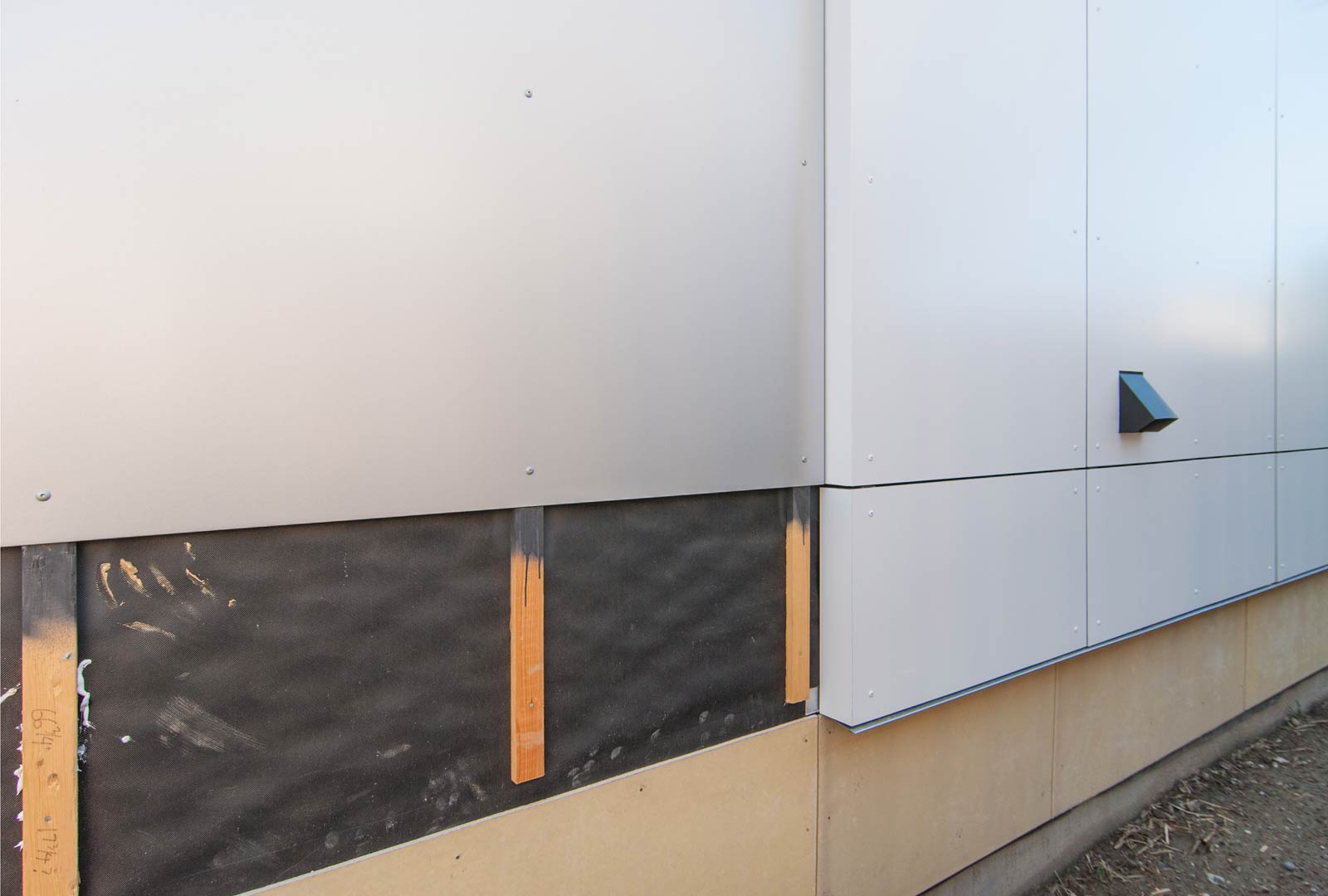
The simple step of painting the vertical runners of the rain screen black is a no-brainer move in our book. This keeps these lines hidden in the shadows, and the ¼” air gaps around the rain screen panels should look concise and consistent. It takes great craft to get this right, and fortunately, our team and process are on-board with the approach.
CEDAR SIDING
Two pronounced locations on the CSH2014 allow for the sensible use of the more delicate 1×4 T&G cedar siding. Both the front and rear entry points offer overhead protection from the weather and allows one to experience the detail of the cedar finish up close. Recessed outdoor ceiling lights at the lid of these locations let the cedar to project a warm glow at night.
Beyond the warmth and texture that vertical cedar provides many of our projects, we’ve always respected the similar cedar application employed in the previous era of mid-century and similar forward-thinking Pacific Northwest architectural movements. Though not part of everyone’s experience with stained cedar siding, we appreciate the quiet reference to the mid-century masters that came before us, and influence they have on our own design approach.
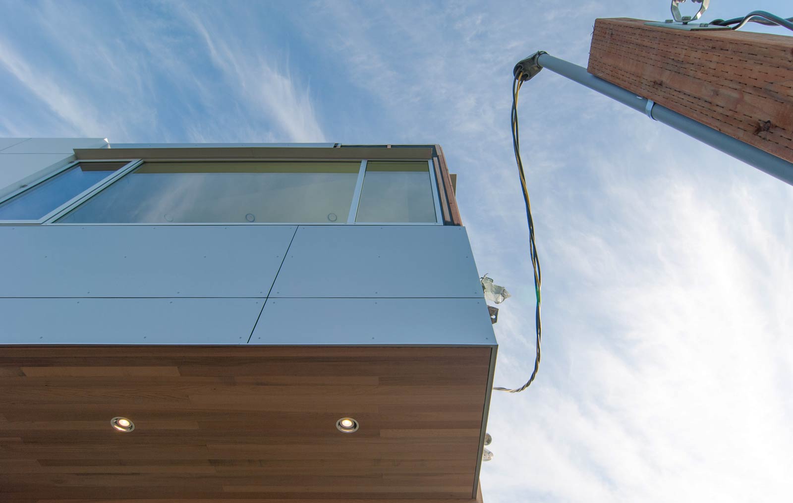
An ipe wood deck is implemented at both cedar-wrapped entry points. If left natural (no stain, no sealant) the ipe will weather into a gorgeous silver. And given that it is extremely durable, and highly sustainable (fast growing time unlike many other tropical woods), it’s use is literally a no-brainer. Plus, as mentioned earlier, this aging will bring the ipe and cedar to a similar tone over time.
The applications of cedar siding also open up opportunities to bring the material inside. At the back porch of the CSH2014, the cedar is extended into the lid of the master bedroom. This move elevates the level of finishes in the master suite and adds texture and warmth to the interior.
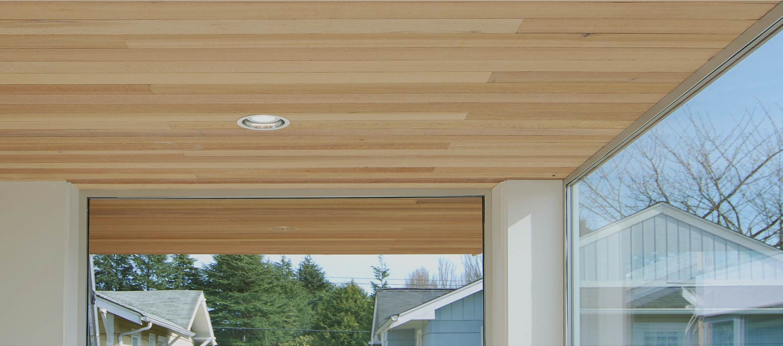
Lastly, in an effort to provide effective and inconspicuous soffit venting, we installed ¼” spacers oriented perpendicular to the cedar soffit board, which allowing air to cross-ventilate the soffit through a small gap at each edge. We looked at this as another opportunity to use CSH2014 to implement subtle, yet powerful details that make the finished project that much more cohesive.
BASE CONDITIONS
Where a basement exists, the bottom level of most houses can be difficult to visually deal with simply because of the variety of at-grade conditions. There are the changing levels of earth, utility connections, meters, and different doors types — all of which need to be tidied up into a unified aesthetic. Keeping the base of the structure dark brings all of these disparate elements together while highlighting only the structure above. Technically this move adds a 4th color to the Rule of Three, but a darker charcoal tends to push the lower level to the background — nearly in the shadows. (One could argue black is not a color and therefore the rule still stands.) To further commit to this effect, the CSH2014 uses bronze anodized aluminum windows at the basement level to match the charcoal color.
APPLIED ELEMENTS
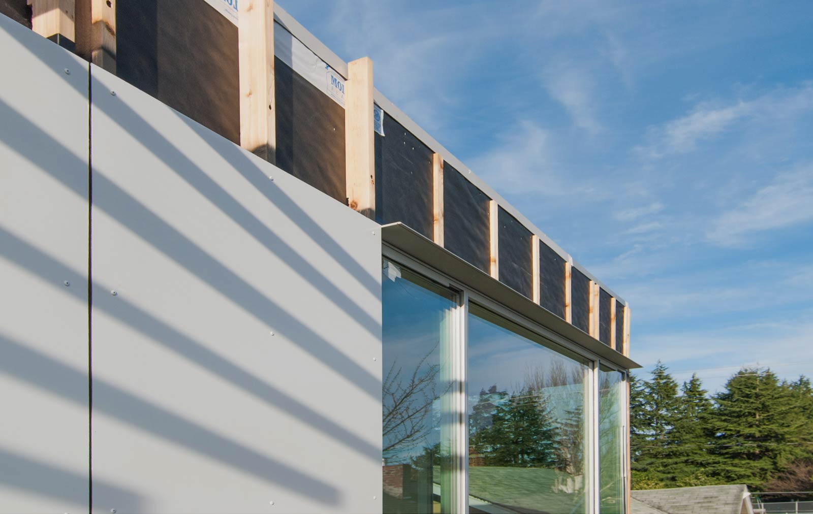
As a method to keep water off the window heads, anodized aluminum eyebrows were used at the upper level of the CSH2014. These angles stick to the material palette by matching the aluminum windows and panels, while also providing the subtle detail of a shadow relief to the wall elevation.
DETACHED STRUCTURES
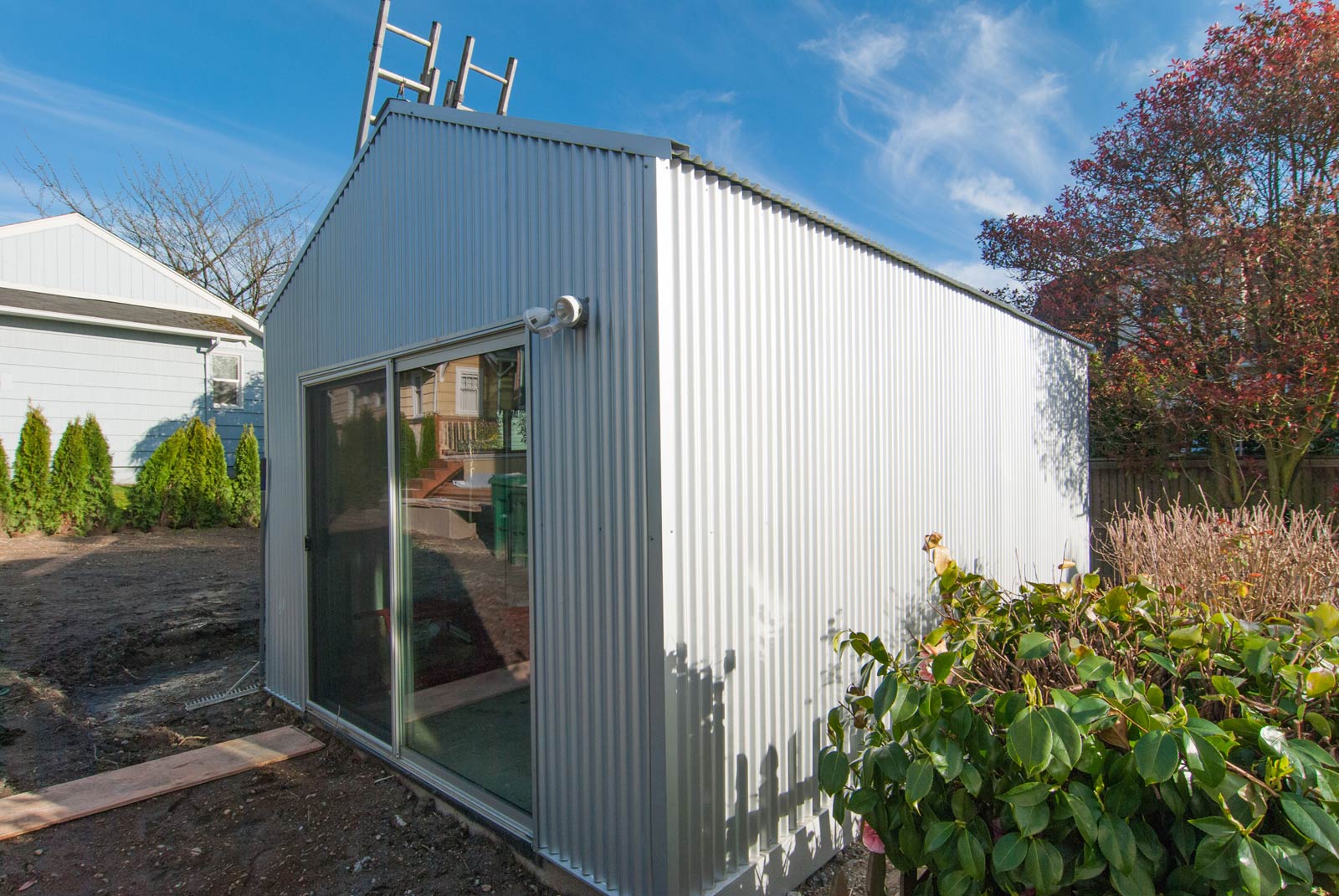
A small, detached backyard studio deviates slightly from the material palette of the house. Because it’s a different structure and a different function, the siding package changes to a uniform corrugated metal siding but stays within the silver wrapped vocabulary of the main house. The PBR series corrugated panels by AEP Span lend a more intricate geometry to the scale of the studio, unifying it’s roof and wall assembly and complementing the finish of CSH 2014. It’s relationship to the home can also be further enhanced through landscaping and a pathway that provides a mental separation between home and studio.
Stay tuned for more coverage on the Case Study House 2014. As the construction wraps up, the coverage on the design methods and construction techniques is just ramping up.
Cheers from Team BUILD


