[Photos by BUILD LLC]
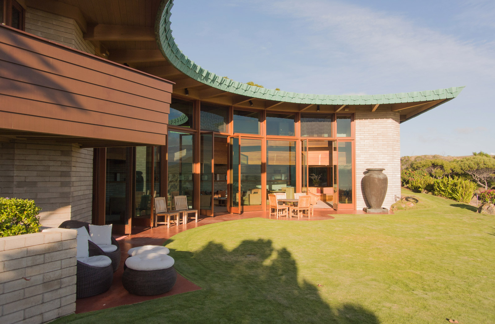
On a trip to Hawaii’s Big Island earlier this winter, we had the rare opportunity of staying in a home designed by Frank Lloyd Wright. We took on the experience as a study of sorts and treated the house as a laboratory of design. Going full-on design-nerd, we packed our tape measure and set aside time to thoroughly photograph the structure. Today’s post unpacks the Wright designed home and includes our architectural observations.
The 3,700 sf residence was originally designed in 1954 for the Cornwall family to be constructed in Pennsylvania. Then for reasons unknown, the project was shelved for decades. Around 1984, the project was resurrected by Reginald Sanderson Sims, an advertising executive from Honolulu. Fascinated with Wright’s work, Sims had envisioned a master-planned community to include many unbuilt Wright designs within a 450 acre plot on Hawaii’s Big Island. While the development never got off the ground, Sims completed the construction of the original Cornwall residence on a 2.9 acre site near Waimea in 1995.
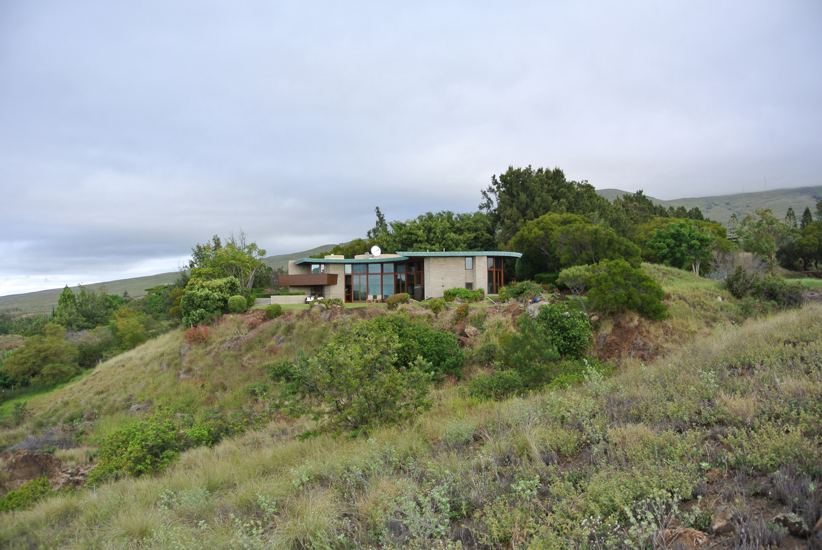
The plans were prepared by Taliesin Associated Architects in Scottsdale, Arizona who are affiliated with the Frank Lloyd Wright Foundation and the only entity authorized to oversee the construction of Frank Lloyd Wright’s unbuilt projects. The project was built by Hans Torweihe and the interior design was completed by Gina Willman; both are local to the island.
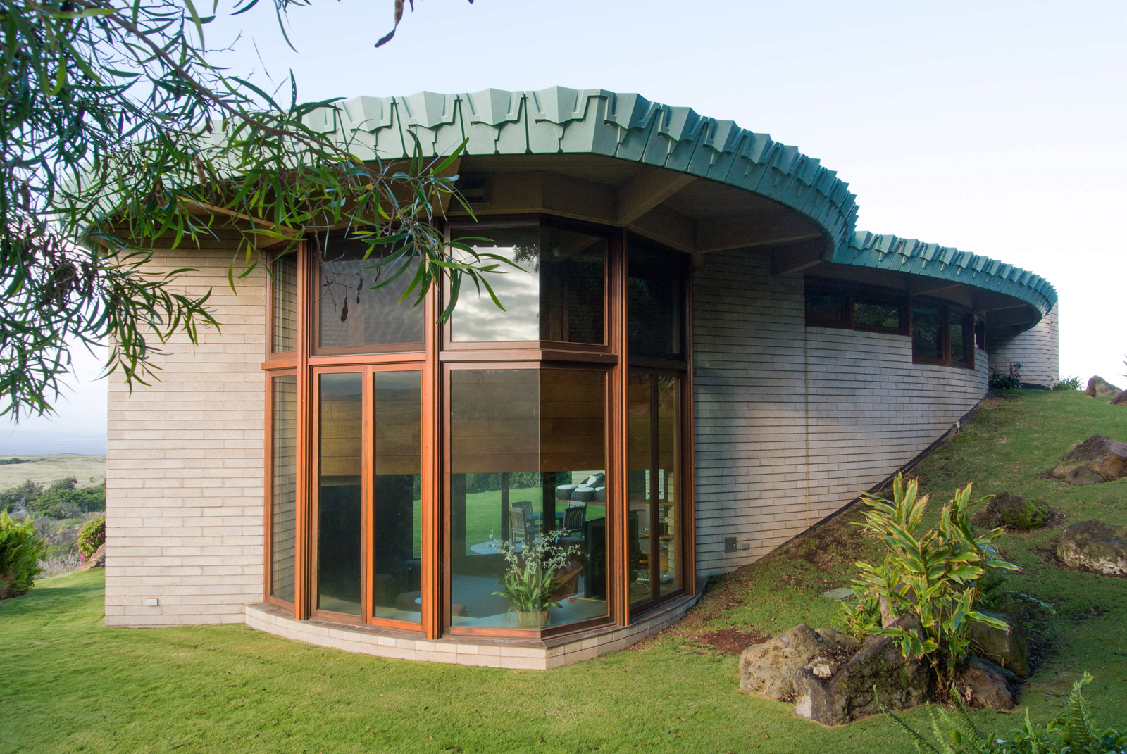
Wright’s designs are typically praised for their relationship to and integration with the site, and knowing that the house was originally designed for an entirely different environment made us immediately skeptical that the siting of the house would live up to Wright’s reputation. However our initial reaction upon entering the grounds was one of delight. Either the parcel was carefully selected to meet the criteria of the design, or the site was significantly altered to fit the home. The approach reveals the structure carefully nestled into the hillside, Wright’s organic architecture fitting like a rock outcropping among the occasional lava stones.
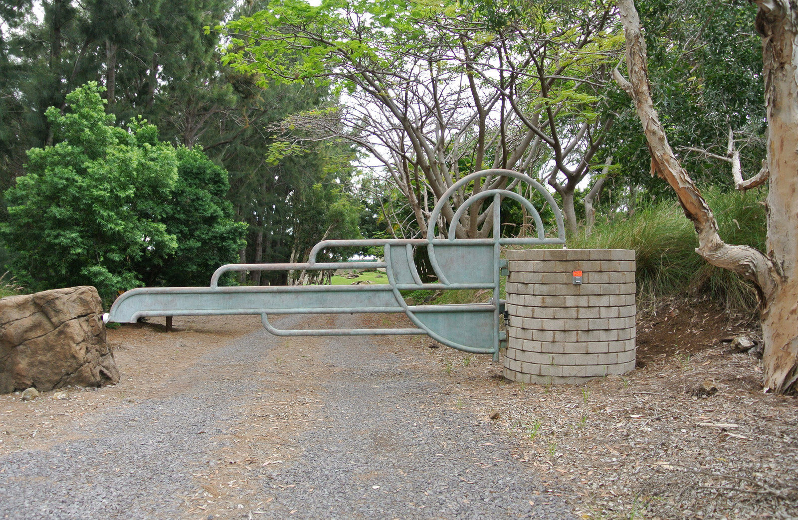
One of the first design elements that rewards the visitor is a Wright-designed privacy gate. The gate offers a nice hint at what’s to come and it lends a satisfying feeling of getting past the bouncer of the residence.
A generously curved gravel driveway leads down to a two-vehicle carport. The simple structure and sparse parking area suggest a time of less clutter and automobiles that were more stylish (the rented Nissans failed miserably at living up to their surroundings). A storage shed further up on the property reaffirmed that carports are not a solution to modern living. That said, a spotless carport is all the more important in this application as it is the only point in which the home can be entered.
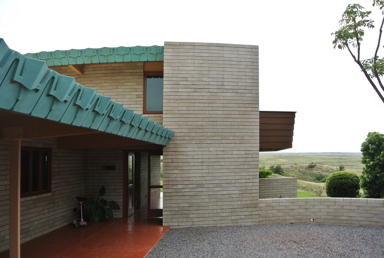
Admittedly, some uncertainty about the house itself followed us on the trip. Wright’s designs are lauded to such degree, that as architects we often wonder if all the praise is based on actually
As with most of Wright’s residential work, the entry point is low and rather dark to exaggerate the open, light-filled common areas beyond. This strategy works quite well in the home and the living areas reveal a stunning view of Mauna Kea, hundreds of acres of ranchland, and the Pacific Ocean beyond.
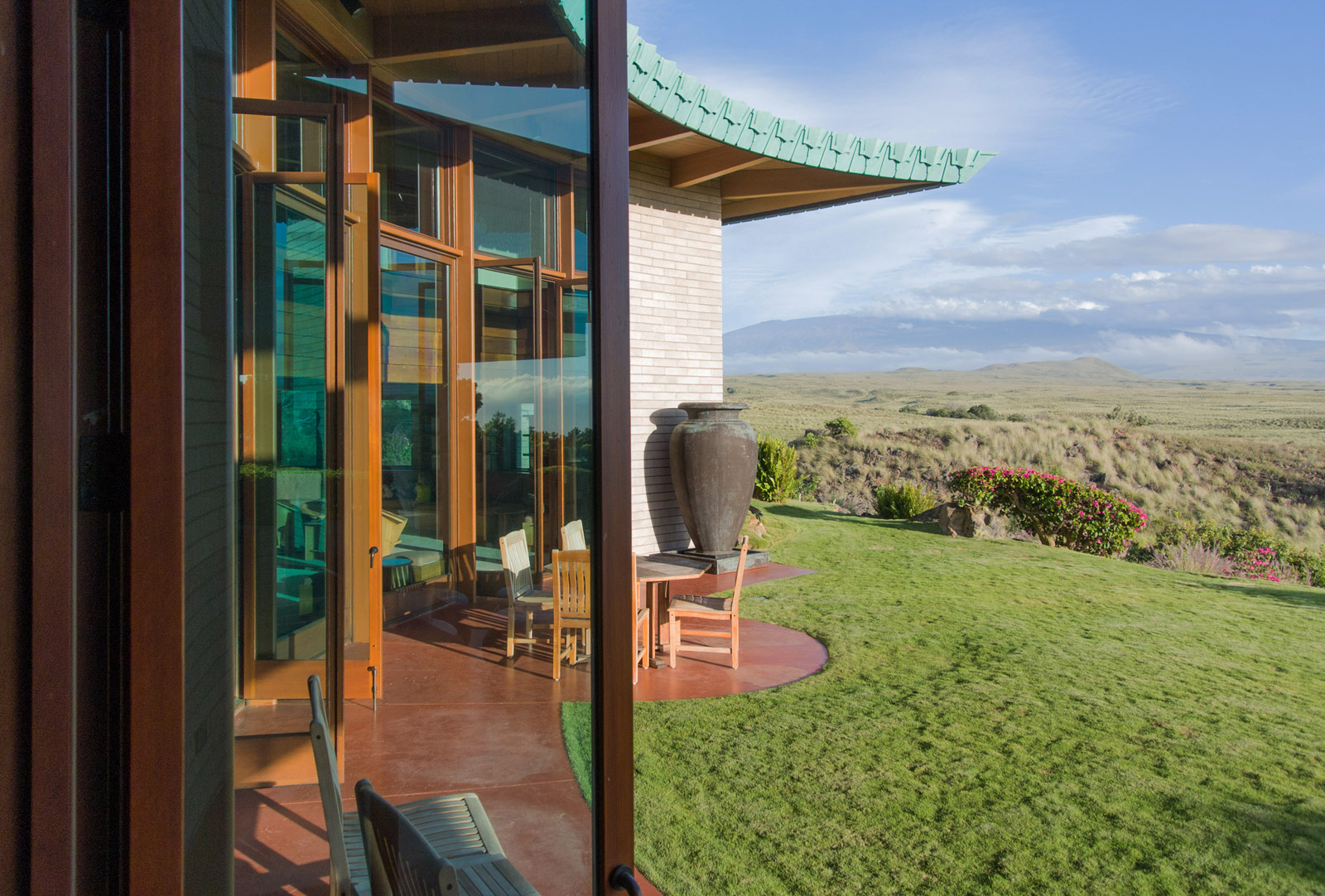
Most striking about the interiors are the three living areas flanking a glass wall which includes three sets of 10’-7” tall doors. Oddly enough, there is no means to shade the space or block the light at what is likely the most prominent heat gain of the house. This residence was clearly intended for entertaining and each sitting area captures a gorgeous (and slightly different) view of the landscape. A common criticism of Wright’s interiors is the lack of head height which this house does not escape. The distance between the finished floor to the bottom of the living room beams is a mere 7’-0 1/2” but this house solves the equation in a clever way: the double-height hallway allows generous head height for circulation, while the sitting areas are lower and cozier (where standing at full posture is limited anyway). We’re dubious that this design trick would work in today’s residential market, but we admire the craftiness of the move.
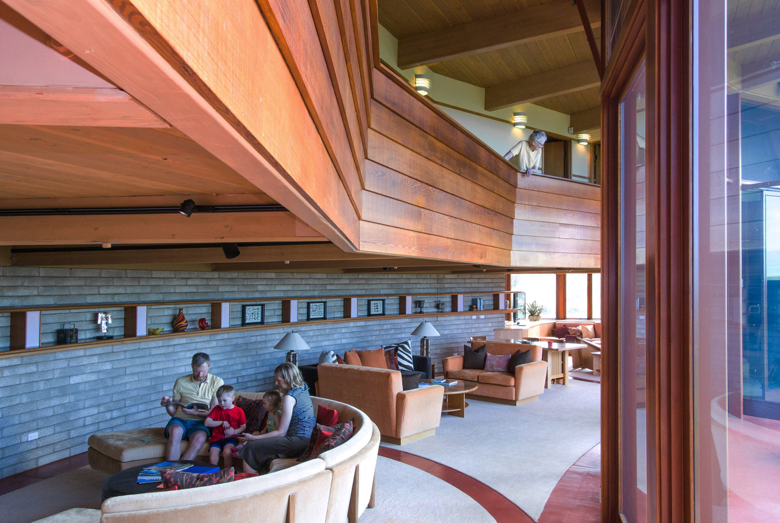
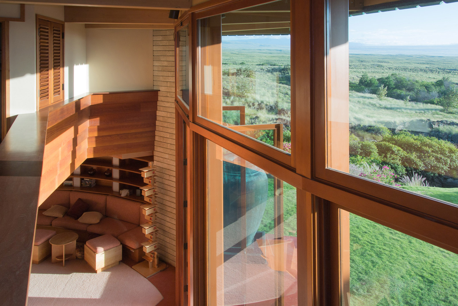
The double-height circulation at the living spaces is accomplished by pulling back the upper floor and hanging the exposed ceiling beams from a series of steel tension rods concealed within the upstairs walls and attached to the roof beams. This creates a loft-like feel to the upstairs hallway and the perspective captures additional views outside.
The image below shows the upper level framing plan of the home based on the circular grid.
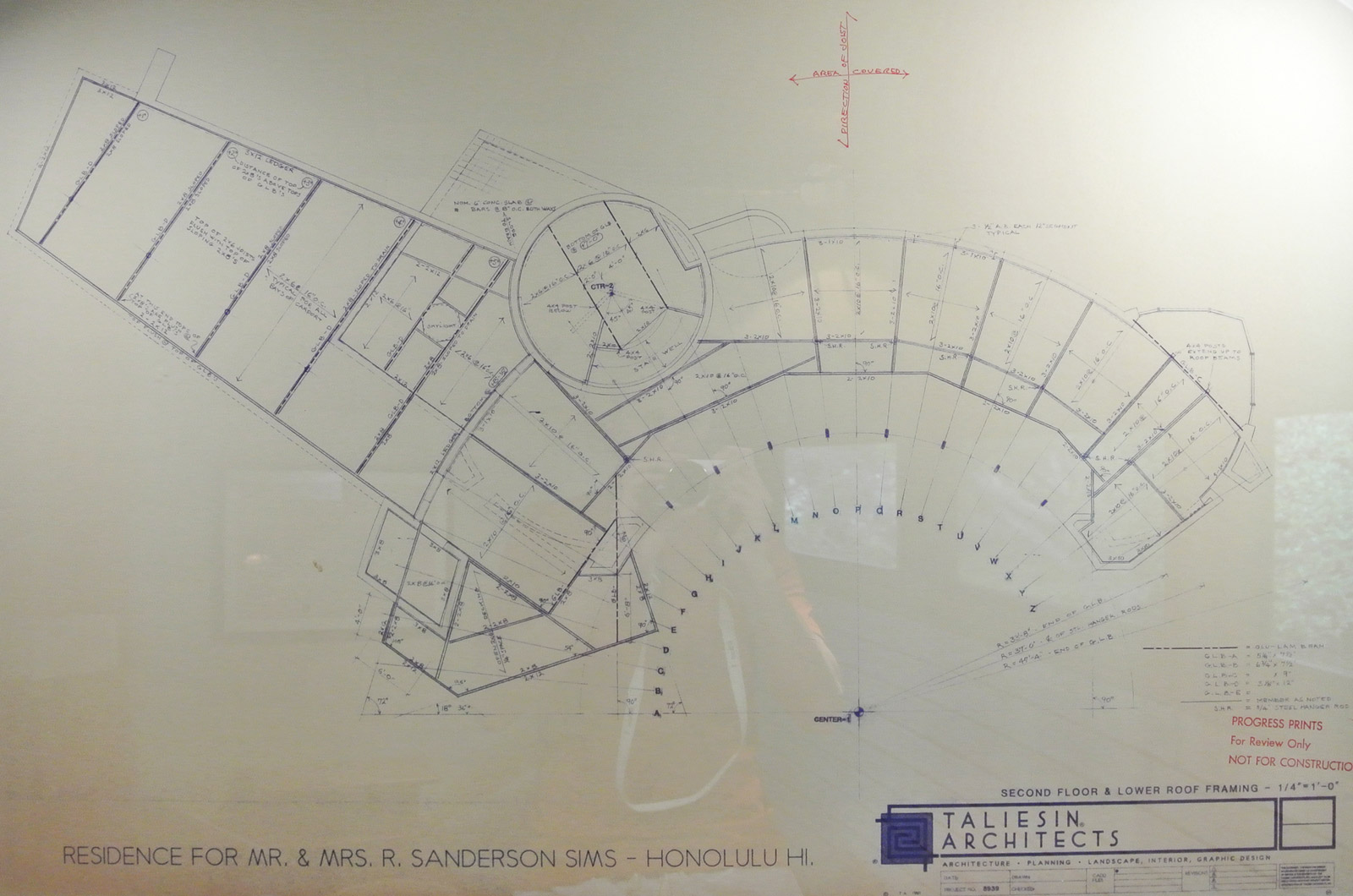
[Drawing by Taliesin Architects]
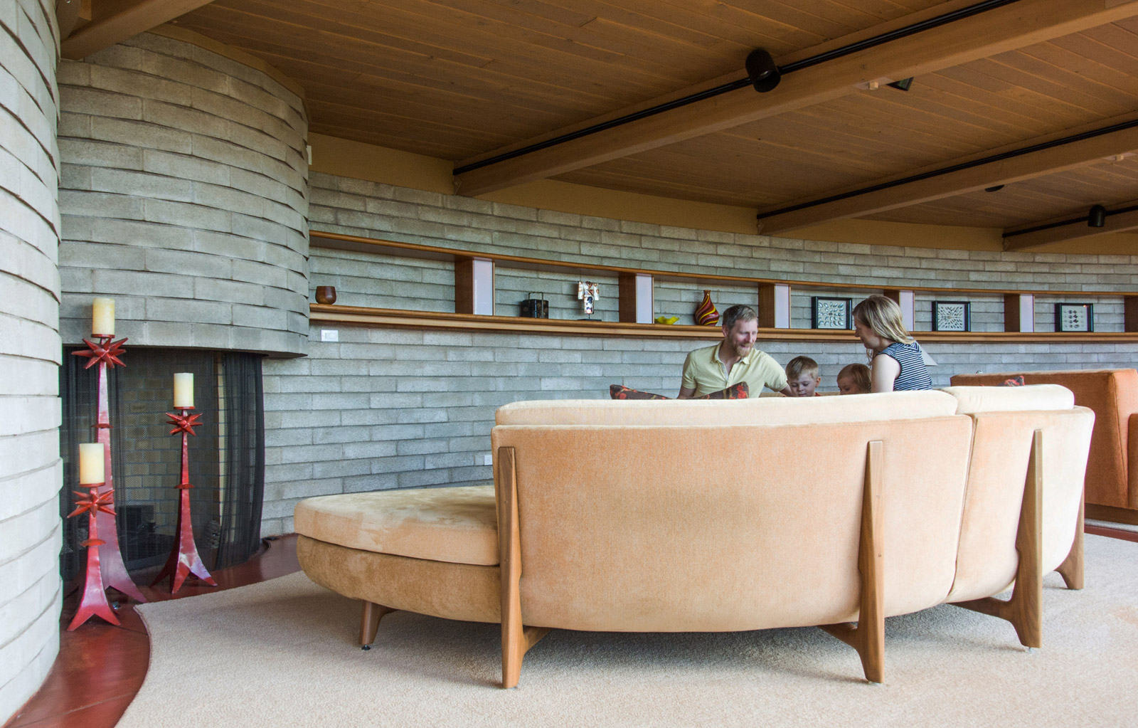
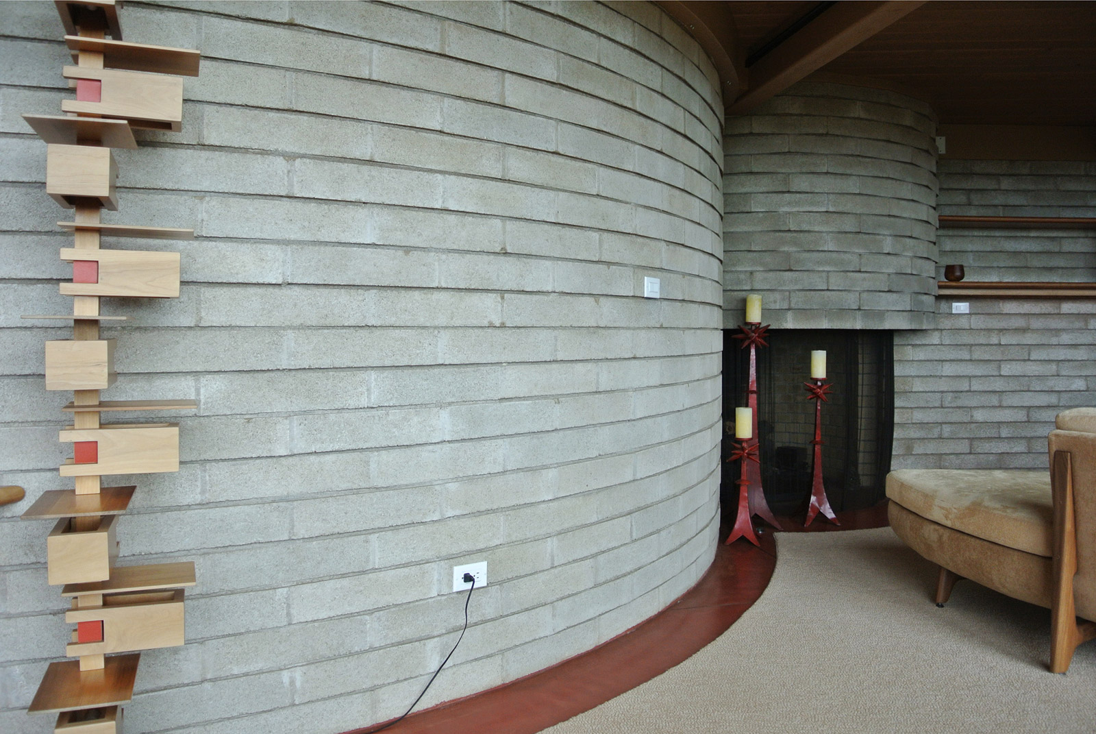
The first sitting area includes a semi-circular custom fabricated couch which turns away from the view and instead focuses on a built-in fireplace. The fireplace interlocks with a larger cylindrical volume which houses the service functions of the house (bathrooms, utility rooms, and stairs). These cylindrical geometries as well as the arcing back wall at the sitting rooms are constructed of aggregate coral blocks from O’ahu which measured at 15-1/2” long x 3-5/8” tall x 11-1/2” deep.
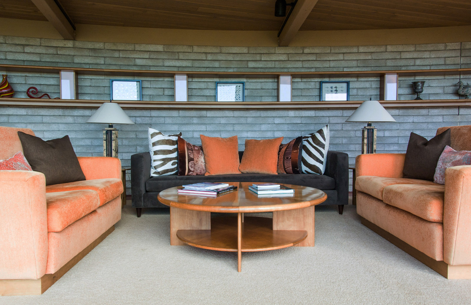
The center sitting area appears more formal with opposing couches and a bit more emphasis on the landscaping and view. This sitting area, as with the others, is backlit with built-in lights nicely integrated into a bookshelf that runs the length of the space.
The sitting area at the far end is a gem of its own. Comfortable built-in seating wraps the north wall with built-in bookshelves and integrated lighting above. Frank Lloyd Wright

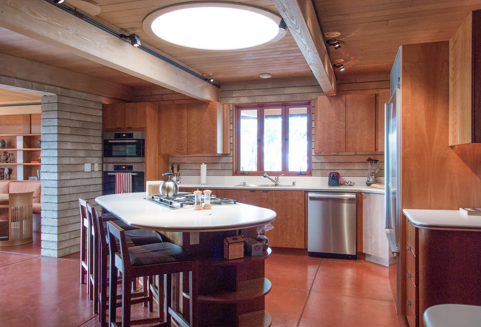
In our experience, the kitchen designs in most Wright projects are severely lacking. The Wright-designed kitchens we’ve toured so far (5 or 6 now) have been located in smaller, darker nooks of the house. These kitchens were not designed as places to gather and celebrate the preparation of food, but rather for a solo cook to produce a meal with little fanfare. The kitchen in this house was a pleasant contrast. It is spacious with ample room for family and guests to gather, while an angled kitchen island brings the work triangle to below 18’. A round skylight measuring nearly 4’ in diameter centers the room and keeps the space light and bright during the day. An updated Miele appliance package and Sub-Zero refrigerator also allowed us to field test some new equipment. Overall, it was a kitchen that exceeded the sensibilities of a 21st century lifestyle.
Adjacent the kitchen is the dining room, designed with another handsome built-in bank of seating and bookshelf with integrated lighting. The space was smartly designed with the built-in bench, which is capable of accommodating a small, medium, or large table while maintaining harmoniousness in the space. As pictured here, the 8′-0″ long table allows some bench to extend as casual seating without feeling out of place.
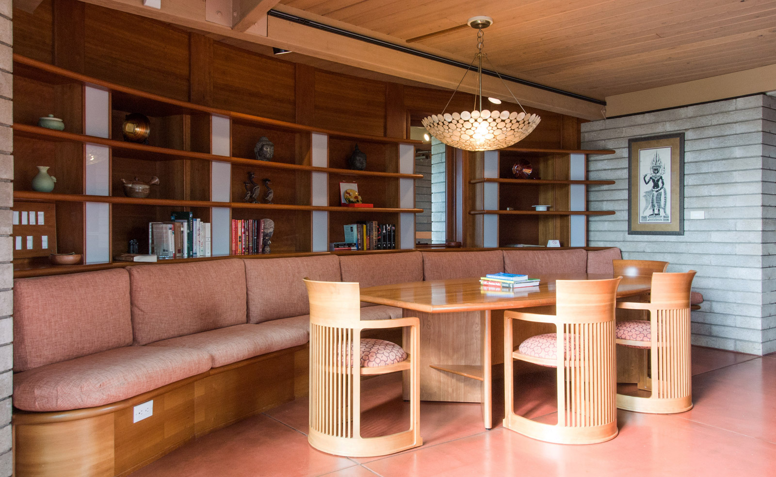
The entire main floor is slab on grade concrete with either an integral color or a bomb-proof coating of red stain which complements the other materials nicely. While the home has a shoes-off policy, the concrete is still a great application for families returning from a long day at the beach.

A circular stairway within the large cylindrical geometry of the home’s floor plan arcs up to the second level. There’s a nice sensibility about having the aggregate coral blocks exposed and raw on each side, but there are disadvantages with this detail as we’ll discuss in a bit.

The upstairs is made up of a linear series of 3 bedrooms, a den, and 3 bathrooms. Another common criticism of a typical Wright design is an undersized bedroom. Once again, this particular residence defied the norm and we found the bedroom proportions to be ample and even generous in the master bedroom. The bedroom in the image below measures at 10’-3” wide x 16’ long and includes a small built-in desk and closet.
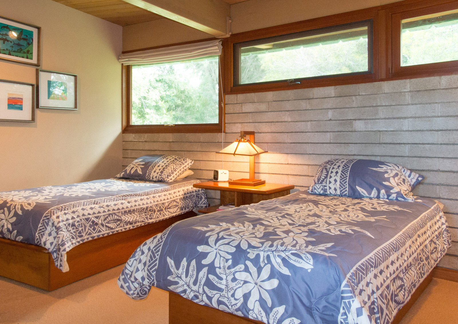
The master suite includes a fireplace, work area, walk-in closet, a large master bathroom, and its own private deck. Overall the master was luxurious, our only criticism is an unfortunate relationship between a very deliberately located bed and an exposed structural beam that visually splits the bed in two. We’ll be the first to admit that this observation is one probably only noted by a persnickety, tape measure toting architect.


While the den is one of the most thoughtfully-curated spaces in the house, it appears drastically under-appreciated with the competition of three sitting rooms downstairs.
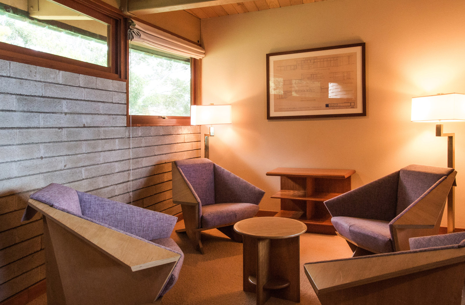
Two of the three bedrooms also have a strong relationship to the common areas below by way of louvered shutters that can be opened. We found this to be pleasant enough for a vacation rental with kids, but it could just as easily be a privacy concern if the home were a primary residence.

The deficiencies of the house were few, but noticeable to the trained eye. Keep in mind that these are nit-picky criticisms based on the fact that we were evaluating a Frank Lloyd Wright residence from an architectural standpoint, armed with decades of design experience and a tape measure in our holster. Overall, we would recommend staying in this house without reservation.
While all of the built-in lights are visually harmonious with the architecture and create a warm quality of light, the electrical systems critical to the operation of the residence seem to be an afterthought. Electrical devices (e.g., switches, outlets, etc) don’t consistently align with each other and are often awkwardly located within the aggregate walls. It’s evident that running electrical lines to unanticipated technology (e.g., flat screens) has produced some challenges with locating the conduit lines over the years. This is simply the result of the difficulty in opening up existing concrete block walls to run electrical lines. Similarly, we were disappointed to see the addendum of surface-mounted track lights at many of the exposed beams.
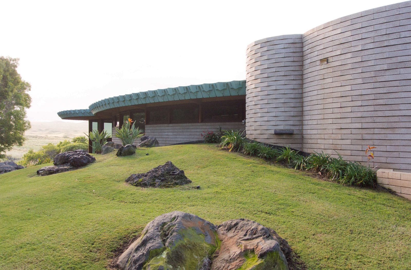
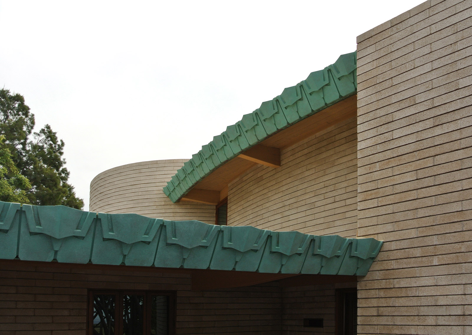
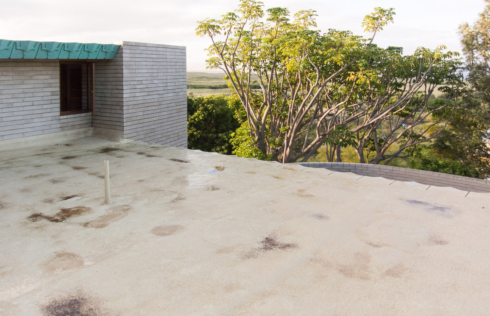
Due to the frequent rains at night, we were able to experience the roof drainage system (or lack thereof) first-hand. In lieu of directing rain water to valleys, scuppers, and downspouts, the roofs were designed to sheet-drain water to most of the eaves of the house. This, coupled with the intricate eave cladding system resulted in rainwater being cascaded into dozens of little waterfalls that hit the pavement below, making a bit of noise and bouncing water onto the face of the house. While it wasn’t anything that disrupted us as guests, this type of drainage design isn’t even allowed within the building code of most jurisdictions anymore.
There are two entrance points to the house, both of which require passing through the carport area. While one of the entry points seems to be the more celebrated of the two, it is a bit circuitous as visitors must pass beside the carport, through an outdoor hallway, and then appear at the courtyard side of the house. Not necessarily an issue for the short-term visitor, but it seemed less refined than what one would expect from a typical Wright entry sequence.
Our last concern about the house simply deals with the amount of custom furnishings necessary to properly outfit the interiors. These include an abundance of custom made cushions to line all of the elliptical built-in seating, large rugs custom made to fit the curvature of the rooms, and the Frank Lloyd Wright licensed lighting that makes a space like this resonate.

Without a doubt, this residence is a timeless example of design. It was forward-thinking in 1954, it’s an exceptional piece of architecture today, and it will be a treasured gem 50 years from now–all while being perfectly functional. The massing of the structure respects the landscape by neither mimicking nor interfering with it. At the same time, the house belongs exactly where it is. The clear geometry of the cylinder and the arc create an elegant plan, while the designation of functions (all services in the cylinder) keeps the interior organized and tidy. From a detailing perspective, it is an extraordinary example of how raw materials (e.g., concrete block, concrete floors, exposed beams) can create sophisticated and pleasing interiors.
There are several individuals to thank for the experience of staying in this home and the information about its history. We’re grateful to the owners who have kept the residence in pristine condition while still allowing it to be a comfortable home. Opening up the property so that others may get a glimpse of what it’s like to live in a Wright-designed house requires a great amount of trust, and we’re thankful for that. Gratitude goes out to Karen Anderson for her excellent article “Wright in Waimea” which appeared in the August 2013 issue of At Home Magazine and educated us on the history of the house. For those interested in further research behind the project, it’s worth noting that Reginald Sanderson Sims published a book on the experience of building the home titled How Frank Lloyd Wright Got Into My Head, Under My Skin And Changed The Way I Think About Thinking.

Cheers from Team BUILD


