[All images by BUILD LLC]
We’re currently working on a couple of projects that foster a different way of thinking about floor plans and how the home is occupied. In these particular situations, the traditional layout of ground floor common areas and upper floor bedrooms wouldn’t optimize the site or the lifestyle. For a variety of reasons, the floor plans of these residences were flipped in the design phase to place the common areas at the top of the structure and that’s when everything clicked.
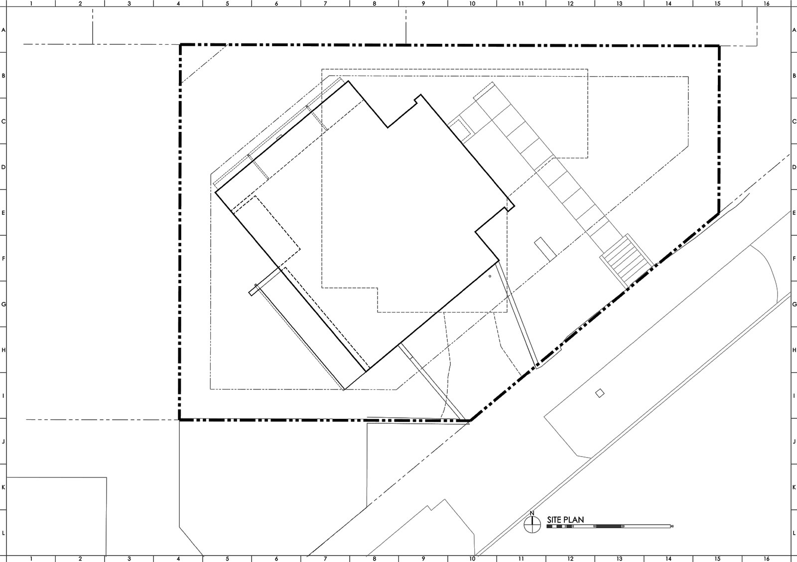
Before we get into the technicalities of inverting the common areas with the bedrooms, let’s review some of the site conditions that commonly lead to this design solution. Like many urban areas, there’s very little land left in Seattle. The available lots are typically on the smaller side, tend to involve an older home in tear-down condition, and are very expensive. Add to these the increasing constraints of the municipal code, (setbacks, lot coverage, etc.,) the fact that neighboring houses are typically uncomfortably close to the property lines, (older setbacks were liberal,) and the desire for a view in the city (previous home designs often failed to take advantage of these views, and apparently, they also tended to place a low value on privacy). All together, these factors lead to a persuasive case that the house volume must go up. With a height limit of 30’ in the City of Seattle, most houses can include three levels. (Four if you’re clever about it, squeeze in a basement, and maximize the height limit). This design model produces houses on the taller side with tidy floor plans. The diagram below maps the four-level Desai Residence in Queen Anne per function, orientation, view, and daylight.
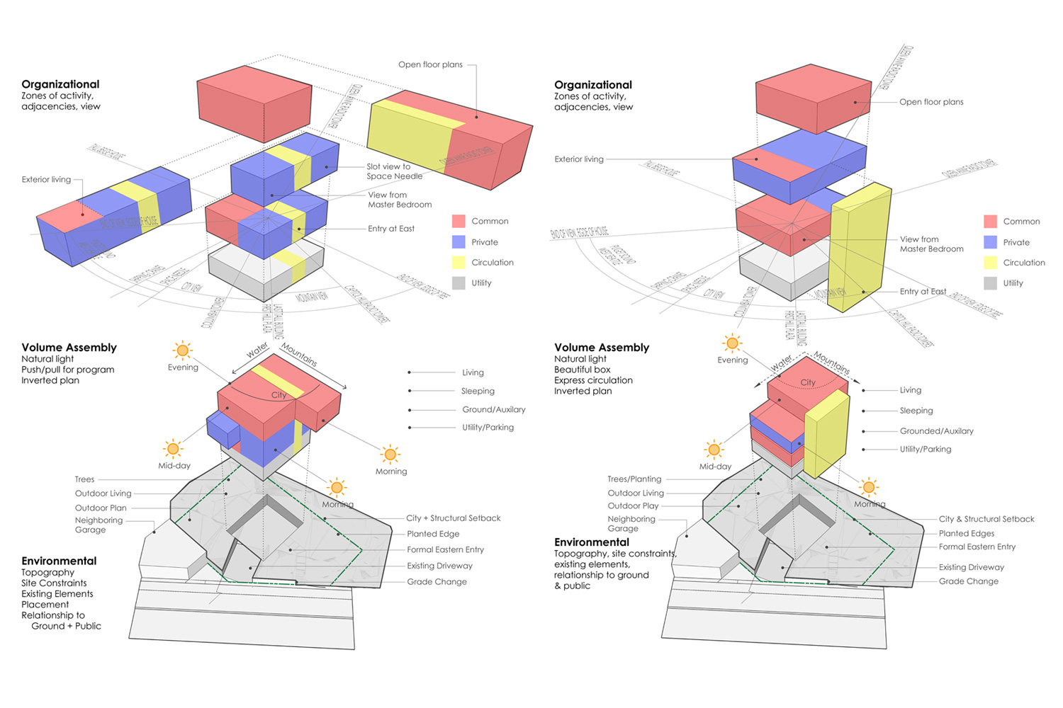
With a home of three or four stories, it’s no surprise that the top floor has better views and more natural light than the lower floors. But here’s the game changer: in the past, traditional forms of architecture (like the craftsman and tudor styles common in Seattle’s most desirable neighborhoods) awkwardly tucked the top floor of the house within a gable roof. The A-frame ends of the roof and occasional dormers may have allowed for meager windows, but for the most part, these upper floor spaces lacked view and daylight. These upper floors accommodated dark bedrooms, storage areas and cramped stairways that often involved ducking. The clean lines and flat or shed roofs of modernism, however, allow the inclusion of full height windows on all sides of the structure to capture views and plentiful daylight. Modern design methods are such a significant shift, in fact, that they often allow the top floor of a home to be the most desirable lifestyle experience measured by airiness, views, flow and privacy.
It could be argued that most people enjoy going to bed with a crisp view of the sunset or waking up with an abundance of sunlight flooding through the windows. But when you study the amount of time most people spend awake in the bedroom it falls dramatically short in comparison with the time spent in the kitchen, dining room, and living room. Perhaps the drafty homes of earlier times caused those owners to bundle under blankets at the ‘warmest’, upper level, location – not much of an issue now with better construction and radiant heating.
There is also a privacy advantage in that most neighboring houses have their common areas located at the ground floor; locating the common areas of a new house on top puts some distance between them and a neighbor’s living room window. Lastly, given that roof terraces are prized today, the access between a top floor common area and the roof deck is straightforward and relatively practical. With key site conditions at play, pushing the common areas up to the top of the house makes sense from an experience perspective but, as you can guess, this move has some lifestyle implications and the approach to addressing them architecturally- with sensitivity and thoughtfulness to the specific site- can make or break the end result.
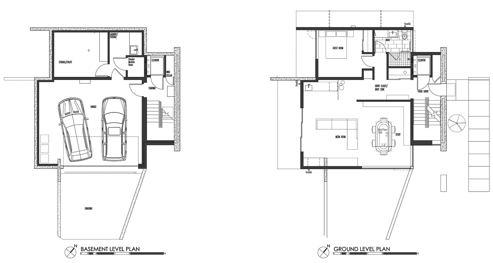
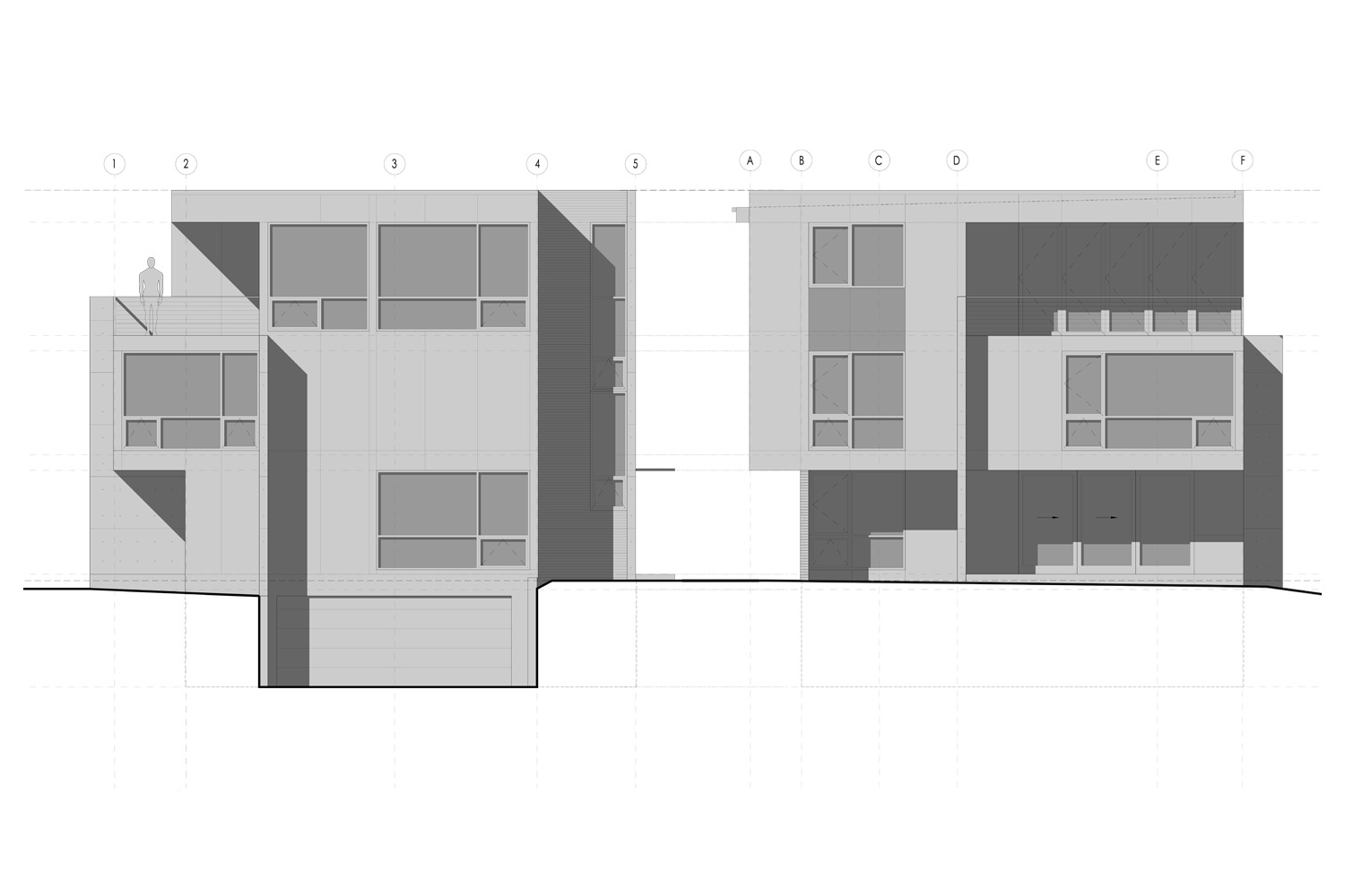
The number one concern with a top floor common area is getting the groceries from the garage to the kitchen. Throw in a couple of kids, grab the mail on the way up, and navigating three or four stories worth of steps becomes a serious workout. The reverse pattern of taking out the garbage involves similar challenges. The four-level Desai Residence (above and below) was designed with a 3’ x 4’ residential elevator to solve these issues.
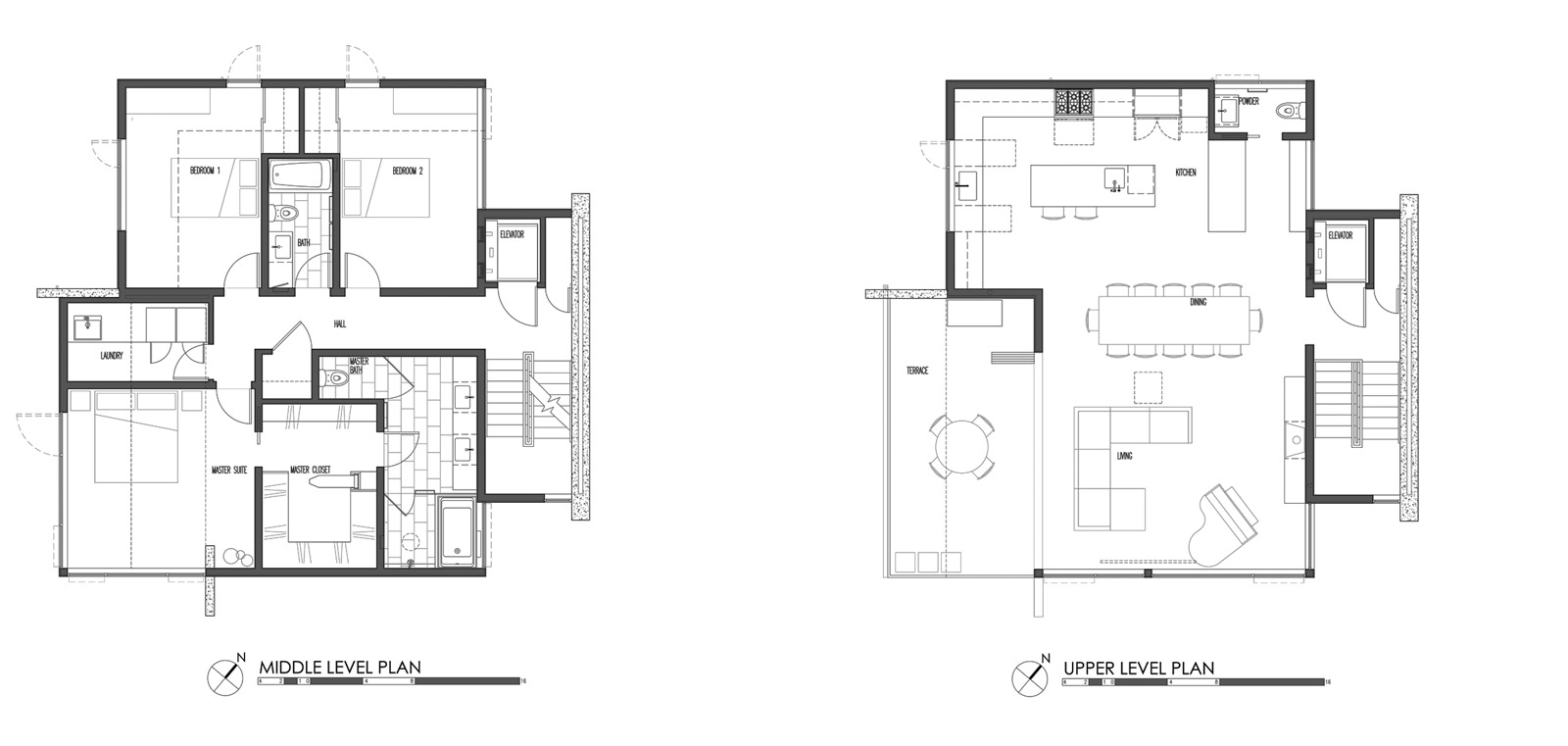
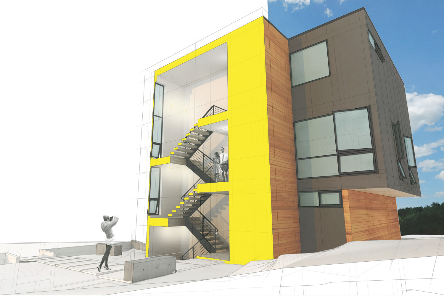
There is also the issue of the private bedroom areas being located closer to the entry level of the home. This project designates a specific stair circulation core within the home, so that visitors are directed efficiently up the stairs (or via the elevator) to the top floor common area. Visual cues such as changes in materials also direct guests subtly away from the bedrooms and up to the living room.
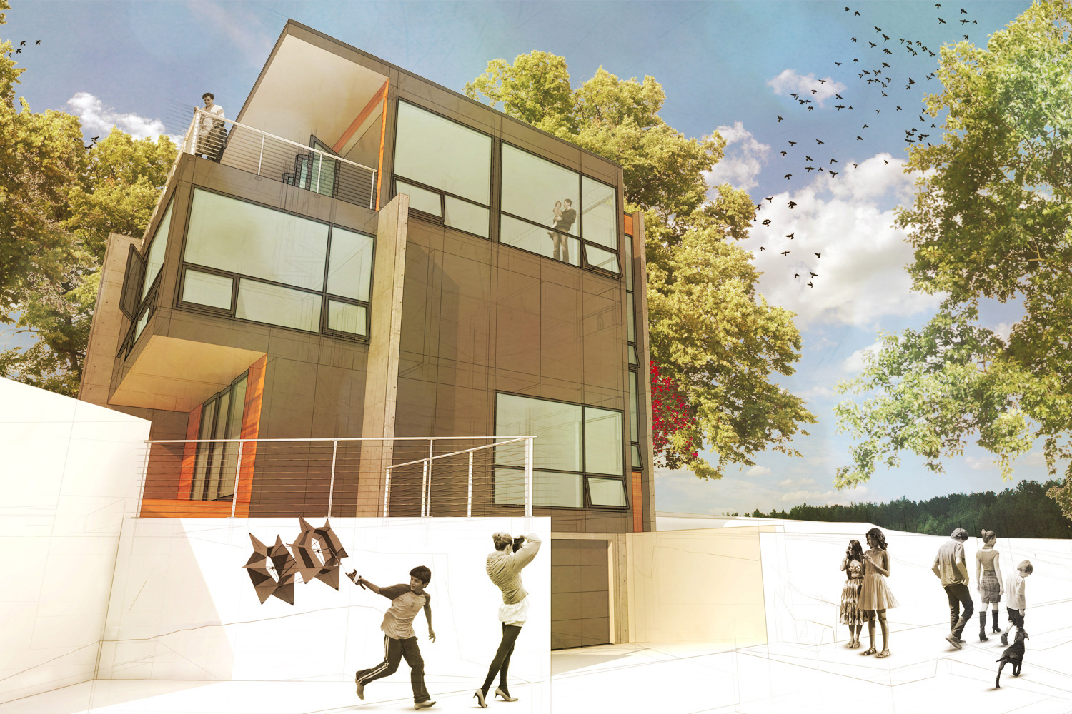
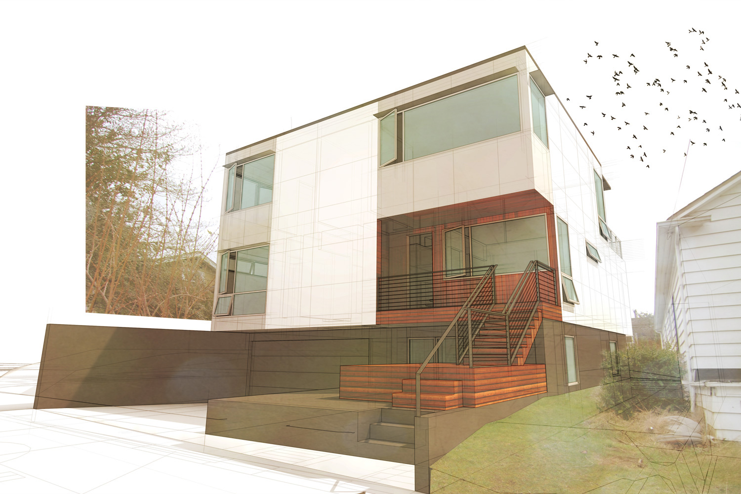
The BUILD Case Study House 2014 uses a similar strategy of locating the common areas on the top of three floors. Bedrooms and bathrooms occupy the middle level and the garage, utilities, and a flex space are located at a partial basement below. The grocery bag dilemma is solved with a handy dumb-waiter in this case, which travels directly from the garage to the top floor. Lastly, the ground level has been designed with multiple future needs in mind, and has provisions for a potential, future mother-in-law suite with a separate bathroom and kitchenette for an aging adult or rental unit.
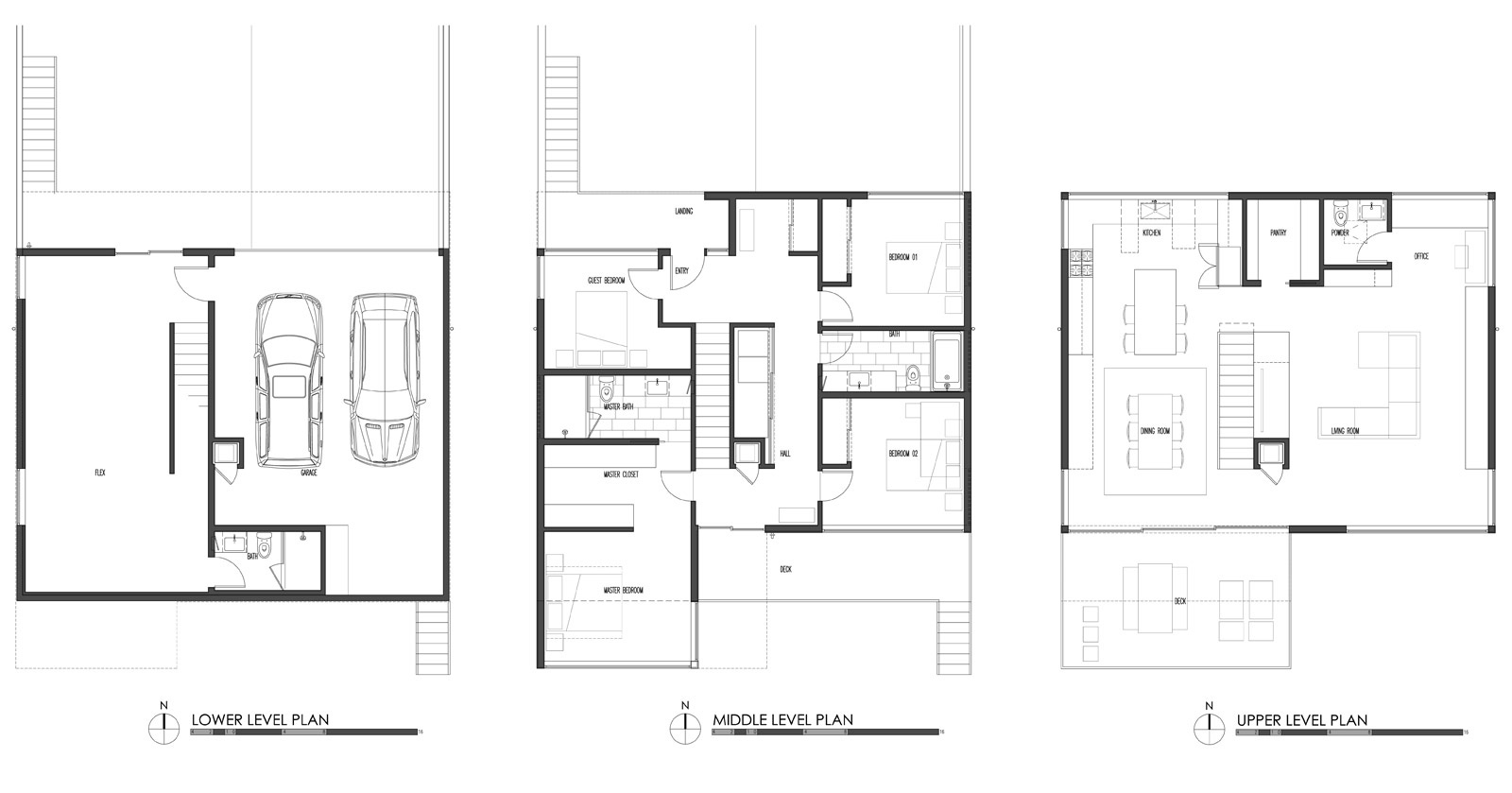
In this project, the entry-bedroom privacy concerns are dealt with by locating the stair directly in front of the entry so that you can’t miss it. One quick run of stairs delivers visitors conveniently to the common areas while the bedroom areas are positioned to maximize privacy.
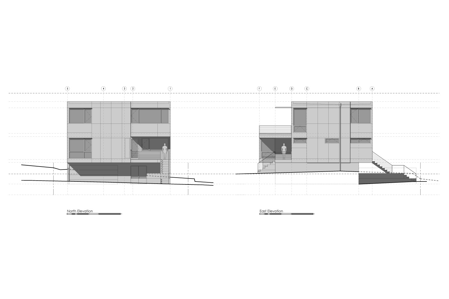
Located on the rising hill of Seattle’s rapidly changing (thanks to the nearby light rail station under construction) Roosevelt neighborhood, the Case Study House takes full advantage of the floor plan flip and includes a roof deck just a stair flight away from the common areas. The additional eleven feet of height accesses stunning mountain and city views, as well as plentiful sunlight from the southern exposure.
Inverting the common and private spaces of a residence is an effective and inspiring solution to challenging site conditions. Granted, the flipped plan isn’t for everyone; it requires an open mind and a rethinking of how we all use the home. At BUILD, we like to think of it as another strategy in our design toolbox that enables a home to benefit from the site and create an enjoyable lifestyle.
Cheers from Team BUILD


