[All photos provided by Gert Wingårdh]
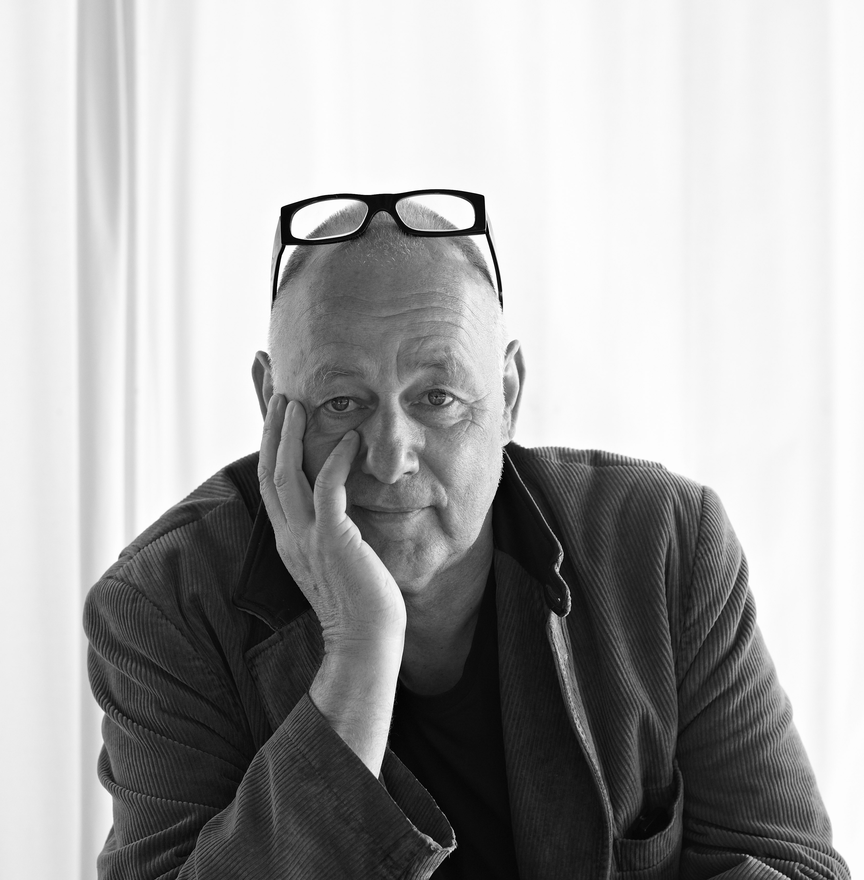
This fall, BUILD met up with Gert Wingårdh at his Stockholm headquarters to discuss his impressive roster of forward-thinking public and commercial projects. With completed work in Scandinavia, Northern Europe and The United States, his project types range from embassies and university buildings to shopping malls and air traffic control towers. We discussed the design of golf clubhouses, how to keep your clients happy, and what it means to be a maximalist. Part 1 of the interview can be viewed here.
You’ve recently taken on several urban planning projects. How did you make the transition from public and commercial work to urban planning?
As an office, we shied away from doing urban planning for a long time, and instead focused on buildings, because I feel most comfortable doing buildings. But then you get opportunities, and you rise to the occasion. We got into urban planning more by being asked.
There is so much design talent in Sweden, why do Swedish design competitions typically invite international architects to the competitive pool?
Sweden is a culture which is quite open-minded and we want to bring in new people and fresh ideas.
With the scale and diversity of your projects, and an office of 175 individuals, how do you keep on top of the design process?
The organization has grown slowly and some of our staff has been with the firm since the late 1980’s. It’s like a marriage in a sense.
How do you describe your role in the firm?
I’m often asked by students if I design everything and in a sense I do, but if I did everything myself, I wouldn’t have a staff of 175 people. The boat can’t sail if you’re alone on it, but you still need a captain. It’s about starting a lot of projects and I enjoy being pulled in a lot of different directions. I’m very much a reactive person rather than an active person, so I like my staff to read a brief and do a design then present it to me and we can refine the solution from there.

You describe your work as having an ecological awareness but the relationships between your designs and nature are so much more poetic than that phrase suggests. Can you tell us a bit about how you design with the environment?
This term of ecological awareness comes from being educated in the 1970’s. Dealing with the oil crisis of 1973 had a significant impact on being young at that time. It made us look to the U.S. because early ecological examples thrived in placed like California or in Arizona with Paolo Soleri’s work. Moving into the 1980’s you had architects like Emilio Ambasz building underground which has an ecological thinking to it. I think it’s a very German-Scandinavian understanding that the architecture respects nature and the poetics come from doing so in an artistic way.
Scandinavians seem to be avid proponents of modernism in the public realm whereas the American public can be quite resistant to modernism. What do you think accounts for this difference?
I don’t have a clue. The obvious thing to say is that you’re a young nation and you’re sensitive about your heritage. The people that seem to care the least for their monuments live in some of the oldest places, like Rome.
What have been the greatest challenges of your career?
My career has been very gradual and the greatest challenge was getting the first commission, which was the Öijared Golf Clubhouse. It’s tough to get the ball rolling.
Is each project a reinvention or is there a kit-of-parts that you rely on in your project?
Each is a reinvention, but we typically start with a solution that we completed on a previous project. There are so many starting points now, that you can ask people to take off from material already established.
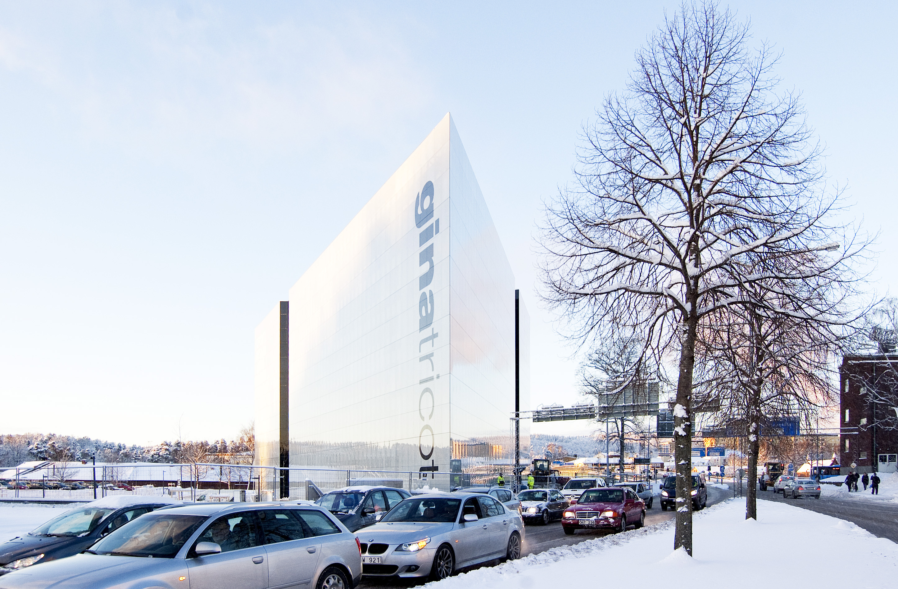
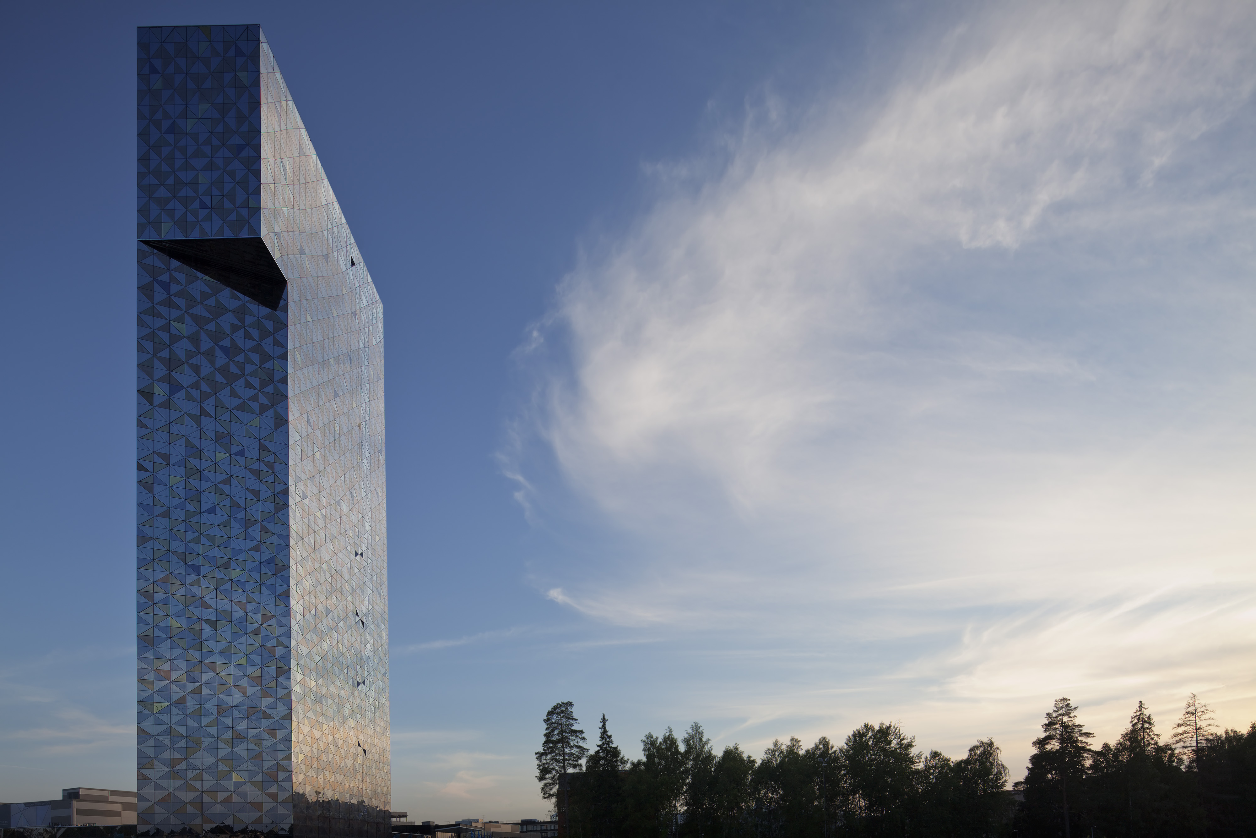
How have the locals responded to projects like the Gina Tricot building and the Victoria Tower, with their bold, modern forms?
I’ve heard nothing negative on either, in fact we’ve even received fan mail on the Victoria Tower. The tower stands away from any neighborhoods, and in a context of upstart firms and other companies that are not usually all that sensitive about the environment. I’m sure there’s people who aren’t fans of the building, but they haven’t come forward.

Nearly every project on your website is shown in plan and section. What is the significance of these drawings within the presentation of completed projects?
If you’re an architect, you’re always reading sections together with plans. Our idea with the website lately is not to talk too much but to be kind of matter of fact. There should be a body of work on the website that shows what we’ve acheived. The news and more vibrant information resides on our Facebook page.
Do you build physical models in addition to the 3D rendering work?
Yes, the physical model is an important design tool for the clients as well as inside the studio. We also like to take them out to the jobsite to communicate with the trades. It’s important that the people actually building the project develop a clear mental idea of what the project will be like.
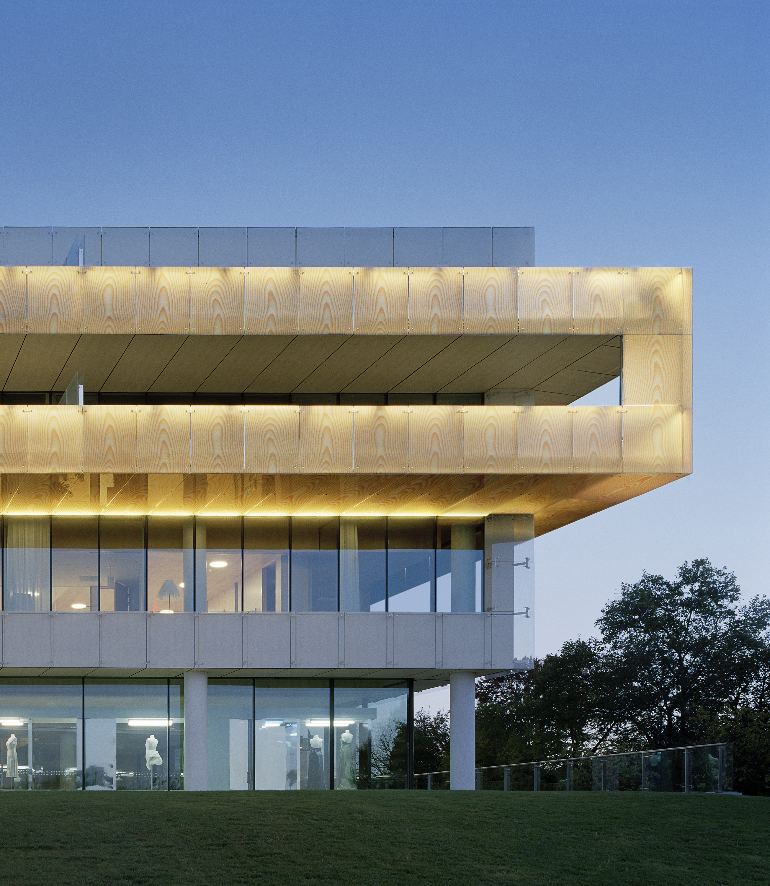
In 2006, the Swedish Embassy in Washington D.C. that you designed was completed. What were some of the differences designing and building in the United States?
While the projects are more regulated in the U.S., the process was also more reassuring. Getting the project realized also felt more believable and doable.

How does the building design represent Sweden?
Historically Sweden was a poor country and it was common in architecture to paint birch, which is abundant, to look like stone. In the spirit of faking materials, the wood textures covering the 2nd level guest residences are computer generated. We also had a lot of white dots printed onto glass to give the impression of mist rising early in the morning.
What design work influenced you most as a young architect?
Carlo Scarpa was the greatest influence, and I still enjoy looking at his work. When I first saw Scarpa’s work it seemed like the answer to everything because it was so elaborate. It was so far away from Rossi or Sterling who were trying to make buildings interesting, but Scarpa was the real stuff. We took the entire office down to Venice and Verona three or four years ago to tour his work.
How have you made it through economic downturns?
In the early ’90s people made the transition from drawing by hand to drawing by computers. I could only employ a young staff, all of whom were computer literate. Shortly thereafter, Sweden experienced a big recession and all of the big firms had to lay off their young people because you have to let employees go in the order in which they were hired. These firms became computer illiterate because the young staff was gone, whereas we retained the youth and the digital skillset. In 1995 when things started picking up again, we were still a very strong office. We had a strong position by luck.
Gert Wingårdh studied economics, art history and architecture in the 1970s at Gothenburg University and Chalmers University of Technology in Sweden. He founded his firm in 1977 and now employs a staff of 175 in Stockholm, Malmö and Göteborg, Sweden. The award winning practice specializes in architecture, urban planning, interior design and landscape planning. Wingårdhs has completed projects across Sweden as well as internationally with design competitions representing a large part of the office’s business operations.


