


One of the most inspiring aspects of architecture is its constant evolution. Over time, new technologies push materials and their assemblies to new capabilities, while new ways of thinking introduce different geometries and relationships within design. Staying true to this process of evolution produces an architecture of the current time. And as we like to say, creating an architecture of the current time is authentic.
The unfortunate flip side to this equation is all of those architectural features that linger around are based on nothing but the nostalgia of the past. These are elements that have long been superseded by different and better ways of doing things, but they keep popping up like card-board cut-outs, offering a romanticized illusion of times past.
Today’s post calls out 10 architectural features that should have been taken out of rotation by now. These architecture features may have been useful at one time, and some of them should even be credited as important stepping stones, getting us to where we currently are in design. But by thoughtlessly sticking these features onto the sides of houses and buildings in this day and age, we’re not only fooling ourselves, but we’re pushing design backwards.*
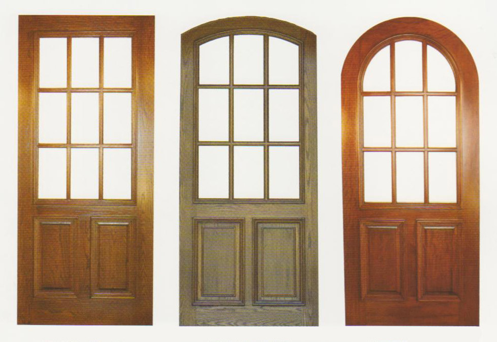
The Nine-Light Window or Door
The most ironic thing about nine-light windows and doors is that the aesthetic wasn’t even desired when it was originally developed. The small glass panels were simply a product of the technological limitations at the time. Today, conventional residential double-pane glass panels can easily be produced in sheets of 50 square feet (and larger for custom applications). In fact, the limitations of window sizes today are more typically governed by the gravity and lateral forces acting on the glass, rather than the technology of manufacturing glass. Adding insult to injury, many off-the-shelf nine-light applications are actually two large pieces of glass with 4 plastic runners in between creating a geometrical illusion of nine separate panes of glass. Uhgo.
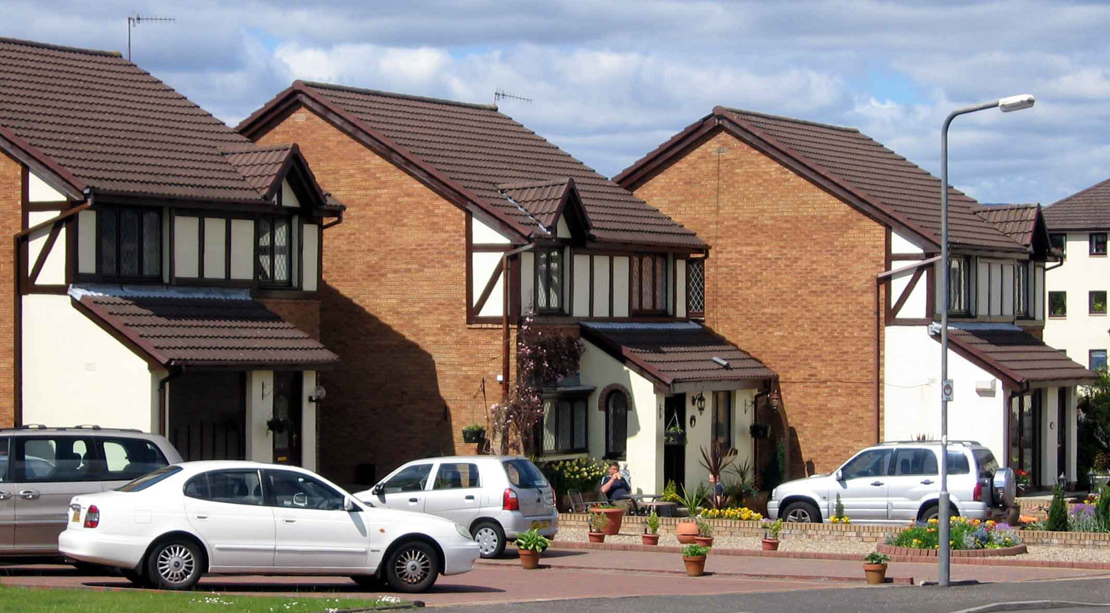
The Half-Timber Infill
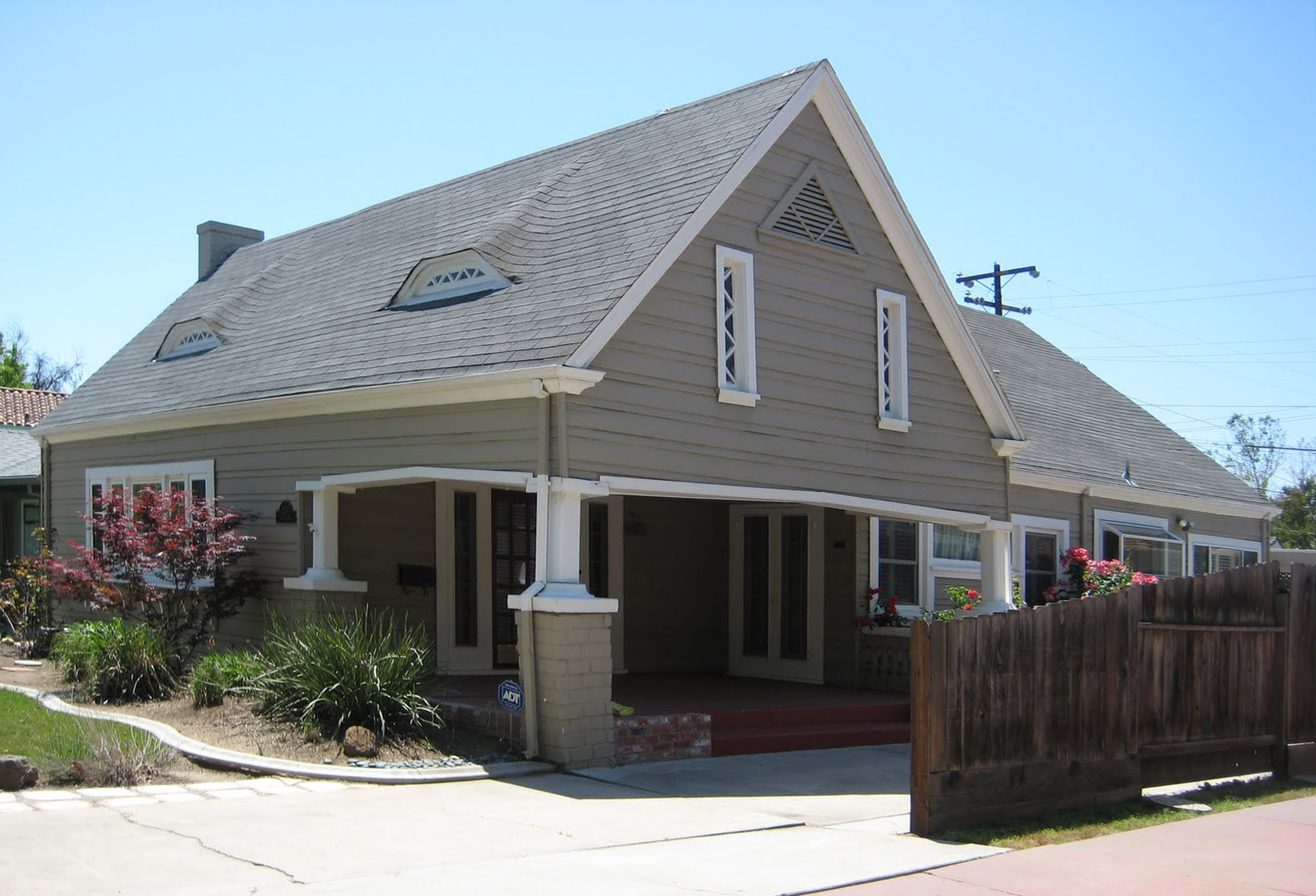
Way back in Medieval Europe, when tall and straight trees became scarce, architects and builders turned to smaller, scrawnier trees to frame the exterior walls of a structure. This produced the classic Tudor look with the stick framing enhanced by its white stucco counterpart filling in the cavities between wood members. Where do we even start with this one? Never mind the abundance of tall straight trees in regions like the Pacific Northwest, this aesthetic is entirely irrelevant to every aspect of construction in the modern world. Today, the entire half-timber visual is stuck onto conventionally framed walls made out of 2x6s and plywood. It is, quite literally, exterior wallpaper. Wallpaper that screams, “I live in the dark ages! But only superficially.”
The Knee Brace
Knee braces made a name for themselves in the early 1900’s within the craftsman style and were even considered embellishments at that time. Modern day framing has long since replaced the need for exterior mounted supports at roof eaves and a decent structural engineer can design a roof system that avoids knee braces in their sleep. Oddly enough, these “supports” are often one of the first exterior elements of a house in need of replacement.
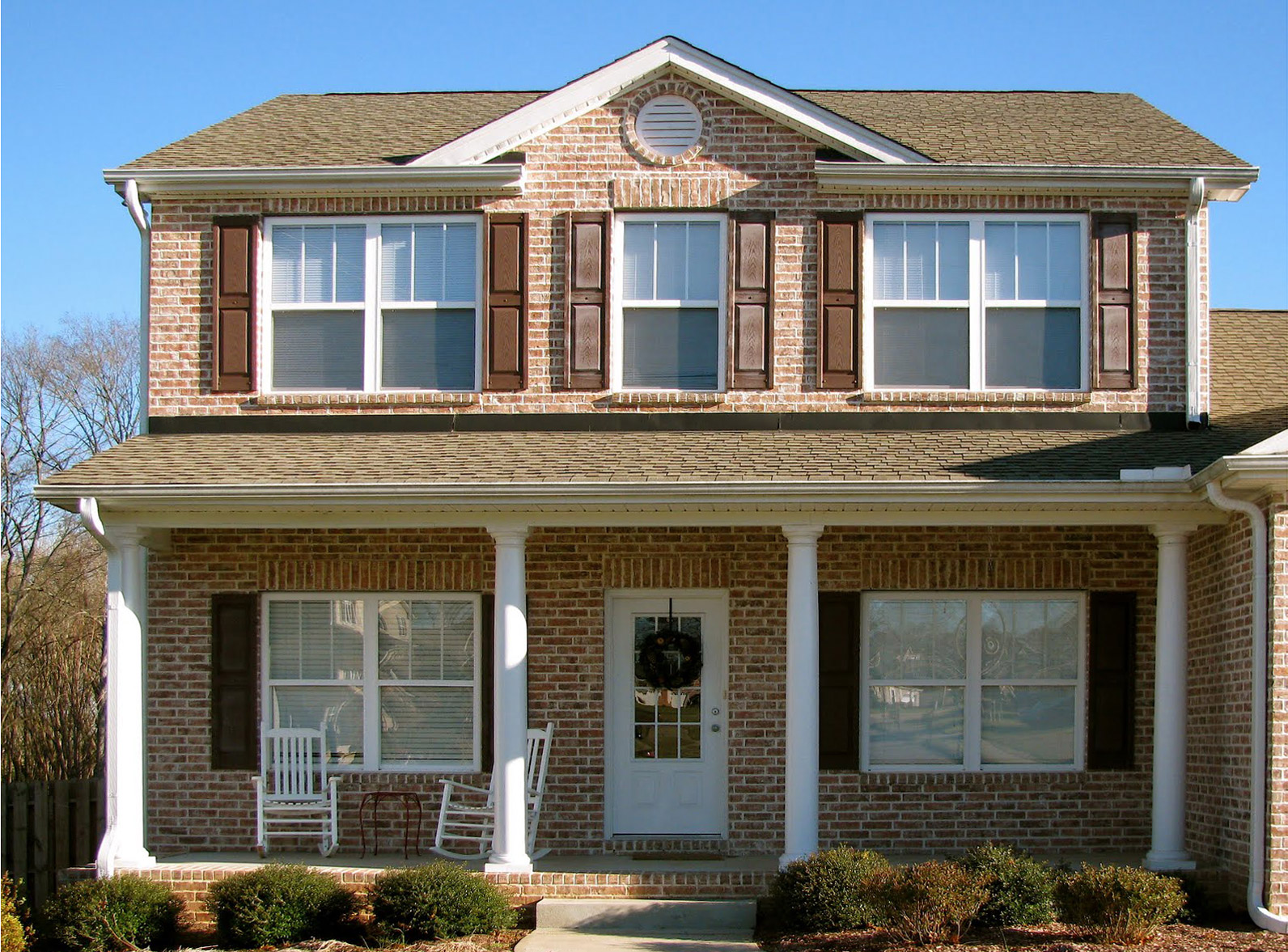
The Decorative Shutter
The worst thing about the decorative shutter is that, well … it doesn’t shut. These ornamental panels are typically mounted to the exterior walls on either side of the windows permanently. Our favorite version of the inoperable shutter is when the sizes of the shutters don’t even correlate to the window itself. Stunning!
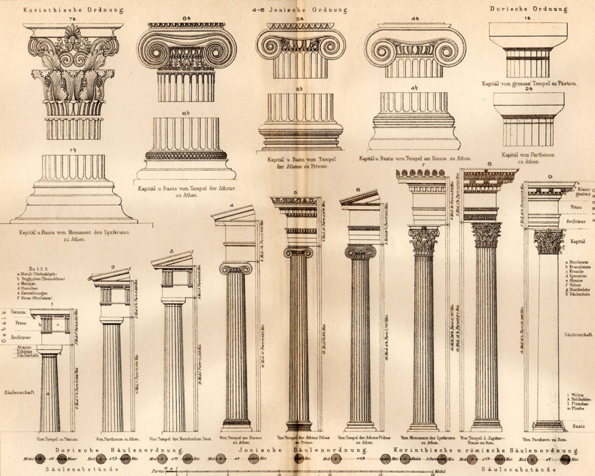
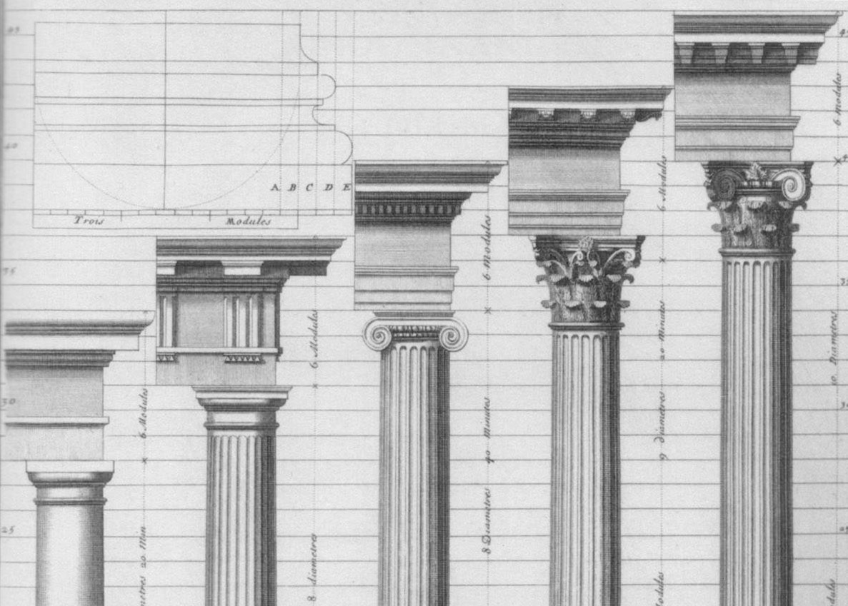
The Doric, Ionic, Corinthian, and Composite Column Orders
The Greeks invented the Doric order and Ionic order (known for the volutes of its capital) in the Archaic Period between 750 and 480 BC. Around 430 BC, the Greek city-state of Corinth produced its namesake order which was modeled after the acanthus leaf. Much later, the Romans designed the Composite order which combines elements from the Ionic and Corinthian orders and first appeared in 82 AD. The point is this, the Greek and Roman orders have twenty-five hundred years of architectural history embedded in their DNA. Don’t tack these onto the side of your 1980’s ranch style house. Just don’t.
The Double-Hung Window
Made from one part romance and two parts impracticality, this historic window type relies on counter-weights at each side of the window buried within the walls. Lighter, modern day versions have eliminated the counter-weights but always seem to retain the awkward mechanics of actually opening the window typically caused by the window racking as it attempts to battle gravity. For an authentic application of this window, we recommend globbing on numerous coats of paint to further inconvenience the user. Bonus points for combining the double-hung window with the nine-light window.
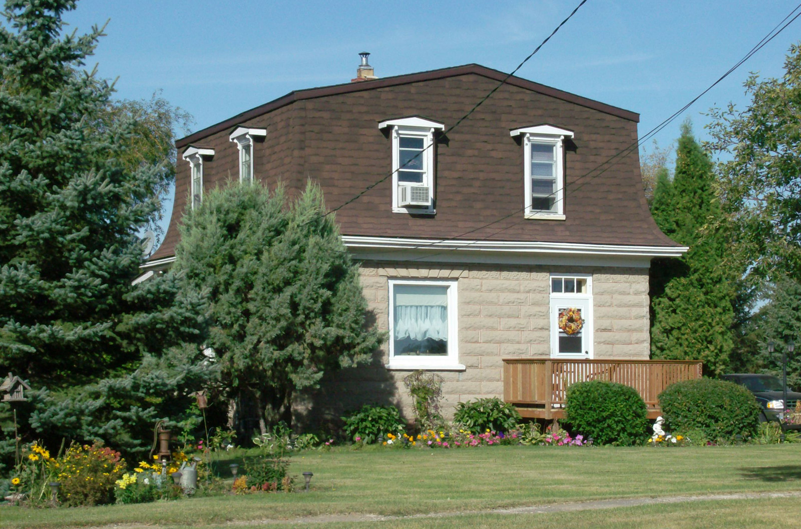
The Gambrel Roof and Mansard Roof
Both the Gambrel and Mansard roof geometries were originally designed as strategies to balance the facades of large, stately buildings into an appropriately proportioned base, middle and cap. And when applied to the Chateau de Fontainebleau, this approach produces a monumental example of historic architecture. When applied to the American single family residence, however, it not only fails to create visual harmony, but it devastates the structure’s scale.
The Mini-Dormer and Eyebrow
The mini-dormer or eyebrow window is a clear sign of architectural denial. The house wants to have a second story but doesn’t want to admit it to the world. The inhabitants pay the price for this condition by having to twist their necks and angle their heads just to use the bathroom mirror. Worse yet, design denial is only the first stage in mourning the loss of functional architecture, followed by anger, bargaining, depression, and finally, acceptance.
Quoins
Originally, these corner blocks were made from solid stone and were visually enhanced at the corners of a building, suggesting that your great-grandfather hauled them by wagon and heaved them into place by hand. Modern day examples are applied like peel-n-stick styrofoam and are often painted a different color to “create an impression of permanence and strength, and reinforce the onlooker’s sense of a structure’s presence” (thanks Wikipedia). Great-grandpa would be proud.
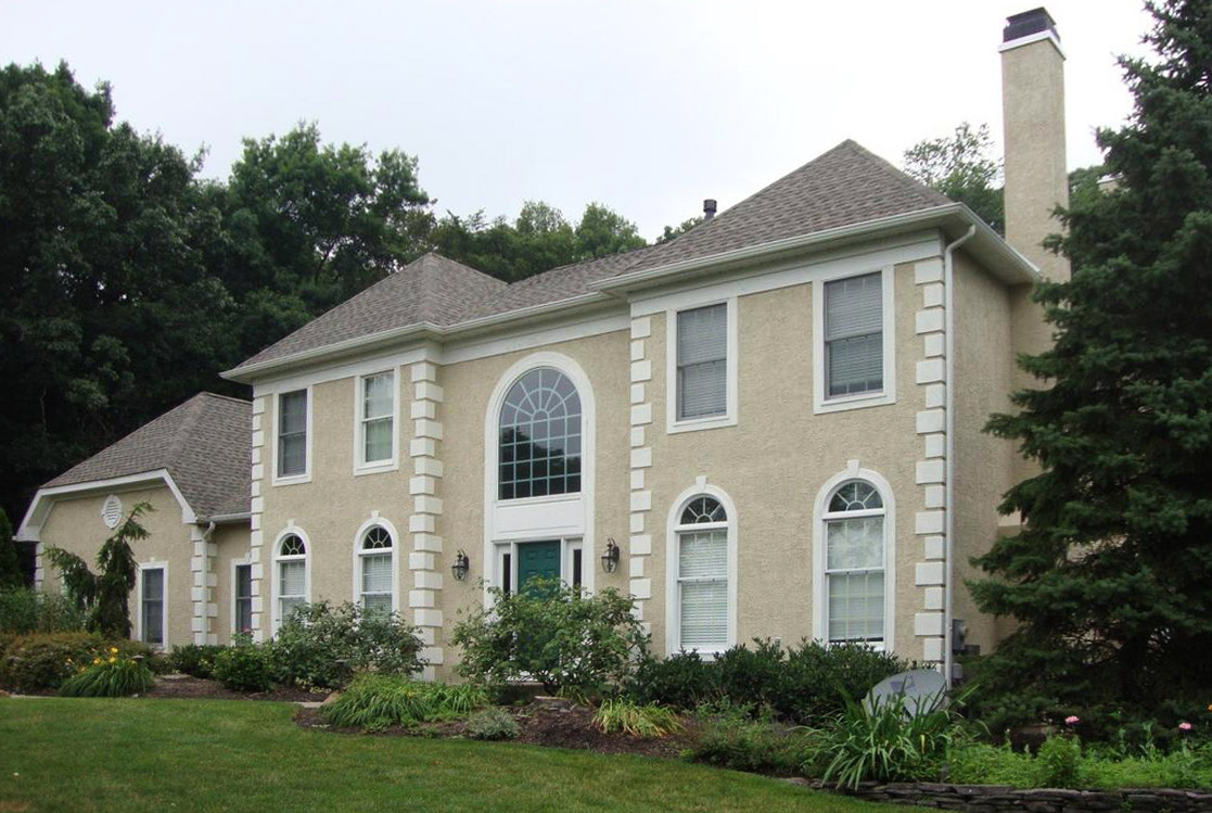
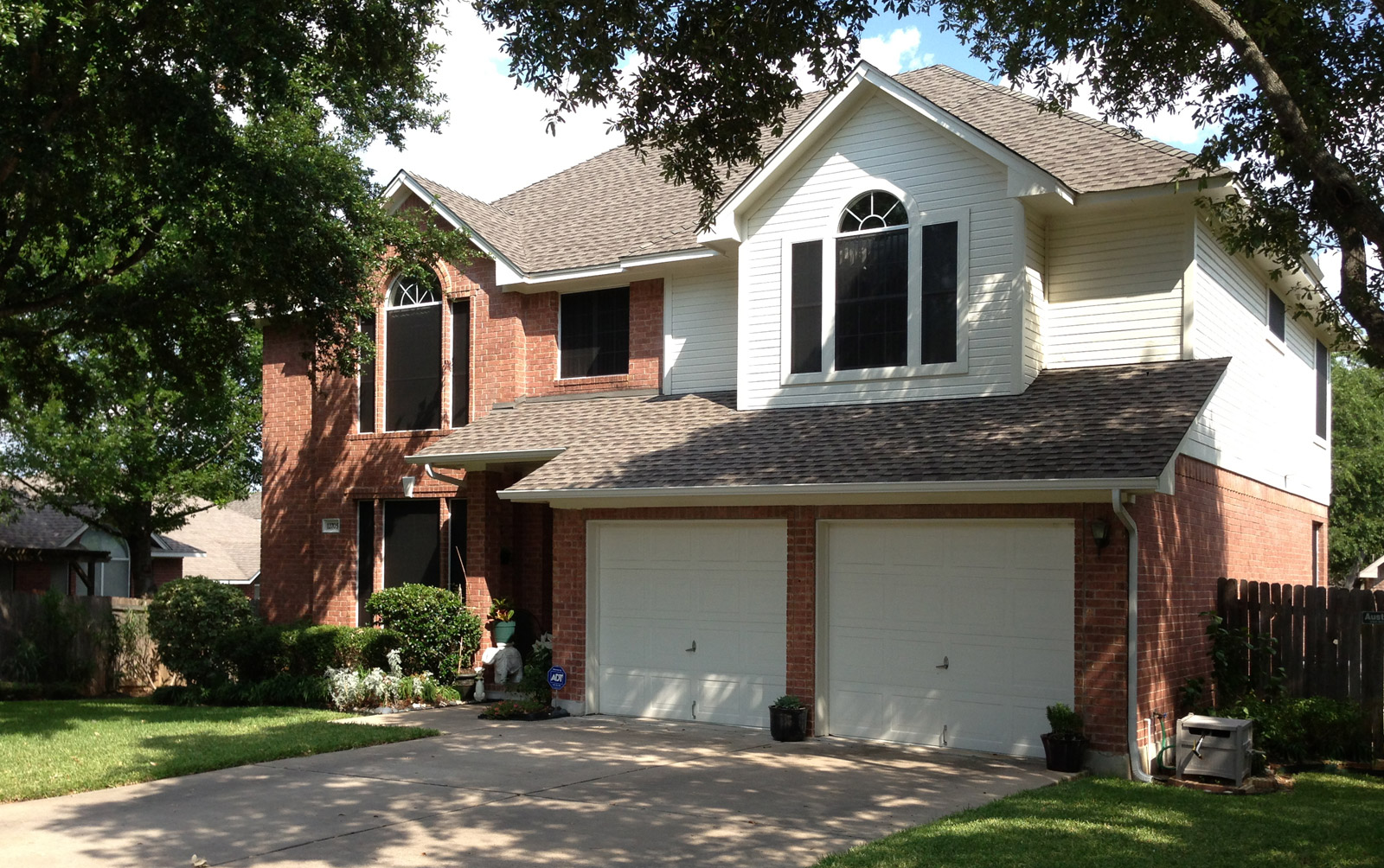
The Palladian Window
Praising the modern-day Palladian window is, without a doubt, the swiftest and most reliable way to piss-off your contemporary design friends. Not only is it the most adulterated architectural element in western civilization, but it’s typically used in conjunction with a hodge-podge of items from the list above. Don’t get us wrong, there’s nothing architecturally unethical about traditional examples of this window configuration. Italian examples dating from the late 1400’s remain pure expressions of Palladianism with their central semicircular arched window centered between two rectangular geometries. But installing spring-loaded vinyl roller shades behind a double-hung, nine-light Palladian window, flanked by ill proportioned shutters would have caused Andrea Palladio to launch his pasta across the room.
* There’s an important disclaimer to mention involving historic restoration, which we support. Just as the architecture of today should be authentic to the present time, architectures of the past should be authentic to theirs. Restoring and/or preserving traditional buildings may very well require the use of many of the architectural elements in this list and if it helps respect and maintain these architectures, we’re all for it.
Cheers from Team BUILD