
[All photos by BUILD LLC]
On most residential projects, once we’re into the design development phase, it’s an appropriate time to discuss materials. Interestingly enough, the first comments from most clients on the topic of materials tend to be quite similar — most homeowners want the material palette to be timeless, and for good reason. A quick recall of your parents’ avocado green Formica countertops is all it usually takes to appreciate the value of materials that don’t go out of fashion. Needless to say, the request of a timeless palette dovetails nicely with our philosophy of design. In addition to creating fashion-proof design, we also find value in establishing reliable systems. Rather than scouring the corners of the earth for new and different materials each time a project is being designed, we trust materials that are known to work well together. These materials are cost-effective, predictable, low-maintenance, and, you guessed it: timeless. We experiment with materials here and there, and perform some research to see if anything new or better has emerged in the market, but for the most part, we rely on solid material palettes that have proven themselves over time. For us, the process of material selection is more about editing rather than exploration. This applies to both the exterior of the house as well as the interior. Today’s post breaks down four material palettes for the kitchen and surrounding interiors.
There are some important guidelines that we’ve learned over the years about the selection of materials inside the home. Most importantly, that certain materials should be chosen first, as they tend to guide many of the secondary material decisions. In our experience, the single most important material of a residential interior is typically the floor. The color, tone and texture of the floor sets the path for many of the remaining decisions such as the cabinets, which in turn influence the countertops which affect the backsplashes. Given that it can be a chain reaction of decisions, we find that the process is most effective with lots of experience and a healthy dose of discipline. Simply walking into a design showroom with its overwhelming material options can do more harm than good. As architects and designers, an important part of the service we offer is that of curation. Ideally, the process of material selection should have some structure behind it and some previous examples to study.
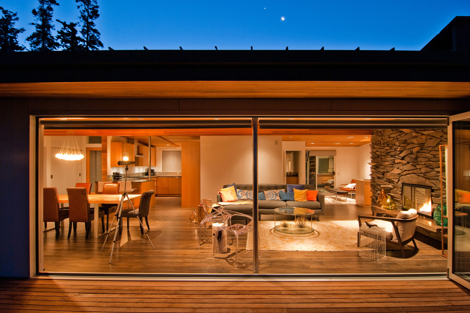
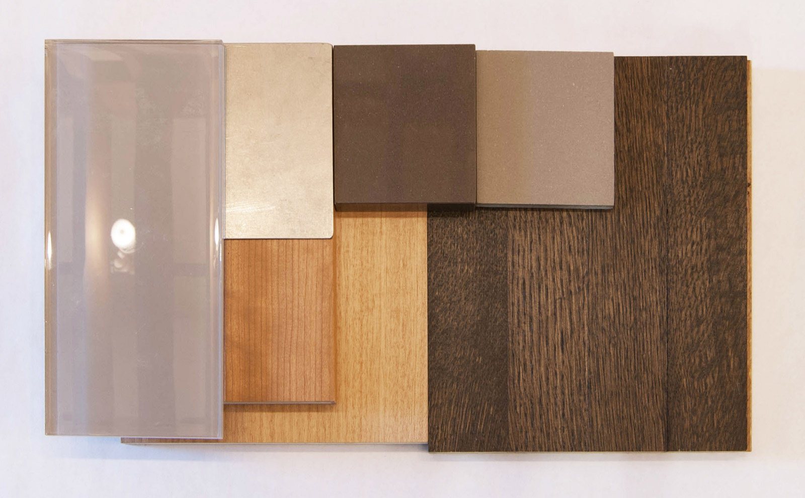
We’ve also found that the most successful interiors packages tend to establish a balanced contrast between the floors, cabinets and countertops. For instance, light floors, darker cabinets and light countertops. Or the inverse of dark floors, light cabinets, and dark countertops. This contrast shouldn’t be so bold as to visually knock you over when you walk into the room, but there should be a distinct difference in tone between one adjacent material and the next (rather than a muddy blend of materials).
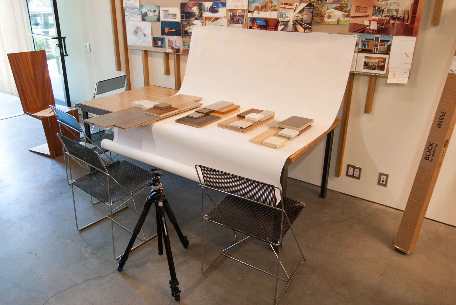
Visual tools like these have helped us establish the palettes covered in today’s post. These four have served our projects well, and since we only work on new residences and full house remodels, they commonly set the tone for the entire house. They hit the requirements above, and we’re willing to bet our liquor cabinet that they stand the test of time.
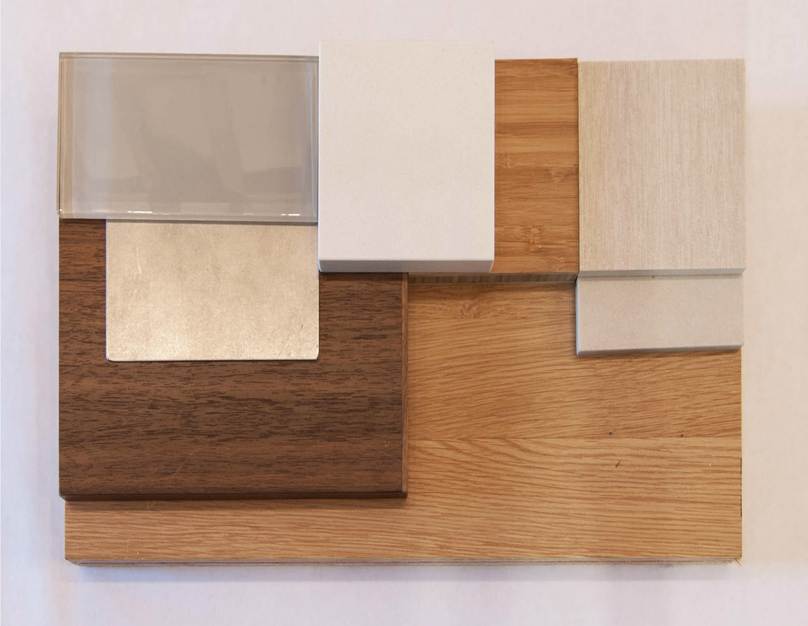
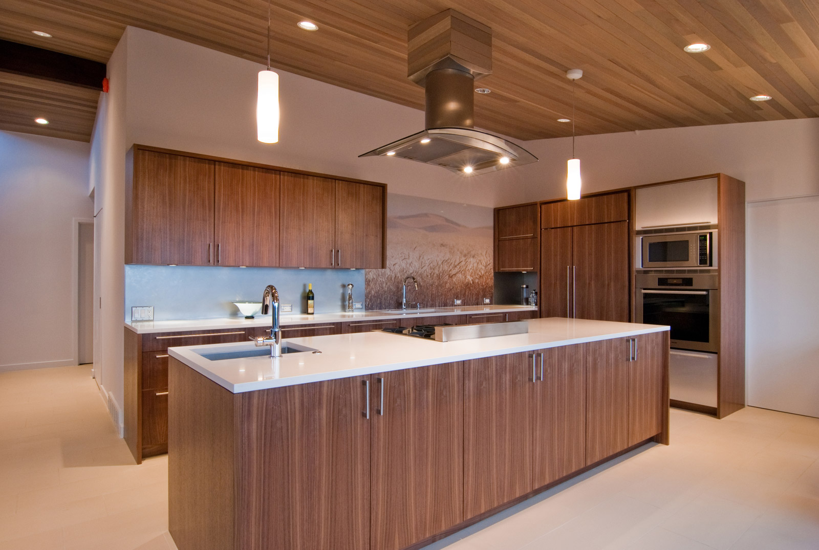
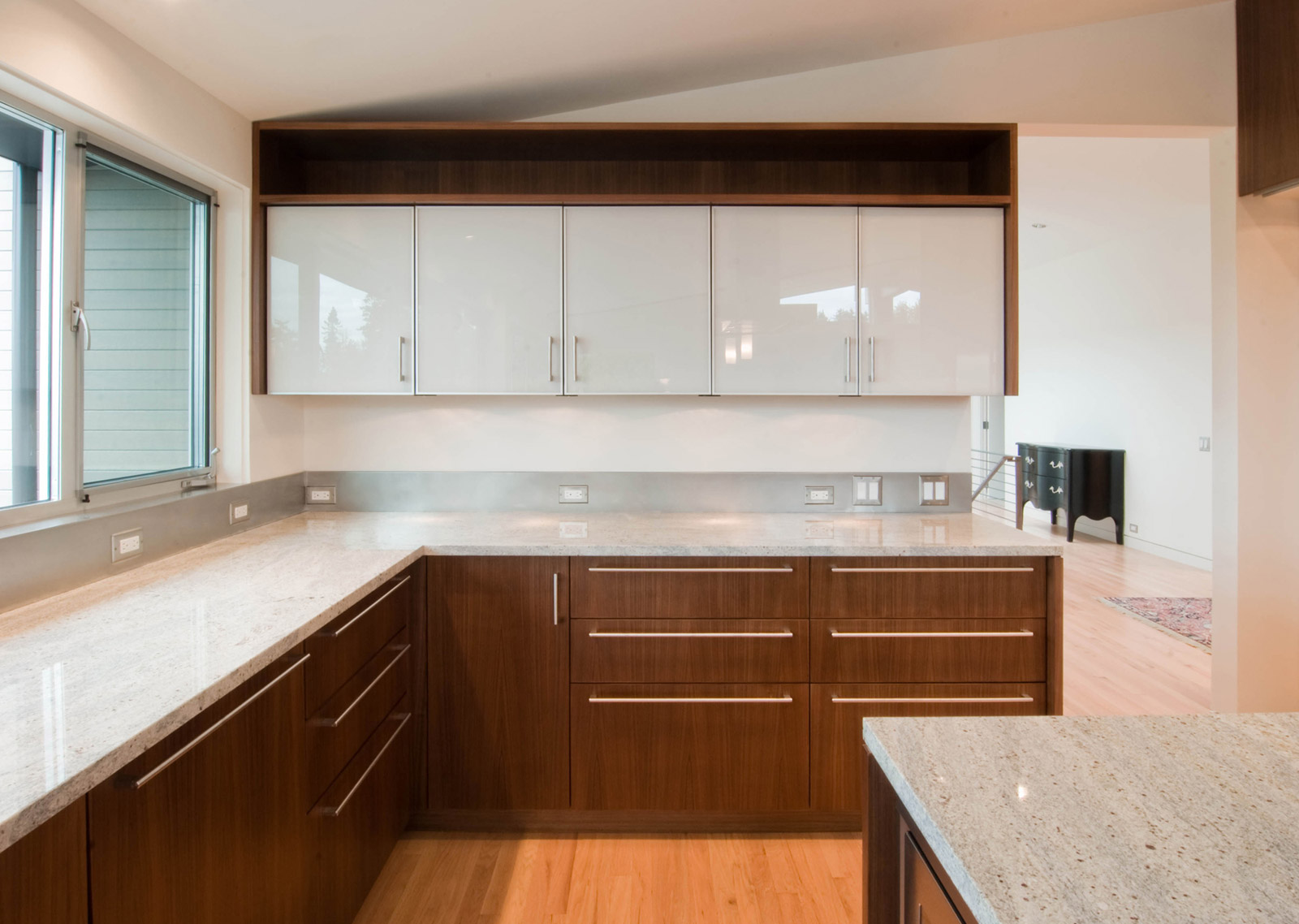
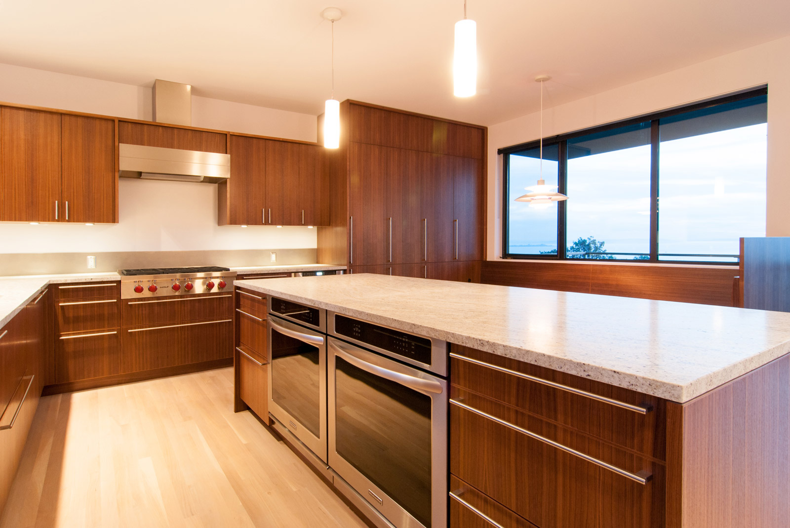
PALETTE 1
Floor: Combination of rift-sawn and quarter-sawn oak with a Swedish matte finish
Cabinets: Quarter-sawn walnut
Countertop: Pentalquartz Cascade White
Backsplash: Stainless steel with a non-directional finish
Options: Vertical grain carmelized bamboo flooring, Pental Park Botticino tile flooring, Pental Feel Colonial tile flooring, Statements Flow Glacier glass tile backsplash*
Similar Job: West Seattle
PALETTE 2
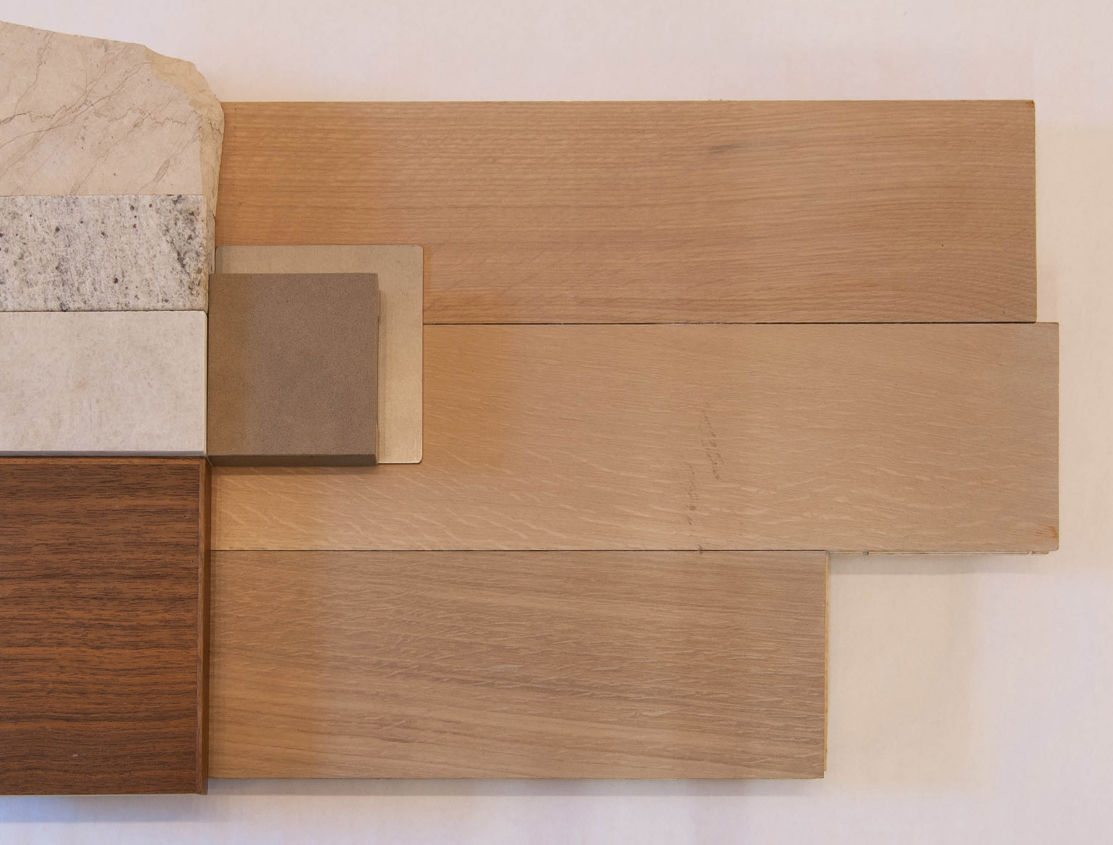
Floor: Combination of rift-sawn and quarter-sawn oak with light gray stain
Cabinets: Quarter-sawn walnut
Countertop: Natural stone (Courtyard Fleur Light, Cashmere White, or Perla Venata all from Pental)
Backsplash: Stainless steel with a non-directional finish
Options: Pentalquartz Oasis Polished countertops
Similar Jobs: Innis Arden, Magnolia Residence
Note: Although using the natural stone as the backsplash seems intuitive, it actually creates a chunky profile that becomes too much of a visual distraction. Instead, we like the sleek, minimal look of the stainless steel for the backsplash with this palette.
PALETTE 3
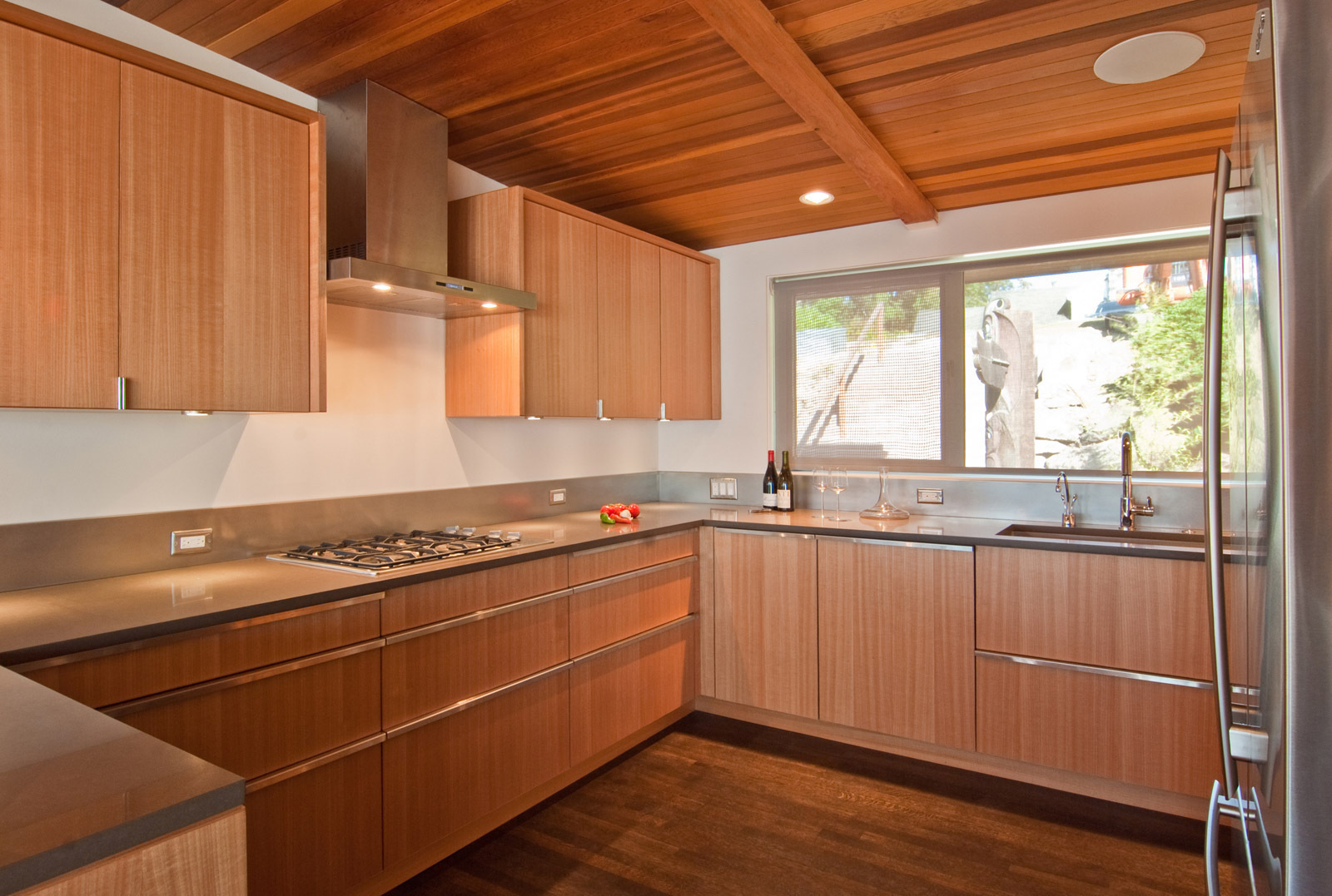
Floor: Combination of rift-sawn and quarter-sawn oak with ebonized finish
Cabinets: Non-figured anigre
Countertop: Pentalquartz Mesa Polished
Backsplash: Stainless steel with a non-directional finish
Options: Cherry cabinets, Statements Flow Grey Mist glass tile backsplash*
Similar Job: Risley
PALETTE 4
Floor: Maple with clear finish
Cabinets: Gray laminate
Countertop: Pentalquartz Alpine Polished
Backsplash: Stainless steel with a non-directional finish
Option: Vertical grain bamboo flooring with natural finish, Statements Flow Ice Grey Mist glass tile backsplash*
Similar Job: Queen Anne
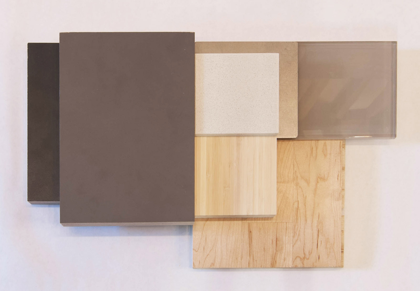
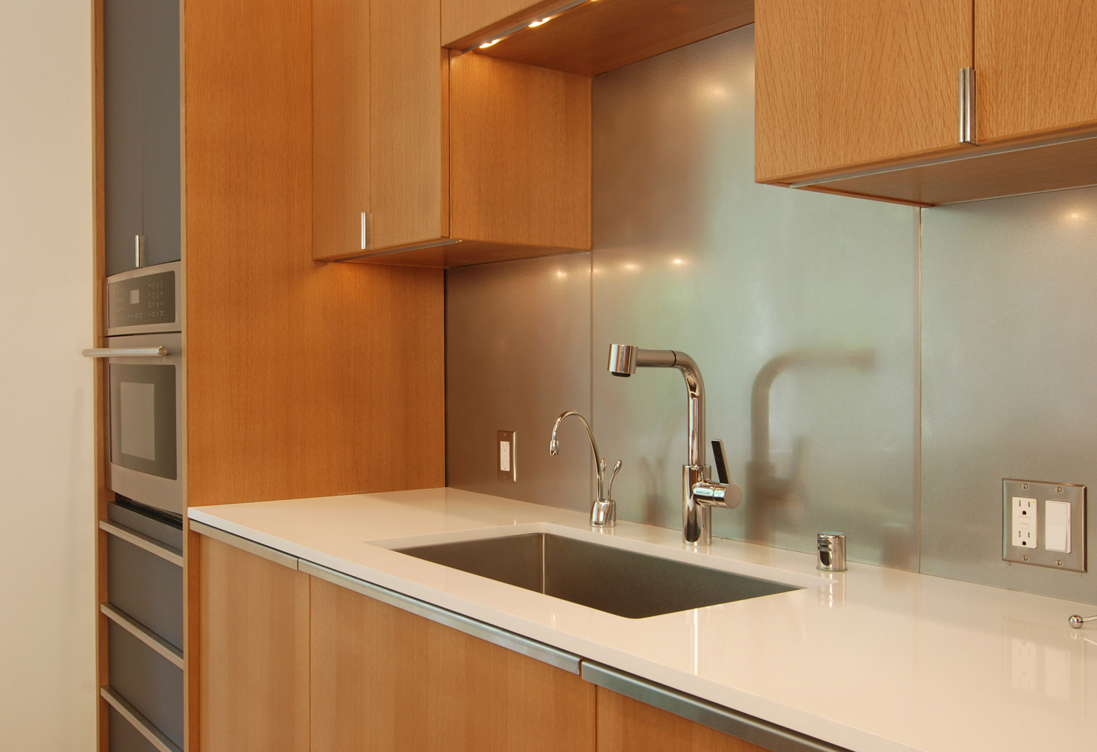
*While we occasionally use glass tile as the backsplash, the application comes with a disclaimer. Typically we’re trying to downplay the backsplash, which is why our preferred backsplash is stainless steel with a non-directional finish. While glass backsplashes can be a nice feature in some kitchens, it’s also a highly specialized surface that can draw too much attention away from some of the more important features, like the cabinets and appliances.
Cheers from Team BUILD


