Something we picked up during our architectural training in Scandinavia was the idea of “controlled design experimentation.” Most of the firms we admire most in Denmark, Sweden, Norway, and Finland use a similar vocabulary of aesthetics from one project to the next. The benefits of employing a common kit-of-parts on each project are obvious: it allows the design and construction teams to optimize their time, it maintains a reliable quality of construction, and it keeps the budget predictable. (It also builds a regional language and establishes a consistent portfolio of work, but we’ll save that tangent for a different post.) The point is, when you’ve spent your career learning what works best in architecture, there’s little efficiency in reinventing the wheel with each project. With a cache of tried and true details, materials, and techniques, everybody wins.
Now if you know anything about the Scandinavians, you know that they’re much more sophisticated than simply repeating the same beautiful design over and over again. As you might suspect, there is a more subtle strategy at work within the rigor of this system. In each project, there is usually a distinct architectural feature that became the focus of controlled design experimentation. This could be directed at the siding, the window geometry, the interior palette, or any other individually defined component of the project. The key is that the design team experimented with bold ideas they had never implemented before and the area of focus was controlled to a single architectural feature.
This strategy has influenced our own work and we’re usually deliberate in focusing our experimental design energy on just a handful of architectural features, most notably the stair. As timing would have it, BUILD just completed a stair design unlike anything we’ve done previously and it makes an excellent example for today’s topic.
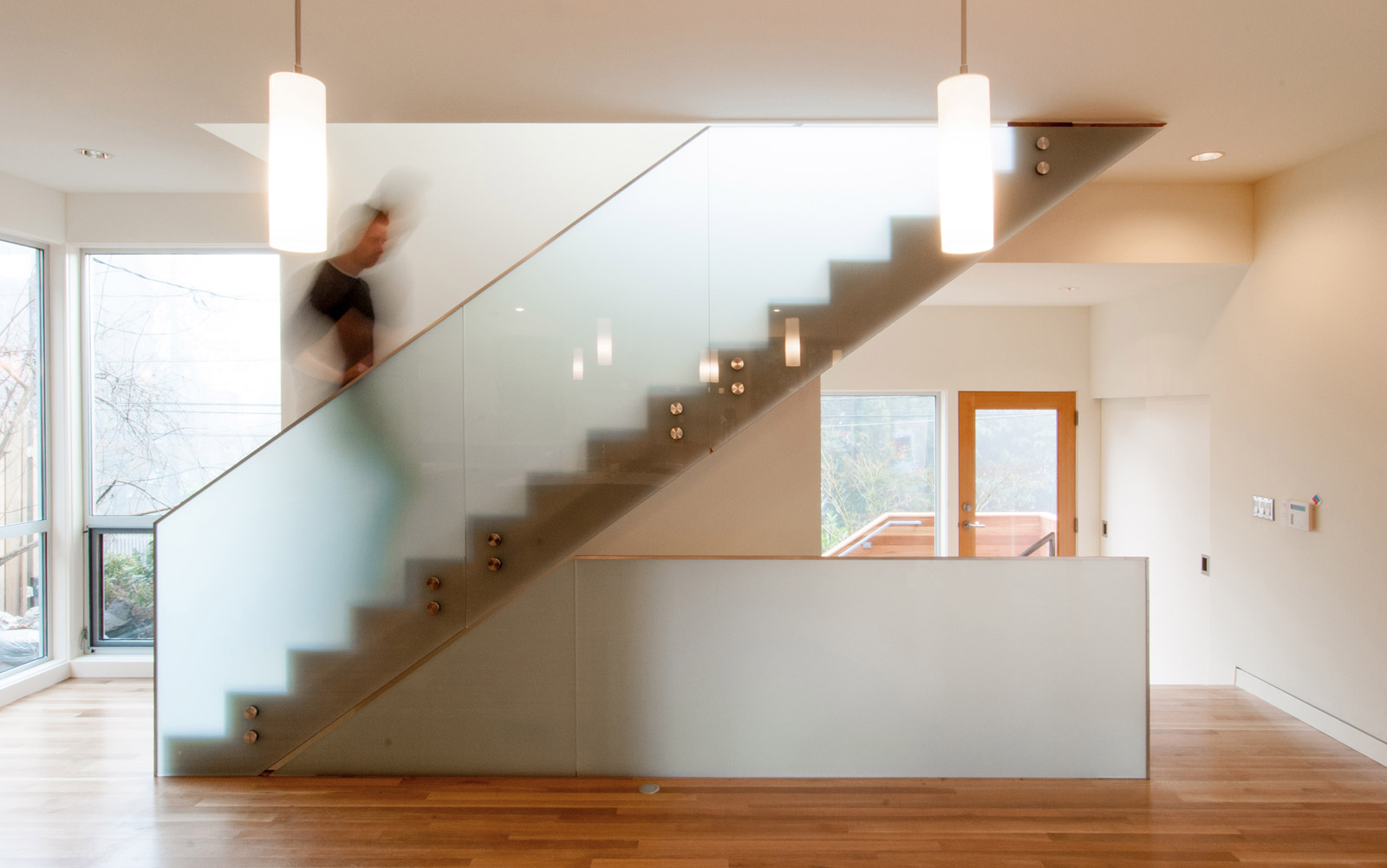
The Madison Park Remodel is a two story home with a full basement where the vertical circulation features prominently on every level. Each of the three floor plans was kept intentionally open, and subsequently the stair is the feature of the house, no matter where you’re standing. Because of this relationship, we wanted the stair to be a sculptural piece within the home.
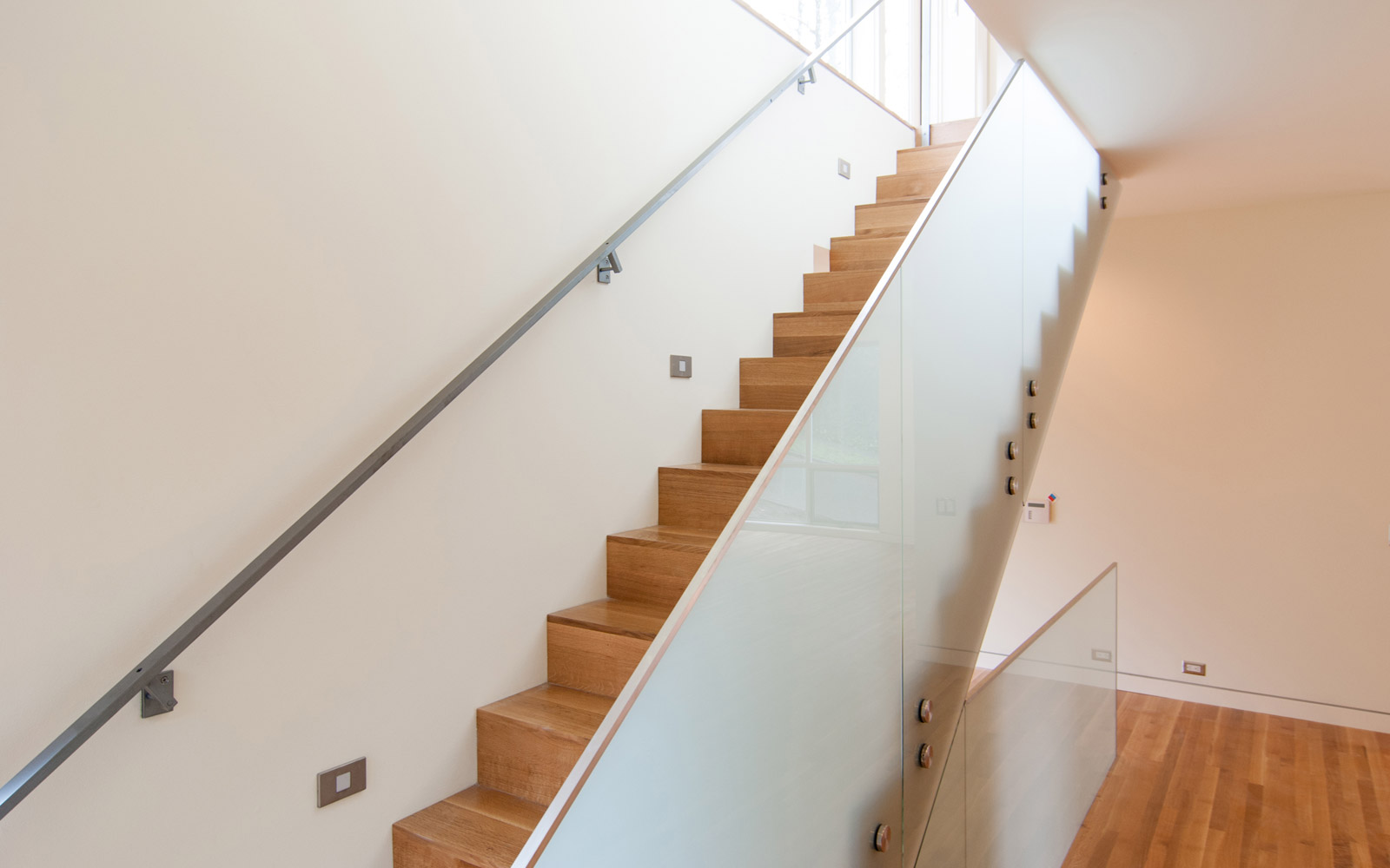
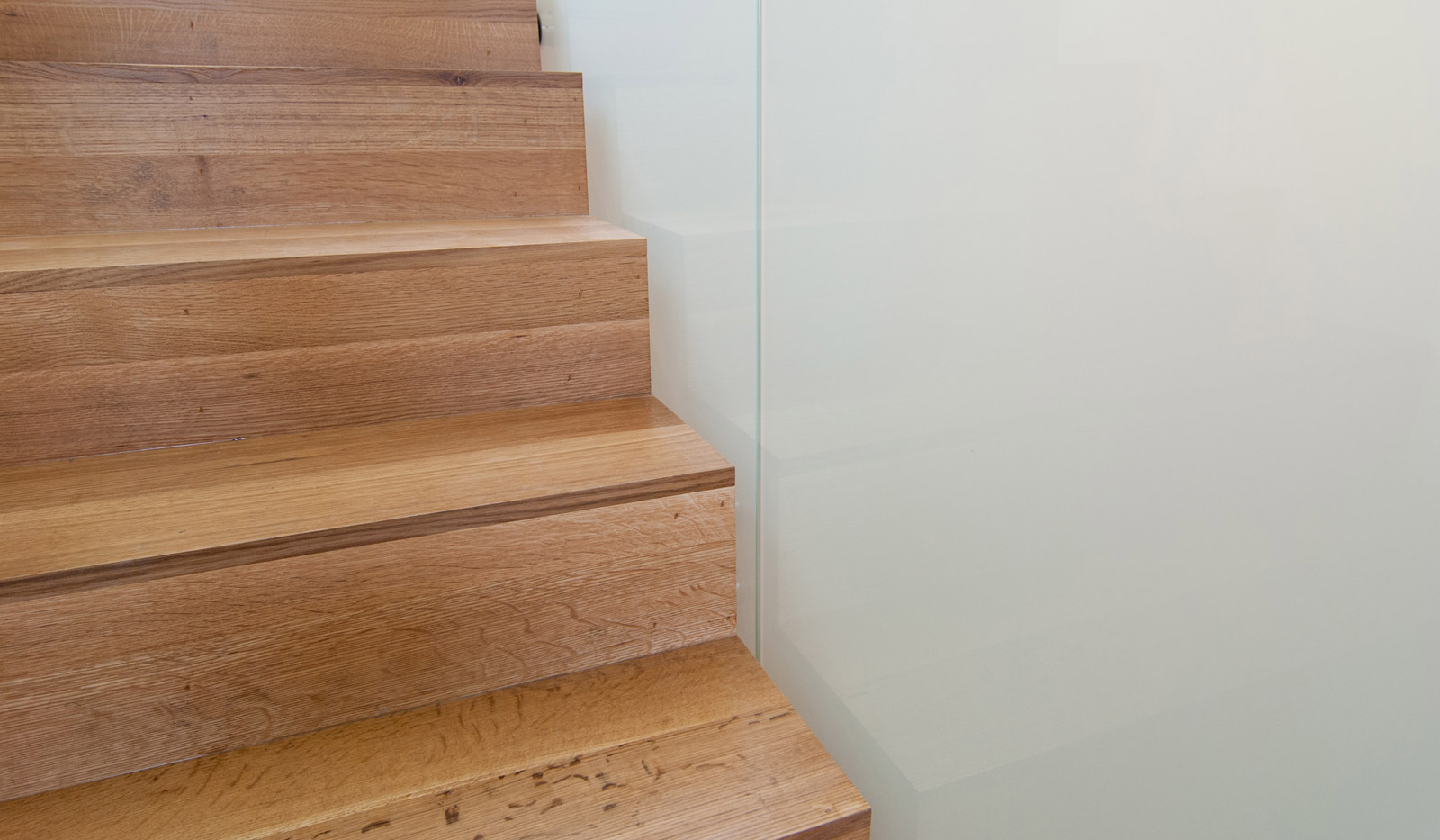
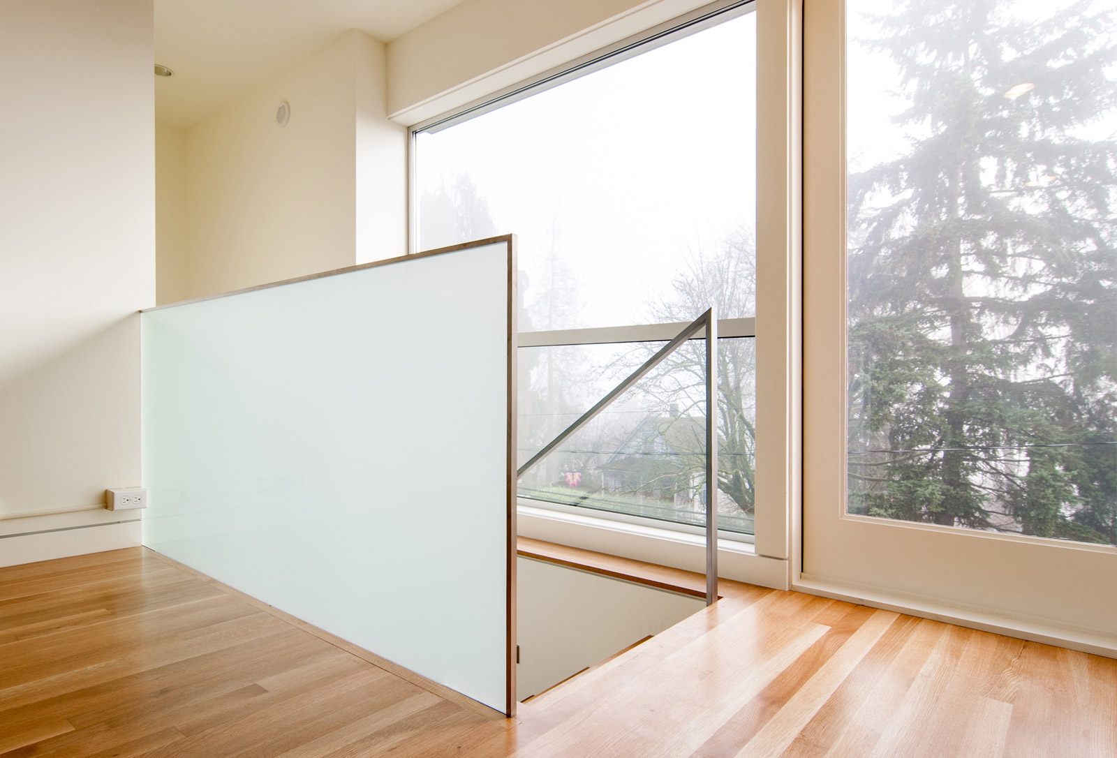
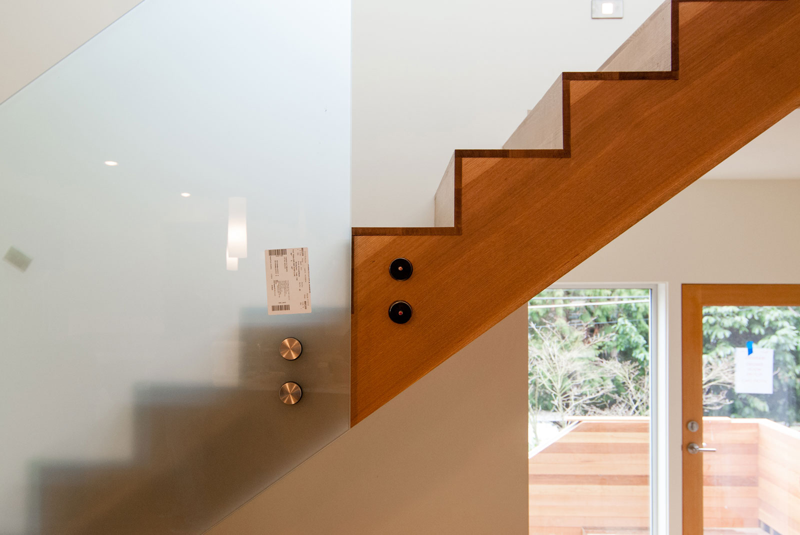
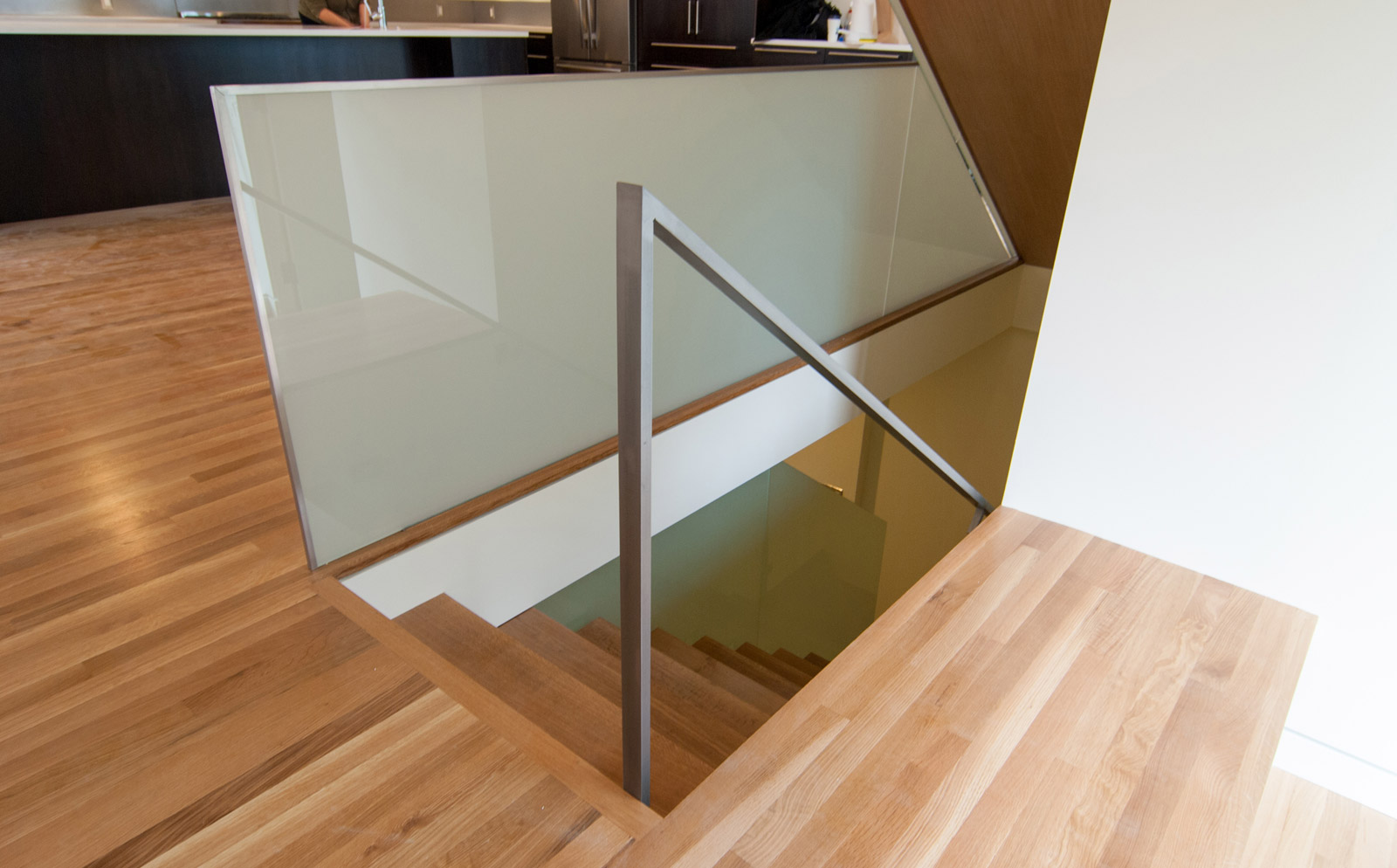
The design philosophy of the stair was to use what is already necessary about a stairway and make it aesthetically interesting. The zig-zag geometry of the stairway was enhanced by eliminating the nosing at each tread and wrapping the entire stairway volume in white oak to match hardwood floors. Next, a simple plane of translucent safety glass was attached to the side of the stair structure serving as the guardrail; this allows plenty of light to reach the interior, while giving the stairway a soft glow. A slight reveal between the glass guardrail and the stair keeps the materials deliberately separated. To maintain the simplicity of the stair and guardrail relationship, the steel handrail was attached to the adjacent wall. Overall the assembly lends a calming, sculptural feel to each of the floors, while providing the required function of a stairway.
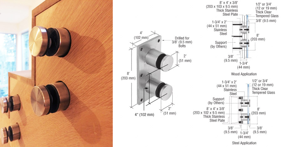
To achieve this assembly at the stringers, we used the C.R. Laurence RSOB20BS Glass Rail Standoff Fitting in brushed stainless and attached directly to the stair stringers. The bulk of this bracket has a bit of a commercial feel, so we buried the mounting plate behind the finished oak paneling and exposed only the round standoffs which hold the glass plate in place via stainless steel compression disks.
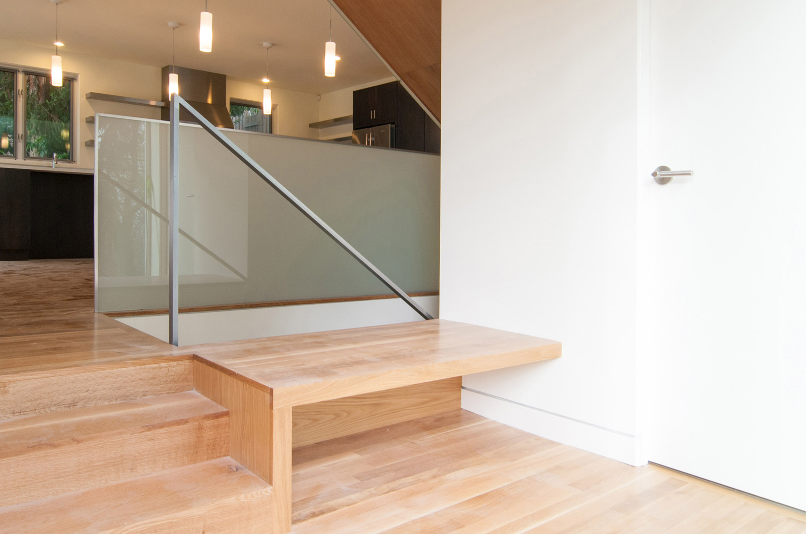
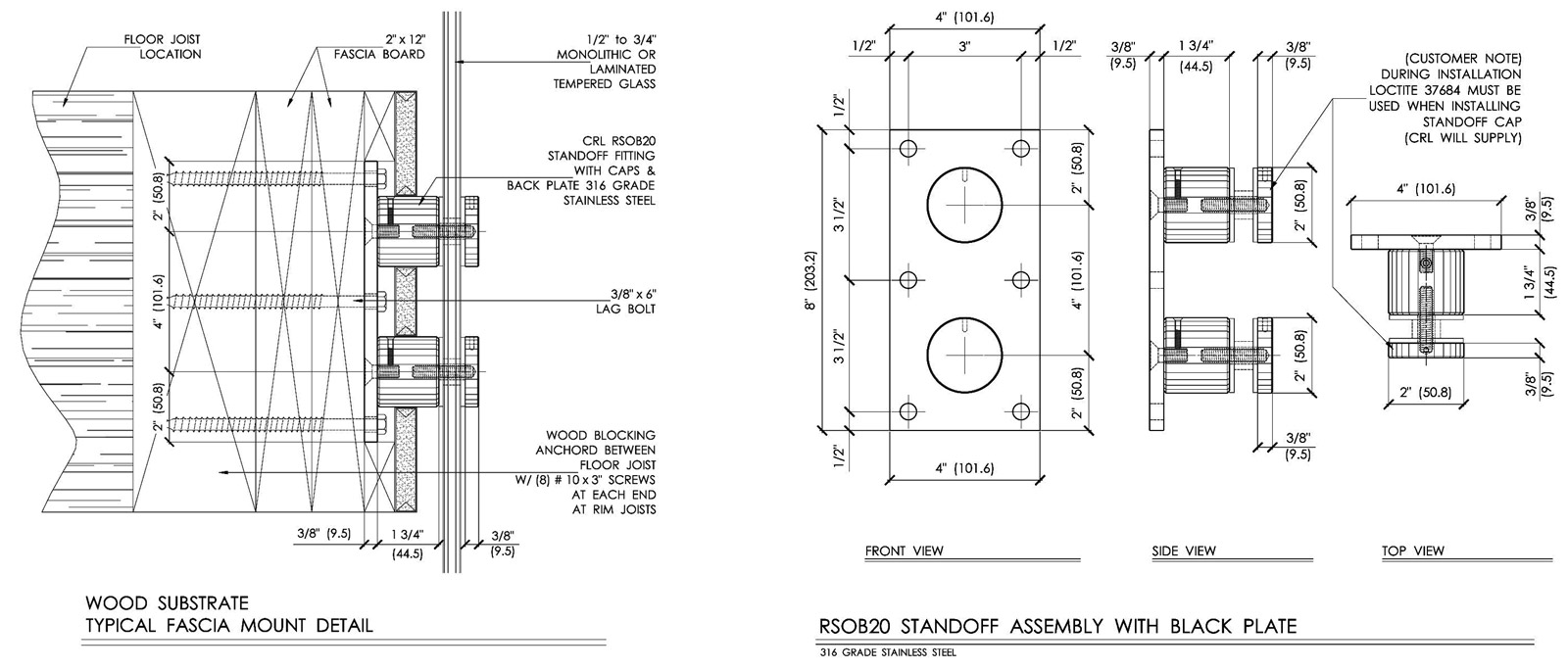
At floor conditions, the glass panels are sandwiched between the blocking and the rim joist of the stair opening and shimmed with a lightweight concrete fill. This gives the floor mounted glass guardrail panels enough strength to resist any applied lateral forces without cluttering up the clean aesthetics with a series of bulky floor brackets. Details of other conditions can be found on the C.R. Laurence website.
The glass needs to be safety rated due to the location and as per the building code (IRC 308.4.4, if you want to get all technical). While the edges could have been left exposed, the finished look of the glass layers looked unfinished to us so we applied a thin aluminum edging to the glass panels.
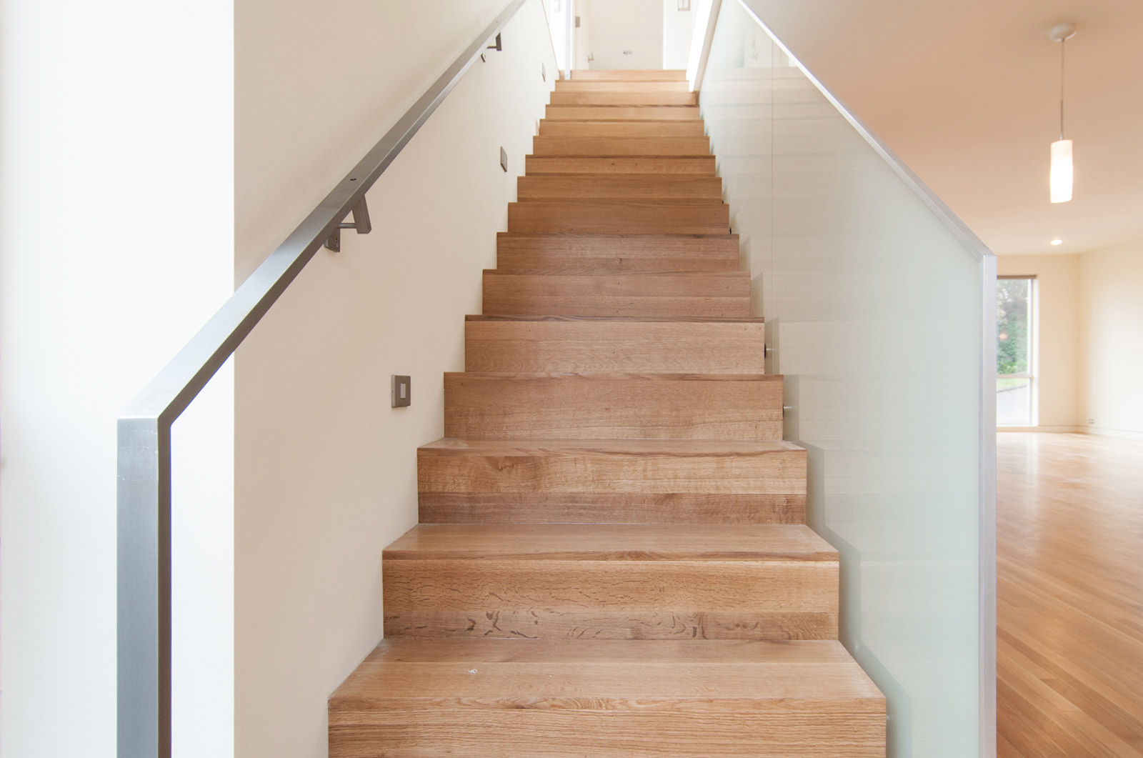
The clear finished steel handrails opposite from the guardrail assembly are the product of Bart Gibson. The minimal handrails are attached to floors and walls at discrete locations as to avoid competition with the stair and glass.
Overall, we’re extremely happy with the results of this design experiment. Stay tuned for additional coverage on the Madison Park Remodel as the interiors are furnished and the family moves in.
Cheers from Team BUILD


