Today’s post covers four dwellings that have had a profound effect on how we think about designing and building in rural Pacific Northwest environments. These featured projects share many important characteristics with one another, some of which are quite apparent, while others require a deeper read. Together, the four projects establish a vocabulary of design that is evolving architecture in a design-forward direction of sensibility, timelessness and discipline.
Walker-Pope House designed by Gordon Walker, Orcas Island WA
[Photos by BUILD LLC]
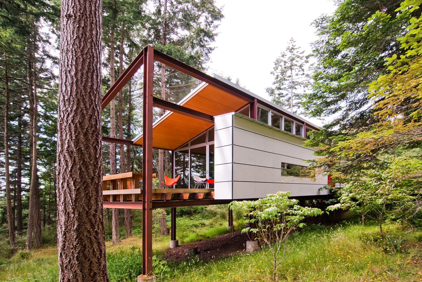
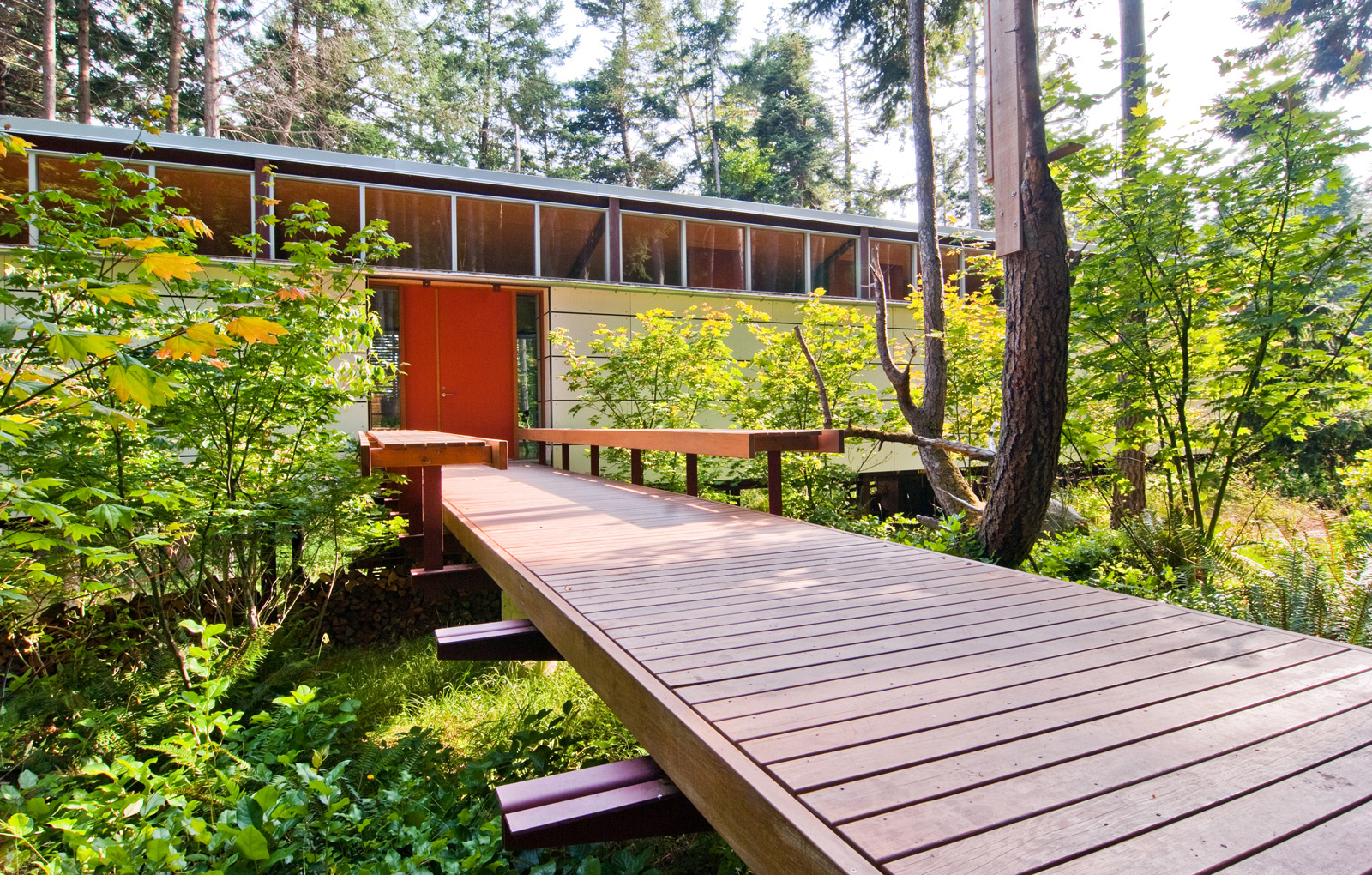
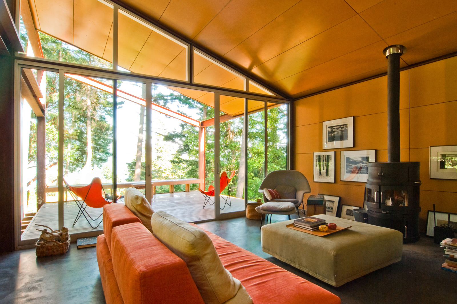
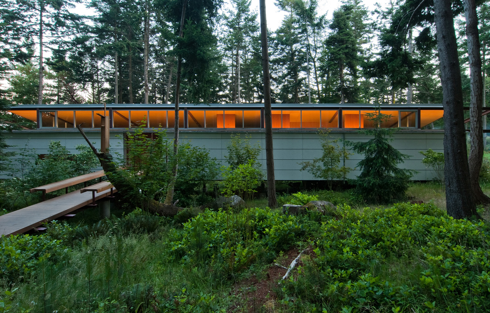
The architectural shell is one simple geometrical move in this project; a steel frame supporting the floor structure and a shed roof is repeated along the changing grade of the forest floor. The dwelling gently touches down at the top of the slope, creating an intimate terrace experience adjacent the bedroom. At the bottom of the slope, an elevated deck opens to a striking view beyond. Two circulation corridors run the length of the interior giving the plan a quiet formality and allowing the living room to take advantage of the full width. Floor to ceiling windows on the south elevation open up to the forest, while a storage block runs the length of the structure on the north elevation.
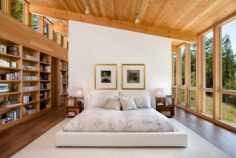
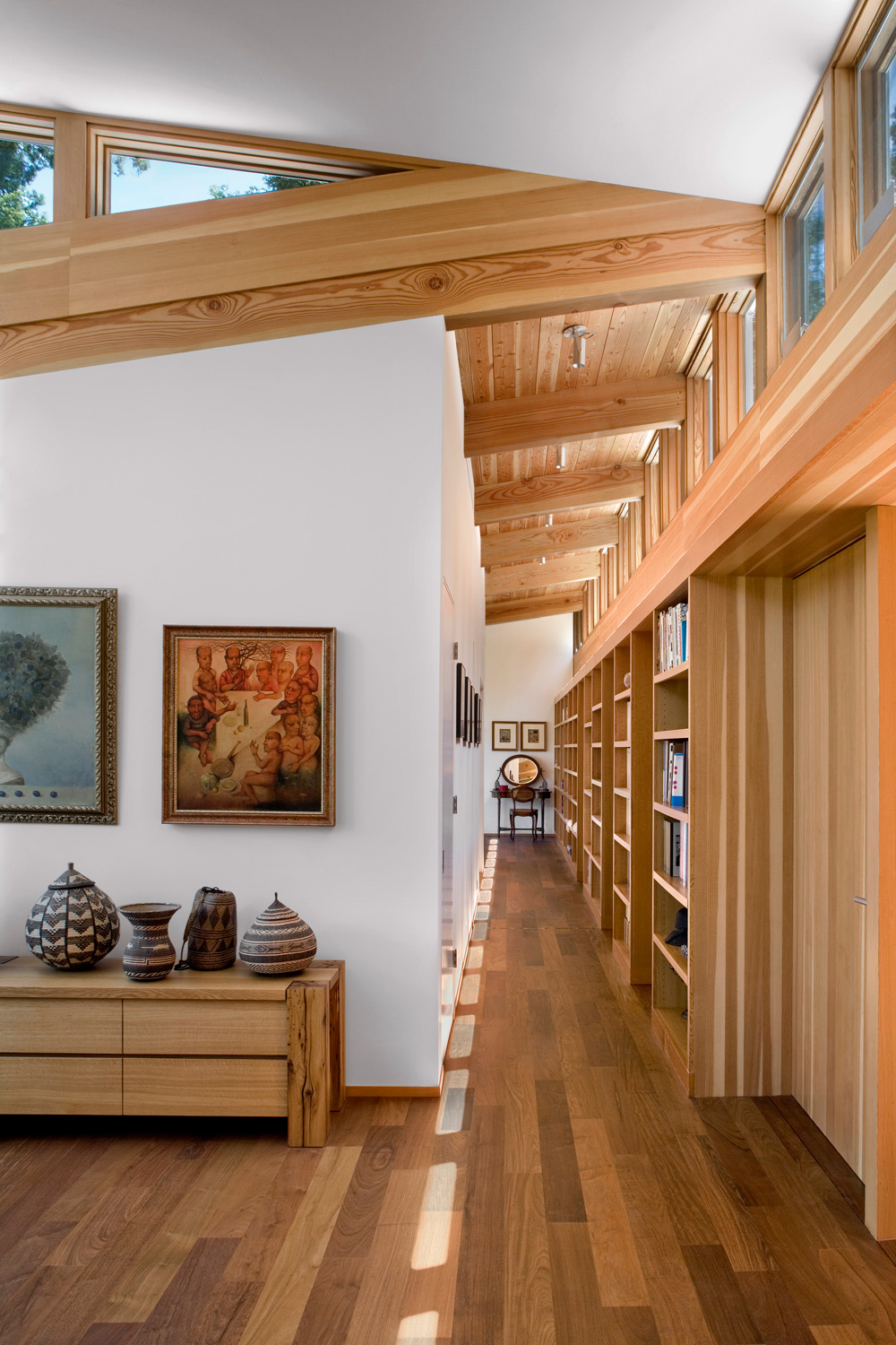
Sebastopol Residence designed by Turnbull Griffin Haesloop Architects, Sebastopol CA
[Photos by David Wakely Photography via archdaily]
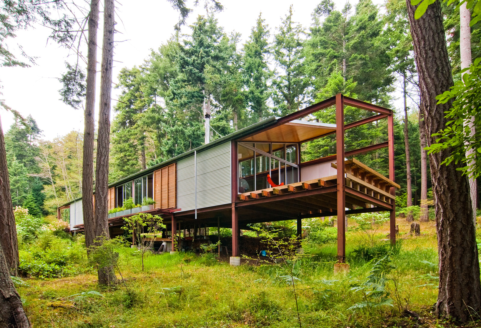
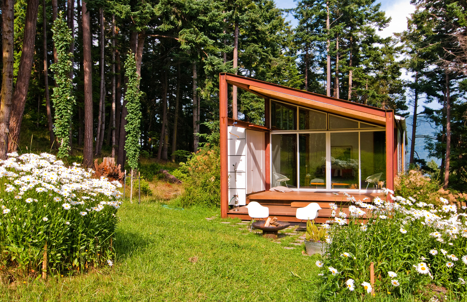
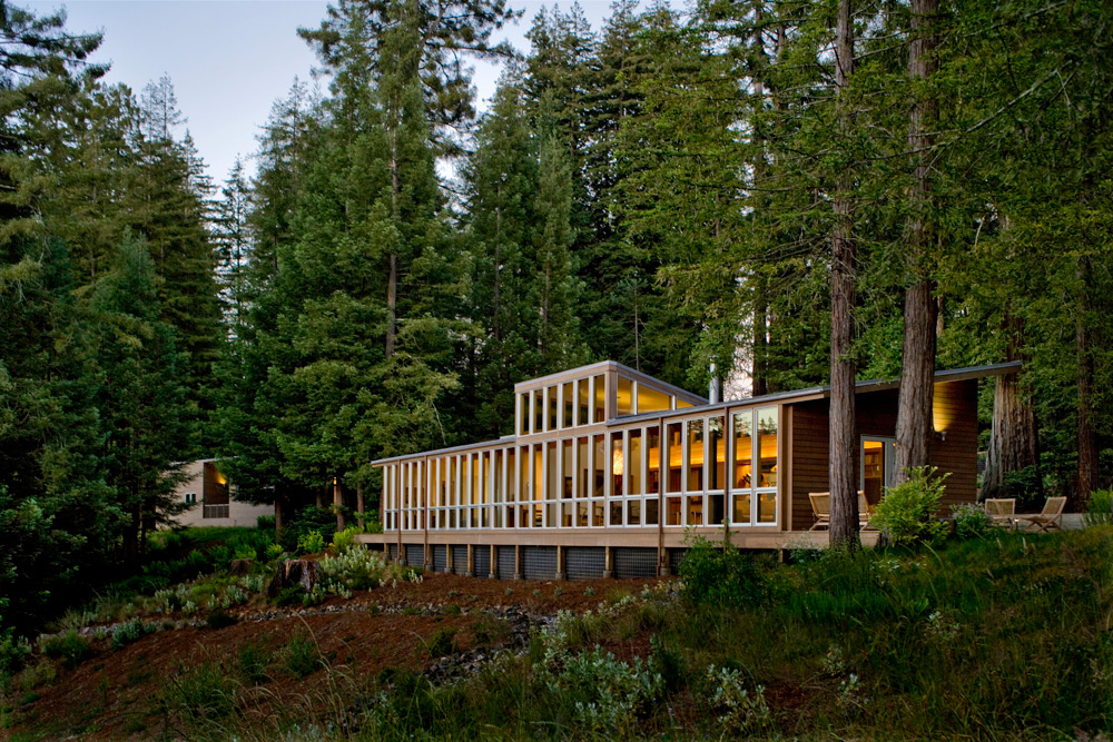
Similar to the Walker-Pope House, this project uses a simple shed roof structure repeated to create a series of bays. At the dining room, the structural bay is lifted to provide additional view, daylight and ceiling height. Once again, we see the use of double corridors and a utility block at the entry –allowing the opposite side of the structure to fully open up to the view. This project does a particularly nice job of delineating the served spaces (living, dining, kitchen, bedrooms) from the serving spaces (bathrooms, utility, storage).
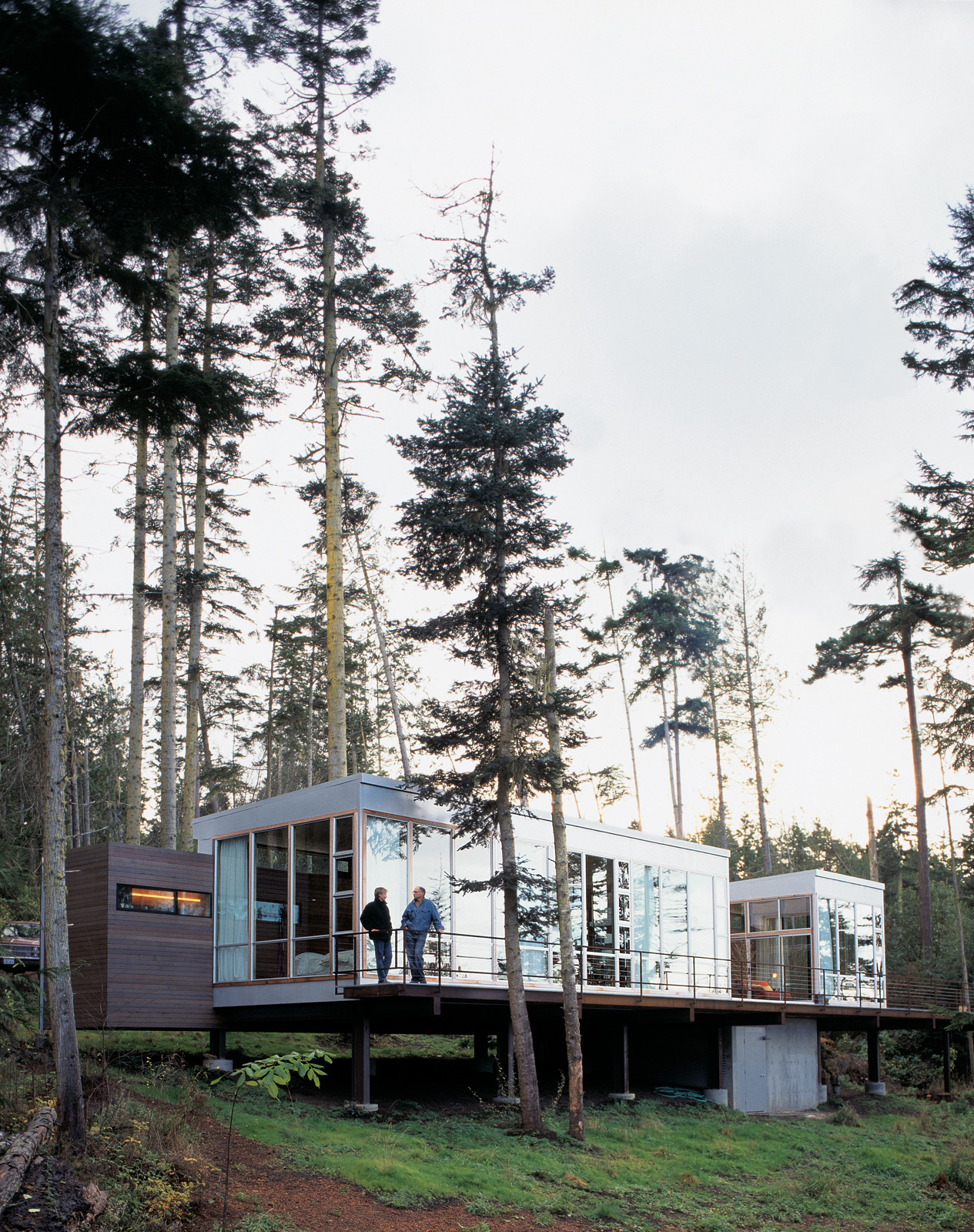
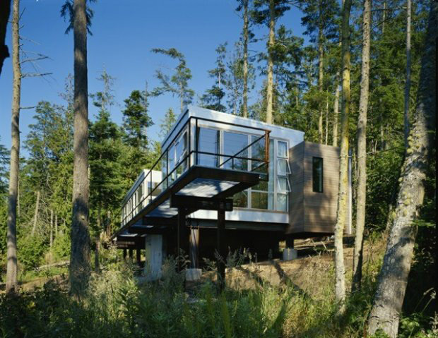
Villa Lucy designed by Anthony Pellecchia (WPA Studio), Strait of Juan de Fuca WA
[Photo by Philip Newton via Dwell]
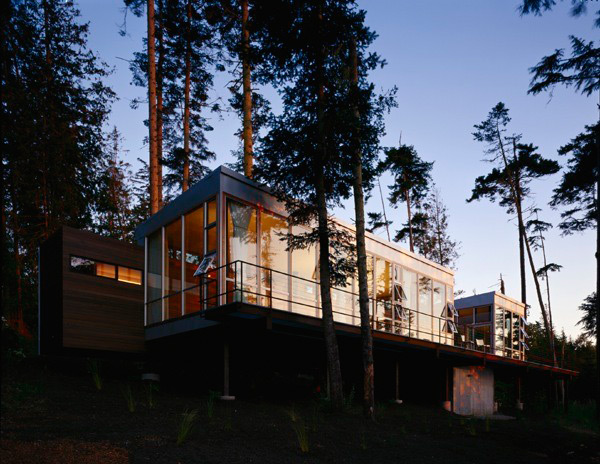
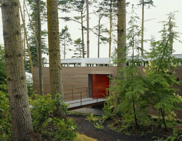
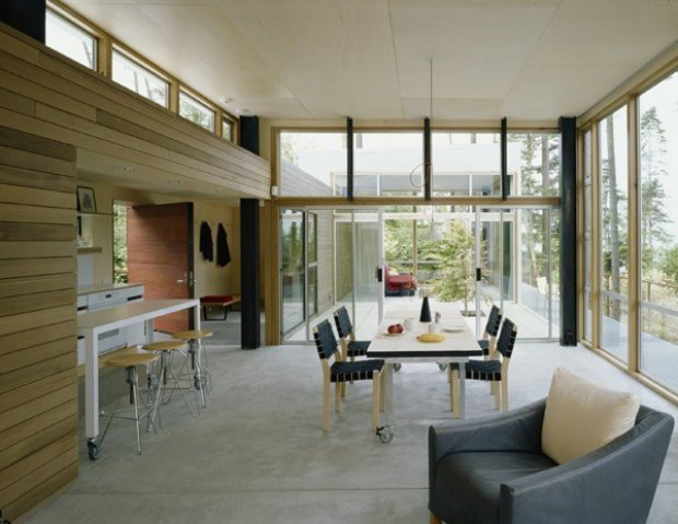
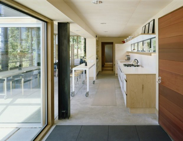
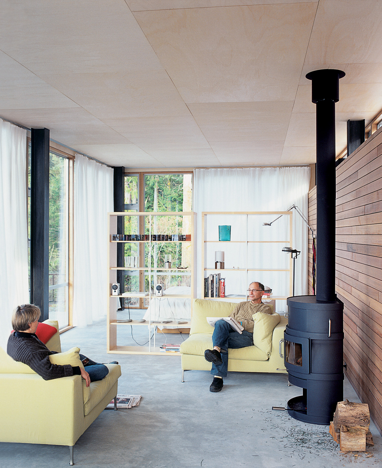
Two simple glass boxes envelop the common area components, while a more solid block of serving functions follows the length of this house. While the interior includes only one corridor along the length of the structure, an exterior walkway creates the double corridor plan, likening it to the previous projects. A deliberate move to raise the structure above the forest floor creates intentional relationships with the topography and the additional height captures a stunning view.
[Photo by Philip Newton via Dwell]
Visiting Artist House by Jim Jennings, Geyserville CA
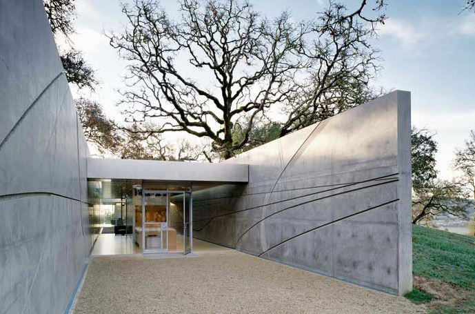
[Photos by Tim Griffith, Mattew Millman]
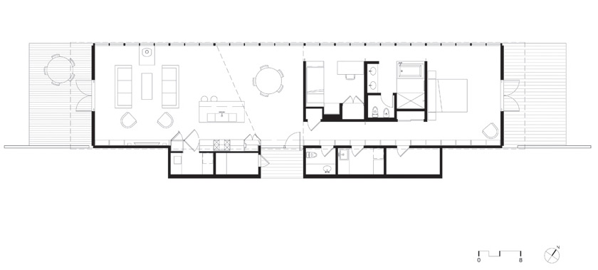
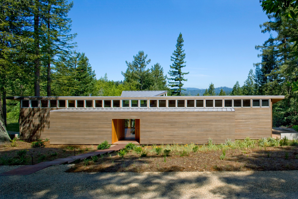
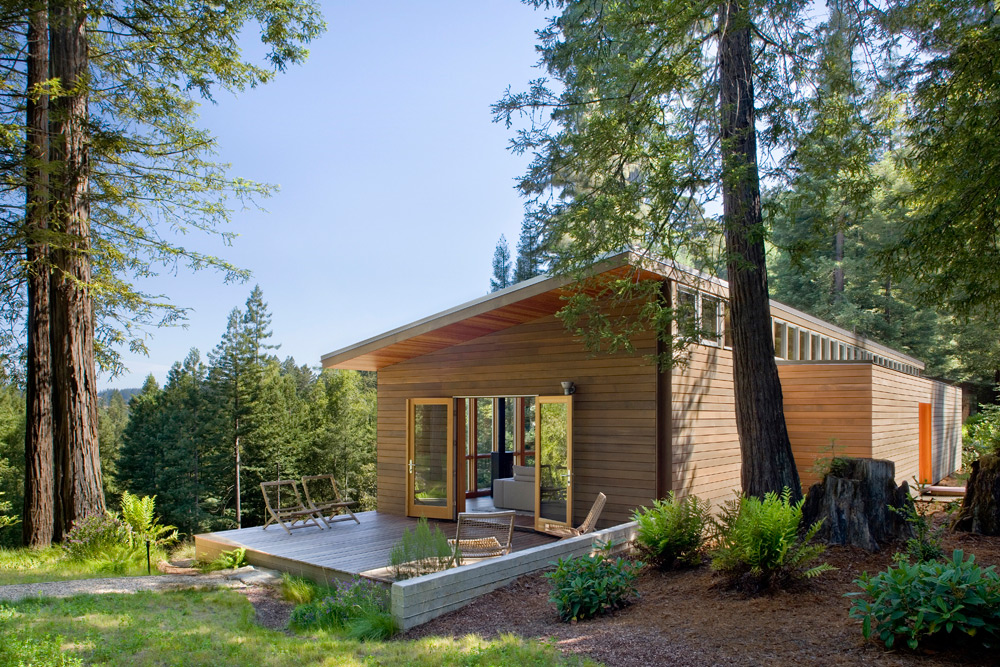
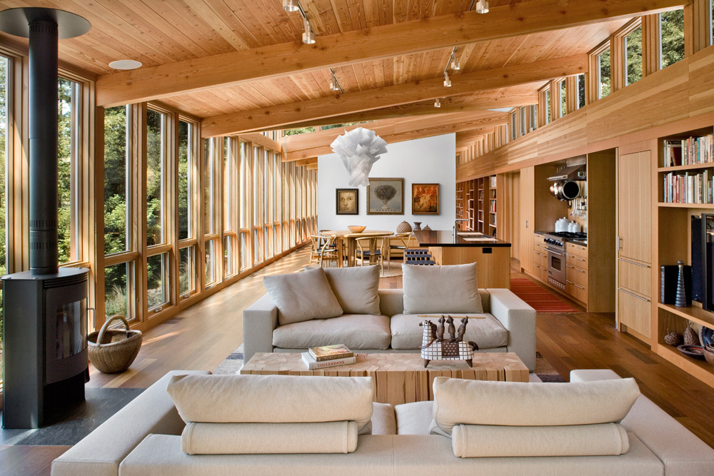
On the surface this example may seem like a drastic departure from the previous schemes, but a study of plan and elevation reveals significant parallels. The double corridor is present, allowing individual rooms to center neatly within the width of the structure while common areas (like the living room) take advantage of the full width. The siting of the structure to the topography is of paramount importance and each end of the dwelling creates a different relationship to the landscape. While the self-restraint of this project prohibits a view along the concrete walls of the structure, a careful slot of natural light is situated between wall and ceiling.
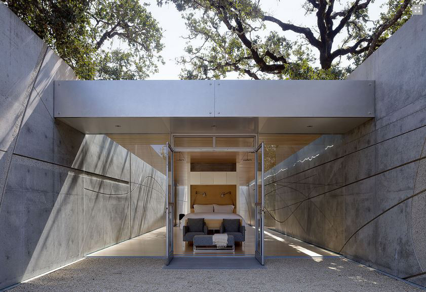
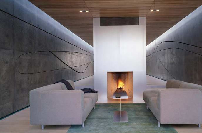
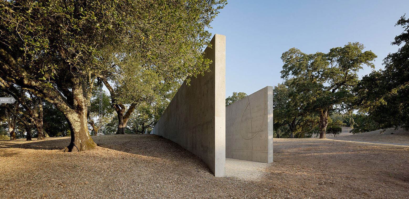
Each of these projects was designed by someone we consider to be a master architect (and at least 2 out of the 4 were designed as dwellings for the architects themselves). When such clear similarities are found in works of this caliber, it’s more than simply influence or a movement; rather, the similarities are the building blocks of a school of thought. Perhaps more importantly for us architects, these similarities are lessons to be studied. These four projects speak volumes about the value of simplicity, the significance of how a building relates to the land, and the importance of discipline in design.
Cheers from Team BUILD


