


[All photos by BUILD LLC]
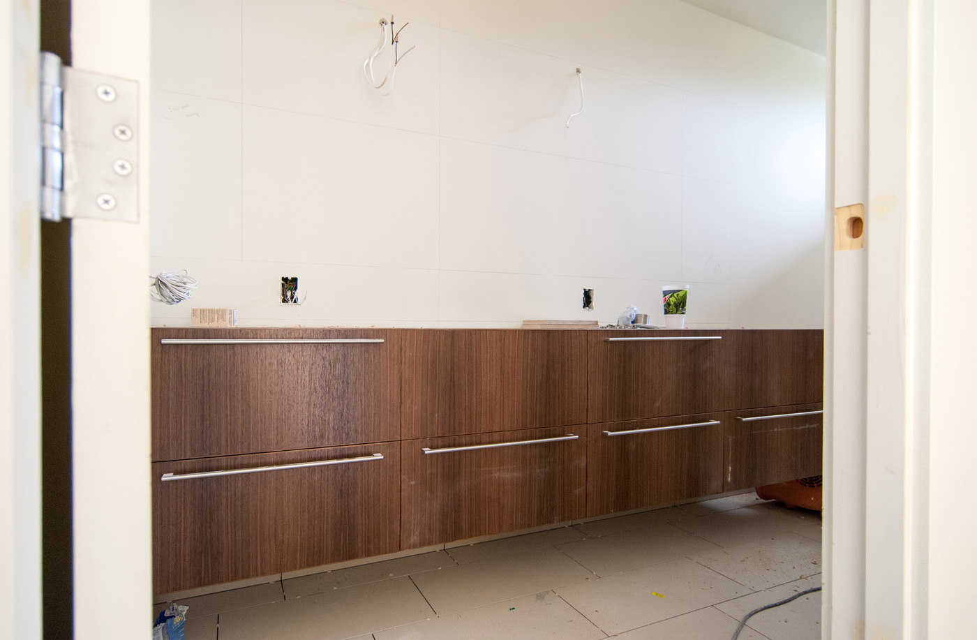
This summer, BUILD has been busier than ever in construction and, at the moment, we’re in the home stretch of a mid-century modern remodel on Seattle’s Queen Anne Hill. We’ve shared a bunch of progress photos and blog posts on the design behind this remodel over the past several months, and recently took the team up there for a site visit.
Something that became clear as we moved through the process of design and construction was that this project encompassed almost all of the common aspects which make up a BUILD home. As a result, it gave us a good opportunity to fine-tune some of our standards moving forward, further improving our process. It’s been a couple years since we’ve talked bathroom design and finishes, so today’s post covers some design decisions of one of the most important rooms in a home.
Floor Tile
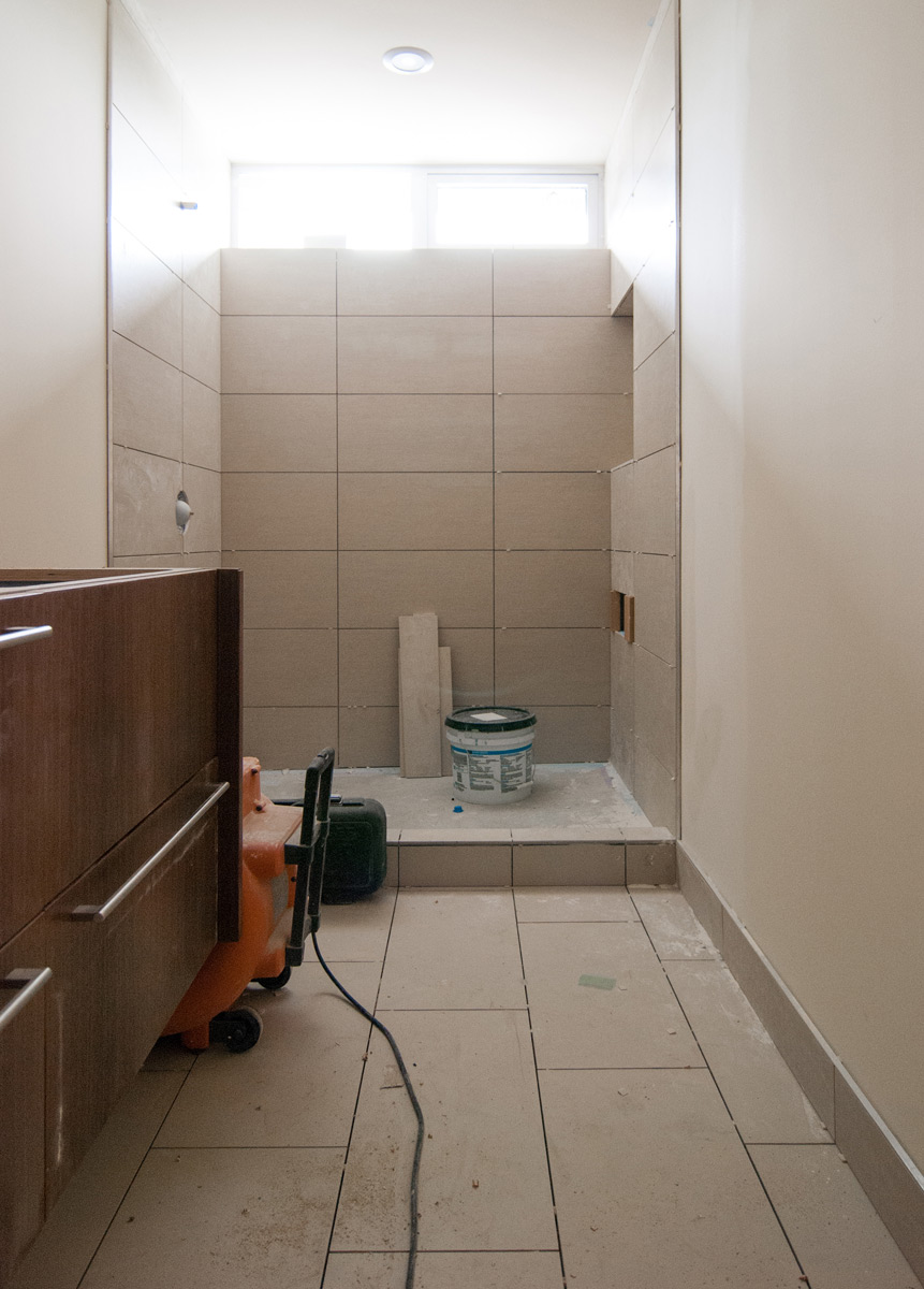
Consistent with projects old and new, we’re still going strong with large tiles staggered in thirds. The field of tile disappears, and maintains a clean, classic look. A bit of texture is always useful with floor tile and we’ve had good experiences with linen and matte finished floor tiles. Favorites at the moment include Feel Colonial and Parc Botticino, both from Pental.
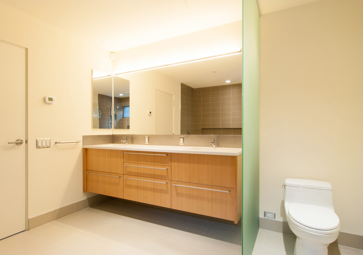
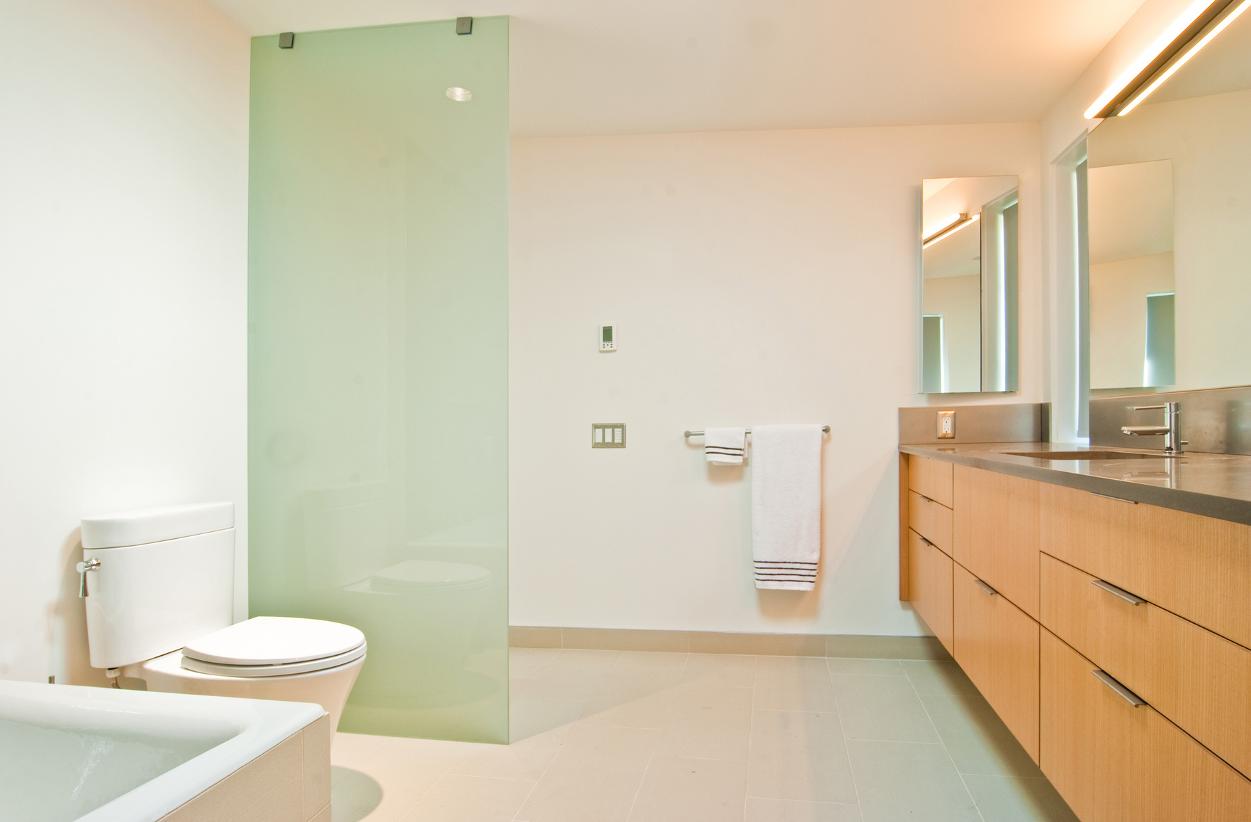
Wall/Shower Tile
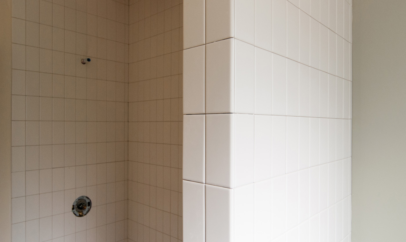
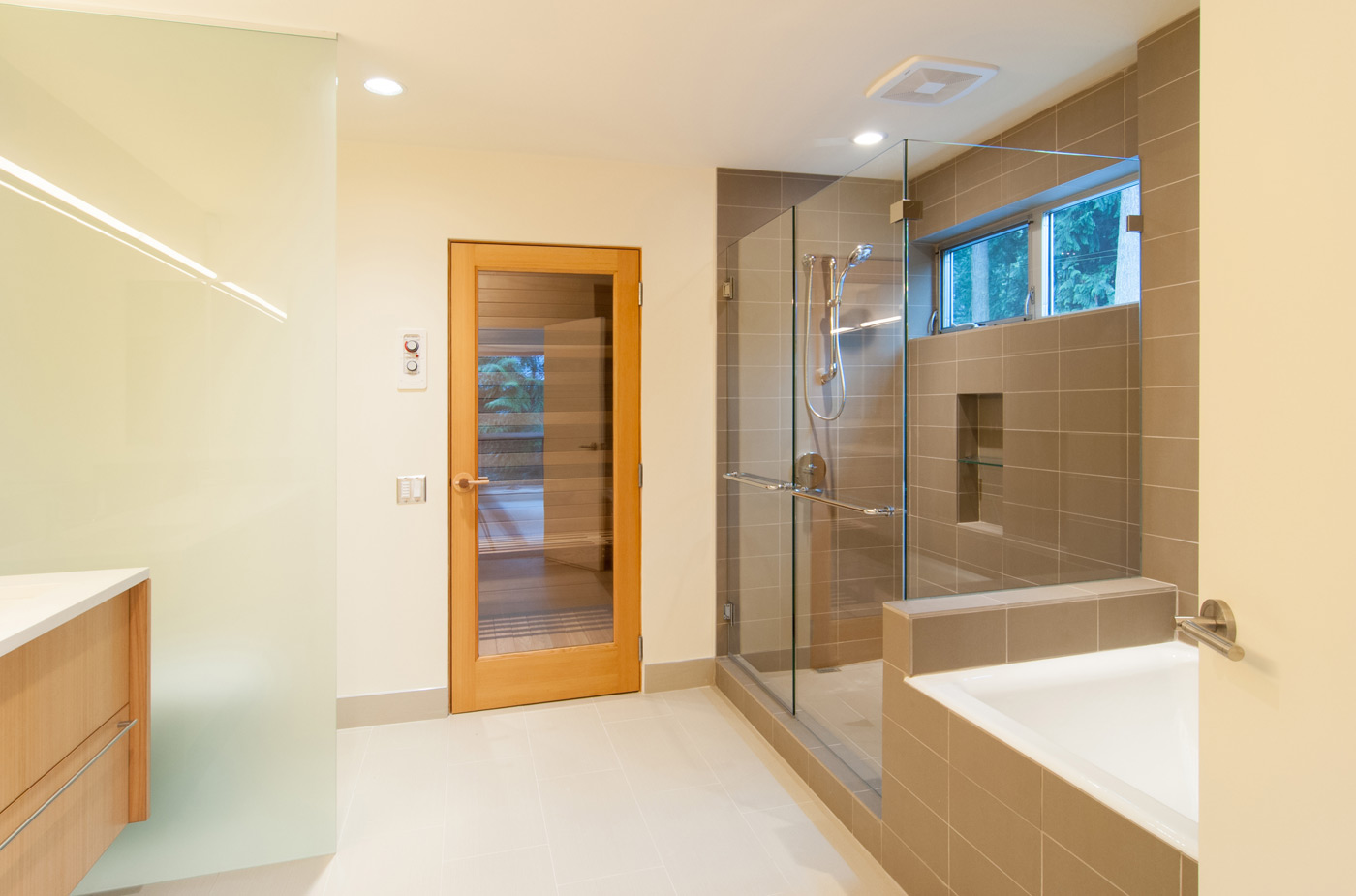
A clean tile grid at the walls gives the bathroom a crisp, modern aesthetic, and while large tiles reduce the amount of grout joints, we also like the look of smaller subway tiles. We went with a vertical orientation on the subway tiles in this application, which breaks from the common horizontal use of subway tiles and brings a fresh geometry to this bathroom.
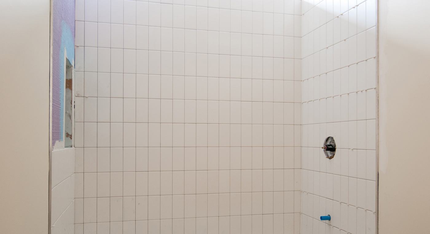
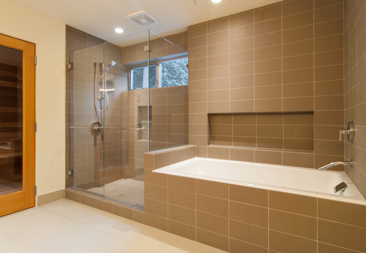
As for the boundaries of the tile, we’ll typically take it up vertically all the way from floor to ceiling. This creates a consistent field of tile without multiple horizontal breaks that would otherwise create visual clutter. Similarly, in the horizontal extent, we’ll wrap the entire shower area (and bath, if they’re adjacent) with tile from one side to the other.
In some cases, a wing wall will separate the shower from the toilet, and the question of where and how the tile and drywall meet comes up. Instead of dealing with a fussy outside corner detail or arbitrarily picking a point for the transition, the tile can just wrap around the entire wall to terminate at an inside corner. Though not necessary from a functional standpoint, it’s a simple solution that creates a good looking accent wall.
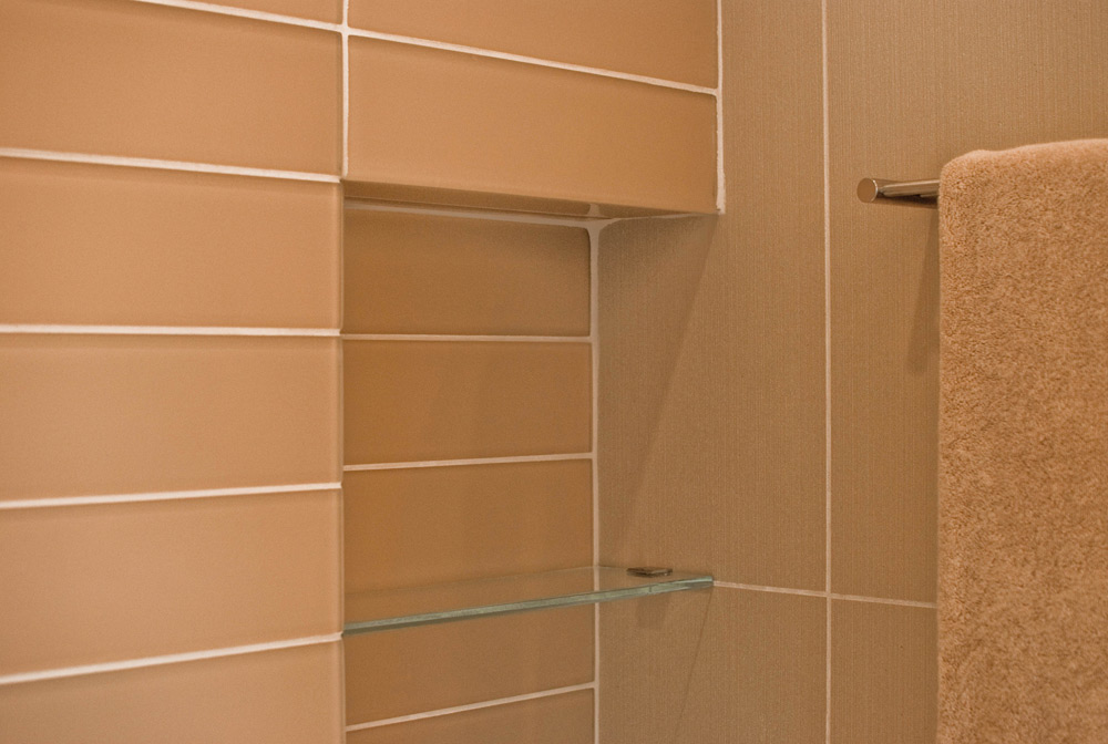
Shadow Box
We try to avoid direct sightlines to the shadow box from the entry as much as possible. Placing it opposite of the fixture and against the corner is ideal. A small glass shelf with minimal polished chrome brackets add to the usefulness of this already highly-functional feature. A new addition to the shadow box family is the shadow ledge, a place to rest one foot for leg-shaving and foot scrubbing ease.
Grout
Our standard is to match the grout color to tile color for a consistent field. However, there are times, whether client-driven or a desire to emphasize an accent wall, when we want to achieve the aesthetic of contrast with dark grout and light tile (or vice versa).

We map out our grout lines to run along centerlines of bath and shower fixtures, as well as align with shadow box edges. This alleviates the need for intricate cutting of tile. Not to mention, the clean aesthetic.
There you have it — our common-sense-driven standards for bathroom tile. Let us know what you think, and any successes/lessons you’ve learned on this front.
Cheers from Team BUILD