[All images by: BUILD LLC]
The subject of alignment and reducing visual clutter is well-tread territory in the world of modernism, as well as the pages of this blog. We’ve covered the subject in multiple posts and today’s post takes a closer look at the importance of simply lining things up. While not everything on a project can be perfectly aligned all the time (placement follows function), we find that there are horizontal datum bands that can effectively guide the placement of just about everything required of an interiors package.
Today’s post covers the horizontal datum lines we adhere to on our projects along with a bit of rationalizing.
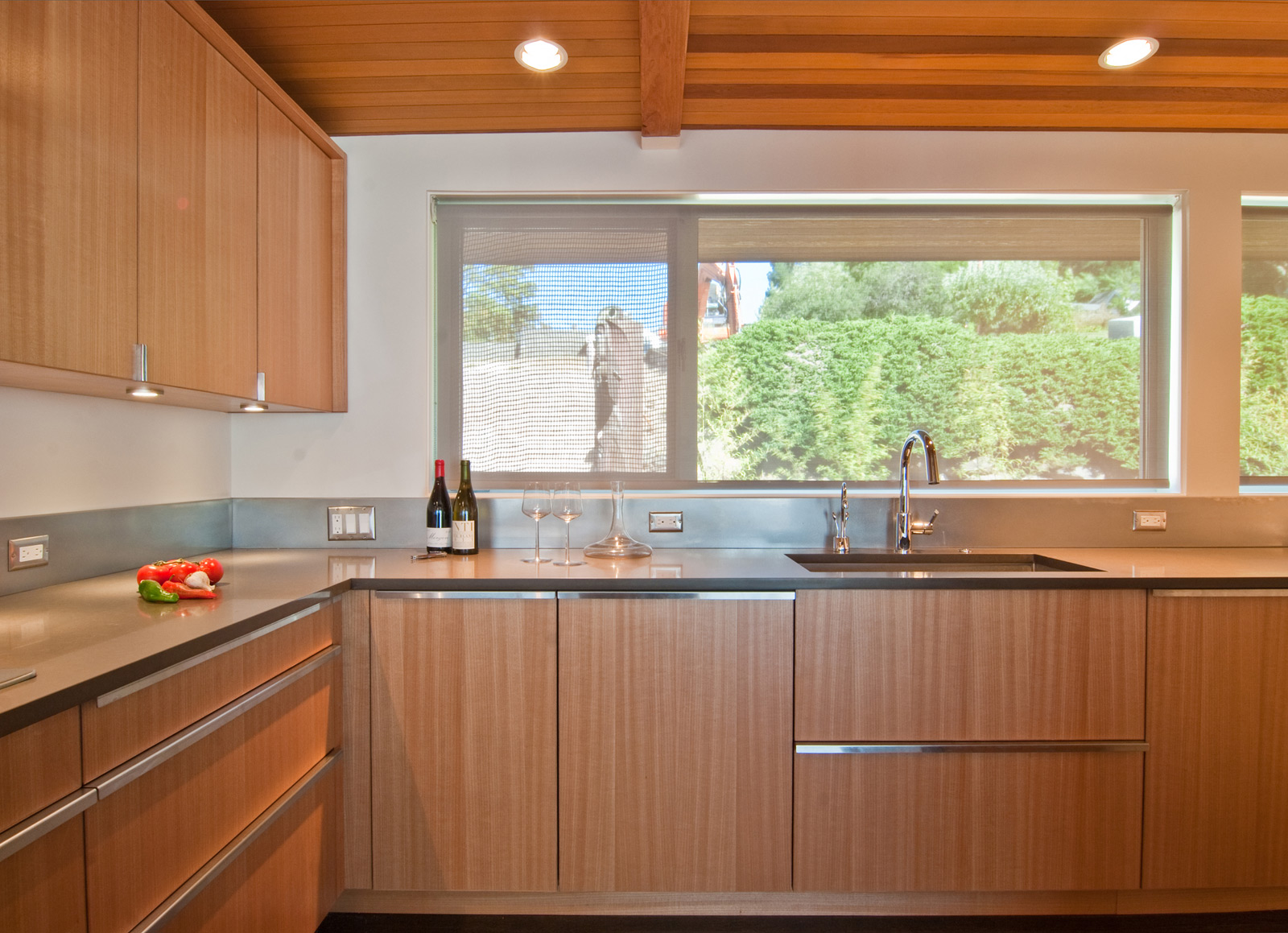
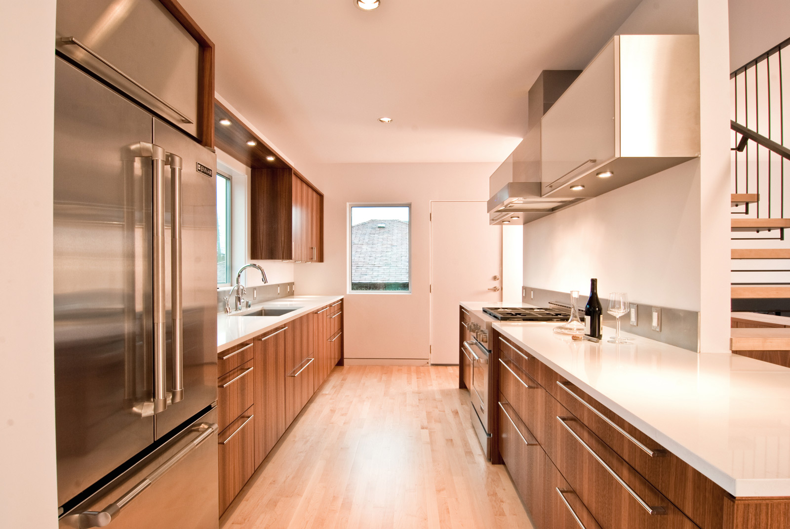
Railing and Counter surfaces. 36″
This mid-range datum is defined primarily by guardrail and countertop standard heights. It also defines a consistent location for horizontal window mullions and other built-in surfaces. This datum line becomes all the more prominent inside as the backsplash band begins at the countertop level. Outside, common adjacencies involve guardrails and windows, so it helps to have a common horizontal geometry between the two for visual harmony.
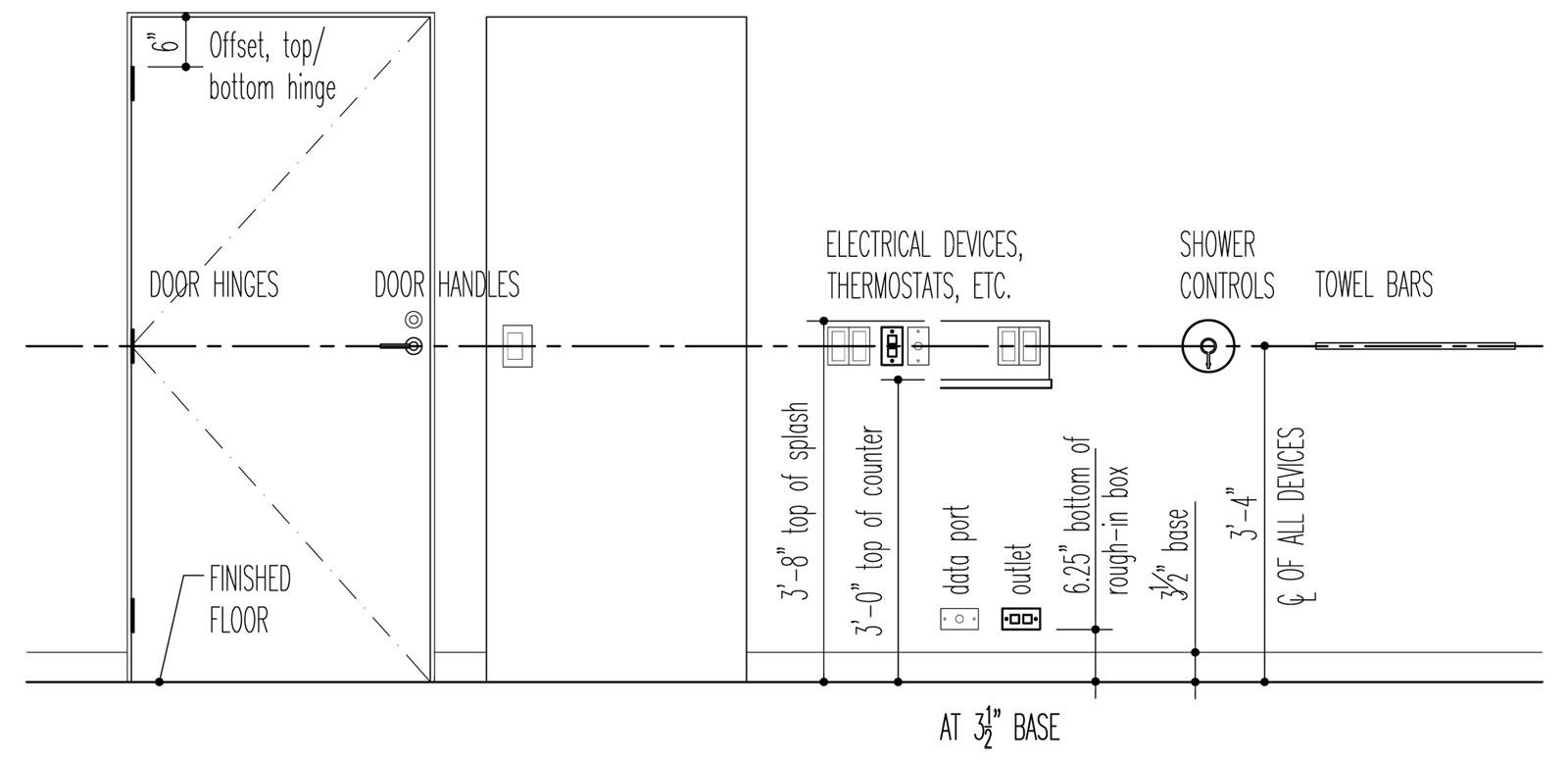
Devices and door handles. 40″
The objects we interact with in a space (switches, plugs, knobs) are maintained along their own datum. Years ago, we made the decision to align these elements across the board, and we haven’t looked back. The thinking is that anything a person would reach out to grasp should all be within the same plane— predictable to the point that you could maneuver around your house in the dark. It’s not necessary in the strictest sense, but it does wonders for reducing visual clutter, streamlining the user experience, and creating a predictable set of instructions for the construction.
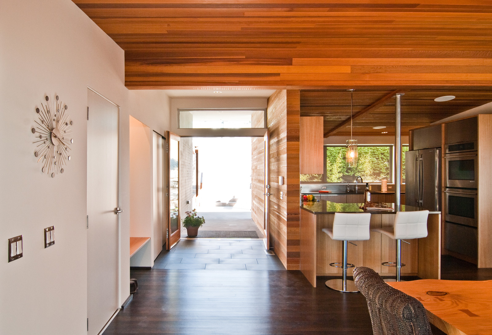
Door and window headers. 80″ or 84″
Door and window head heights are typically set at 80″ or 84″. There are of course exceptions, but for the most part this is a common datum on our projects. This dimension is based on standard door and window heights as well as effective sight-lines within the structure. Adhering to this datum also makes the exterior wall framing straight-forward.
The Exception: Cabinetry. 88″
While cabinet countertop surfaces maintain a consistent datum with other elements of a project, we’ve found that the top of full-height cabinets need to operate on their own. In the past, we have wrangled the alignment of cabinet heights and door/window header heights (and have made it work), but the detailing and coordination during construction is fussy and quickly becomes a time-suck. Cabinets are their own beast, and we’ve found a kit of parts that works. No sense in forcing alignment just for the sake of principle.
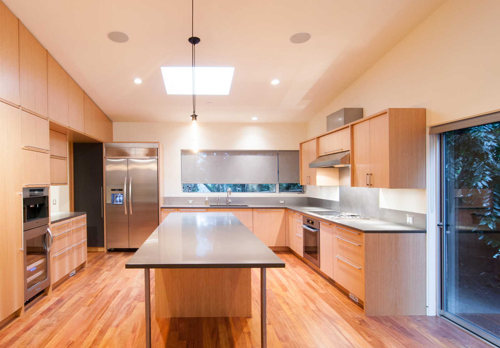
The Variable: Visual Devices.
There are a host of devices which cater more to the eye than to the hand. These include thermostats, alarm systems, the occasional wall mounted iPad, and any other screen-read device. This datum varies as it is based on the eye level of the users.
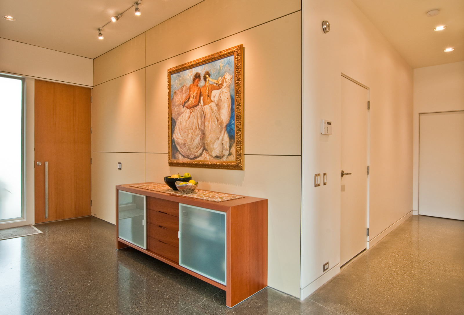
We like simple rules at BUILD. They help us educate the trades on how to best build our projects, they put all of our experience in design and construction to best use, and they make our time more effective in the office. For us, an important part of a modern aesthetic is an underlying philosophy that guides the decision making process, and these guidelines on horizontal datum lines are a good example.
Cheers from Team BUILD


