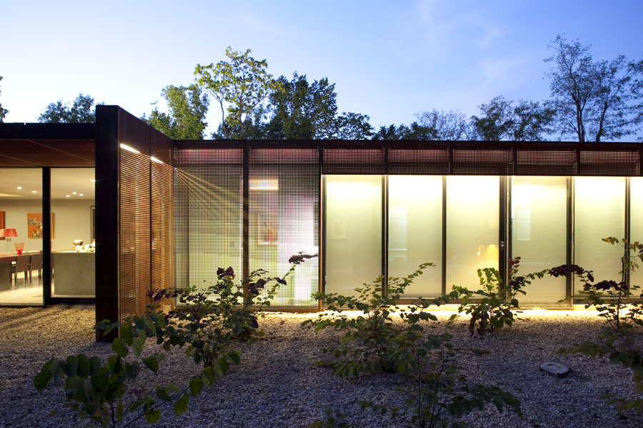
Last week, we shared a handful of examples of architecture with rhythm. Today, we continue our exploration modern homes which successfully balance interest, elegance, and function.
Heavy Metal by Hufft Projects
A play off of the various solid materials, this residence emphasizes the horizontal and uses the differences of color and texture as the primary focus. There is a very judicious use of glazing on this façade and we admire the attention to panel breaks and material intersections.
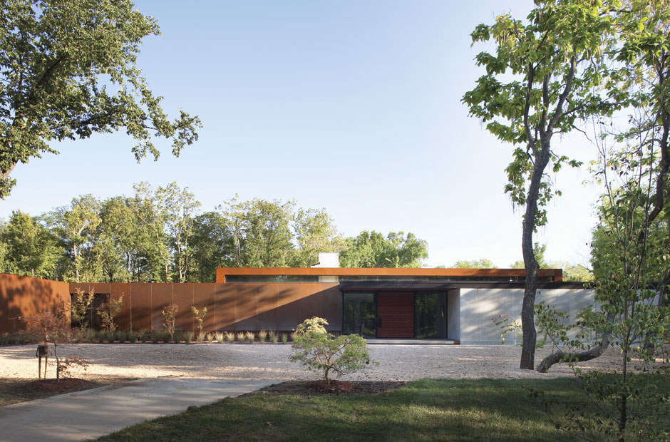
Postcard House by Hufft Projects
This residence is a nice example of employing a solid wall without it being overly brutal. Several delicate moves provide relief from the monolithic façade, adding texture and warm color to the utilitarian steel siding. The careful shifts between planes provide nice opportunities for entryways and windows.
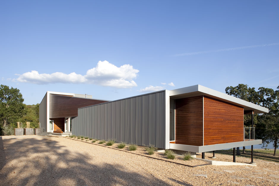
Casa Ruetter by Mathias Klotz
A complicated assembly of wood screens, steel framing and walls of glass become a synergistic whole in this project. There is a striking relationship between material planes starting, stopping and sliding past one another.
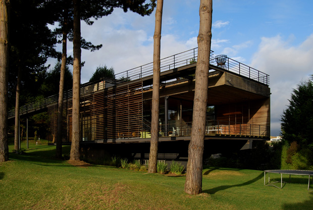
Baulinder Haus by Hufft Projects
A complicated but successful composition that uses a heavy base and a seemingly arbitrary geometry of vertical fins above. We’re a bit perplexed as to why the base still appears heavy with the screening, but it works nicely. We also applaud the move up top to randomize the fins.
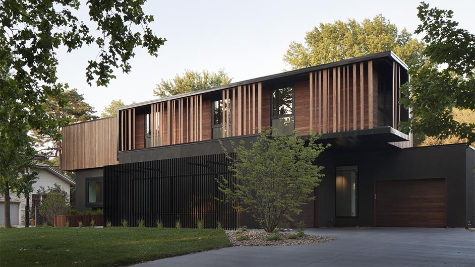
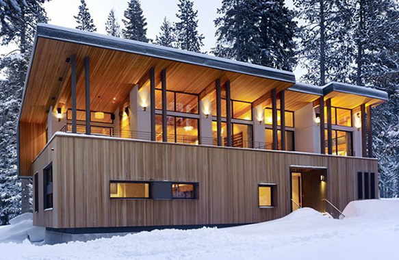
Truckee House by John Maniscalco Architecture
A heavy base is punctured with intentionally located window boxes and topped with a regular pattern of attenuated double columns. The heavy roof plane relates to the material of the base, allowing the upper level to be warm, light, and spacious. The house creates a nice distinction between screened private areas and transparent open areas.
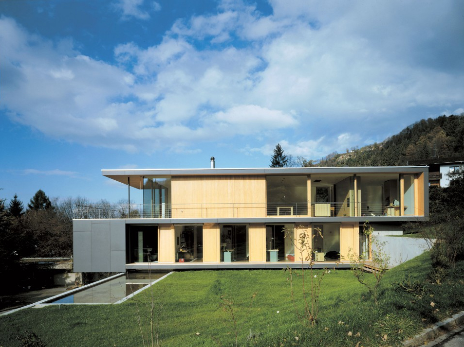
House L by Dietrich | Untertrifaller
A geometrical band winds its way across and down the envelope of the residence interlocking with an alternating façade of solid wall and floor-to-ceiling glazing. The three primary elements (band, walls, and windows) tie together nicely and develop a harmonious language.
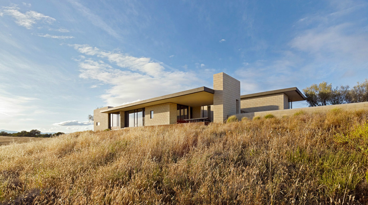
Paso Robles Residence by Aidlin Darling
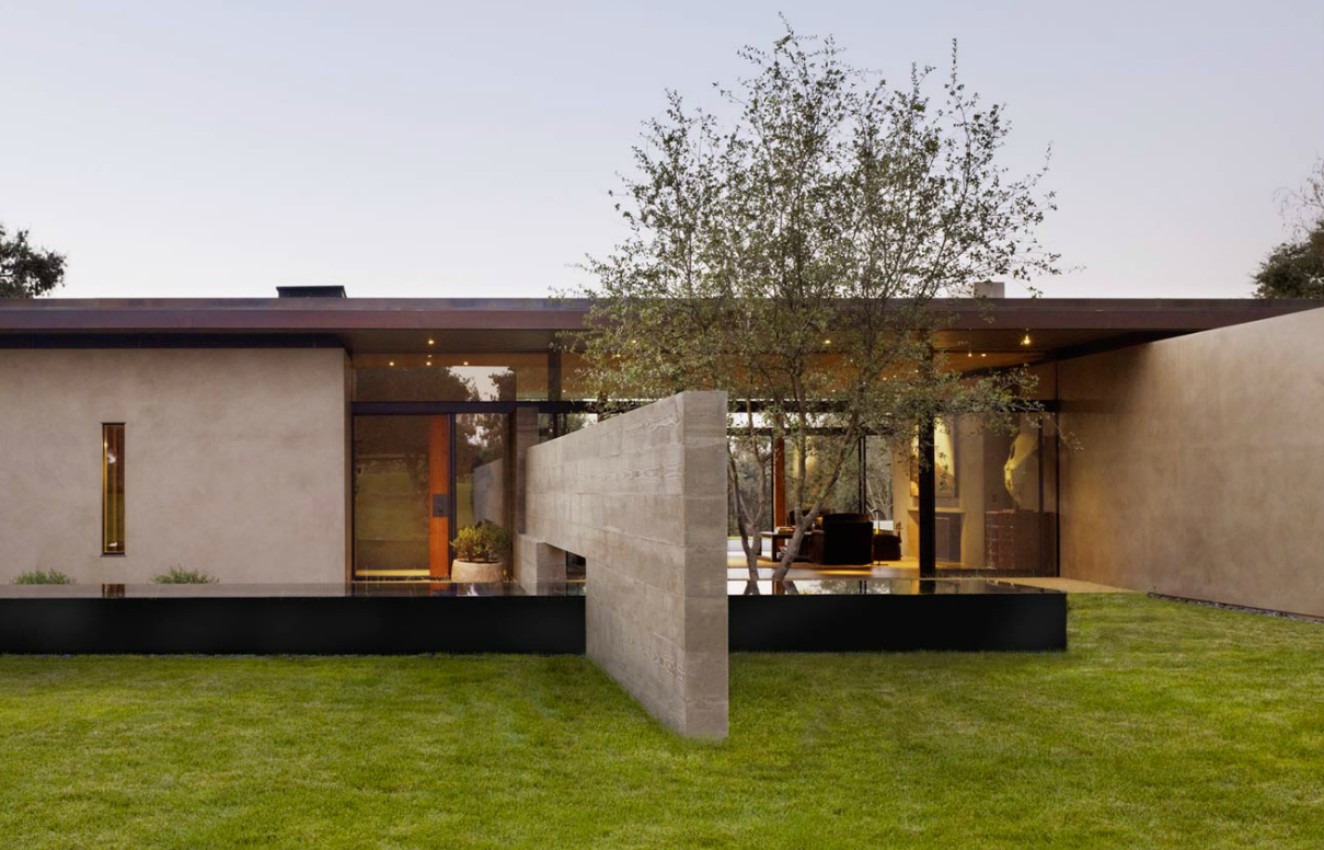
Transparency voids are located between solid blocks of wall with a strong horizontal eave and a pronounced vertical chimney. The horizontal and vertical planes delicately sliding past each other really do it for us on this one.
San Joaquin Valley Residence by Aidlin Darling
A central transparent void is bookended with fins extending into landscape and the entire composition is capped with a strong horizontal eave. We love how the house engages the landscape and develops a low horizontal geometry to the residence.
East Windsor Residence by Alter Studio
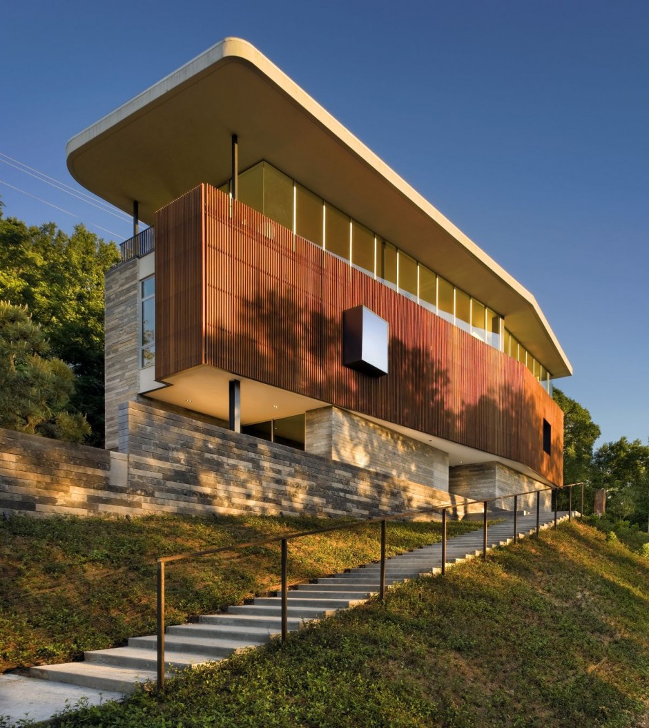
Four horizontal elements give this house a strong geometry; they consist of a solid stone base, a screen wall (that appears solid from far away), a transparent band of windows, and a heavy horizontal roof plane. The character of the façade is greatly enhanced with the use of pronounced and recessed window boxes. We’re big fans of the articulation of the screen wall and the slight angle introduced into the form.
Wapiti Valley House by Studio.bna
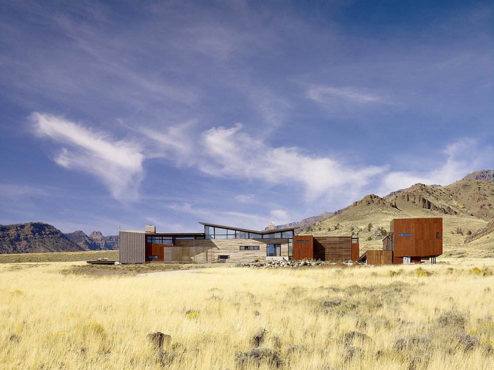
Wrapping up our study, this residence is the “everything composition” and includes just about everything mentioned above. It even comes with a side dish of cor-ten steel box guest suite. It does all this and still looks gorgeous.
Cheers from Team BUILD


