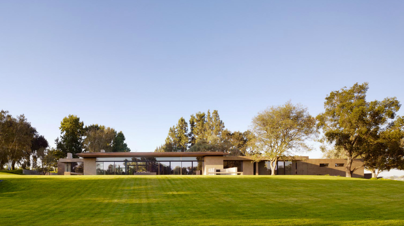
BUILD recently started the schematic design phase for a new project that will reuse the existing foundation of a current (and soon to be demolished) home. It’s an interesting project because the existing home is nearly 109’ feet long and, as a matter of course, the new design will inherit this elongated plan. With such a considerable extent of envelope, the design has our minds spinning with possibilities. Along with putting pen to paper we’re also using this opportunity to study up on similar built solutions in the architecture world. Today’s post is a survey of residences that deal with these same architectural factors in exceptional ways. Each uses its own rational design language to create a harmonious sequence and resolve an extensive envelope. In other words, it’s an analysis of architectural rhythm. We’ve organized the examples from simple to complex. Let us know of any examples that should be included in the study.
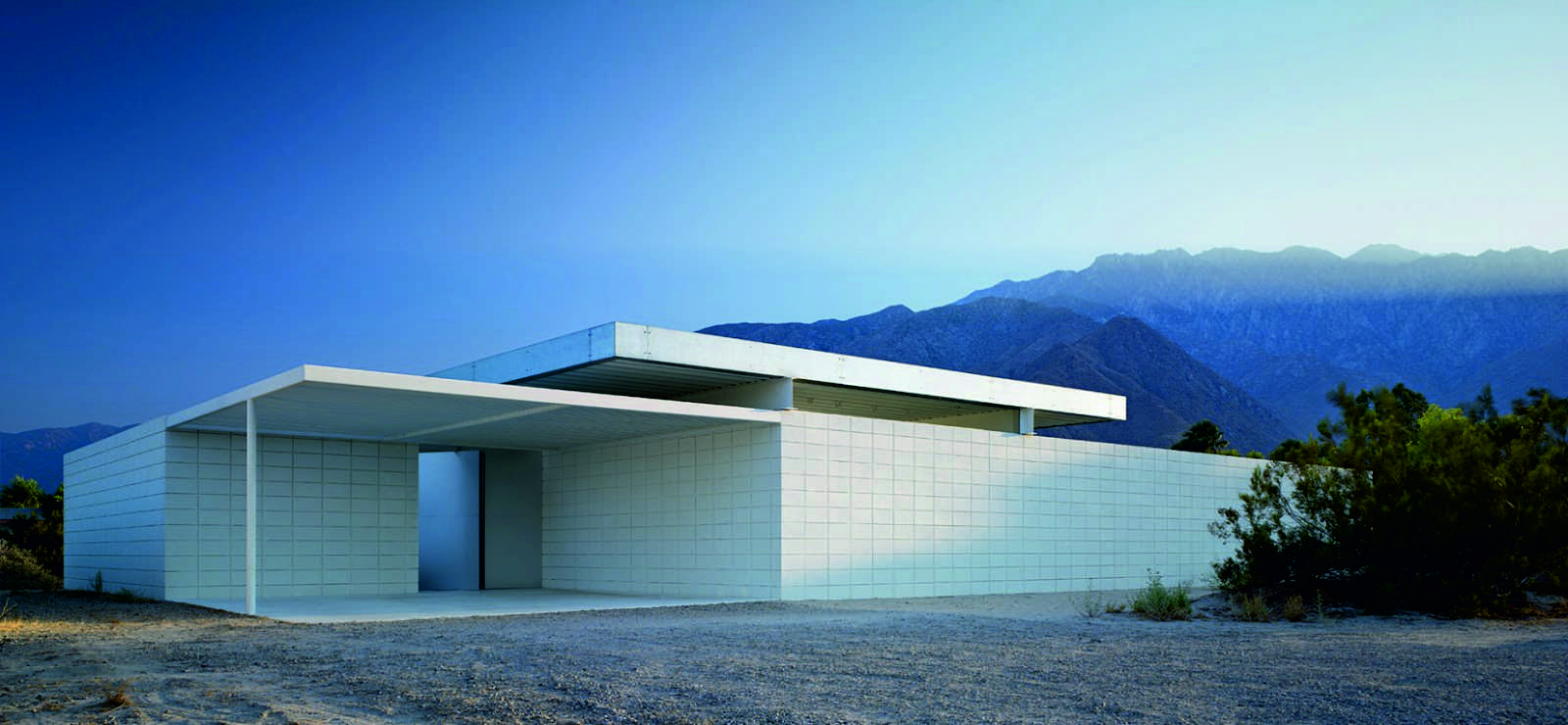
Desert House by Jim Jennings
While a bit too austere, this residence is an excellent departure point for the study. It’s plain walls emphasize a careful material grid and places a few significant structural moves in the spotlight. While the simplicity seems a bit impractical, we can’t take our eyes off of this residence.
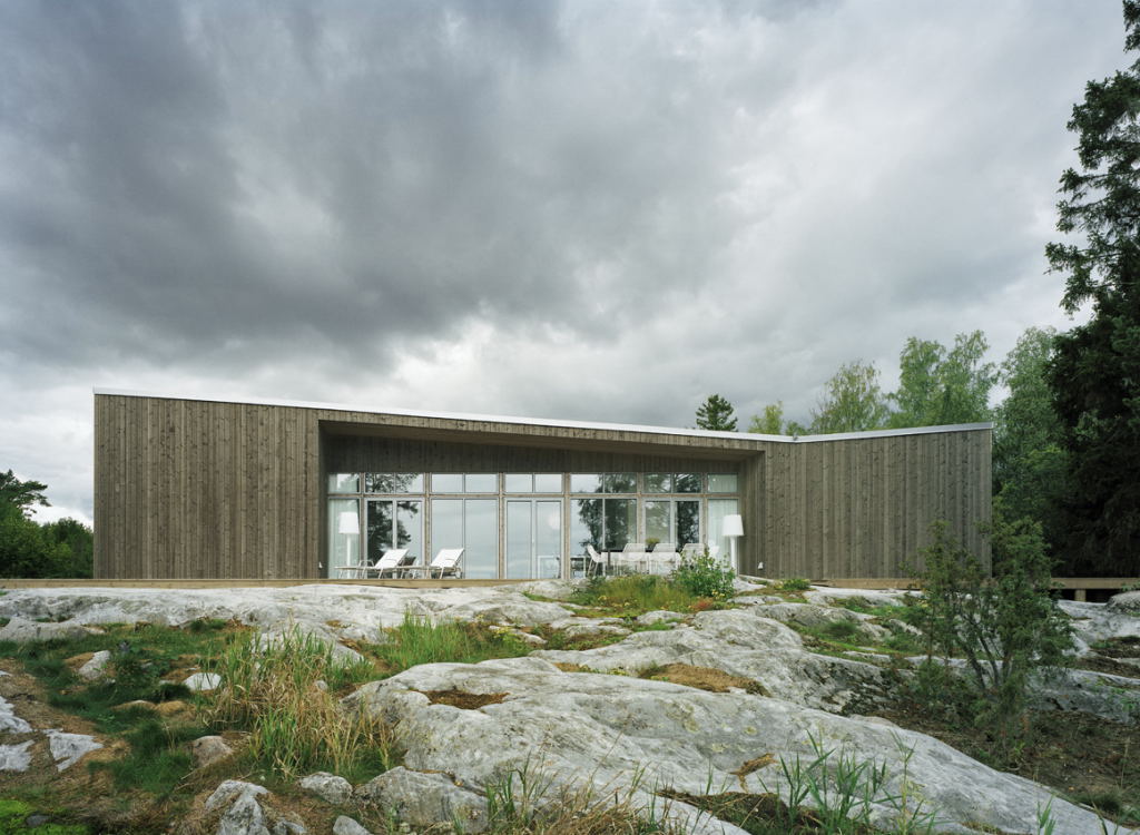
Folded Plane House by Claesson Koivisto Rune
Two solid volumes bookend a transparent center area of this house while the roof plane remains flush to the exterior walls. The simple form is a pleasure to look at and we’d like to think that the roof slope is a derivative of the functions inside.
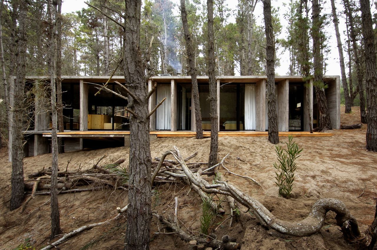
Concrete House by BAK Architecture
A simple concrete box frames a sequence of recessed vertical fins which offer privacy screening and control of daylight (we presume). We admire the pure, rational translation of the form and there’s something about the primitive finished look that we find refreshing.
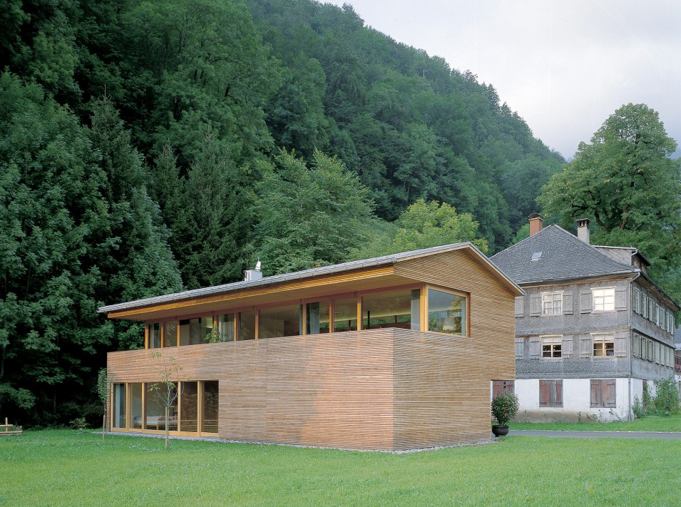
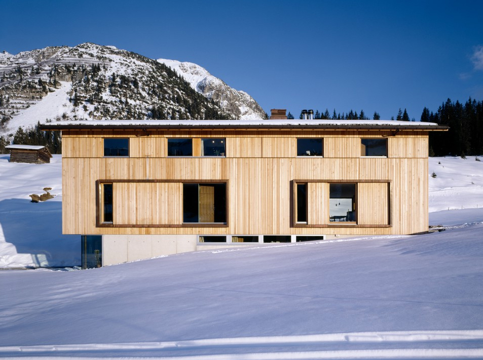
House R by Dietrich | Untertrifaller
A solid base contrasts with the airy, recessed upper level. The heavy roof plane is necessary to emphasize the lightness of the transparent band of the upstairs. It’s a nice simple composition that successfully introduces asymmetry with the sliding doors at the lower level.
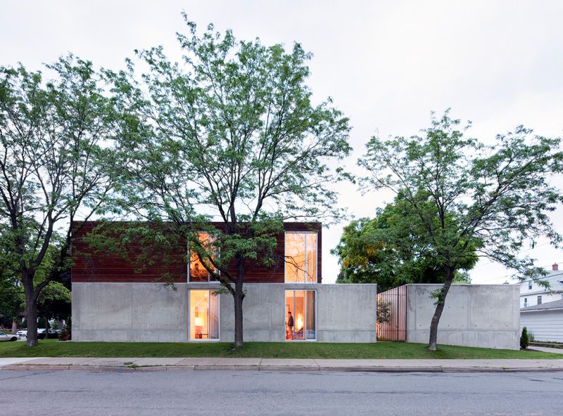
B+W House by Julie Snow
Horizontal bands created through different materials are linked via window alignments on the top and bottom. The concrete garage (we’re guessing) extends the massive base to accentuate the horizontal plane. Very few houses accomplish so much compositionally with so few moves.
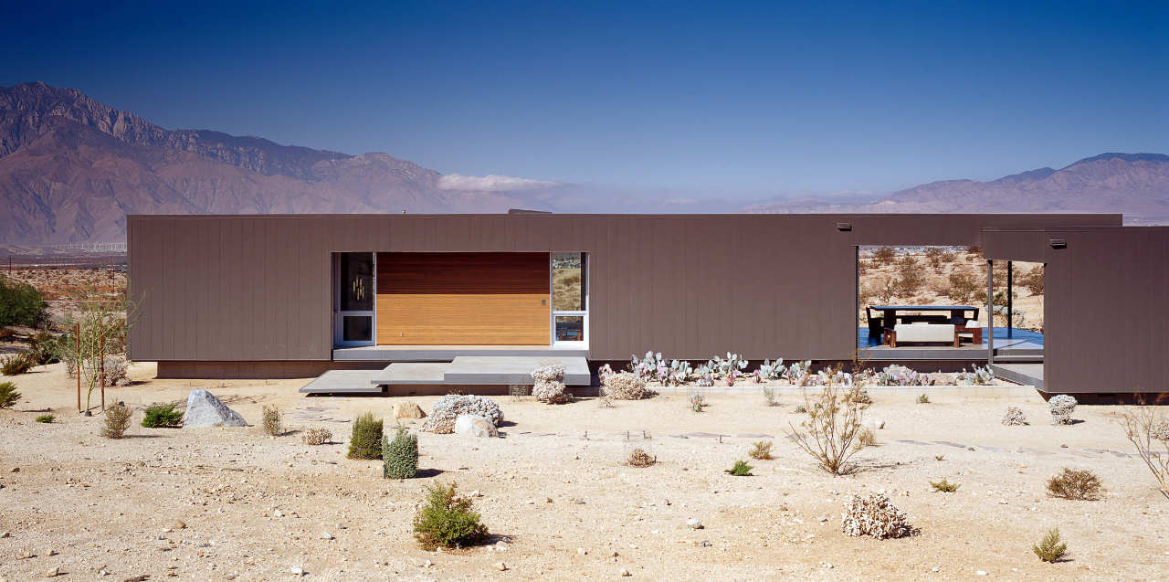
Desert House by Marmol Radziner
A heavy, minimal façade is surgically carved with openings for windows, entry and exterior space. That the box cantilevers over the foundation gives the composition a light, floating feeling. Organizing the windows, doors, and warm woods into a common geometry within the façade is a very pleasing move on this residence.
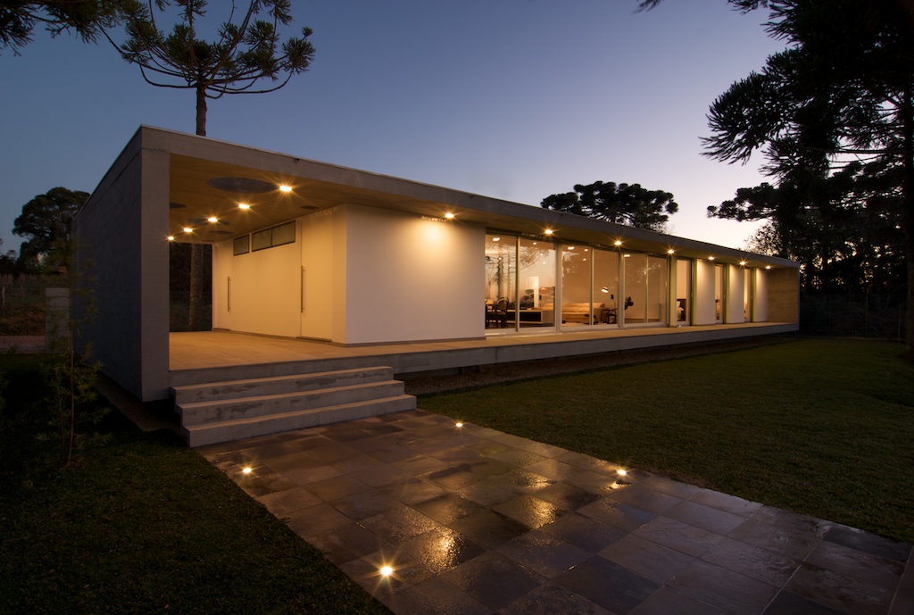
Bento Golçalves House by Studio Paralelo
A fantastic example of geometrical purity, the pronounced envelope frames a simple geometry of opaque and transparent panels, while the entry void introduces a bit of asymmetry. Design like this requires an immense level of discipline on behalf of the owners and architects alike.
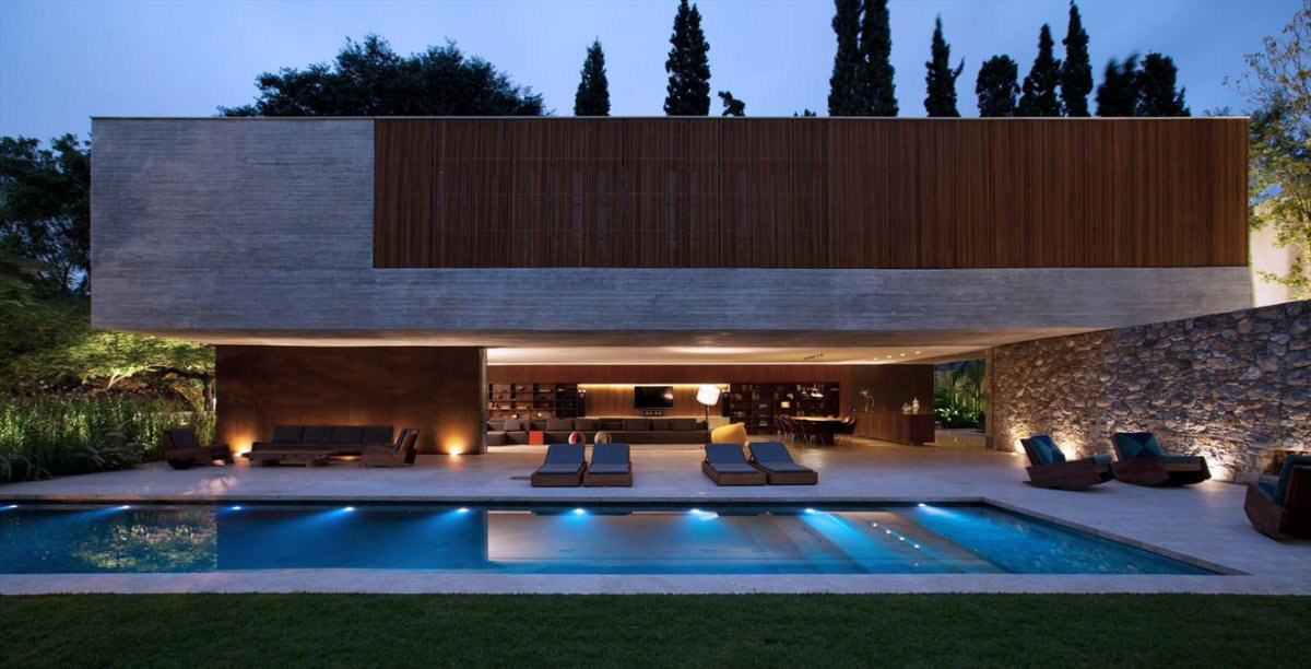
Ipes House by StudioMK27
A heavy floating concrete box notched with a stretch of warm wood screening adds up to one of the boldest residences we’ve ever seen. Just pure bold.
House S by Dietrich | Untertrifaller
An exercise in alignment, this house uses strong horizontal lines and simple rectangles to achieve a clear geometry. The symmetry is carefully thrown off with the addition of an extra bay on the left. Our favorite element of this composition is that the operable doors on the main level are differentiated from the windows above with a pronounced frame.
Magnolia House by Heliotrope
A balanced geometry is set up through the use of heavy base, an articulated middle, and a delicate, horizontal roof plane. There’s a nice play between vertical and horizontal siding elements in this residence (including a very deliberate pair of downspouts). Also of particular note is a clever distinction between opaque, full transparency, and partial transparency as every other vertical board is removed from the rainscreen system.

Cheers from team BUILD


