[All photos by BUILD LLC]
Wrapping up Part 1 and Part 2 of the creativeLIVE San Francisco project, today’s post covers the fun stuff; the hidden lofts, weathered mezzanine and sun soaked deck — in other words, the places to unplug, get some face-time with your cohorts and maybe even kick your feet up.
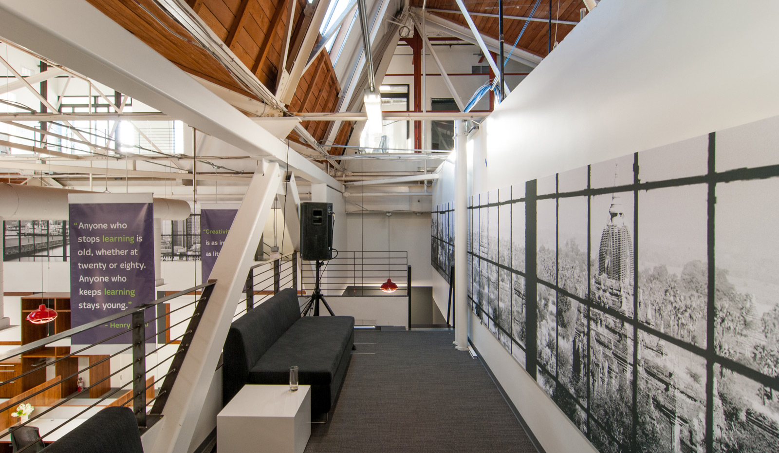
Throughout the creativeLIVE space are lofts strategically located over areas that require full visual or acoustical separation — namely the control booths, green room, and break-out rooms. These confined spaces all have a lower ceiling height and make for a great opportunity to do something on top that caters to the imaginative, brainstorming side of creativeLIVE. The acoustical datum band carries through to the loft spaces tying them to the larger workrooms; however the atmosphere up top is entirely informal. The low-slung Bonnie Studio Sofas and Clyde Sofas, both from Bludot, create a place to take refuge and get some thinking done, a hideaway to sneak in a nap, or a stage to put a DJ for your kick-ass party.

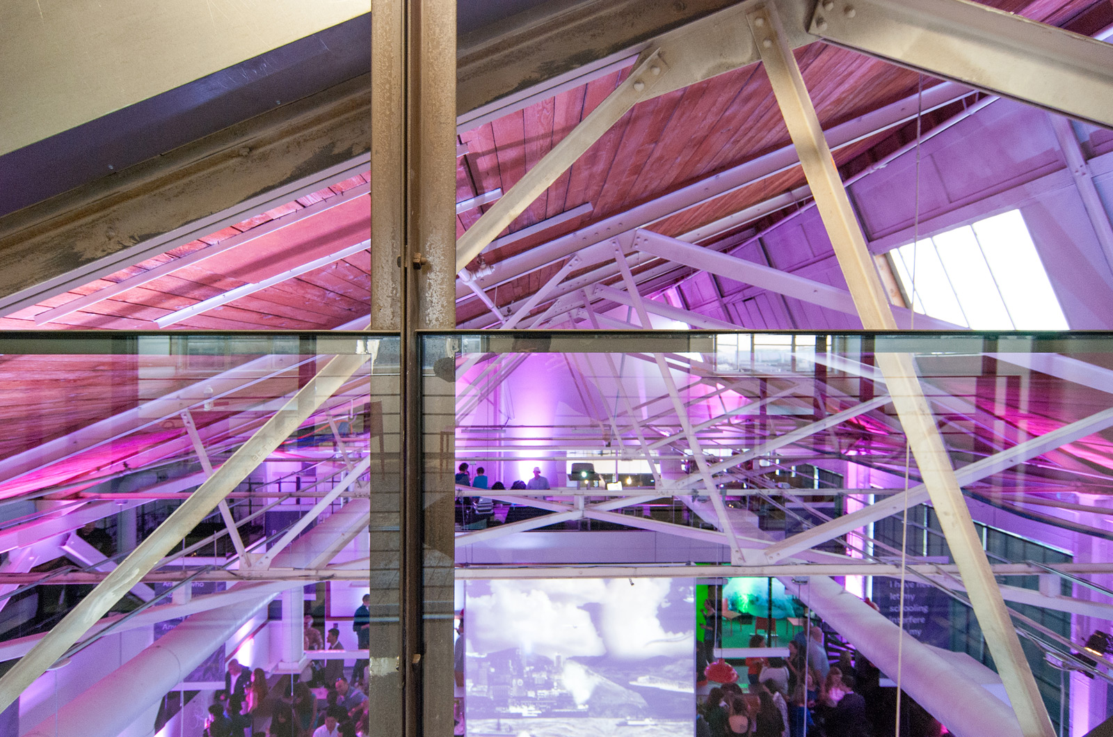
Some of the lofts use the existing steel cross-bracing as a featured design component, while others embrace the industrial aesthetic and incorporate the HVAC ducting installed by the exceptional team over at American Mechanical Services. Each loft offers fantastic sight-lines of the original steel saw-tooth roof trusses.
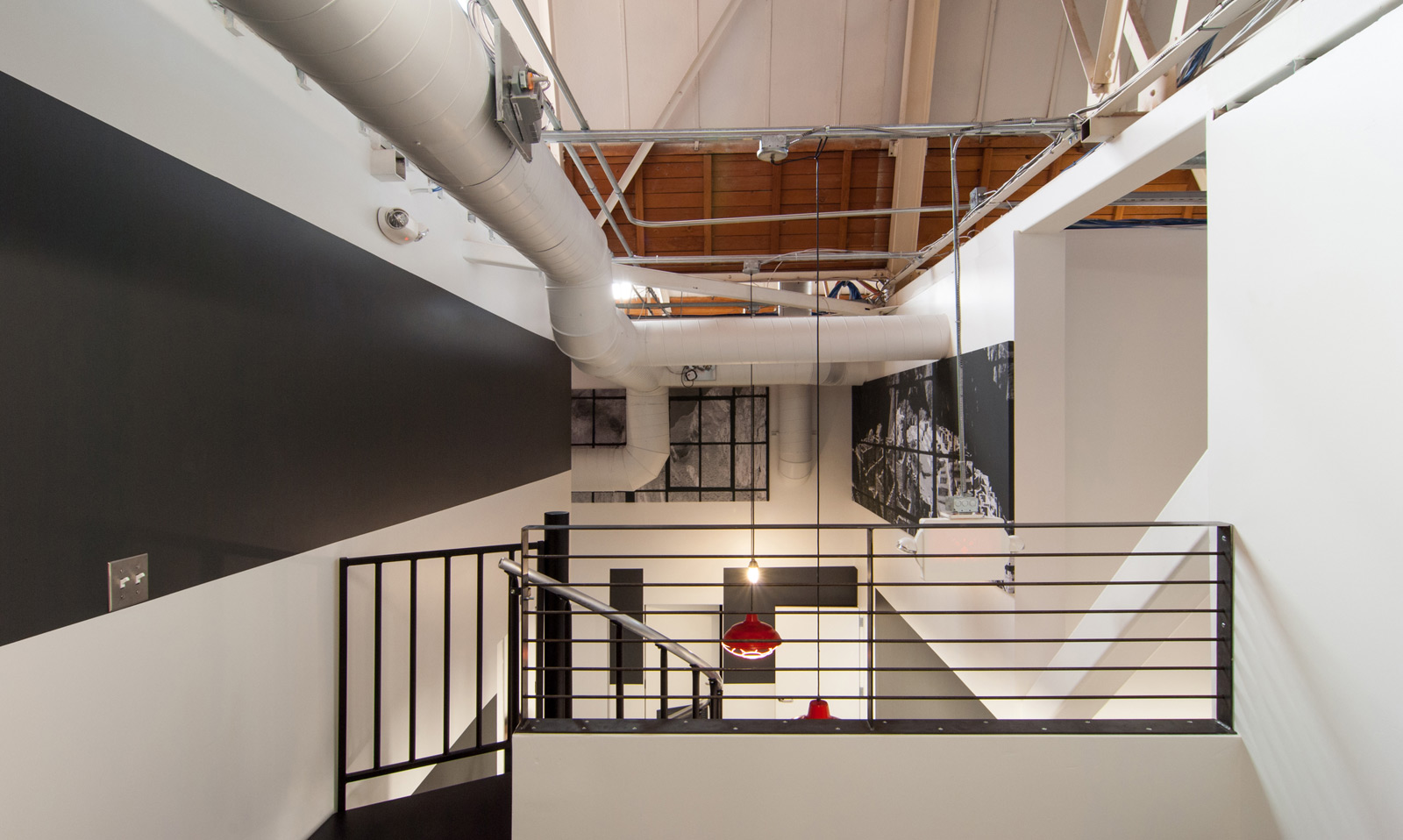
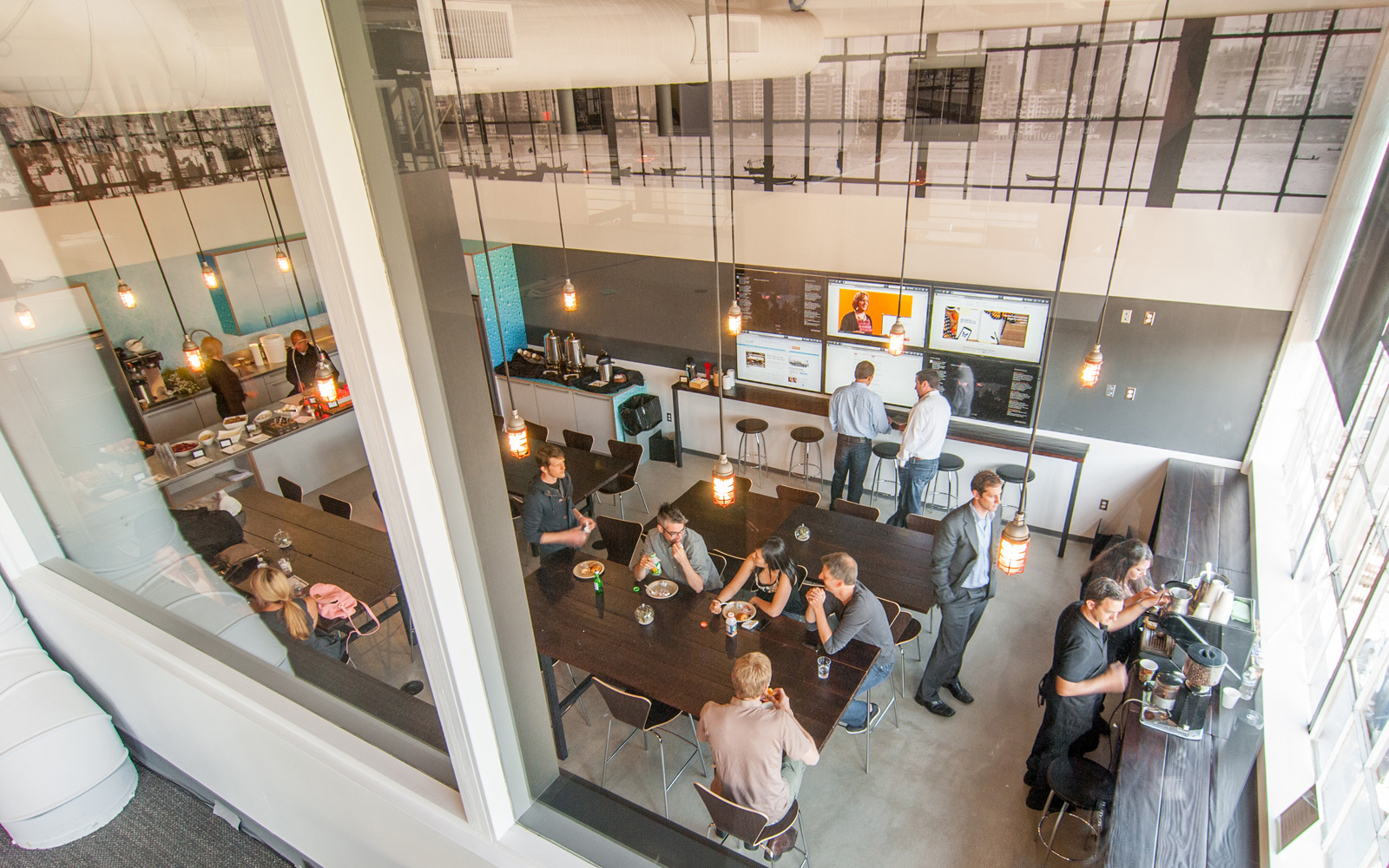
We especially like the bird’s eye view the lofts offer and one can see exactly what sort of goodies just got served up in the kitchen from the adjacent loft.
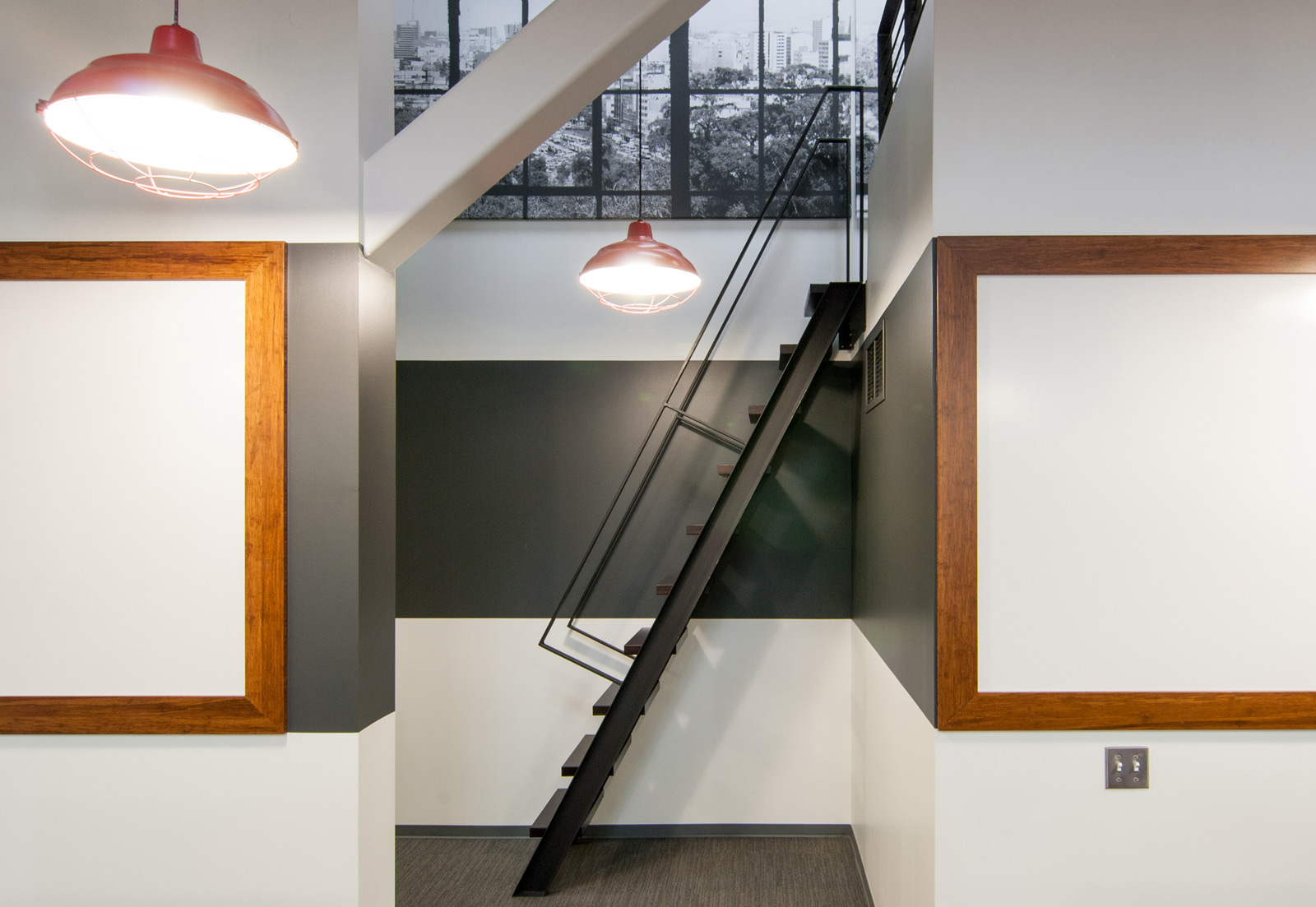
The lofts are reached via a custom steel ship ladder or steel spiral stair — the handy work of Fineline Metal Fabrication who did a sharp job with the steel components (which also include the loft guardrails and stair handrails).
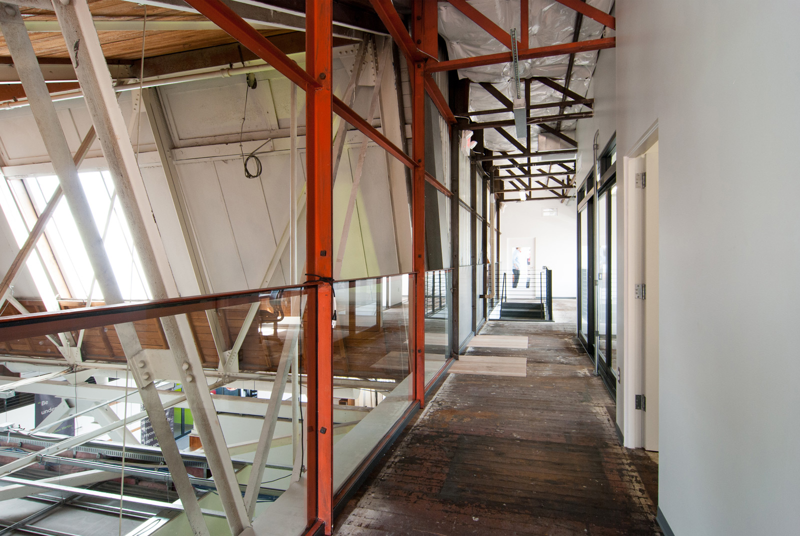
Above the lofts and double-height work rooms, sits a1,500 square foot mezzanine, (technically an upper floor, but much more mezzanine in feel). Our first tour through the original space revealed this previously neglected storage area to be a loft-like space that could engage both the roof structure and open floor below. Following initial demo, we found an alluring grit and authenticity that we took to immediately. A wall of original weathered steel had an attenuated structure difficult to produce these days. We kept the wall exactly as is, even with the faded orange paint, and outfitted the lower bays with clear guardrails. The long glass panels visually disappear and allow the steel to delicately march down the hall.
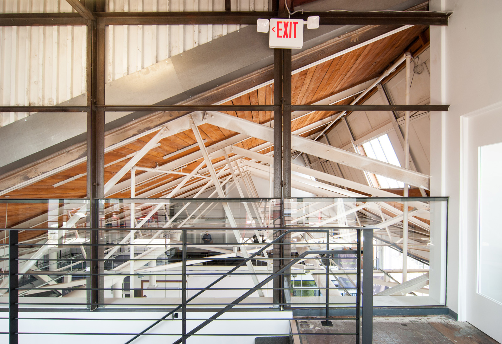
The glass and steel composition allows for an exceptional view through the roof trusses and down into the workrooms. The steelwork is contrasted with the clean white gypsum walls labored over by the folks at L.C. Interiors Inc.
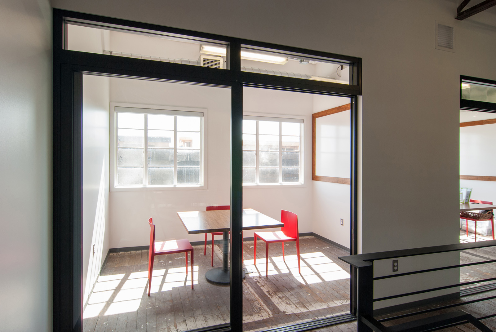
Three break-out rooms, a board room, an editing room and restrooms tuck neatly into the mezzanine footprint. Similar to the existing weathered steel, there were several features at the mezzanine that simply had too much history and character to discard or paint over. The original floor boards were layered with paint lines from previous walls, bleached from decades of sunshine and seasoned from the natural weathering process of old growth timber. Basically the floor had stories to tell and we weren’t about to stop it. Patching occurred where necessary which adds another layer to the story.
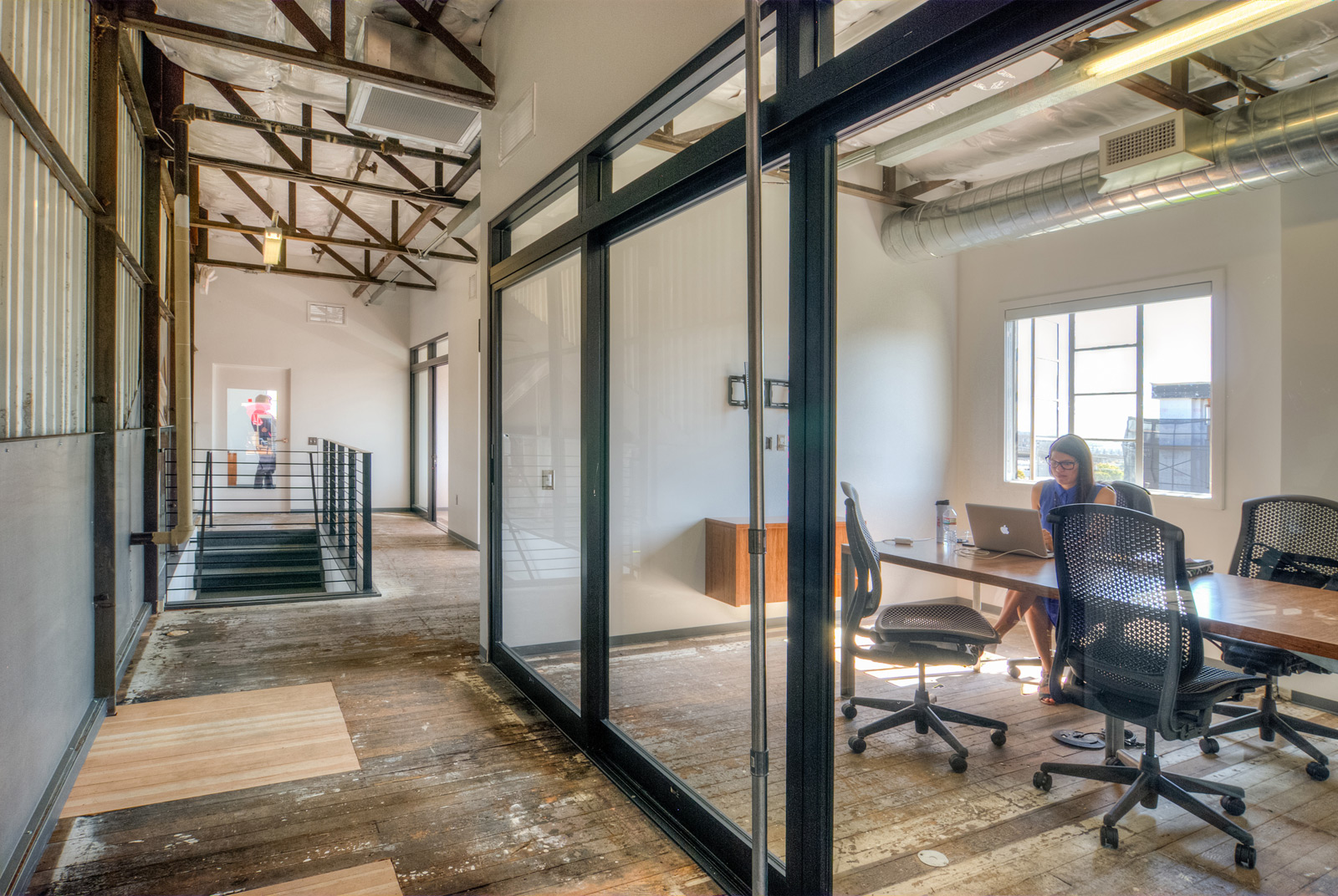
As mentioned in part 2 of the series, a collection of bronze anodized aluminum doors were found on site as part of the previous office space. We cleaned them up and put them back to work in new locations as dividers to the break-out rooms. Part of a smart architectural approach involves using what’s already there, reducing the amount of material going to the landfill, and being cost-effective (three items that play well together).
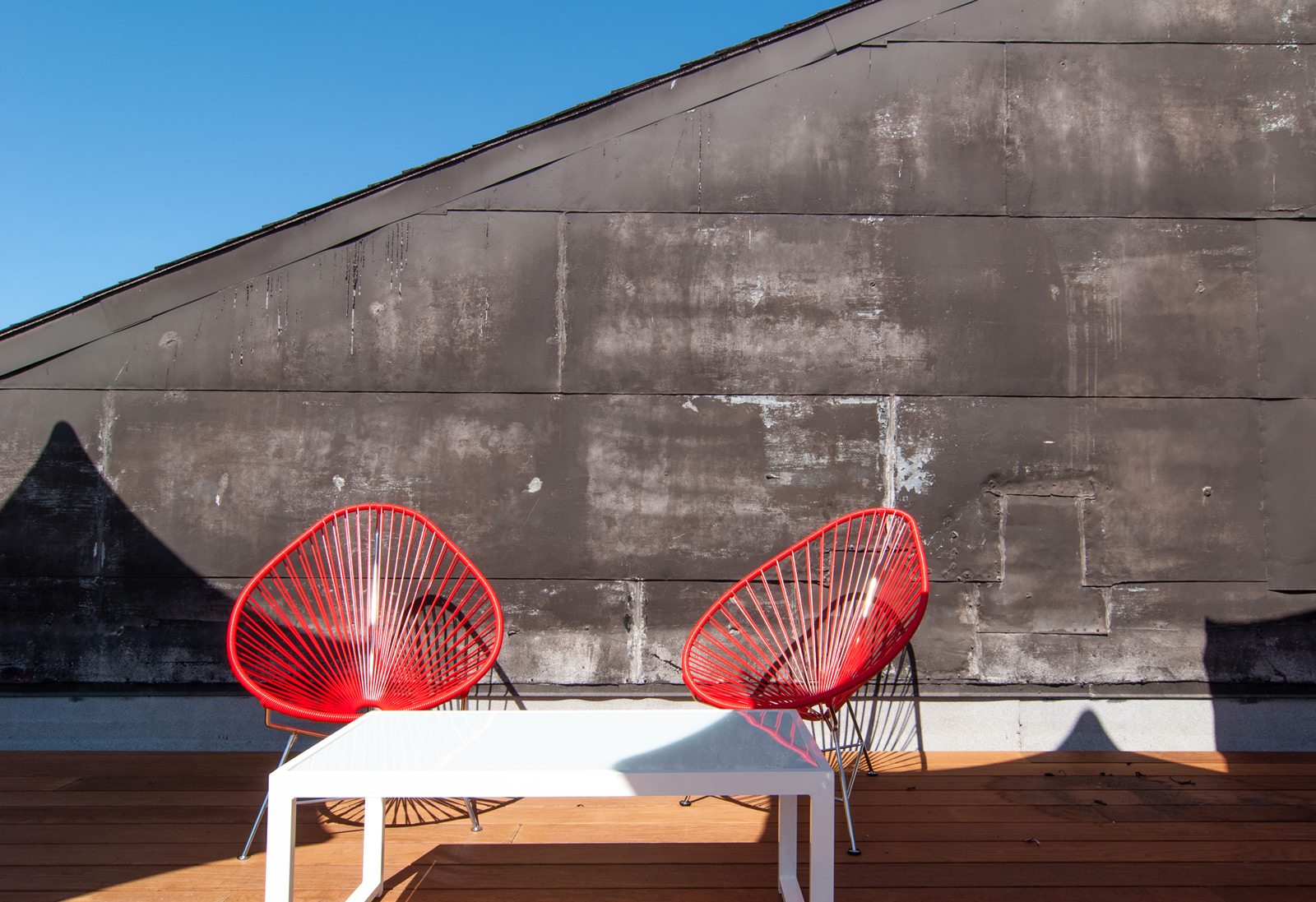
A trip through the workrooms, up the stairs to the mezzanine and down the hall to the exit is handsomely rewarded with an enormous 1,400 square foot roof deck, furnished with all the accoutrements for lounging, soaking up some vitamin D, and throwing full on roof parties. The deck quickly became our favorite hang-out spot for the launch party and we had a difficult time pulling ourselves out of the Acapulco chairs (which are as comfortable as they are gorgeous by the way).
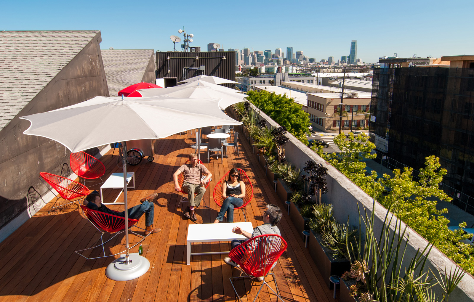
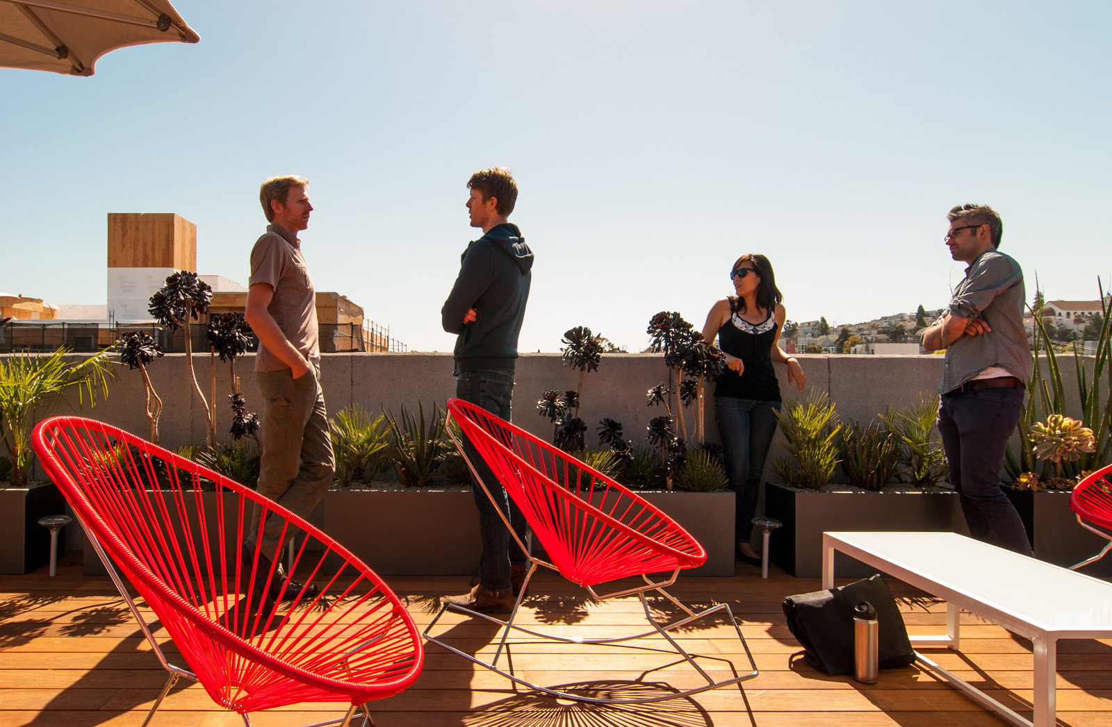
Thanks to Steven Schneider Construction, the new ipe hardwood deck sits atop raised sleepers which rest on top of the roof. The deck hosts a variety of additional outdoor rated furniture including Bellini Chairs, Big Wave Folding Round Tables, Golden Beach Coffee Tables, and perhaps our favorite component, the New York City ice cream carts and fruit & vegetable carts converted to mobile bars. For more information on the furniture package, check out our previous post on commercial outdoor furniture. The patina of the existing walls up top provided a nice textured background to the deck.

To soften things up a bit and bring some greenery to the rooftop, our friends at Gardenista installed 75 linear feet of Pure Short Rectangular Planters filled with all sorts of California-friendly, hearty, low-water consuming growies. Luceplan’s Solar Bud uplights are situated between each planter box to highlight the plants at night and provide a warm background to the deck scene. During the heat of the day, cool shade is provided by the Tuuci Razor Umbrellas thanks to DWR
We’d like to reiterate a couple of thank yous to Centric, the general contractor who put the whole thing together and to our local architect collaborators and good friends Zack | de Vito. Huge gratitude goes out to creativeLIVE for teaming with us and putting their trust in our abilities throughout the process: Jon, Mika, Chase, Kari, Julie and many others bravely and calmly went on the adventure with us.
That wraps up the coverage of the creativeLIVE San Francisco project. Thanks for tuning in and keep your eyes open for more — there continues to be exciting work coming down the pipeline.
Cheers from team BUILD


