Before we get to detailing, before we start drawing up floor plans, before we even really start the architecture, there’s something more crucial to pin down for any given project: the design concept. For us, the design concept is the basic DNA of a project and it provides direction from schematics all the way to the construction completion. It may be a powerful idea, a philosophy of design, or it might just be a simple framework of design guidelines to work from. The important part is that the concept is a deliberate road map to follow throughout the course of design and construction.

The design concept was more important than ever on our creativeLive San Francisco project, which is nearing completion. With tens of thousands of square feet of wall space and a rigorous program, it was critical to nail the design concept and stick to it. The team at creativeLIVE is dynamic, innovative and, well, creative — so landing on the design concept was intense and fun. The design concept was highly collaborative and refines all of the rationale, emotions, and insight of the project into 3 basic subjects:
PLACE + TIME + FORM
Each claims its own territory within the 10,000+ square foot program and here’s the breakdown:
PLACE
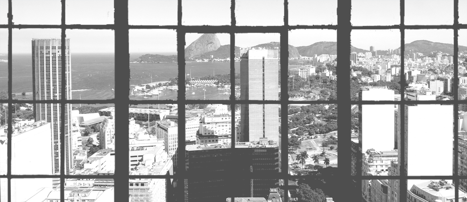
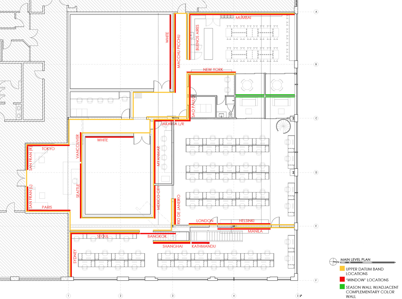
Because creativeLIVE is changing the nature of education on a global scale we wanted to provide a sense of its world-wide reach. The “windows to the world” idea (Thanks, Chase) incorporates large-format photos of 22 cities from around the world. The panels, some as wide as 39 feet, are doing double-duty in that they’re also canvassing an extensive system of acoustical panels throughout the space (filming studios need to be very, very quiet).

We wanted the images to read more like urban textures, rather than postcards from various cities. For this reason, iconic structures (like Seattle’s Space Needle) are deliberately cropped to downplay the object and highlight the texture. Taking everything into black & white tied the various photos together with a visual consistency. All of the city images are organized into a horizontal band around the space to align with windows and other functions. Each cityscape photo is placed within the space based on its actual location in the world with respect to the room.

Visitors will meander through the interiors enjoying scenes of urban texture from all over the world; and upon arriving at the common lunchroom, they are rewarded with a true view of San Francisco through real windows.

TIME
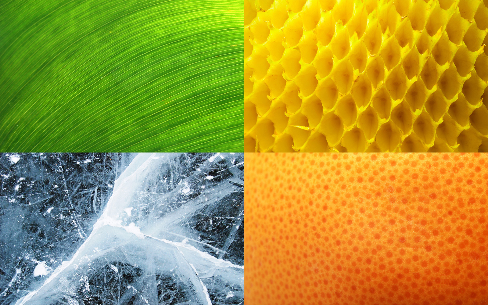
Four main breakout rooms allow for meetings, brainstorming charrettes, privacy, and varying work patterns. These spaces are off the grid in terms of having their own geometry, placement and character within the space, so it led us to the conclusion that their concept should also be off grid. Contrasting with the black and white cityscapes, the breakout rooms explore each of the four seasons. As the rooms will be used differently from one another, a concept of distinct yet similar flavors seemed appropriate. The feel and texture of each season is heightened through extreme close-up photos of nature and bold color walls.

FORM
The kitchen and common lunchroom include a wide expanse of cabinets. So much cabinetry, in fact, that it becomes its own type of blank canvas. The design concept makes a play off of the purpose of the kitchen; changing matter into different forms. The concept uses H2O in its three states: gas, liquid, solid. A photo of each state is then veneered onto the cabinet package in a different orientation (front, top side) for a finished look that is cool and refreshing — and appropriate for a kitchen.

It was a blast working through this three-part design concept with the team over at creativeLIVE, and we’re looking forward to seeing the final results in the very near future. Stay tuned for photos covering the completion.
Cheers from Team BUILD


