[Images courtesy of Jay Ranaweera]
During most academic quarters we sit in on design reviews at the UW School of Architecture here in Seattle. As guest jurors, we supplement the teaching, provide a bit of real world coaching, and offer up knowledge about how buildings get designed and built. But maybe, more importantly, we’re there to learn. Architecture school reviews are a tremendous opportunity for professionals to keep a pulse on fresh ideas, new technology and the energy unique to architecture students.
One thing that really struck us at a thesis review earlier this spring was how challenging it can be (both as reviewer and student) to convey the depth and complexity of a design project. On average, presentations get a timeslot of 20-30 minutes, most of which is allocated to comments, questions and dialogue from the jury, leaving 10-15 minutes for the actual student presentation. In such a slender timeframe, it’s nearly impossible to communicate the fundamental design points along with some of the applicable research and design process. For a student to properly convey their ideas, a clear and concise design language is not only helpful, it’s critical given the time constraints.
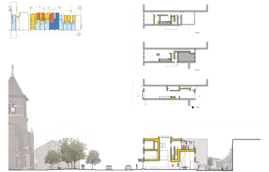
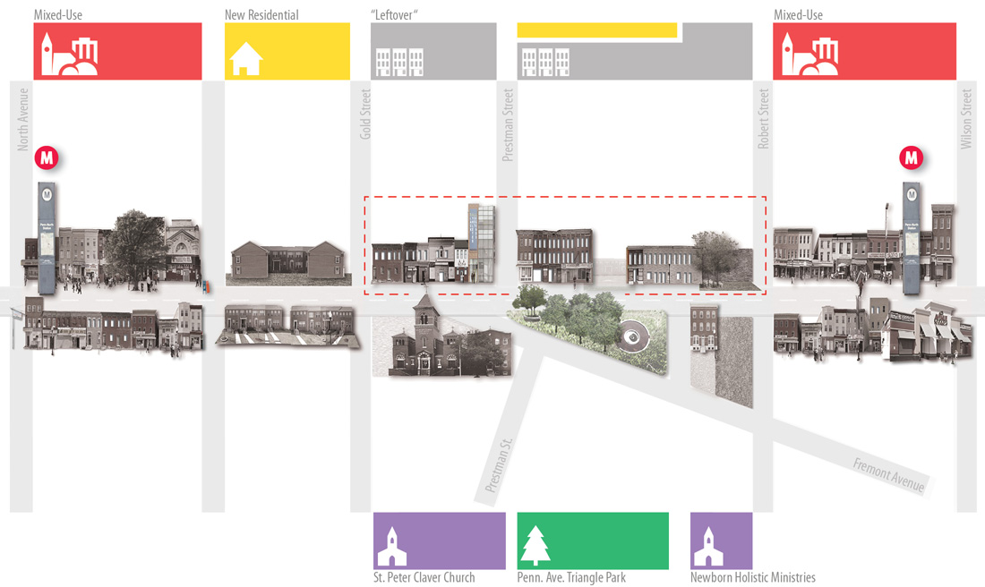
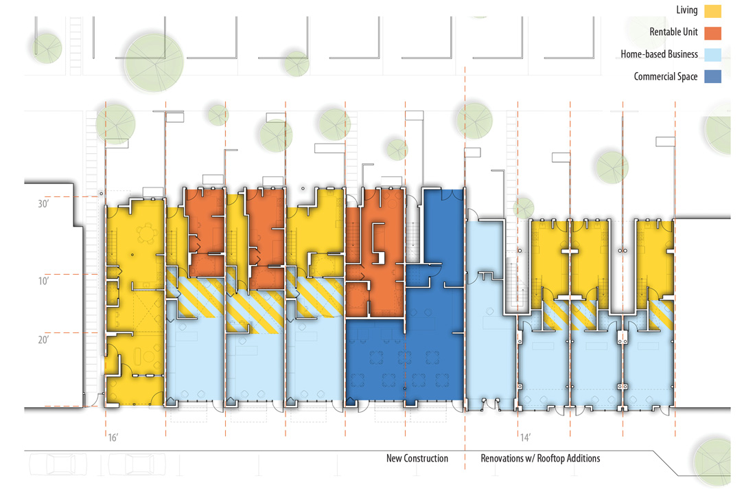
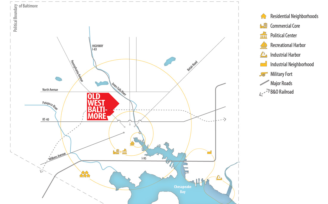
In terms of establishing a powerful language of communication, one project in particular hit the ball out of the park. The design by Jay Ranaweera not only took on the challenge of architecture in the complicated urban area of Baltimore, but built an entire thesis around cultural and social empowerment as well as conomic strategy. Each piece of the solution was clearly conveyed through simple, concise diagrams in an intelligent graphic format that the spectrum of society (not just the esoteric design-minded) could comprehend.


Well-crafted diagrams are synergistic. The interaction between graphics, text and data produces an effect greater than the sum of the individual parts. A good diagram typically empowers us to comprehend information more rapidly (and enjoyably) than any other form of presentation.

We can’t stress enough the importance of not just diagrams themselves but understanding what makes a them effective. It’s always inspiring to see students who have grasped an understanding of graphic communication and who are running with it full speed ahead.
More about Jay and his work are available here.
Cheers from Team BUILD


